


The Italian motorcycle industry stands out among the world’s manufacturers for its unrivaled beauty and reliability. The country where many brands that later became famous were created has the highest demand for products worldwide. Ducati, MV Agusta, Guzzi, Italjet Moto Srl, Moto Guzzi, and Benelli are a few Italian manufacturers whose names are familiar even to those far from motorcycling. Most Italian brands have become world-renowned in this field. Italy is not just a sunny country with a unique climate and friendly, hospitable people. It is the birthplace of many outstanding designers, engineers, motorcycle racers, and mechanics. These people are the basis for the Italian motorcycle’s successful development and popularity.
What are Italian motorcycle brands?
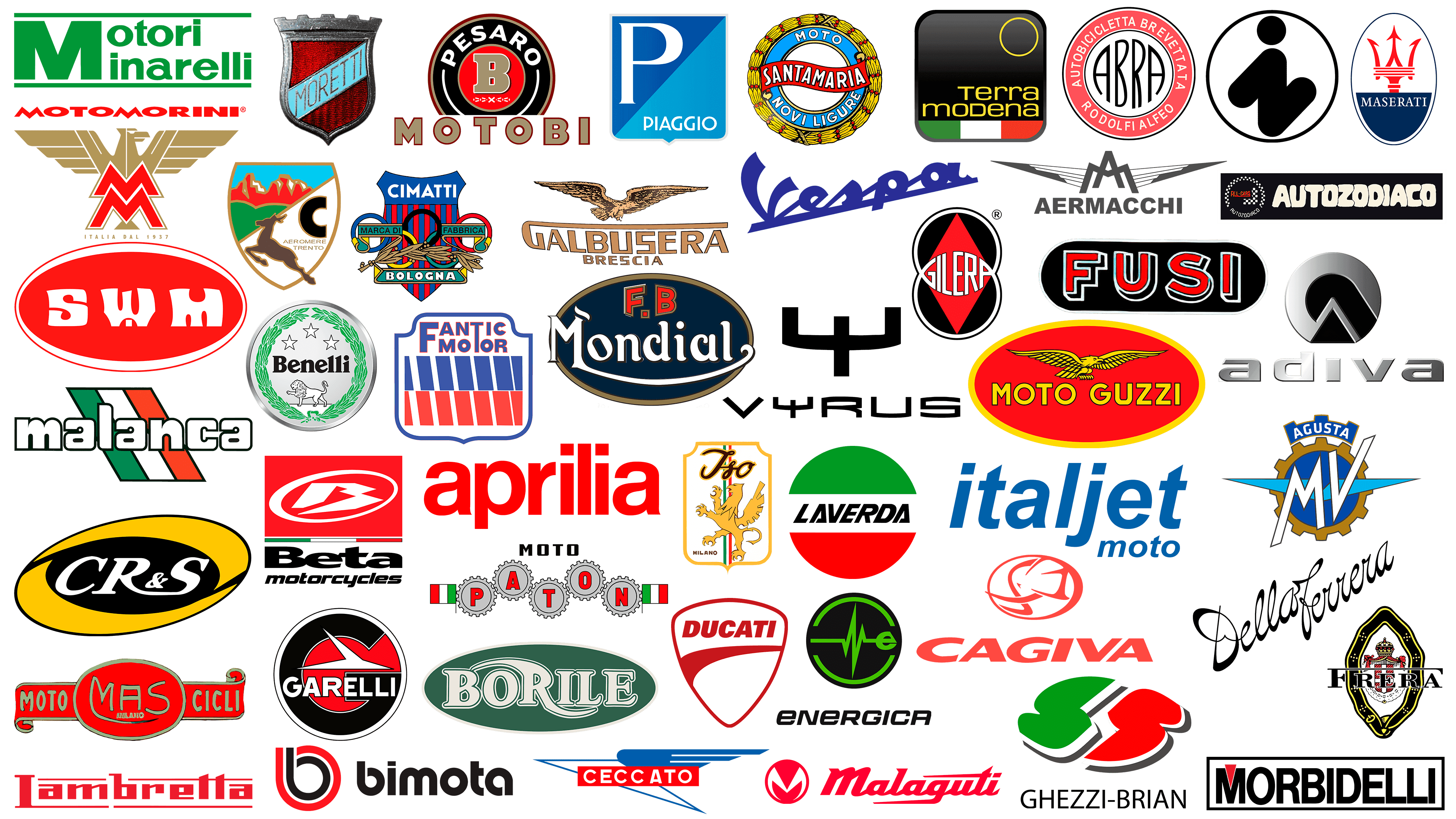
Italian motorcycle brands are leaders in the global market. Among them are well-known names such as Benelli, Moto Guzzi, Italjet Moto Srl, MV Agusta, and Ducati. But there are also lesser-known companies that have been forgotten, such as Abra, Autozodiaco, and Cagiva.
Motorcycle production is an important area affecting the country’s economy today. Unlike other European manufacturers, which have ceded the palm of superiority in this field to Japanese, Chinese, and even Indian brands, the Italian motorcycle industry continues to develop. It is showing good acceleration at the moment. Between January and June 2021 alone, more than 140,000 motorcycles of various types were sold, far exceeding the figures of the last decade.
Abra
![]()
The Abra brand has not been Italian “long-lived” in the motorcycle industry. It existed for only four years from 1923 to 1927. It was distinguished by the release of unique motorcycles and power units produced solely in-house. The tragic death of the company’s founder in 1927 led to the stoppage of all production and the termination of the company. DKW bought the rights to production and the company itself from the founder’s relatives, Abra. The received technology, with some modifications, was applied to the brand’s motorcycles.
The company’s emblem is circular. The shape of the circle was chosen as a symbol of infinity, unity, and cyclicity, meaning rhythm and constancy of movement, which were the principles of the Italian brand Abra. The logo’s inner space consists of several circles. The inner circle is filled with red, a symbol of movement and fire’s action. The red color was an accent; it contrasted with the smaller white circle bearing the brand name. The name is in the original design and black. The letters, in height and along the sides, repeat the circle’s shape through their curves, forming a circular composition.
Adiva
![]()
One of the young yet promising Italian brands in the motorcycle industry is Adiva, founded in 1994. Serial production of city scooters on 2- and 3-wheeled models began in 2001, and in 2008, their AD3 model received an honorary prize at the EICMA exhibition in Milan. The model was characterized by increased maneuverability and stability, both of which are important in urban conditions. This was specified by the chassis design, which features two wheels at the front and one at the rear. All models of the brand feature a retractable, weatherproof roof. The company’s headquarters is in Milan, and its production sites are in Malaysia and Taiwan. Distribution centers have been opened in Japan, China, and Hong Kong.
The company’s ambitions supported its desire to enter the market, which paid close attention to developing its unique style. It is based on innovation, modern design, and enthusiasm. These three components were reflected in the Adiva logo, which conveyed a sense of integrity, perfection, safety, and versatility, characteristics of the Italian brand’s entire model range. Visually, the emblem is a circle with a volumetric bulge. The circle has a lower part, supported by an arrow-shaped element pointing from its top to the center. The emblem is a stylized wheel connected to a fork. This element complements this visual perception of the composition and simultaneously forms the contours of the letter “A,” the first letter of the brand name.
Aermacchi
![]()
The history of the Aermacchi motorcycle brand began in 1912, when its founder, Giulio Macchi of Varese, formed the Newport-Macchi company. This town became the center of Italy’s aviation industry. The company became involved in aircraft used extensively in aerial combat during the First World War. During the war, it was renamed Aeronautica Macchi and continued to grow rapidly in this area. After the war, the company refocused on producing three-wheeled trucks and motorcycles. These were produced under the Aermacchi brand until 1978. Although the brand was acquired by Harley-Davidson in 1960, the new owner retained the original name and adopted the dual name. In 1978, Harley-Davidson removed the reference to the old brand.
The company logo remained true to the brand’s history. It consisted of the first two letters of each word in the brand name, grouped, with the descending top lines of the letter “M” forming the crossbar of the letter “A.” To the right and left are elongated wings shaped as two triangles with their vertices raised. Both letters and the Aermacchi brand name are in Arial Std Black.
Agrati Garelli
![]()
At the end of the 19th century, Antonio Agrati from Cortenuova di Monticello Brianza opened a forge. The beginning of the twentieth century adjusted the demand for the company’s products. The founder passes it on to his sons, Clodoveo, Luigi, and Mario, who produce highly sought-after electric motors and bicycle parts. The tragic deaths of all three led to the company being taken over by 16-year-old Carlo Agrati. In 1958, the company completely refocused on producing electric bicycles and launched the first Capri scooter. The launch of the Capri marked the beginning of the full production of scooters and mopeds. The Agrati brand was independent until 1991, when it merged with Garelli, based in Lacciarella. All motorcycle models were released under the new name Agrati Garelli.
The emblem features a traditional Italian motorcycle-brand circle shape, symbolizing infinity, unity, and cyclicality. In the center of the circle, the letter “G” is inscribed in black. The free space inside it is filled with alizarin red, providing a contrasting effect with black. This combination of achromatic black and red, the main color palette’s color, strongly impacts a person, attracting the eye and attention. The brand name is in the Garelli font at the bottom of the emblem.
Aprilia
![]()
Aprilia is a brand known today not only in Italy but all over the world. Aprilia is part of the world’s fourth-largest industrial group, Piaggio, producing two-wheeled vehicles. The company was founded in 1945 in the Venetian city of Noale by Alberto Beggio to produce bicycles. The brand’s name was a tribute to the founder’s favorite model, the Lancia Aprilia car. The year 1960 marked the release of the first Sport Uomo moped. In 1968, the company’s ownership was transferred to the founder’s son, Ivano Beggio, who began producing mopeds, leading to the simultaneous market launch of three models: Colibrì, Daniela, and Packi, as well as the first Italian off-road vehicle, Scarabeo. Today, the president and CEO of Piaggio is Roberto Colaninno.
The company’s logo is a vivid example of its ability to promote its brand effectively. It is simple and laconic, with nothing extra to distract the eye. The emblem is the company’s name, presented graphically in Latin capital letters. An important accent is the red background, chosen to evoke the grief and sorrow of many people who suffered the hardships of World War II. The red color symbolizes the brand’s founder’s masculinity and resilience, as well as the company’s spirit. The font used for the lettering is Neue Haas Grotesk Display 65 Medium.
Aeromere
![]()
After World War II, the victorious countries banned the Axis powers from producing military equipment. This also affected Caproni’s concern, which was engaged in producing combat aircraft in Trento. Founded in 1910 by engineer Gianni Caproni, the company began producing heavy bombers, analogs that did not yet exist. Even the United States used them in its air force in 1918. After World War II, Caproni began producing light motorcycles under the Capriolo brand, which became associated with its new motorcycle. The founder’s death in 1957 led to a complete rebranding of the company. It gets a new name, Aeromere, and a new emblem. In parallel with motorcycle production, the company also produces light aircraft and gliders. In 1964, the company was acquired by the Laverda concern.
The company’s emblem, which adorned its motorcycles, accurately reflects the spirit and hopes of its founder. The heraldic shield with sloping sides features a small deer in a leap, which gave the brand its name. The shield is divided diagonally into two parts. The upper part is framed in black with a red flame in the field. In the lower part of the shield on the right, there is a white Latin letter “C” (the first letter of the brand name), and below it, in small print, are the founder’s name and the company’s location, Caproni Trento. On the left is a deer.
Autozodiaco
![]()
In 1968, buggy car production began in Bologna. The Autozodiaco brand existed for only 13 years, during which it made a small contribution to the Italian motorcycle industry. In the mid-70s, the company released a motorcycle, Moto Zodiaco Tuareg. Its important difference was the absence of a generator and the presence of a mechanical start from a cord. To ensure passability, it used large pneumatic tires. In 1978, the company ceased to exist.
The company’s emblem was a circular sign whose circumference was formed by black-and-white checkers. In the lower part of the circle arc was the name of the brand Autozodiaco. Inside the black field was an inscription in red Latin font, ALL CARS, resting on a black-and-white checkerboard. The text is underlined with a thin red line to the first letter, which is slightly larger than the rest. Next to the sign was the brand name in an inflated “cartoon” font, like a symbol for inflated motorcycle wheels. The font looked particularly eye-catching and memorable on a black background. The letters overlap, as if trying to get ahead of the next one, which gives the sign a sense of cheerfulness and appeal.
Benelli
![]()
In 1911, the Italian brand Benelli was founded. The company’s appearance is quite original. The brand’s founder was a woman, a mother of six children, who taught them to repair bicycles to earn a living. Noticing the growing demand for motorized bicycles, the company developed its bicycle engine in 1919. This continued with the production of motorcycles for sports racing, in which the two brothers began participating. Their successful performances in 1938 made the first three models particularly sought after. In 2005, the company went bankrupt and was bought out by the Chinese concern Qianjiang Group. The company manufactures new products under the Benelli brand in China, producing lightweight, small motorcycles and scooters in high demand in Asia.
Today’s Benelli logo has a more “Chinese” look. Paying tribute to the historical form and some elements characteristic of the company’s mid-20th-century logo, the appearance has undergone significant changes. The emblem is a three-dimensional silver circle. A laurel wreath of dark green saturated color occupies the inner field on the circumference. In the lower part is the figure of a white lion standing on three paws, with its right front paw raised in a warning gesture. Above it is the brand name Benelli in black lettering, and above that are three white five-pointed stars arranged in a triangle.
Beta Motor
![]()
The Beta brand dates back to 1904, when it was known as Società Giuseppe Bianchi, specializing in bicycle production. In 1940, gradually expanding and introducing new product types, the company carried out a complete re-equipment of its production with modern equipment and changed its name to Beta. It consisted of the initials of the founder’s son, Enzo Bianchi, and his father, Arrigo Tosi, who was the company’s chief engineer. The brand produced its first motorcycle with an engine in 1948. The transition to motorcycles occurred in 1950, when the first full-fledged motorcycle, the Ital JAP, was released. The brand’s products proved themselves in off-road racing. The company’s fame was brought by its models for mototrials.
The company’s latest rebranding has led to a redesigned logo, making it more suitable for modern display and perception by a new generation of users. The red rectangle logo symbolizes success and consistency, forward movement, and necessary rebirth. In the center of the rectangle is an image of a white oval of uneven thickness, angled upwards. The oval suggests movement, resembling a wheel spinning at high speed. Inside the oval is the letter “B,” whose shape and direction reinforce the visual sense of speed and acceleration. All these marks have a band with the colors of the Italian flag. Below is the full name of the Beta Motor brand. The word “Motor” is typed in small type and is centered below the first one. Combining black and red colors with white creates a very effective visual contrast. The red becomes the accent color, while the black and white form a definition, showing will and balance.
Borile
![]()
In 1988, the Borile brand, founded by Umberto Borile of Venice, entered the Italian motorcycle industry. The company was small and could not boast of mass production. It wasn’t until 1997 that the Borile B500T brought the company fame and glory. Within two years, the world was conquered by two unique models: the B500CR cafe racer and the B500MT motorcycle. But the best-selling model was the Borile Multiuso. The annual sales volume of this small manufacturer exceeds 50 units of customized equipment.
The company’s logo demonstrates a pronounced corporate style. In the emerald-green ellipse, the trademark name is in white Latin font. Each letter of the name has an emerald-green border. The text, executed in lowercase, has a unique design. The central figure is the letter “R.” Its upper and lower parts resemble the stylized shape of a motorcycle fairing. The logo’s simple, uncomplicated design positively affects its perceived visual impact and memorability.
CR&S
![]()
Roberto Crepaldi is the founder of the relatively young Italian motorcycle brand CR&S. For a long time, as a representative in Italy of leading motorcycle brands worldwide, such as Harley-Davidson, Triumph, and Norton, Roberto had been thinking about creating his own motorcycle. In 1992, Crepaldi opened his own company to sell retro motorcycles from the ’60s and ’70s. At the same time, Crepaldi begins taking orders for unique models, which he designs. Another direction is to accept orders for remodeling older models. CR&S production is located in Milan and fulfills up to 100 annual orders from Russia, the USA, Japan, Australia, and China.
For the CR&S logo, Roberto chose a stylized wheel in motion. This perception is reinforced by the shapes of the outer and inner ellipses, whose different inclinations further accentuate it. At the same time, this effect is supported by two black half arcs emanating from the inner black ellipse. The half-arcs are turned in opposite directions and arranged symmetrically. These elements divide the ellipse’s space into two equal parts. There is a sense of a wheel rotating at high speed, the spokes of which merge. The central element of the emblem is the CR&S brand abbreviation in white-on-black space.
Bimota
![]()
In 1973, Bimota was founded by three friends, Valerio Bianchi, Giuseppe Morri, and Massimo Tamburini, in Rimini. The brand’s name is an abbreviation of the three founders’ surnames. Initially, the company developed exclusive chassis designs for existing motorcycle models, primarily sports. In the 70s of the last century, Lamborghini began motorcycle assembly. In the early 80s, Bimota began modernizing motorcycles of the world’s leading brands, Yamaha and Ducati. After 2003, the factory released the Bimota DB5 Mille, which, like all of the company’s products, was ahead of its time. The release of DB5 once again confirmed the brand’s main tenet: creating models of the future with bright designs and unique technologies.
Bimota made its logo a true reflection of the brand’s spirit and style. The emblem featured a laconic yet effective visual presentation. The symbol’s main colors are red and black. The first is the color of risk and extreme, movement and activity, energy and courage. It inclines the audience to decisive actions. Its elegance and luxury are defined by high-quality black. Tandem is characterized by strength, but some anxiety. This effect is softened by the white element separating the two colors. The red color seems more vivid and accentuated, attracting attention. At the same time, this combination evokes associations of passion and elegance. The emblem is the first letter of the name “b.” Below is the brand’s full name in black text: “Bimota.”
Cagiva
![]()
For some time, the Italian motorcycle market was owned by the American Harley-Davidson subsidiary, which was owned by brothers Claudio and Gianfranco Castiglioni in 1978. Before that time, the brothers owned Cagiva, a company that manufactured motorcycle equipment and spare parts. In 1978, they immediately introduced two new racing models to the Italian market after purchasing the Harley-Davidson subsidiary. In just one year, production grew to 40,000 units. The beginning of the 1980s was marked by the release of several off-road vehicles, which opened a new production series. The MX model became the flagship of motocross cars. Today, Cagiva is a major, rapidly growing concern.
The Cagiva emblem is designed in a modern, conceptual style, with an active red color. Thanks to it, the emblem achieves a spectacular visual impact on the viewer, evoking a sense of extreme risk, a charge of powerful energy, and courage in decision-making. The composition, enclosed in an oval with variable contour thickness, evokes a sense of reckless dynamics and high-speed movement. The brand name is placed below this mark in a font similar to the Egyptian Wide. The right slant symbolizes speed and acceleration. This impression is reinforced by the elongation of the letters, which form a visual movement.
Ceccato
![]()
The Ceccato brand is one of the prime examples of innovative Italian motorcycle companies formed after World War II. The company’s founder was Pietro Ceccato, a pharmacist whose profession was quite far from motorcycle manufacturing. However, Ceccato’s fascination and passion for control and engine ideas outweighed his professional affiliation. The Giro d’Italia motorcycle model demonstrated the first significant success, equipped with a single OHC powerplant. The engine was a joint development with students from the Taglioni Technical Institute. Motorcycle production was discontinued in the mid-1960s.
As an emblem, Ceccato chose a stylized image of a flying bird with a triangular body. At the top of the figure were attached wings, beneath which was a red plate. The Ceccato brand name was written on it in white Dymond Regular font. This choice of colors in the overall composition has a very strong visual impact. The most effective psychological effect distinguishes this combination. White and blue colors give restraint and style. The warm, rich red color adds dynamism to the whole composition.
Cimatti
![]()
Since 1937, the Cimatti brand has been producing bicycles, mopeds, and motorcycles in Italy for the international market. Marco Cimatti named the new brand after himself, as he was a cyclist and represented the country at the Olympic Games. Like most pre-war businesses of this type, the company began by producing bicycles. In the mid-50s, as it set up mass production, the brand produced its first moped. By the beginning of the 60s of the last century, motorcycles went into production, and the Sports Luxury model was in great demand. The company’s next model range was racing motorcycles: the Kaiman Cross. From 1972 to 1977, the company produced two more motorcycles: a road model and a motocross model. In 1984, the company was closed.
The brand’s logo consists of many elements and colors. In the center, in the foreground, there were 5 Olympic rings. They were made in red, yellow, green, light blue, and dark blue colors. A horizontal branch of bronze laurel overlapped the lower rings. At the top of the first and third rings are plates in the form of unfolded scrolls, and inscriptions are made MARCA DI in the first and FABBRICA in the second. Under the rings on an oblong plate is placed the name of the city, BOLOGNA. All these elements were placed atop the heraldic shield, which featured vertical blue and red stripes. At the top of the shield is the brand name.
Ducati Motor Holding SpA
![]()
So, Ducati Motor Holding SpA was a division of the Ducati Group. The division was responsible for the development and production of motorcycles. The division’s headquarters were in Bologna. Since its inception, the company has specialized in high-performance machinery. They are characterized by two-cylinder, four-stroke power units with “L”-shaped cylinders and desmodromic valves. Today, the company is part of the German concern Audi AG.
The Ducati emblem embodies professional product promotion. It became an example of the effective use of modern visualization technologies. The emblem is characterized by simplicity and brevity, featuring only one element: a bright red heraldic shield. In the upper sector of the shield, the brand name is silver-gray. The slight rightward slope of the font imitates the tension before the start and the forward momentum.
Della Ferrera
![]()
Motorcycle manufacturer from Turin with a 39-year history. Della Ferrera became famous for its machinery, on which it won the Trofeo Turistico Nazionale in Cremona and other competitions before the First World War. Athletes widely used its products, which brought the brand to the leading position among Italian motorcycle manufacturers. The brand’s stable, even successful, development in the 1930s of the twentieth century was disrupted by the outbreak of World War II. The company could not recover. Following the country’s post-war economic recession, devastation, and sanctions against the Axis countries’ leading industries, Della Ferrera closed in 1948.
In the history of the Italian motorcycle industry, this brand remains memorable for its original motorcycle design and logo, characterized by aristocratic elegance and flamboyance. In its day, the brand was so recognizable that it didn’t need any additional visual impact to resonate with consumers. The company’s logo featured the brand’s full name in a beautiful calligraphic font, with strict, laconic, and aristocratic black vignettes. Both words flow smoothly into each other; the monogram from the last letter of the first word joins the beginning of the first letter of the second word. The slope from left to right symbolizes movement, and the composition’s direction from top to bottom conveys confident aspiration for victory.
Energica Motor Company
![]()
One of the modern high-tech brands in the motorcycle industry is Energica Motor Company. The brand was founded in 2010 to develop and manufacture electric-motor-based motorcycle technology, with a research center and production facility in Modena. The company, founded by CRP Group Corporation, specializes in material processing using CNC and modern laser technology. The official name, Energica Motor Company, was registered in 2014, when the company completed production of the first model in the Energica Ego range of eco-friendly motorcycles. They were first unveiled at the Top Marques exhibition in Monte Carlo.
The Energica Motor Company logo was created with production specifics and modern visualization methods in mind. It is based on a symbolic image of a pulsating electric discharge, which smoothly arcs around the text below. The letters are formed by the “continuation” variant of oscillations, giving them a graphical appearance resembling peak indicators. The last letter, “A,” is a transition to the schematic representation of the electrogram. The brand’s initial and final letters are saturated with a bright light green hue.
Fantic Motor
![]()
Since 1968, the Italian motorcycle manufacturer Fantic Motor has operated in both domestic and international markets. The company specializes in producing and exporting motorcycles oriented toward sports endurance, karting, and three-wheeled minibikes. A new light motorcycle model, Caballero, was launched quickly. In 1977, this brand began producing trial motorcycles, which brought it to the forefront of the market. The company’s real masterpiece is the Fantic motorcycle. Today, the company is developing a new direction for eMTB electric bikes.
The company’s logo is shaped like a coat of arms, a historical device used on the coats of arms of medieval cities. The outline of the shield and the first row of the stylized tire track in the form of vertical rectangles, depicted in the inner space of the sign, are made in purple. Below them is the second row of imitated tread track in bright red. Above them is the brand name. The font is individual. Two words are placed, one below the other, aligned on the left edge. The letters “F” and “T” in the same size correspond to the heights of both words and serve as a unifying element. Thanks to the contrast, the composition attracts attention and places the necessary emphasis on the brand name.
FB Mondial
![]()
FB Mondial first announced itself in 1936, when the Boselli brothers opened their factory in Bologna. The Italian company became the most famous brand for producing Mondial sports motorcycles. The brand received its official status in 1948. Throughout its existence, the brand remained ahead of its time, thanks to technological advancements. FB Mondial products won five world championships before 1957.
The FB Mondial brand had a memorable logo that combined aristocratic and luxurious elements. The simultaneous use of black and gold colors ensured this perception. The brand name was inscribed in a black oval with a golden outline. The accent is formed on the brand name and made in the original style. An arc covers the whole text from the first letter and ends with a monogram. The letter “O” resembled a bolt head with a screwdriver slot, hinting at the logo’s technical nature. The text was slightly outside the oval. This color scheme is most effective in making the brand visually appealing and easy to remember.
Gilera
![]()
Giuseppe Gilera, a young but already famous motorcycle racer, founded Moto Gilera in 1909. Its emergence was driven by the need to improve the motorcycles Gilera competed on. Gradually, the company expanded. In 1936, the brand began producing a series of racing motorcycles with a powerful powerplant that achieved the highest speeds. Thanks to it, these models received the title of the fastest, making the company the most famous and profitable. In 1939, the Saturno-500 was released and later entered the annals of “motorcycle glory.” In the early 1980s, the brand introduced a new model that won the Paris-Dakar rally twice.
The Moto Gilera emblem is presented in a bold red-and-black combination, making a strong impression on viewers. To soften the psychological impact, white was added to the composition. The emblem’s structure consists of two intersecting rings in a vertical position, with a red rhombus inscribed in their common center. The brand name is inscribed at the intersection point of the rings, where the first and last letters represent the arcs of each ring.
Frera
![]()
In 1905, Corrado Frera founded a company in the Italian town of Tradate to produce and repair bicycles. The brand existed for only 29 years, but left a significant mark on the history of the Italian motor industry. Its flagship model was the 1931 Frera Motoleggera, characterized by high technical characteristics and an attractive design. Today, you can learn about the brand’s history at the company museum in Tradate.
The Frera emblem has been known to all Italian and foreign cyclists and motorcyclists throughout the brand’s existence. One of the symbols of the emblem was a vertically stretched wavy ellipse on a belt, with a buckle at the bottom. In the interior of the symbol was a royal canopy with a crown and a heraldic shield, on which a Catholic cross was applied. The entire composition centered on the brand’s name. The first letter of the name served as a unifying element, symbolizing unity and security.
Fusi
![]()
Fusi & Co., SpA Milano, is a company that actively shaped the history of the Italian motorcycle industry. Its founder, Achille Fusi, began as a motorcycle dealer of the Belgian brand FN (Fabrique Nationale de Herstal), founded in 1889. In early 1932, Fusi began manufacturing RAS motorcycles from FN parts. This year marks the birth of the motorcycle brand. In 1933, the factory produced several models. The founder’s death did not end the company. Luigi Bo took over the leadership. One of the first models was a three-wheeled motorcycle released in 1937. In 1941, the M 25 CFS model was released, and it became the basis for sports cars produced until the mid-50s of the last century. 1957 was the last year of the brand’s existence.
In designing its emblem, the brand chose the most stable and visually appealing triad of red and black, a color combination used since ancient times. Inside, on a rectangular, rounded black background, the brand name Fusi is printed in red lowercase font with a white border. Each letter is given a three-dimensional shape with shadows.
Ghezzi & Brian
![]()
One of the youngest Italian motorcycle companies is Ghezzi & Brian, based in Missaglia. Founded in 1995 by Giuseppe Ghezzi and Bruno (Brian) Saturno, it focused on developing a new type of racing motorcycle. In 1999, it expanded its lineup to include city models. An important distinction between the two is the distinctly individual design and sporty styling. In 2002, the company began engineering developments in motorcycle and automobile construction. Two motorcycle models, the STW1100 and the Furia, can be called the flagships of their respective lines.
In its logo, the brand used the colors of Italy’s national flag: green, white, and red. The original execution of the sign allows one to “see” it in several variants for its interpretation:
- A stylized image of the motorcycle kick-starter ratchet
- uniquely created an image of the first two letters of the brand name “G” and “B.”
- Motorcycle fuel tank hatch.
A good way to “tie” your symbolism to the production profile and corporate identity. With this approach to logo design, it is easy to remember. This is achieved through the viewer’s task to determine what the emblem symbolizes. The brand’s full name is printed underneath the sign.
Galbusera
![]()
Plinio Galbusera and engineer Adolf Marama Toyo, two men passionate about technology, became famous for their unique development of small Python and Sturmey-Archer engines in 1934. Since then, Moto Galbusera & Co. of Brescia has been a vintage motorcycle company. For 21 years, this machinery has saturated the market with reliable, safe motorcycles. By emphasizing these parameters and sacrificing the development of speed characteristics, the brand gained fans among the users of the technique for ease of movement. However, post-war economic problems significantly reduced the purchasing power of this category. In 1955, the production was closed down.
Galbusera chose the flying eagle, which serves as the brand’s name, as its brand. The eagle symbolizes a successful and promising start. At the same time, the proud bird symbolizes success, victory, courage, and greatness. The successful take-off of the eagle was ensured by the elongated upper part of the letter “G,” which was a reliable support for the upper symbol. In addition, the inscription encompassed the entire text, visually unifying it and enhancing its elegant effect.
Italjet
![]()
The emergence of another original Italian motorcycle brand marked the mid-20th century. Italjet Moto Srl, based in San Lazzaro (Bologna), was founded by the talented designer Leopoldo Tartarini in 1959. From its emergence, the company mastered light-machinery motorcycles and scooters, characterized by an elegant, sporty design. By the early 90s, quad bike production began, and demand increased. During this period, the brand created three popular models: Dragster, Formula, and Velocifero.
The Italjet logo is a graphic representation of the company name. The logo fully meets modern standards of simplicity, making it easy to memorize. For the text, Ascender Sans WGL Bold Italic uppercase font is used. The first word, “Italjet,” is slanted to the right. Below it, the second word, “moto,” is in small, slanted type.
Innocenti
![]()
Founded in the 1930s by master blacksmith Ferdinando Innocenti in Milan, Innocenti became one of the most famous scooter and car manufacturers. Initially, the company produced scaffolding patented by the founder. The Lambretta scooter brought the brand fame. The brand divided its products into three main directions, which functioned until the 70s of the last century: engineering, motorcycles, and cars. The founder’s death in 1966 led to his son, Luigi, inheriting the engineering production, which he sold. Lambretta was manufactured in Spain and then moved to Indian factories. In 1997, the company was discontinued.
The brand was accompanied by an emblem originally executed, characterized by laconic, “lightness” design. The emblem is an image of the first letter of the company’s name enclosed in a circle. The inscription is in uppercase, with a connecting “tail” at the top. This provided a memorable sense of symmetry and a visual perception of the track as a zigzag. In this way, a link to the brand’s production direction was established. Due to the strictness of the color palette and the lack of visual overload, the logo acquires restraint, distinguished by the completeness of its forms. The emblem reinforced the brand’s overall image.
Iso
![]()
From 1939 to 1970, the Milan-based brand Iso operated in the Italian car and motorcycle manufacturers market. The company immediately made a loud statement about its high-quality products. Renzo Rivolta, a design engineer from Dezio, founded the brand. At its foundation, the company was named Isothermos, which was changed to Iso Autoveicoli in the late forties. The main production profile was motorcycles, scooters, and three-wheeled sidecars, characterized by reliability, original design, and high price. The brand developed and produced a new model almost every year for several years. These were Furetto in 1948, Isoscooter in 1950, Isocarro in 1951, Isomoto in 1954, Isosport in 1953, and Iso Diva. The last model was the Iso 500, released in 1961.
Rivolta’s fascination with heraldry was reflected in the brand’s emblem, a golden heraldic shield. Vertical stripes in the Italian flag’s colors were placed at the center of the shield. In the upper part, the stripes were superimposed over the founder’s name. Below the inscription was a heraldic griffin. The emblem hinted at the company’s aristocratic, high-demand clientele, as well as its nationality and technologies.
Lambretta
![]()
The Italian brand Lambretta, founded in 1947, immediately won recognition among the youngest motorcycle enthusiasts for its Milan-produced scooters. Lambretta scooters have become a symbol of youth and liberation for a whole generation. Their characteristics and dimensions facilitated movement in the narrow streets of Italian cities. The original design, which constantly kept pace with the times, became an important addition to the youth style, characteristic of the release period of this or that model. Today, the brand’s production has moved to Switzerland, where it has expanded its range to include cars, watches, luxury accessories, clothing, and perfumes.
The brand stands out with its modern logo. Fully in line with the requirements of visualization and a new approach to image perception among the modern generation, the logo is simply the brand name. The typeface was custom-designed by Minneapolis-based Chank and named Lambrettista. Executed in bright red, it visually complemented the logo. The trademark symbolizes fullness of life, activity and energy, dynamism and strength, passion and determination. All this is characteristic of the brand’s products, which fully align with these views.
Laverda
![]()
The history of the Laverda motorcycle brand dates back to 1873, when Pietro Laverda founded a company to produce agricultural engines. The production base, named Laverda SpA, was located in the village of Brigance. After 45 years, the founder’s grandson, Pietro Francesco, renamed the company Moto Laverda SAS Dottore Francesco Laverda e Fratelli and began producing mini-motorcycles. The first model was developed in 1947 as a garage model, not intended for full-scale retail. The unexpected success of the model led to the brand’s reorientation and to preparations for mass production in 1949. This year was marked by stable production of low-power, small motorcycles known for high quality, reliability, and durability. An important distinction of Moto Laverda was the requirement to use innovative solutions in each new model. By 1952, Laverda motorcycles had become favorites in racing competitions. In 1985, the Laverda family discontinued motorcycle production.
As true Italians, Laverda strived to demonstrate their national identity in everything they did. This was reflected in the logo, which was quite simple. It was a circle divided into three sectors, each in the color of one of Italy’s national flag colors, in the order they appeared. In the center, on a white field, the brand’s name was inscribed in lowercase letters. The font was specially designed for the brand and had the right slant, typical for motorcycle and automobile brands. Simplicity and brevity ensured that the emblem was recognizable and easy to remember the first time.
Moto Guzzi
![]()
The Genoa-based motorcycle company Moto Guzzi was founded in 1921 by the Parodi family, Vittorio Emanuele and his son Giorgio. Italian Air Force pilot Carlo Gucci joined them. The brand is among the oldest motorcycle manufacturers in Europe. Its first model immediately became a benchmark, shaping all subsequent brand development. In 1928, the company released a new model, the Moto Guzzi GT, to popularize the brand, and Giuseppe Gucci rode 4,429 km above the Arctic Circle. This model was named Norge. With the end of World War II in 1939 came the Airone 250, which ushered in a new wave of successful Guzzi models. However, in 2000, the brand could not withstand the competition and was absorbed by Aprilia, which in 2004 became part of the Piaggio concern.
When creating their logo, the founders paid tribute to the memory of pilot Giovanni Ravelli, Giorgio Parodi’s assistant. He died shortly before the company was created. In his honor, the logo features a soaring eagle, as on the Italian Air Force emblem. Under this symbol is the Moto Guzzi brand name. The text is set in Casagrande Antifascista Bold. The emblem has acquired solemnity and restraint with a certain grandiosity of execution. The eagle’s composition with the brand name made the emblem especially memorable and respectful.
MV Agusta
![]()
Italian motorcycle company MV Agusta was founded on January 19, 1945, by Count Domenico Agusta. The tasks of this division of the Agusta aircraft company included developing and producing engines, bicycles, and motorcycles. The production was located near Milan in Cascina Costa. In the fall of 1945, the first light motorcycle, the Vespa 98 cm3, was produced. This model went into serial production under MV 98 and was produced in 2 versions. Racing versions followed this model. By 1952, the factory produced serial motorcycles and scooters, among them a novelty: a four-stroke model in two versions, 175 CST and 175 CSTL. This model became the MV Agusta 175 CSS-5V prototype, a serial racing motorcycle. In the 1960s, motorcycle enthusiasts were enamored with the Checca. Some design similarities with other manufacturers began to depress sales, leading to a complete redesign of the models in the mid-70s. However, the company’s owners lost interest in this direction. In 1977, motorcycle production was discontinued.
Despite his origins, the Italian count was not very keen on heraldry, as reflected in the logo’s design. The company’s emblem reflected its main areas of activity. The main element was a bronze gear, over which hovered a three-toothed link in the form of a crown bearing the brand’s name. Stylized blue wings, a symbol of the company’s main profile, were superimposed on the gear. At the top of the composition, in white letters stretching from bottom to top, was the abbreviation MV, symbolizing the brand’s successful ascent and development.
Malaguti
![]()
The products of the Italian company Malaguti SpA, founded in 1930 by Antonino Malaguti from San Lazzaro di Savena, aroused great interest among motorcycle enthusiasts worldwide. The company’s founder was a woman. The main products were bicycles, which immediately captured the market with their quality, advanced technical features, affordable prices, and original design. This trend continued after World War II, when production was reoriented to mopeds and, in 1958, to motorcycles. An important feature was the use of small-capacity engines. In 2011, the company filed for bankruptcy. Seven years later, the brand was acquired by the Austrian company KSR Group GmbH, which continued to produce spare parts for existing products.
As its logo, the brand has chosen the company name in text and the letter “M” in a red circle. This icon resembles a motorcycle helmet, with the visor forming the letter’s graphic design. The text of the name and the sign is bright red, the color of victory, success, and the desire to move only forward. The text’s graphics reinforce the latter, with a font that runs serifs from right to left, symbolizing the headwind.
Minarelli
![]()
The Minarelli brand, founded by Vittorio Minarelli, began in 1951 as a manufacturer of racing motorcycles. However, seven years later, the founder changed the company’s profile, focusing solely on producing engines for sports motorcycles. The company was rebranded in a hundred, and the brand name was changed to Motori Minarelli. At the same time, a new factory is opened in Calderara di Reno. By the mid-70s, the company’s powerplants were on most award-winning motorcycles. One of the most famous motorcycles was the 1972 Minarelli 50 GP. In 1990, close cooperation with Yamaha led to the Yamaha Group’s takeover of Minarelli. In the fall of 2020, the brand’s ownership changed to Fantic.
The Minarelli emblem is designed in a warm, attractive green. Thanks to this, the emblem has a calming effect while also conveying strong energy. The brand name font is Hypersans Black, designed by Aah Yes. The designers proposed combining the letter “M” as the initial letter of both words, placing them below the other. Marking the upper and lower borders with a line visually focuses the name on the sign, separating it from extraneous elements. At the same time, this design technique is an original visualization of constant linear movement in the development of the brand’s production and technology.
Moto Morini
![]()
Italian motorcycle brand Moto Morini was founded in 1937 by Alfonso Morini, a resident of Bologna. The company’s history is complex, with many dramatic changes, during which the brand left a significant mark on the Italian motorcycle industry. In 1987, the company was acquired by Cagiva. In 1996, it became part of the Texas Pacific Group. In the late 90s, the brand was acquired by Morini’s nephew, who incorporated it into his company, Morini Franco Motori Spa. The company’s latest model was the 2009 Granferro Hypermotard motorcycle. In 2010, the brand announced its sale. In 2018, the ownership was transferred to Zhongneng Vehicle Group.
The company’s logo signifies several elements arranged one above the other. The first is the brand name “Motomorini,” rendered in Balgin Black Expanded color by Studio Sun. Below the name is an imperial heraldic eagle in the color of wilted leaves, contrasting with red elements. Above the eagle is the letter “M.” The letters are superimposed. Under the sign, there is a small inscription in print: ITALIA DAL 1937.
Malanca
![]()
Italian engineer Mario Malanca founded a small business producing motorcycle parts and named it after himself. By 1956, he had matured into motorcycle manufacturing and produced his first model. Having conquered the domestic market, Malanca began targeting Asian and American markets. In 1980, the brand switched to producing motorcycles with powerful powertrains. However, the process of developing new modifications was delayed. In 1986, unable to withstand the competition, the brand ceased to exist.
Throughout the production period, the company was accompanied by a simple, easy-to-remember emblem, the result of a highly successful design solution. The brand’s inscription was set against a background of three vertical stripes of the Italian flag, with the right slope. All the letters were capitalized and had thin bezels, ensuring clear visibility. The logo’s colors convey a perception of free space as a place to realize creative ideas, embody the company’s consistency, and offer unlimited perspectives. The ShyFoundry SFPortabello Shaded font was slightly redesigned and given a new, attractive shape. Under the first letter of the brand name is a small inscription in Italian.
MAS
![]()
For 36 years, from 1920 to 1956, the Italian market offered consumers the products of its own company, Motorcycle Alberico Seiling (MAS). Its founder, Seiling, was a motorcycle designer and developer. From his 20th to his 22nd year, he developed several motorcycle models simultaneously over two years. The company started serial production in 1922. His OHV motorcycle held the top spot in its category for a long time.
The company logo had an attractive look and a memorable visual identity. It was a ribbon with an oval in the center and curls like ancient scrolls around the edges. The entire interior was red. Red, in its darkest shades, symbolizes power, strength, energy, speed, and confidence, aligning with the brand’s ethos and spirit. Combined with the font’s bronze border, the composition created an associative perception of the brand as a stable, reliable company. On the left side of the ribbon is the word MOTO; on the right, CICLI. In the center of the oval is the brand name’s abbreviation, MAS. Under the small print, the abbreviation is the name of the city where the brand is located, MILANO.
Maserati
![]()
Maserati is a brand that practically needs no advertising and is known worldwide for its luxury cars. Since 1947, its division, Fabbrica Candele Accumulator Maserati SpA, part of the world’s largest corporation, Adolfo Orsi, has been producing spare parts for motorcycles and mopeds. The first motorcycle models to leave the factory were the Tipo 125 / T2 and Tipo 160 / T4. A major change in the design of the Maserati motorcycle lineup occurred in 1955. For the next decade, the company focused solely on mopeds, which it later discontinued.
The history of the Maserati logo is quite interesting. Its central element is a red trident of Neptune. Mario Maserati, a family friend of Marquis Diego de Sterlich, suggested this symbol. The Trident is a formidable weapon in the hands of Neptune, who is in the famous Piazza Maggiore fountain in Bologna. Neptune symbolizes strength and energy. Being an artist, Mario followed this advice. The logo is a trident that conveys the beauty of the products and the brand idea, strength, passion, and high class.
Morbidelli
![]()
The year 1959 was a landmark year for the Morbidelli family. That year, Giancarlo Morbidelli from Pesaro created a new Italian brand that became legendary, first in woodworking and then in car manufacturing. Originally a woodworking company focused on innovation and ingenious designs, Giancarlo transferred this to motorcycle manufacturing. This became the brand’s hallmark. As a result, the company’s products enabled the Italian athlete to win four world motorcycle racing championships, leaving the era’s eminent leaders behind. The brand’s demand in the sports environment increased so much that it enabled it to win numerous victories over the most famous Japanese manufacturers. In 1987, a merger with the SCM group of companies took place. The merger greatly expanded Morbidelli’s capabilities and increased the company’s capacity.
The company’s logo became a model of simplicity and brevity. Significantly ahead of its time, the logo has acquired a special appeal. The brand name, in black with a small bright red accent in the form of an apostrophe, made the Morbidelli logo one of the most memorable. The strong, disturbing color combination highlights its merits in this tandem. The red color is like a torch in the dark. The emblem effectively demonstrated the brand’s passion, energy, and elegance.
Moretti Motor Company
![]()
Founded in early 1925, Moretti Motor Company designed, developed, and produced motorcycles. The company’s founder, Giovanni Moretti, realized his projects and provided services similar to those of other motorcycle manufacturers. In the late 30s, shortly before the outbreak of World War II, the brand gradually shifted to car production, which became its main focus after the end of hostilities. Until 1989, the company produced sports cars and microcars.
The emblem of Moretti Motor Company reflects the founder’s interest in heraldic elements. The emblem is a heraldic shield depicting a medieval city with a jagged top, characteristic of fortress walls. The emblem’s accent is a blue diagonal stripe across the shield’s inner field, which bears the brand name Moretti Motor Company. The first word is written in a strict italic font, which gives it perceptual priority. The rest of the name is placed below it in lowercase letters. The name’s location symbolizes the company’s growth prospects. The combination of silver-gray color with rich red and blue tones of the central element provides visual impact and attractiveness to the composition.
Motobi
![]()
For 22 years, the Motobi brand has been present in the Italian motorcycle market. The brand was founded by Giuseppe Benelli, one of the Benelli family’s brothers and the owner of the company of the same name. In 1948, he created a company called Moto “B”. The new company’s products included small motorcycles and scooters. The year 1953 was marked by the release of the innovative Spring Duration B200 motorcycle. At the end of 1955, two new versions of the Catria were released from factory stock, which had many design advantages over previous models. The arrival of the Catria led to a sharp decline in demand for the then-popular 175cc Moto Aermacchi. After Giuseppe Benelli’s death, his sons brought in designer and former racer Prima Zanzani to run production, who further developed the Catria. Each subsequent range version featured a colorful and original design and improved performance. In 1962, the family-owned Benelli acquired the brand, forming Gruppo Benelli-Motobi. In 1977, the Motobi brand was removed from the name. In 2010, Austrian Michael Leeb Trading GmbH attempted to revive the brand in partnership with Demharter GmbH.
During its existence, Motobi equipped its motorcycles with the original emblem. Colorfully designed, the emblem had a strong appeal. This ensured a professional approach to the choice of color symbols: brown, dark red, black, and white provided brightness and enhanced the visual impact on viewers. The logo’s content featured a stylized wheel as its central image. The lower part of the figure was trimmed to a circle, with the brand text superimposed. The name of the city where the brand was founded, Pesaro, was inscribed in white letters on the circle at the top. In the center was a three-dimensional “B” brand mark.
Paton
![]()
After the closure of sports motorcycle production at FB Mondial in 1957, the company’s chief mechanic and designer set up his own business. Giuseppe Pattoni named the new brand after himself, Paton. Former FB Mondial employee Lino Tonti also participated in the company’s development. After receiving the design documentation for previously unrealized models from Mondial Racing, the founders started developing their sports models. The first model came out under the Paton-Mondial dual name. In 1962, the Paton BIC motorcycle appeared. The latter modification, BIC 500, remained the market leader for a long time. Giuseppe Pattoni died in 1999, leaving the company to his son Roberto. In 2016, the brand was bought by Advanced Group Srl.
Each company model was marked with an emblem personally designed by Giuseppe Pattoni. The emblem is composed of the word “MOTO.” Below are five gears, each with a letter of the brand name and two Italian flags at the beginning and end of the gearing. The top word, “MOTO,” is typed in Graviton’s Naftera Black Italic font. This visual identity is easy to remember and creates a clear perception of the brand as a sports equipment manufacturer.
Piaggio
![]()
Piaggio & C. SpA dates back to 1884. This year, Rinaldo Piaggio founded an industrial enterprise that produced ships, airplanes, and various equipment. At the end of the Second World War, Enrico Piaggio reoriented production toward light motorcycles. Since 1946, Vespa scooters have become widely known. The death of Enrico Piaggio in 1965 led to the company’s transition to the Agnelli family, which owned Fiat. By the end of the 1960s, the company owned the Gilera brand, which expanded Piaggio’s offer with new models. Financial turmoil led to the brand changing hands from 1999 to 2003, when the new owner, Roberto Colaninno, breathed new life into it.
The Piaggio emblem had a heraldic orientation, characteristic of Italian brands of the late 19th century. The emblem’s main symbol was a rectangular shield. The image’s simplicity and brevity made the emblem particularly memorable. The inner part of the shield was divided diagonally into two colors: bright blue in the upper part and turquoise in the lower part. The letter “P” was inscribed in the space of the upper half. On the bottom edge of the second part of the emblem is the brand name Piaggio. The purity of the colors and the absence of bright, diverse shades gave the emblem an aristocratic look and visual impact.
SWM
![]()
SV.VM has been an Italian motorcycle manufacturer since 1971. The abbreviation stands for Sironi Vergani Vimercate Milano, referring to the founders, Milanese Piero Sironi and Fausto Vergani. Today, the company’s products are represented by a world-famous line of models for observational trials, enduro, motocross, and off-road. The brand got a second life in 2014 when Apelio Macchi and Daxing Gong joined forces to revive it. Apelio Macchi has been the technical director of Cagiva, Aprilia, and Husqvarna. Daxing Gong heads the Shineray group of companies.
The SWM logo is simple and concise. The mark is a horizontal oval. In the center of the oval is the SWM brand abbreviation, in the competition font MN by Mecanorma Collection. The combination of red and white on the emblem gives it a majestic appearance, symbolizing loyalty and solidity and embodying the brand’s hopes.
Santamaria
![]()
The Italian motorcycle brand Santamaria was founded in 1951 in Novi Ligure. The company produced several motorcycle model lines for 12 years, until its closure in 1963. The most famous were the 1957 Grand Sport, the 1958 Tigrotto 50cc Minarelli moped, and the 1962 Franco Morini 50cc Sport. Several models developed by the brand are known as Zundapp. Officially, the company’s products have entered the markets of Portugal, the Netherlands, and South Africa.
The Santamaria logo is a wheel. The outer part is woven into the form of a laurel wreath. The name of Novi Ligure’s founding city is in the circle field’s lower part. In the upper part, the production direction is MOTO. From the center of the sign to the edge of the wreath runs a ribbon, on which, repeating the curves of the ribbon, is the name of the brand Santamaria.
Terra Modena
![]()
Terra Modena Mechatronic Srl is the youngest company in the history of the Italian motorcycle industry. The company was founded in 2015 by Dario Calzavara in the eponymous city of Modena, Italy. The brand’s main focus was on developing EIPS electric navigation systems. Another product from the company is the Terra Modena 198 sports motorcycle. HPE Piero Ferrari developed the motorcycle between 2005 and 2007. The brand has not yet added any new products to the bridge construction, but this model has continued to be modified to improve its performance.
The brand has chosen a black circle on a dark gray field as its logo. The emblem looks like a stylized planet against a dark background. This rather gloomy duo is diluted by the light yellow color of the company’s name. The word Terra is centered in the upper part of the emblem. At the bottom is the word Modena, and the inscription uses the Arial Nova Bold font. The emblem’s black and yellow colors form the brand’s perception as a guarantor of reliability, safety, stability, and unexpected, innovative solutions.
Vespa
![]()
Vespa is the original name of Piaggio’s first scooter, which was launched in 1946. The great demand for this model led to its production and the start of mass production. To develop this line of business, Piaggio created a subsidiary called Vespa. Mass interest from Hollywood stars led to a manifold increase in scooter sales. In 1952, the Vespa Club was established, with a worldwide membership of over 50,000. Companies around the world purchased licenses to manufacture Vespa. The brand’s prosperity waned by 1992. In 2003, Roberto Colaninno invested in the fading company, bringing Rocco Sabelli to redesign the factory. This made it possible to produce scooters on any type of assembly line.
The Vespa logo was a copy of the name once drawn by Enrico Piaggio, owner of the merged corporation. The text was placed along a straight line from bottom to top. The handwritten font of the name demonstrated the exclusivity and originality of the company’s products. At the same time, through this visualization technique, the brand emphasized reliability, thereby evoking consumer confidence. The diagonal arrangement of the text evokes associations with the product’s speedy advantages and its confident swiftness.
Vyrus
![]()
The Italian motorcycle brand Vyrus is characterized not by mass production but by unique, exclusive developments. The brand is based in Coriano. Founded in 1985 as a design company focused on modernizing motorcycles, it merged with Bimota. The merger allowed the realization of independent individual projects, for which Massimo Tamburini had a rich imagination. In its development, the company focuses on improving motorcycle performance and creating exotic, individual designs. In 2003, the brand entered the European market.
Like all Vyrus products, it has a visual identity based on exoticism. The brand name in the logo is composed of a sign in the style of ancient runes. The main element is the letter of the Greek alphabet Ѱ psi, under which the brand name is located. The sign has a deep, sacral meaning. Ѱ symbolizes three main components of the soul’s power: reason, feelings, and will. This characteristic accurately reflects the company’s principles and enables it to create unique, exotic products. The composition’s contrast provides a clear visual impression. The color scheme harmoniously integrates all logo elements while symbolizing the elegance and sexuality of each Vyrus product.