


![]() Izod Logo PNG
Izod Logo PNG
The Izod logo signals the middle price segment of the fashion brand’s offerings, as it lacks decorative elements or other design frills. Everything is simple and clear in it: two large letters superimposed, one on top of the other and forming a single “design.” It cannot even be called a monogram because the glyphs are geometrically clear, smooth, and even.
Izod began in London’s West End in 1922, when tailor Arthur James “Jack” Izod opened A.J. Izod on Regent Street. The shop sold men’s shirts, ties, knitwear, and sportswear. In 1930, Edward, Prince of Wales, ordered shirts from Izod for the royal court, giving the name early prestige in British menswear.
In 1937-1938, American businessman Vincent Draddy of David Crystal, Inc., bought the Izod trademark and brought it to the United States. The key turn came in the early 1950s, when David Crystal partnered with Lacoste, the French brand founded by tennis champion René Lacoste and André Gillier. Draddy received the U.S. rights to produce and sell Lacoste shirts under the Izod Lacoste name.
The $8 polo was expensive for the time, so Draddy promoted it through public figures, giving shirts to Dwight D. Eisenhower, Bing Crosby, and John F. Kennedy. By the 1960s and 1970s, crocodile polo had become part of the American preppy style, associated with tennis courts, yacht clubs, and country clubs. At its peak, the brand reportedly sold more than 16 million polos a year. At the same time, Le Tigre appeared as a cheaper rival with a tiger logo.
By the late 1980s, heavy distribution and counterfeits weakened the brand’s exclusivity. In 1993, Lacoste’s owner, Sportloisirs S.A., bought back the U.S. rights, ending the Izod Lacoste partnership. In 1995, PVH Corp., owner of Van Heusen, acquired Izod through Crystal Brands for $114.7 million. PVH expanded the line into women’s wear, golf, footwear, and accessories. On June 23, 2021, PVH agreed to sell Izod, along with Heritage Brands, to Authentic Brands Group for $220 million, with the deal closing on August 2.
Meaning and History
![]()
The roots of this fashion brand go back to the beginning of the last century, when a talented tailor, Artur James Izod, appeared in the capital of Great Britain. He conceived, sewed, and sold the products in his fabrication shop, AJ Izod, in the West End. He tried to make it a full-fledged, ready-to-wear store. This event is dated 1922. The assortment included ties, knitwear, classic shirts, and sportswear.
In 1930, Prince Edward entered the master tailor’s shop. He was impressed by the product’s quality, the fashionable fit, and the sophisticated design, so he soon ordered a batch of shirts for the royal family’s representatives. The demand for Artur James Izod products increased, and their popularity grew. The master’s fame went beyond Britain and reached the United States, so in 1937, a businessman hired by David Kristal visited the manufactory. His task was to offer the tailor a decent payment for the rights to the Izod trademark.
The result of the meeting was the brand’s relocation to the United States, as the founder was advanced in age and intended to retire. So the London garment factory was moved overseas and introduced to the United States in 1938 under the same name. This decision helped preserve the fame already gained, as Artur J. Izod had created the Windsor tie knot for Emperor George V. Therefore, the brand did not change the debut logo for a long time, using it until the early 2000s.
What is Izod?
Izod is a fashion brand from the United States. It offers sportswear, sweaters, polo shirts, jackets, shoes, cardigans, and accessories. Its products are characterized by youthful style, original prints, and colorfulness. The brand’s founder is the British Artur James Izod, who opened the manufacturer in 1922. Then it was sold to the American company Authentic Brands Group. Since 1938, the brand has been considered American. The head office is in New York.
1938 – 2004
![]()
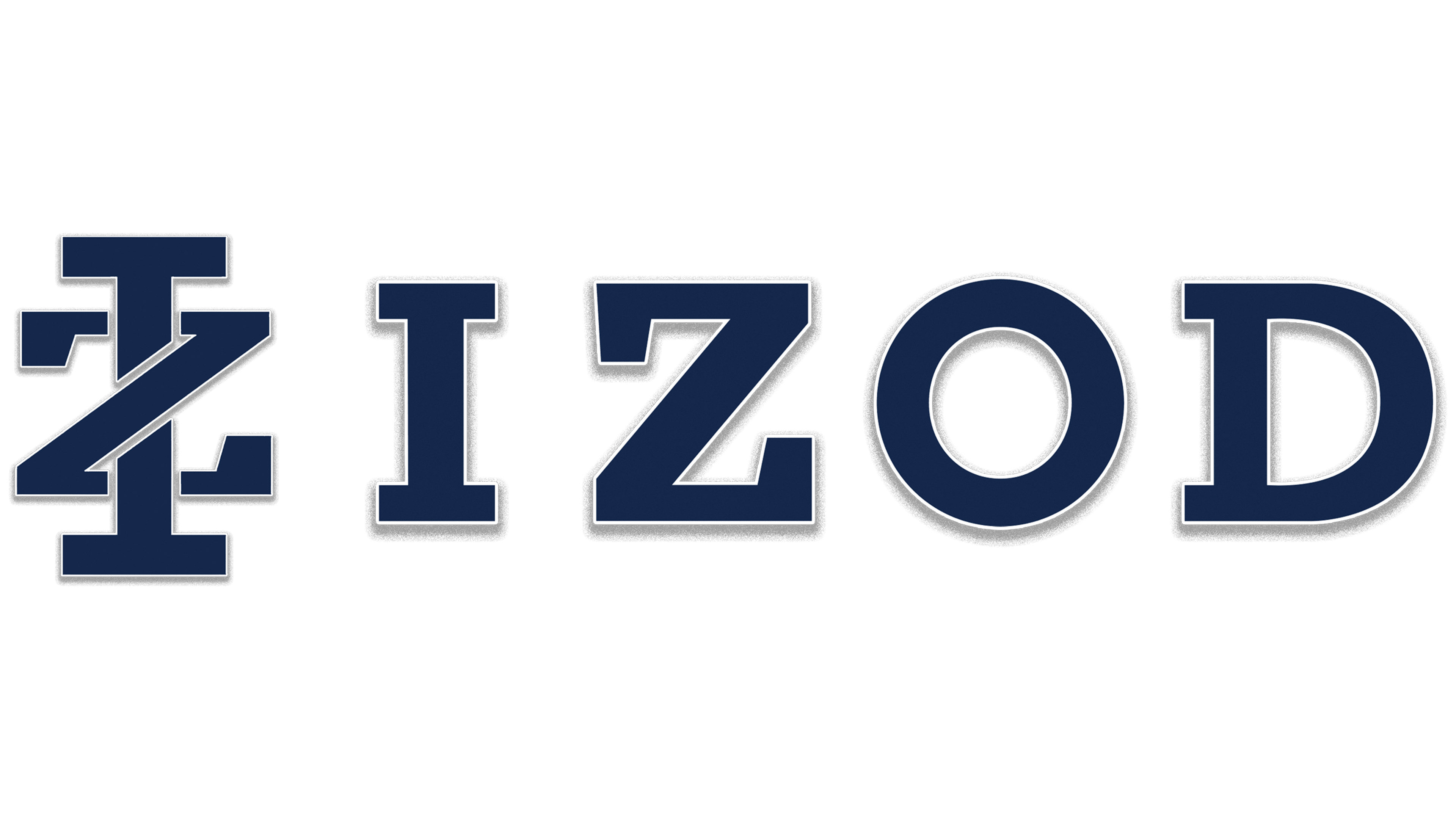
On the primary emblem, there is nothing but the clothing company’s founder’s name. The visual identity sign is massive and strict, in a monochrome palette. All letters are in uppercase. They consist of a harmonious combination of wide and thin stripes that form serifs. In “D” and “I,” serifs are long, needle-shaped; in “Z,” on the contrary, they are thick, with blunt ends. The central part of the “O” is a vertical oval. The inter-character space is free, so the word “Izod” is visible both on the label and the logo.
2004 – today
![]()
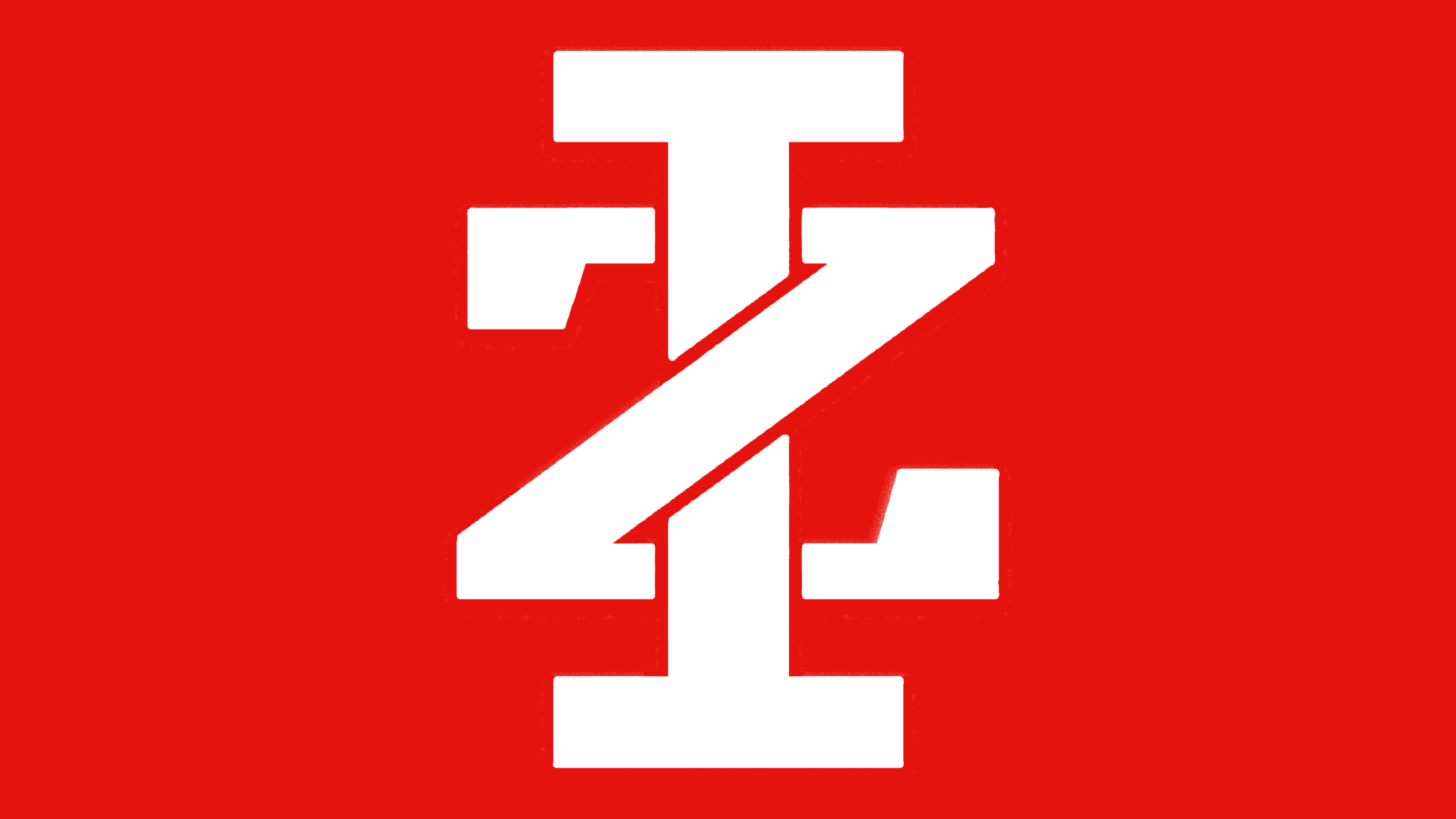
The modern version of the logo is complex. It conveys not only the name but also the concept. The key element is a geometric monogram. Although it lacks the characteristic swirls, the glyphs are still intertwined. “I” and “Z” were taken as the basis. They are connected in such a way that the core of the first letter is wound up behind the diagonal strip of the second. To show their order (as they appear in the title), the designers made the “I” much higher than the “Z,” which is composed of three segments.
Each symbol is surrounded by a thin white border and a wide gray shadow, making the monogram appear to float. Below is the company’s full name. It is decorated in the same style as the monogram – red letters with a white frame and shadows. Below them is the phrase “America’s Premium Leisure Wear,” painted in black and underlined with a thin line.
Font and Colors
The difference between the debut and current logo is significant. If the first one contains only a text designation, then the second one has a graphic sign, which is often used separately as an icon or label. But they have the same style: strict, businesslike, practical.
In the earliest logo of the fashion brand, the inscription is in bold sequins, similar to typefaces such as Speakeasy Modern and LTC Bodoni Bold Extended. In the second version, the text is typed in a font close to Coltan Ages Extra Bold. In both cases, the glyphs are wide and brutal. The color scheme has no common denominator: the name in the emblem can be done in black, red, or dark blue, depending on the background. In addition to them, neutral white is used.