The box is the main element presented on the emblem. It is played in numerous formats and styles, has many color shades, and is complemented by several unforgettable images. It evolves along with the franchise, and this is its main advantage. Thanks to the Jack in the Box logo, the fast-food restaurant chain demonstrates its vitality, development, and ability to stay afloat with confidence.
Jack in the Box: Brand Overview
Jack in the Box is a fast-food restaurant with over 2,200 outlets in the western part of the United States and some major cities. The chain offers a variety of chicken and potato dishes, cheeseburgers, hamburgers, egg rolls, and tacos, which are in high demand and generate more than $1 billion annually. The company’s founder is Robert Oscar Peterson.
In 1951, Robert O. Peterson launched the first Jack in the Box in San Diego, California, marking a significant moment in fast-food history with the introduction of drive-thru service. This innovation allowed customers to order and receive their meals without leaving their cars, setting a new standard in the industry.
At first, the restaurateur had other catering establishments. One operated on El Cajon Boulevard in San Diego and was called Topsy’s Drive-In. He added a few more points of the same name a little later. In the late 40s of the last century, Robert Oscar Peterson designed his first restaurant on the boulevard in a circus style – with the image of a clown. After a while (in 1947), he bought the right to order and sell food through the window – for those arriving in cars. In 1951, the owner of the fast food chain completely transformed the boulevard, designing it in the design of Jack in the Box, installed a kiosk, and began selling burgers for visitors in vehicles. It was a two-way drive-thru concept, where the customer received the entire previously announced order at the end. Although such an idea was not new, Peterson was the first to resort to radio communication because before that, everyone around used direct client-window contact. This helped increase the speed of service.
Throughout the 1960s, Jack in the Box saw rapid expansion, particularly across Southern California, growing to over 300 locations by the decade’s end. During this era, the chain began offering combo meals—a burger, fries, and a drink at an affordable price—and became one of the first to provide 24/7 service.
1968 was another milestone when Ralston Purina Company acquired Jack in the Box, fueling further growth. The 1970s brought the brand beyond California’s borders, opening new restaurants in Texas, Arizona, Nevada, and Washington.
However, the 1980s presented challenges, leading to a sale to an investment group headed by John Martin. This change in leadership spurred menu updates and a branding refresh, including introducing new signature items like chicken strips.
In 1993, Jack in the Box went public after several effective advertising campaigns. However, a year later, in 1994, the brand faced a significant setback with an E. coli outbreak linked to undercooked burgers. This crisis led to industry-wide changes in food safety standards.
In the late 1990s, a quirky brand mascot, Jack Box, was introduced, giving the chain a distinct and memorable identity.
The 2000s were focused on menu innovation, introducing premium options like the Sirloin Burger and expanding snack offerings.
Since the 2010s, Jack in the Box has emphasized better ingredients and healthier menu options, including salads and turkey burgers, alongside leveraging technology with mobile ordering and payment apps.
Today, with over 2,200 outlets in 21 states, Jack in the Box continues its legacy of innovation, quality, and creativity. Signature dishes like the Jumbo Jack burger, Ultimate Cheeseburger, and tacos and chicken snacks keep customers returning. The mascot, Jack, remains a central part of the brand’s advertising, keeping the image of Jack in the Box unique and lively.
Meaning and History
The new-generation restaurant Jack in the Box was conceived as a modern food machine. The decor reflected this idea: a giant clown was on the roof, and another smaller one served as an intercom. Next to it, a sign read, “Pull forward, Jack will talk to you.”
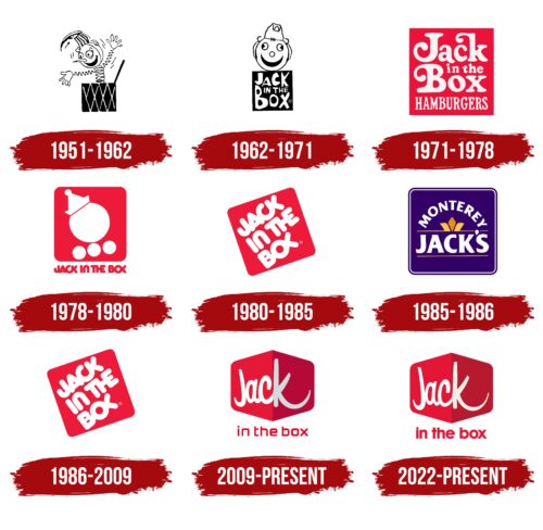
The revolutionary project’s author is the Californian modernist architect Russell Forester. Soon, his design harmoniously incorporated the concept of a restaurateur. All Robert Oscar Peterson establishments were united into a common network and renamed Jack in the Box. The same idea has been carried over to the visual identity, so some logos (especially the initial ones) feature an image of a merry clown jumping out of a box. There are eight multi-format emblems (two of them are the same).
What is Jack in the Box?
Jack in the Box is an American fast food restaurant chain with over 2,200 outlets. She specializes in potatoes, chicken, tacos, egg rolls, hamburgers, and cheeseburgers. Its founder is Robert Oscar Peterson. The company was founded in 1951. The headquarters is located in San Diego, California.
1951 – 1962
The debut sign was distinguished by a clear link to the image of a clown, which is completely in tune with the name of the fast food restaurant Jack in the Box. It was a simple and friendly logo with a funny toy popping out of a square box adorned with dark diamonds. The body of the figurine consisted of a spring. The hands had a similar structure. The palms of the cheerful little man were open in greeting, which testified to the hospitality of the restaurant chain. Wide-open round eyes, an arched mouth, a long nose, eyebrows, and eyelashes stood out on a smiling face. This logo version was used for over ten years, after which the identity was updated.
1962 – 1971
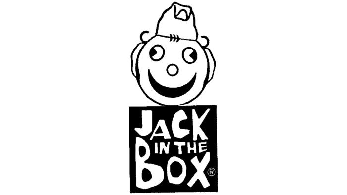
The second badge was no less friendly, albeit cut in half. The fact is that only the head remained of the clown: he smiled cheerfully, leaning out of the rectangular box. It had the name of a catering chain on it. The largest were the words “Jack” and “Box,” written in capital letters. The phrase was divided into three parts and occupied different lines. The shape of the glyphs testified that they were made in an individual font with no analogs. In the center was the phrase “in the.” It was small, though it consisted of capital letters. At the top was a head with completely different facial features than before. Three miniature circles were striking, which denoted the nose and pupils. The mouth was in the shape of an inverted crescent.
1971 – 1978
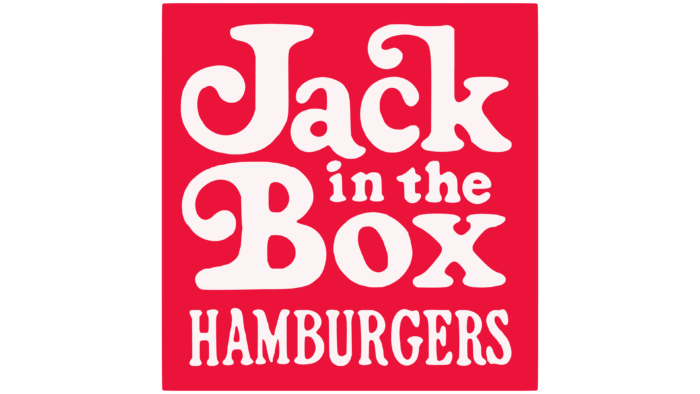
In 1971, the personal sign of the restaurant chain was reformatted. It has become simpler, lighter, and clearer since the clown disappeared. The designers replaced the black color with red and used a different style for the lettering. They added the word “Hamburgers” to the name. Like the rest of the text, it was white, with slightly curved letters. The capital “J” and “B,” as well as the lowercase “k,” had curly elements – large curls that resembled the sharp ends of a clown’s cap with a bell. The background was a red square in the form of a box.
1978 – 1980
As a result of the rebranding with the shortening of the name, the emblem was redesigned. So, the right corners of the box were rounded, and the inscription “Jack in the Box” was moved outside of it. The letters became bubbly, as if filled with air, like long balloons and red to match the background square. In it, the developers placed an impromptu clown’s head with two elements: a large ball with a truncated top and a geometric figure resembling a paper boat, which served as a cap. Beneath it were three thick dots representing a clown’s bow.
1980 – 1985
Changes in the identity were associated with the next update of the logo. The designers kept the red square with rounded corners and made it the background for the inscription with rounded lines of letters. They took the lower text from the previous emblem as a basis. The title was white, uppercase, with a tight connection between the glyphs. Only the preposition “in” did not have it. In other cases, each next character was part of the previous one. That is why instead of “o” and “x,” something that resembled a fish head with a tail or scissors was depicted.
1985 – 1986
Then, there was a radical change in visual identity, but it was unsuccessful, and the innovative logo lasted only a year. It featured the fast food restaurant chain Monterey Jack’s then name. A key detail was a colored badge in the form of a fleur-de-lis. The fleur-de-lis consisted of three segments and was in the middle – between the arched inscription “Monterey” and the horizontal “Jack’s.” Two thin stripes stretched to the right and left of the classical coat of arms. The same line was under the bottom line. The background was a purple-blue square with a double border.
1986 – 2009
After an unsuccessful rebranding and redesign, the restaurant’s owner returned the former name and old logo. It featured a red square with rounded corners and white uppercase lettering, where all the words were solid (with connected characters). The geometric figure, as before, was placed diagonally, with a slight slope: it stood in the lower left corner and looked almost like a rhombus.
2009 – today
The current emblem looks very modern because it has been overhauled. It is a medium-sized, wide rhombus with double-sided triangular protrusions and streamlined edges. Its right side is painted dark red; the left is scarlet as if a side light falls on it. This technique helped create an amazing visual effect: the corner of a three-dimensional square as if two planes of one geometric figure. The inscription on it is made in a cursory stroke of white. The bottom line is typed in red.
2022 – today
On August 27, 2022, a new logo was seen on the Jack in the Box website. This comes days after the fast food chain announced a redesign of restaurants and branded packaging. According to a company representative, rebranding aims to modernize how the business works to make it easier for customers to use digital technologies to place and receive orders.
Perhaps that is why the font of the bottom inscription on the Jack in the Box logo has become bold and rounded. It looks like a modified Avalon Bold from FontSite Inc. or Hurme Geometric Sans 1 Bold by Hurme Design. This style corresponds to modern design and is associated with comfort, coziness, and a homely atmosphere. It helps to create a friendly and welcoming company image to attract consumers who are looking not only for quality food but also for a pleasant environment.
The shape of the letters in the word “Jack” has not changed much. But the designers repainted the “k” white, removing the gray haze, which made the lines appear thinner and sleeker. This helped to make the inscription more harmonious. The logo officially began to be used on October 4, 2022; however, the previous one is sometimes seen on signs.
Font and Colors
The evolution of the visual identity of Jack in the Box started with a conceptual version of the logo, where the main element was a clown jumping out of the box. But gradually, the ideological focus of the logo was lost because something more original and, at the same time, simple was required. The text was considered a carrier of information and perfectly represented the name, so the management refused its double “encoding.” Only the emphasis on the inscription has been preserved, which is much more convenient for signboards, advertising, and small paraphernalia.
The typefaces used in the Jack in the Box fast-food chain emblems are diverse. This is a bubble version, and handwritten, grotesque, and antique. In general, there are many, and almost all are individual, made to order. On the contrary, the color palette is less impressive in terms of the number of tones. A combination of red and white dominates it. In some cases, there are also black, blue-violet, and yellow.
FAQ
When did Jack in the Box change their logo?
On March 16, 2009, the well-known American fast-food chain Jack in the Box updated its logo to make the brand look fresher and more attractive. They launched an eye-catching ad campaign during the Super Bowl. The commercials featured Jack, the chain’s mascot, humorously getting hit by a bus to symbolize the company’s changes. Jack introduced a new logo in the fourth commercial to replace the old one used since 1980. The updated logo maintained Jack’s image but refreshed everything to look more modern, aiming to appeal to more people. By introducing the new logo and memorable advertisements, Jack in the Box began a new era for the company.
What is Jack from Jack in the Box?
Jack Box serves as the mascot for Jack in the Box, embodying the brand’s spirit and identity. Originating in California, the company elevated Jack to the fictional CEO role, distinguishing him in the fast-food sector. Known for spearheading the brand’s engaging and inventive commercials, he is recognizable by his distinctive ping-pong ball head and yellow clown cap.
Throughout the years, Jack has been depicted engaging in various activities. He has appeared as a music star, ran for presidential office, and succeeded in poker, highlighting the entertaining and adventurous spirit of Jack in the Box. Holding the title of Founder & CEO is particularly significant to him, reflecting his dedication to the brand and his commitment to innovation. Jack has humanized the brand by transitioning from a marketing gimmick to a character that customers admire.
How many Jack in the Box locations are there in the US?
As of January 2024, Jack In The Box operates 2,102 restaurants in 887 cities across the US, covering 25 states and territories. This presence highlights its significant role in the American fast-food industry, where it offers a wide selection of foods.
California has 848 of these restaurants, more than any other state. Jack In The Box originated there and remains integral to the state’s food culture. The company continues to draw in customers with new menu items and convenient dining options, aiding in its expansion across the country. Their strategy of establishing restaurants in 25 states reflects their goal to serve a diverse range of customers, adapting to regional food preferences. This has made them increasingly popular and accessible, cementing their status as a top choice among fast-food enthusiasts.
How does the Jack in the Box app work?
Ordering food with the Jack in the Box app is easy. Here’s what you need to do:
- Start Your Order: Open the app and find the “Order” button on the dashboard. Tap it to begin.
- Pick Delivery or Pickup: Choose whether you want your food delivered or if you’ll pick it up.
- Enter Your Address: The app will ask for your address for delivery. Make sure it’s correct to avoid any mix-ups.
- Choose Your Food: Select what you’d like to eat from the menu, add it to your cart, and complete your order. The app will give you an estimated delivery time.
- Wait for Your Food: Now, all you have to do is wait for your food to arrive at your doorstep. Enjoy the convenience of not having to leave your home.
The Jack in the Box app makes ordering food simple and quick. With just a few taps, your favorite meals are coming to you, saving time and eliminating hassle.
Why do they call it Jack in the Box?
Jack in the Box, a well-known fast-food chain, got its name from a playful toy that surprises children. The founder, Robert O. Peterson, opened the first restaurant in San Diego in 1951. He was inspired by the Jack-in-the-box toy, a clown that jumps out of a box when you turn a handle. This toy has delighted children for years by popping up unexpectedly.
Peterson wanted his restaurant to offer a similar sense of fun and surprise. He aimed to create an enjoyable dining experience where the food makes customers happy, just like the toy. The name helped make the restaurant unique, signaling that it was a place for everyone looking for a good time. Jack in the Box has continued to deliver on this promise by regularly adding new and exciting items to the menu, ensuring that each visit offers a new experience.
What type of ownership does Jack in the Box have?
Jack in the Box operates most of its 2,100 restaurants in the United States through a franchise model. This means individual franchisees own most of the locations, with 2,034 franchised and the company owning the remaining 146. This method is common in the fast-food industry because it allows for quick growth and ensures local operators can maintain the quality of food and service. Thanks to this strategy, Jack in the Box can offer consistent quality across its many states, regardless of whether the restaurant is company-owned or franchised. Those interested in how Jack in the Box manages its mix of owned and franchised restaurants can find comprehensive information in Item 20 of their Franchise Disclosure Document. This document contains valuable insights about their ownership and franchising, offering a useful resource for potential franchisees or investors interested in learning more about the company.
