Today, the Japanese motorcycle industry is the world leader in producing motorcycles. In this country, this technique is used by almost every citizen, regardless of gender and age. However, this was not always the case. In the pre-war period, the production of motorcycles amounted to only 1,350 units per year in 1930 and 3,000 in 1940. The high price of the products made them available only to the wealthy. Technique in those years was represented by copies of English and German brands, inferior in quality and characteristics to the originals. The production of motorcycles remained low until 1960 when the number exceeded one million pieces.
What are Japanese motorcycle brands?
The selection of Japanese Motorcycle Brands includes the two-wheeler manufacturers Yamaha, Honda, Suzuki, Kawasaki, Tohatsu, Rikuo, Miyata, Meguro, Marusho, and Hodaka.
Since the early sixties, this industry has accelerated development in Japan. While Europe was struggling for the survival of its brands, the Japanese were improving technology and increasing production. Today, Japanese technology is the world’s leader in the world market. All athletes are eager to purchase its brands, as a Japanese motorcycle has become a guarantee of victory in any competition. Honda, Suzuki, Kawasaki, and Yamaha are not the leading brands in our country and the world. And it is almost impossible to single out any of them and call it the best.
Yamaha
Its foundation is considered to be 1955. On May 1 this year, the brand declared itself an independent unit. Until then, Yamaha Motor was part of the giant concern Nippon Gakki, by the name of the founder of which the future leader of the world motorcycle industry was named. The company is located in the city of Iwata (Shizuoka). Today, its owners are the Yamaha Corporation and Toyota, and its production includes motorcycles and engines for various machinery and musical instruments. The company has subsidiaries, Minarelli and MBK.
Like almost all Japanese motorcycle brands, the company’s logo is known worldwide. The design uses the traditional color red, which is very popular in Japan. Since ancient times, it was believed that it scares away evil forces and averts bad luck. The emblem is a sign with three crossed forks, symbolizing the close connection between the three pillars of the company’s ideology: technology, production, and sales. Only Yamaha Motor’s forks extend beyond the circle symbol. The second accent element, in addition to the sign, is the brand name in Latin letters, which is the name of the company’s founder.
Honda
Motorcycle enthusiasts and professionals in the Japanese company Honda all highly value Quality, design, speed, and economy. Founded in 1937 by Soichiro Honda, Tokai Seiki Heavy Industry produced piston rings of the owner’s design. Fighting during World War II destroyed the production facilities. Soichiro Honda was forced to sell what was left of Toyota and invested in the Honda Technical Research Institute. In 1948, the company changed its name to Honda Motor Company, which produced motorcycles, making the Honda Model A affordable to most Japanese.
The prototype of the now-famous motorcycle and scooter logo was applied in 1973. In 1988, after some changes, the brand’s motorcycles became the owners of the latest variant. The emblem in the form of a spread wing – a symbol of flight, lightness, and freedom with the inscription of the brand name under it- was finalized by the company’s 40th anniversary. The wing was simplified and “brought” to the modern visualization requirements. Red color, aka red, was applied evenly, without transitions and halftones on all emblem elements. Today, the emblem is often combined with the new motto – The Power of Dreams.
Suzuki
One of the oldest Japanese brands, Suzuki, known today as a leading motorcycle manufacturer, was founded in October 1909. Its founder, Michio Suzuki, established the Suzuki Loom Company in Hamamatsu, Shizuoka, and successfully produced looms. In 1952, the company produced a bicycle with a small motor for the convenience of its employees commuting to work. The Japanese government provided a subsidy to further develop this line of business. In two years, more than 6 thousand pieces have been produced monthly. Since then, the company changed its name to Suzuki Motor Co.
The emblem of the company, which has existed unchanged for more than 60 years, includes two main colors revered in Japanese culture – red, the same, filled with a stylized first letter of the brand name “S,” symbolizing passion, honesty, and loyalty to tradition, and blue – “ao,” denoting perfection, greatness, and universal accessibility. The brand name is located to the right of the sign. The emblem is simple, easy to remember, and concise. The emblem is made of silver on motorcycles.
Kawasaki
Shozo Kawasaki is the founder of the eponymous brand of motorcycles. The Kawasaki Tsukiji shipyard, which he founded in 1887, became an example of the application of the most modern shipbuilding technologies, which he adopted from European shipbuilders. This led to the change of name to Kawasaki Dockyard Co and the development of fantastic vehicles for scuba diving. The company was distinguished by innovative ideas reflected in its products: in 1906, the first submarine, and in 1922, the first airplane. In 1963, Kawasaki Motorcycle Corporation was founded, which acquired the motorcycle manufacturer Meguro, creating a new and promising production of motorcycles Kawasaki. Today, the office of the world’s largest corporation, Kawasaki Heavy Industries, is located in Tokyo.
The last change to the company’s logo was in 2014, when an icon was added to the traditional graphic representation of the brand name. It was first used on the new Kawasaki Ninja H2 motorcycle. It is an emblem in the traditional lime green color, with a stylized upper K symbol, rounded legs, and text underneath – the brand’s name. The mark has two meanings – the abbreviation of the name and the “river” sign, symbolizing the commitment to the traditions originating in the brand’s history.
Tohatsu
The official history of the Tohatsu “multi-purpose” brand began in 1932 when the company was the first in Japan to develop and assemble internal combustion engines. In 1950, the brand added a motorcycle theme to its production and developed it until the mid-60s of the last century. Having succeeded in the 50s in winning the title of one of the largest manufacturers of Japanese motorcycles, the company, by the mid-60s, gradually reduced its production, completely closing this theme and producing only outboard motors for boats, pump motors, etc.
The logo on the company’s motorcycles was a gradient steel-gray circle with a stylized “T” symbol in the center. The upper part of it crossed the circle, and the lower part – arrow-shaped – rested on its outer border. The letter looks more like a Latin “V,” with the left and right ends made thicker than the rest of its parts. The black color was used to highlight it, which ensured its accent visibility against the background of the circle. Under the sign was the text, made in Arial Nova Bold font but somewhat narrowed. The font is black, which made the sign an accent piece.
Rikuo
In the history of the world and Japanese motorcycle production, there is a brand whose model was nicknamed “Japanese Harley.” It was built on the Japanese stock of the Rikuo Internal Combustion brand, which was the distributor for Harley-Davidson at the time. From 1922 until almost the beginning of World War II, the American company HD exported its motorcycles to Japan. Through this company, it licensed the assembly of its motorcycles from local parts. In the early thirties, Rikuo operated under the Harley brand, and then Rikuo until 1958. The company had its base in the Japanese capital and provided the birth of the Japanese motorcycle industry.
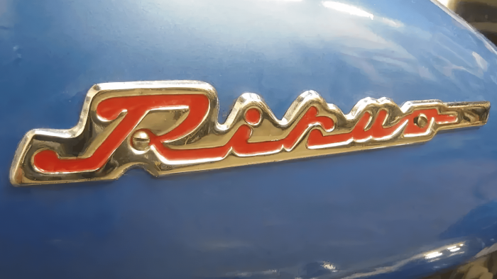
The brand logo was designed just after the war. Having ceased to consider itself a representative of Harley-Davidson, although continuing to use the design of models of the latter, the company produced models that had an emblem with a graphic representation of the brand name. On the first models, it was a metal sign with a protective coating, and in the 50-ies, it was already represented by voluminous red letters with a gold backing, streamlining the text. The text was executed in the signature in Latin letters, sprawling and with a “fast” slant, symbolizing movement and striving forward.
Miyata
Motorcycles under the Miyata logo are familiar to fans of this type of machinery. The brand is best known as a bicycle manufacturer since 1890, and its vintage production still exists today. However, Miyata was at the origin of the motorcycle industry in Japan, launching several models under the Asahi name for the domestic market. The Asahi AA was the production motorcycle that first appeared in Japan as a vehicle available to the general public. The company pioneered a new direction in this area – developing and producing the same model series with subsequent modifications. However, this direction did not exist for a long time under this brand.
Like most Japanese brands, its logo was scarlet, symbolizing the historical commitment to national traditions and passion to achieve goals. It consisted of a sign – a gear, the inner space occupied by the lowercase letter “M” – the first of the brand name. Further, aligned with the height of the sign, there was a text – the name of the brand “Miyata,” made in a dense Latin font, capital letters with a right slope, which in such variants symbolizes constant movement.
Meguro
Hobuji Murato co-founded Meguro Manufacturing Co. with Takaji Suzuki in 1937. The company received government and defense orders to produce special motorcycles thanks to Suzuki’s high position. This brand was equipped with Japanese police and created models for military purposes. Meguro motorcycles were Honda’s main competitors in the first racing competitions. However, the termination of government orders and the transition to the production of light motorcycles led the company to bankruptcy. Kawasaki Heavy Industries Ltd acquired the brand. The new owner continued to produce motorcycles under the old name but soon closed the production. Today, 60 years later, Kawasaki is trying to revive it.
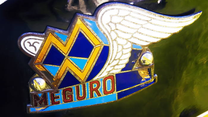
The emblem of the brand was characterized by originality and the presence of a composition rich in elements. It was an image of a pedestal on which the letters “M” were placed – the first letter of the brand name, standing on the side with a mirror image of its double. A vertical line and painted bronze separated them. The letters were three-dimensional. On the side, they had a fill of two colors, a light blue, and a deep dark shade. To the left and right, from the lowest points, they were covered by two open white wings pointing backward, forming the visual of flight. Below the plaque on the front of the pedestal, the brand’s name was printed in burgundy on a light blue background.
Marusho
Marusho is a Japanese motorcycle brand founded in Hamamatsu by Masashi Ito after the 1948 war. The brand existed until 1967, creating in 1950 one of the best models of the Japanese motorcycle industry – Marusho Lilac ML, which is included in the list of 240 representatives of Japan’s best auto and motorcycle products. As the best student of Honda Soichiro, the founder of Honda Motor Co., Ltd., Masashi Ito applied his knowledge to develop a unique motorcycle with a shaft, which led to the creation of the Lilac, which became the winner of the Volcano Asama race. The founder of the brand himself passed away in 2005. He was 92 years old.
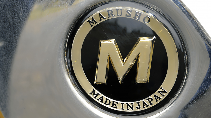
The emblem of the company was used in various variants. The main sign is two circles of different sizes with the letter “M” inscribed, the inner space of which is filled with black color. The outer edge of the larger circle is also highlighted in black color. The distance between the outer and inner circle and the letter “M,” which has a right slant, was filled with light brown color. The text was written in black on the brownfield between the circles. At the top was the name of the brand. At the bottom, “Made in Japan.”
Hodaka
The Japanese company Hodaka, which produced motorcycles from 1964 to 1978, was a joint Japanese-American venture. Before that time, it had been producing powertrains for Yamaguchi models. PABATCO Pacific Basin Trading Company’s distributor was headquartered in Athens, Oregon, USA. This company was responsible for chassis engineering and design, while Hodaka was responsible for engines, production, and assembly technology. The geographical factor influenced the choice of the brand name – the name of a nearby mountain. The Hodaka / PABATCO joint venture entered the US market and gave an impetus to the development of cycling. In 1978, the Hodaka company was closed down.
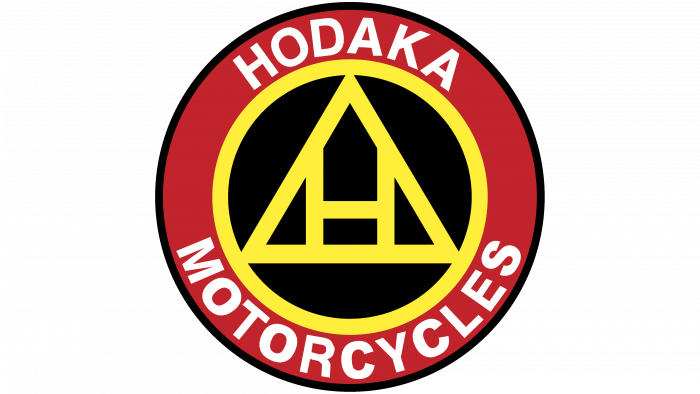
The company logo is simple and combines three colors – traditional red, white, and black. It consists of several circles inscribed in each other, the outer of which has a black circle and a field up to the second smaller circle filled with red. Along the circle in this field is written in white the name of the brand – at the top and below it is the word “Motorcycles.” The red circle is followed by a white rim separating it from the center, a smaller black circle. In it, there is a figure in a white isosceles triangle, symbolizing the accumulation and realization of strength and power. The brand’s first letter, “H,” is inscribed in white color. The combination of white and black symbolizes elegance and aristocracy, creating the necessary accent and easy visual memory.
FAQ
What are the Big 4 motorcycle brands?
The “Big Four” motorcycle brands include the largest Japanese manufacturers known throughout the world:
- Honda: Founded in 1948 by Soichiro Honda, Honda is the largest motorcycle manufacturer globally. It is known for its reliable, high-quality motorcycles. Honda offers a wide range of motorcycles, from CBR sports bikes to Gold Wing touring models, off-road bikes, and scooters.
- Kawasaki: Kawasaki Heavy Industries began producing motorcycles in the 1960s. Known for their powerful engines and bold styling, their motorcycles appeal to those seeking maximum performance. Popular models include the Ninja series of sports motorcycles and the KLR series of dual-purpose motorcycles.
- Suzuki: Founded in 1909, Suzuki shifted its focus to motorcycles in the mid-20th century. The brand offers a wide range of motorcycles, including entry-level models and high-performance motorcycles such as the GSX-R series of sports bikes.
- Yamaha: The Yamaha Motor Company emerged from the Yamaha Corporation in 1955. The brand is known for its diverse range of motorcycles, including the YZF-R series of sports bikes and various off-road motorcycles.
What is the best Japanese motorcycle brand?
Choosing the best Japanese motorcycle brand depends on your specific needs and preferences. Honda, Yamaha, Suzuki, and Kawasaki each have unique features:
- Honda: Known for reliability and versatile applications.
- Yamaha: Offers high performance and advanced technology.
- Suzuki: Renowned for innovative technology and durability.
- Kawasaki: Features powerful engines and bold designs.
Each brand has strengths and a loyal following, reflecting its quality and capabilities.
What motorcycles does Japan make?
Japan produces a variety of motorcycles to suit every taste and riding style.
The Honda CBR1000RR-R Fireblade SP is known for its advanced features and superb handling, making it an excellent choice for sports bike lovers. The Suzuki Hayabusa combines speed and comfort, which makes it ideal for long and enjoyable trips.
Racing enthusiasts may prefer the Yamaha YZF-R6, a racing motorcycle with superb performance and agility designed specifically for speed and precision on the track. For those who love off-roading and adventure riding, the Suzuki DR-Z400 is a rugged and versatile enduro bike that handles rough terrain and city streets equally well.
The Honda Rebel 250 cruiser is ideal for a more casual ride, especially for beginners or those looking for a comfortable, easy-to-handle bike.
Which bike company is in Japan?
Several well-known brands dominate the Japanese motorcycle industry. Honda manufactures everything from high-performance sports motorcycles to scooters. Kawasaki is known for its powerful engines and sports motorcycles that appeal to speed enthusiasts. Suzuki and Yamaha offer a wide range of motorcycles, from beginner models to racing motorcycles. Other Japanese companies, like Moriwaki, specialize in racing components, while Bridgestone, originally a tire manufacturer, now also makes motorcycles.
Japan also has many reputable bicycle manufacturers. Fuji Bikes is known for its road and mountain bikes, combining excellent performance with innovative technology. Nagasawa is famous for its handmade tracks, highly prized by cyclists. Panasonic Cycle Technology produces reliable and modern bicycles. Bridgestone Cycle offers various bikes, including city and road bikes. Tokyo Bike specializes in stylish city bikes designed for urban dwellers.
