


![]() Jean-Paul Gaultier Logo PNG
Jean-Paul Gaultier Logo PNG
The fashion elite and customers alike approve of everything produced under the Jean-Paul Gaultier logo. The emblem speaks to the combination of beauty, comfort, and quality, making the design house’s models timeless pieces.
Jean-Paul Gaultier was born in 1952 near Paris and entered fashion without formal education. In 1970, at eighteen, he sent sketches to Pierre Cardin and was hired as an assistant. He later worked at Jacques Esterel and Jean Patou, gaining technical experience.
In 1976, his first independent collection failed, and he returned to employment. Only in 1982, with support from Japanese textile company Kashiyama, did he launch his own label focused on streetwear without class or body restrictions.
In 1983, Gaultier introduced men’s skirts, challenging gender norms. In 1985, he presented plus-size models, which were uncommon in an industry dominated by strict sizing standards.
A major turning point came in 1990 during Madonna’s Blond Ambition tour. Gaultier designed the cone bra corset, turning underwear into stagewear. The image spread globally and influenced pop culture. Later, artists like Kylie Minogue and Beyoncé collaborated with him.
In 1993, he launched a haute couture line, entering competition with houses such as Givenchy and Chanel. The same year, he released Le Mâle, followed by Classique in 1999. Both fragrances became long-term bestsellers.
In 1997, the Spanish group Puig acquired a controlling stake, strengthening the brand’s financial position. In 1999, Gaultier became creative director at Hermès, where he worked until 2003.
In 2010, he closed his ready-to-wear line to focus on couture. In 2020, he ended runway shows. Since 2021, Puig has relaunched the house with rotating guest designers, while Gaultier remains involved at an advisory level.
Meaning and History
![]()
Jean-Paul Gaultier’s fashion house was founded in 1982 and is named after its famous owner. Since then, its text logo has been changed several times to reflect the evolution of its style. The emblem embodies modern design trends, as the brand originally focused on art direction and bold experiments in fashion. The verbal sign has a rather strict and serious look. But it uses dynamic fonts that convey the company’s history and avant-garde spirit. A characteristic feature of one of Jean-Paul Gaultier’s most famous logos was the stencil font. It helped create a clean, laconic image.
What is Jean-Paul Gaultier?
This French fashion house is known for its innovative design philosophy and for bringing bold concepts to life in haute couture creations. Signature features include corset bustiers, nautical motifs with striped patterns, and unconventional materials in haute couture collections. Its unique approach lies in blending haute couture with street-culture elements, evident in its clothing and the iconic perfume line, whose bottles are shaped like male and female torsos. Frequent collaborations with musicians and artists enable the creation of original collections and stage costumes.
Old
![]()
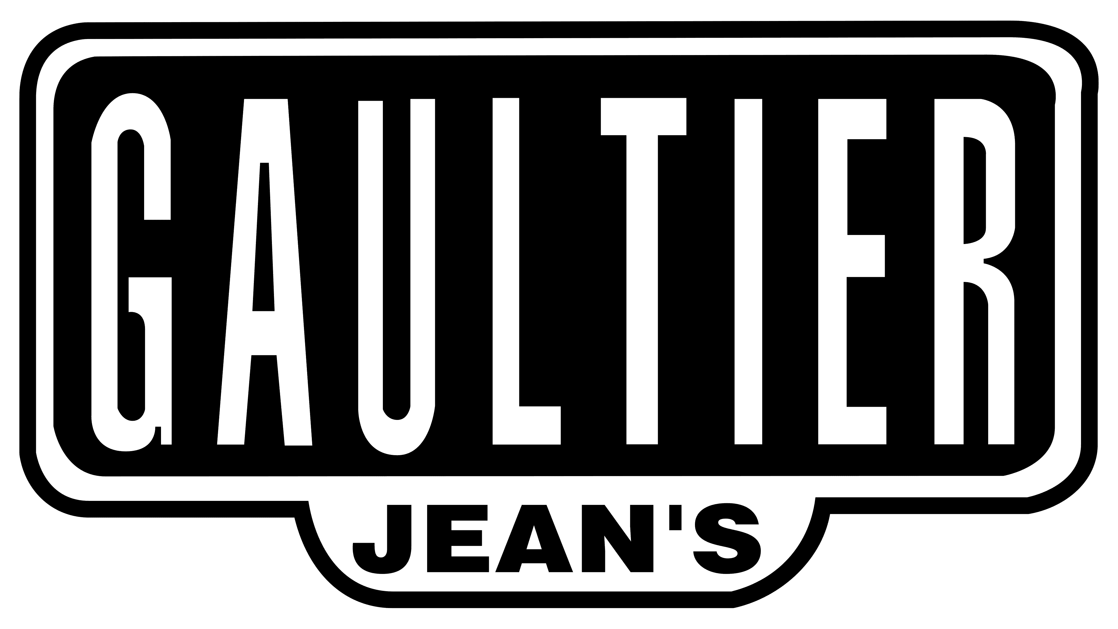
The Jean-Paul Gaultier logo variant features the company’s name, which is also the creator’s first and last names. The word combination “Jean-Paul” is written at the top. It is made in bold serif type from the Caladea family, based on the Cambo typeface. The latter, in turn, was inspired by a form of Khmer writing.
The second line has the big word GAULTIER. All the letters are capitalized in it, but the first “G” and the last “R” are additionally enlarged, and they protrude both at the top and bottom. A modified Steamwreck font is used for them, which is close to the steampunk style. All letters except “G” and “R” are aligned with the logo.
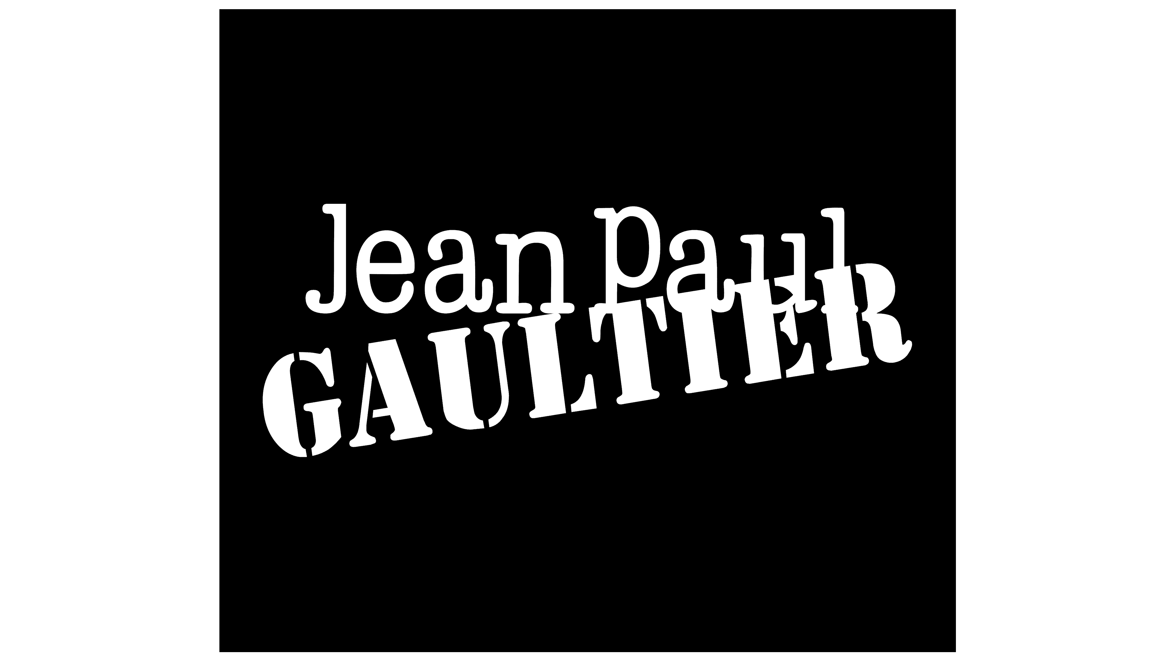
2012 – today
![]()
The brand’s logo only shows its name. But the inscription immediately catches the eye thanks to the original design. The designers tried to make her memorable so that she could decorate elite perfumes and outfits.
The emblem of the French fashion house is based on text design. It consists of the founder’s, owner’s, and lead designer’s first and last names. Judging by the letters’ size, the main inscription is “Gaultier,” set in a massive uppercase font. It resembles a stencil typeface from the Stencil category. All signs have wide legs and are bold.
Further, the second part of the logo is visible: the wordmark “Jean-Paul.” It consists of two bases, arranged in a row, and is written in thin, streamlined letters with a rounded. In this case, the characters are combined: “J” and “P” are uppercase, the rest are lowercase. This typography echoes the ITC American Typewriter Medium Condensed.
Font and Colors
The first two words (“Jean-Paul”) are located at the top. Their font is reminiscent of ITC American Typewriter Medium Condensed. The obvious similarities include the elongated shape, rounded serifs, and thin lines. The letters “J” and “P” are uppercase; all others are lowercase.
The surname of the creator (“Gaultier”) is written at the bottom at a slight angle. “T,” “I,” “E,” “R” partially overlap the word “Paul.” The font is non-standard – bold, geometric, very similar in style to stencil. Despite the overall rigor, this typeface has no straight or sharp corners – all serifs are round.
Thus, the Jean-Paul Gaultier logo combines two dissimilar typographies. This reflects the spirit of the fashion designer who loves to experiment with designs and combine the incompatible.
A restrained monochrome palette emphasizes the emblem’s originality. The words are often black and written on a white background, but sometimes the opposite is true. The choice of a particular scale depends on the visual context.
FAQ
What country is Jean Paul Gaultier’s brand from?
Jean Paul Gaultier is a famous French fashion designer. The designer behind the brand is Jean Paul Gaultier, who was born in Arcueil, France. His work became well-known in the late 20th and early 21st centuries for its bold and innovative fashion.
Gaultier’s collections are famous for celebrating androgyny and mixing street styles with haute couture. His designs combine different cultural symbols, creating unique and memorable fashion statements. As the home of this influential designer, France has shaped the brand’s identity and success.
Who bought Jean Paul Gaultier?
The company Puig Brands bought Jean Paul Gaultier. Puig Brands, a significant player in the fashion and fragrance industry, acquired the fashion house to expand its portfolio and strengthen its position in the luxury market.
Puig Brands is known for managing various high-end brands and bringing their unique visions to a broader audience. Puig’s acquisition of Jean Paul Gaultier brings new opportunities for the brand to innovate and reach new markets.
What does the Jean-Paul Gaultier logo mean?
The logo has two main meanings. It represents both the designer Jean-Paul Gaultier and the fashion house he founded.
Jean-Paul Gaultier is a famous French fashion designer and perfumer. His collections celebrate androgyny and mix street styles with haute couture. The logo features his name, symbolizing his personal brand and creative vision.
The logo represents the Parisian fashion house founded by Gaultier. Known for its avant-garde designs and unique style, the brand has become a symbol of high fashion and creativity. The logo marks excellence in fashion, celebrating the legacy of one of the industry’s most influential figures.
What is Jean-Paul Gaultier’s logo?
The logo prominently features the designer’s name. The word “Gaultier” is twice as large as the rest of the text and positioned diagonally. Behind it, “Jean-Paul” is typed without a hyphen and placed horizontally.
This design makes “Gaultier” the logo’s focal point, giving it a dynamic, eye-catching look. “Jean-Paul” provides balance and clarity. The overall design is bold and straightforward, reflecting the brand’s unique and creative style.
What is the font of the Jean-Paul Gaultier logo?
The logo uses two fonts. “Gaultier” is set in the Stencil typeface, giving it a bold, striking look. This makes the word “Gaultier” stand out prominently.
“Jean-Paul” is in ITC American Typewriter Medium Condensed. This font has a classic, clean style that balances the dramatic look of “Gaultier.”
These two fonts create a unique and visually appealing logo that reflects the brand’s creative spirit.