Although the Jimmy John’s logo has changed several times, it has remained true to itself: in all its versions, you can observe two large “JJ”s. These are the initials of the creator of the fast-food chain with sandwiches on the menu—Jimmy John Liautaud. The monogram only benefits the visual identity, making the restaurants stand out among competitors.
Jimmy John’s: Brand overview
Jimmy John’s is a fast-food chain, and the main dish on the menu is sandwiches. It appeared in 1983 when Jimmy John Liautaud founded it. Today, it is a large franchise with more than 2,700 establishments and headquarters in Champaign, Illinois. The trademark belongs to Inspire Brands, which bought it in 2019 from Roark Capital Group.
Jimmy John’s has become a go-to for quick sandwich delivery in the U.S., starting from a small garage in Charleston, Illinois, in 1983. That year, 19-year-old Jimmy John Liautaud opened his first shop with just $25,000 borrowed from his father and a handful of used equipment. Despite the humble beginnings and a simple menu of just four sandwiches, Jimmy John’s bet on freshness and rapid delivery set the stage for its success.
In those early years, Jimmy John poured himself into the business, often working 18-hour days to make and deliver sandwiches. This dedication quickly bore fruit, and by the late 1980s, the brand had begun to expand throughout Illinois.
The brand took a significant leap in 1993 by adopting a franchising model, starting in Bloomington, Illinois. This strategy, demanding high standards for quality and speed, fueled rapid growth. By 2002, Jimmy John’s had reached a milestone of 160 stores across 12 states.
The growth didn’t stop there. By 2014, 30 years after its founding, Jimmy John’s had exploded to over 2,000 locations across the U.S., thanks to its straightforward and effective business model that appealed to franchisees and customers.
A new chapter began in September 2016 when Roark Capital Group acquired Jimmy John’s. Although the financial details were not disclosed, this acquisition was a testament to the brand’s substantial value and success.
Today, Jimmy John’s operates over 2,700 stores in 43 states, continuing to deliver on its promise of “freaky fast” service. With a menu that has evolved to include dozens of sandwich options, chips, and freshly baked cookies, Jimmy John’s caters to a wide range of customer tastes.
In response to the digital age and changing customer habits, Jimmy John’s has updated its mobile app and partnered with third-party delivery services to stay relevant and accessible.
Meaning and History
The existence of this brand began with a dilemma posed by After Liautaud to his son. He told him that after finishing school, he had two choices: joining the military or starting his own business. The young man chose the latter and did not regret it: the chain he created is now so popular that 98% of it consists of franchise establishments. Initially, Jimmy John Liautaud wanted to deal with hot dogs, but due to high expenses for ingredients, he realized that the $25,000 borrowed from his father would not cover the costs. So, in the end, he opened a sandwich kiosk.
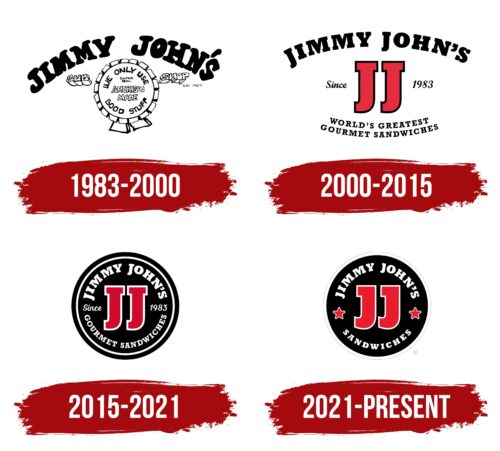
The young man hardly thought about the establishment’s name: Jimmy John chose his name. It has remained the basis for the company’s visual identity forever. The fact is that designers suggested a sign combining “J” and “J.” The identical letters look original on the logo and brightly represent the brand on all levels – up to digital media. In the history of this chain, there are four emblems in total.
What is Jimmy John’s?
Jimmy John’s is a fast-food sandwich restaurant from the United States that has grown into a large-scale franchise. Currently, its network includes over 2,700 establishments. The brand’s inception dates back to 1983. The creator is Jimmy John Liautaud. The current owner is Inspire Brands through the Roark Capital Group, purchased in 2019. The company’s headquarters is located in Champaign, Illinois.
1983 – 2000
The earliest version of the logo was used for a long time – from its inception until the beginning of the millennium. It was monochromatic and contained the full name of the founder. The letters were bold, uneven, with serifs, and were arranged in an arch over a circular emblem with information about the sandwich seller. The year the company was founded was indicated in small characters next to it. All inscriptions inside and outside the circle were made in different fonts. The eclectic mix of styles did not mar the emblem, but on the contrary, it made it eye-catching and interesting despite the black-and-white palette.
2000 – 2015
In 2000, the logo became clean as designers removed all its visual clutter. They made the curved “Jimmy John’s” line neat, adjusting the letters to one size. The marketing information was placed at the bottom in two rows, also bent in an arc. In contrast to the upper inscription, the font in these rows was very small. The year of the company’s founding was written in thin italics and was located to the right and left of the two red “JJ” with a black border.
2015 – 2021
A strict style dominated the emblem of that time. Designers regrouped all elements and placed them almost mirror-like to each other. The full name of the franchise reached the middle of the circle and almost touched the lower text. They were separated by the year the brand was founded: “Since” was on one side, and “1983” on the other. The central place was occupied by the double “JJ.” Although they remained red, the black outline was replaced with white. The shade of the block glyphs was also adjusted, making them raspberry-colored. The middle of the rondel was surrounded by a narrow white ring alternating with a wide black one.
2021 – today
The modern Jimmy John’s logo echoes its predecessor only in shape: round. Otherwise, significant differences appeared. For example, designers changed the font to “JJ.” They enlarged the lower part of the letters and cut off half of the upper bars. Developers similarly treated the capital “J” in the company name. Only one word was left at the bottom, which the typographers stretched and centered. Instead of stating the year of the foundation, they placed two miniature stars, coloring them the same as the block glyphs. The background still consists of a black disc with a white border.
The logo is built on the personal data of the company’s founder. Initially, his full name served as the base, and then it was shortened to initials, which are still used in parallel. The visual symbol evolved from a simple form to a complex one, resulting in the classic rondel with an accentuated center and edged with stripes of varying width.
Font and Colors
Two types of fonts were chosen for the Jimmy John’s emblem: the name is executed in Rockwell Bold, and the word “Sandwich” is written in Rockwell. The developer of the typeface family is Frank Hinman Pierpont. To maintain the attention of potential sandwich buyers, designers used standard colors: black #000000, white #FFFFFF, and red #EA0029. They symbolize impeccability, goodness, and energy.
FAQ
What is Jimmy John’s slogan?
Jimmy John’s slogan, “Freaky Fast,” highlights its commitment to delivering food quickly while ensuring high quality. Since 1983, Jimmy John Liautaud opened its first location, and speed and efficiency have been essential. The slogan reflects its goal to exceed expectations, emphasizing the importance of fast delivery in today’s world for both work and home settings. Jimmy John promises that customers can rely on it for swift service.
The company’s ability to provide this fast service is due to its efficient process of making and delivering sandwiches, which doesn’t compromise quality. It uses fresh ingredients and prepares sandwiches to order, proving that fast service can still offer excellent food.
Is Jimmy John’s only in the US?
Jimmy John’s is known for its fast delivery and delicious sandwiches. It primarily operates in the U.S. About 15 years ago, the company explored expanding to other countries, indicating an interest in international growth. However, this was before Inspire Brands acquired Jimmy John’s in 2019. Since then, the focus has shifted towards enhancing its presence within the U.S.
With around 2,600 stores, Jimmy John’s is one of the smaller chains owned by Inspire Brands, compared to Dunkin’s 13,200 stores. Inspire Brands, which owns several well-known restaurant chains, aims to help them succeed. Jimmy John’s continues to serve its quick and tasty sandwiches to customers in the U.S. without current plans for international expansion under Inspire Brands. The company remains an important part of the U.S. fast-food scene, catering to customers nationwide.
What is Jimmy’s mustard?
Jimmy’s Mustard from the Jimmy John’s sandwich chain has gained popularity for its spicy and tangy flavor. Fans appreciate how it enhances the taste of sandwiches, salads, and dishes. It stands out due to its unique taste and Jimmy John’s reputation for quality.
The mustard is great for more than just sandwiches; it adds flavor to salads and recipes. Customers at Jimmy John’s love it for its ability to improve food taste without being too strong. Its blend of spicy and tangy elements makes it a favorite among many. Jimmy’s Mustard aligns with Jimmy John’s emphasis on delicious, high-quality food. It has become an essential part of dining at Jimmy John’s, demonstrating how a good condiment can enhance meals.
Does Jimmy John’s take Apple Pay?
Jimmy John’s accepts Apple Pay, which is perfect for those who prefer digital wallets. You can combine Apple Pay with the Freaky Fast Rewards® Pass in your digital wallet, allowing you to pay for your meal and earn rewards and points for future purchases with a single tap. This setup is designed to simplify customers’ payment and reward collection process.
However, the situation changes when ordering for a group. You cannot use rewards or earn points on Group Orders. This policy is likely in place to avoid complications with large orders involving many items and customizations.
What is so special about Jimmy Johns?
Since its start in 1983, Jimmy John’s has built its reputation on quality and speedy service. Its success comes from using fresh ingredients and preparing food quickly, creating a hassle-free customer experience. Jimmy John’s is committed to sourcing its meat from the USA, supporting local producers, and ensuring their sandwiches are of high quality. They also bake their bread fresh daily in every store, enhancing the flavor and freshness of their food.
How much money do you need for a Jimmy Johns franchise?
Opening a Jimmy John’s franchise requires a significant initial investment. The franchise fee ranges from $30,000 to $35,000, and the total startup cost will be between $356,200 and $674,200. These costs include the franchise fee, securing a location, purchasing necessary equipment, setting up signs, buying initial supplies, and having enough funds to cover operations until the business becomes profitable. The specific amount depends on the size of the franchise, its location, and the cost of labor and materials in the area.
It’s important to fully understand and be prepared for these expenses before starting. This means having enough money for the initial investment, unexpected costs, and operating expenses.
