


![]() Kate Spade New York Logo PNG
Kate Spade New York Logo PNG
The love of elegance is reflected in the fashion house’s emblem. The Kate Spade New York logo embodies the tenderness and beauty of designer products. Signs indicate not only a unique look but also high-quality tailoring.
Kate Spade New York began in January 1993, when Katherine Noel Brosnahan, a former Mademoiselle accessories editor from Kansas City, decided to build a handbag brand. Her future husband, Andy Spade, encouraged the move, and the company was founded with Alice Arons and Pamela Bell. Andy supplied the first $35,000 from his retirement account, while Kate made early samples from paper and tape at home.
The debut line centered on the Sam bag: a bright, rectangular, practical handbag with a small “Kate Spade New York” label affixed to the outside. That visible tag became part of the brand’s identity after an early order from Barneys. Vogue soon covered the raffia collection, and the bags, priced between $150 and $450, reached young American buyers seeking fashion without the prices of Burberry or Louis Vuitton.
Kate took the Spade name in 1994. The first store opened in SoHo in 1996, the same year CFDA named her Best New Talent in Accessories. In 1998, she won the Accessories Designer of the Year award. The brand expanded through Nordstrom, Macy’s, and Dillard’s and, by 2004, had 13 U.S. stores.
Neiman Marcus bought a controlling stake in 1999 for $33.6 million. Jack Spade launched the same year. In 2006, Kate and Andy sold their remaining shares to Liz Claiborne for $124 million and stepped back from daily management. Tapestry, formerly known as Coach, acquired Kate Spade & Company in 2017 for $2.4 billion. Kate Spade died on June 5, 2018. The Sam bag was revived that year, and the brand remains part of Tapestry.
Meaning and History
![]()
The emergence of this brand is essentially a love story. Its creators met while studying at Arizona State University, where they were trained as journalists (Kate) and architects (Andy). After graduation, the girl worked for a fashion publication, and after she quit, she decided to start her men’s bag line. Her husband sponsored her with $35,000 from the budget. Thus began the fashion career of Kate Spade New York, originally called Kate Spade Handbags.
Gradually, the business expanded, success came, and the bags became trendy. The assortment was replenished with many more fashion and design products. By 2006, the firm’s revenue reached $99 million. Its products are sold in many major shopping centers worldwide and attract customers with low prices. In 2017, the brand was acquired by Tapestry, which has since become its parent company, and closed its once-successful line of men’s handbags. After that, the logos on the rest of the batch were tweaked slightly. In all, this brand has two emblems.
What is Kate Spade New York?
This American company specializes in clothing, accessories, and home goods, distinguished by elegant femininity and cheerful design. The products include bags, wallets, ready-to-wear clothing, jewelry, shoes, and home decor characterized by vibrant colors, original patterns, and unexpected details. Special emphasis is placed on combining style and functionality, particularly in the bag lines, where craftsmanship meets practicality. The company is known for bringing fun and sophistication to everyday items, and its store design stands out with bright colors and graphic accents.
1993 – 2019
![]()
The debut logo is the benchmark that everyone should go for. Well, or at least some. That’s what the creators of the new rising star on the fashion scene decided: to use one of the most dangerous suits of playing cards, spades, for the logo. This symbol is depicted on the emblem, which brought the young company to the leaders of the fashion industry, having caught the attention of the more venerable players in the trendy market.
The black peak is centered and is a standard copy of the classic symbol of secret luck. Who doesn’t know yet that it’s a heart, turned upside down and standing on a shaped leg? Under it is the company’s full name, split into two lines. The large inscription “Kate Spade” is on the top, written in lower-case letters. The font is traditional, with serifs and wide inter-letter spacing. The bottom row contains the remainder of the brand name “NEW YORK.” The name of the city is in capital letters but in small characters. Therefore, this inscription is smaller than the first.
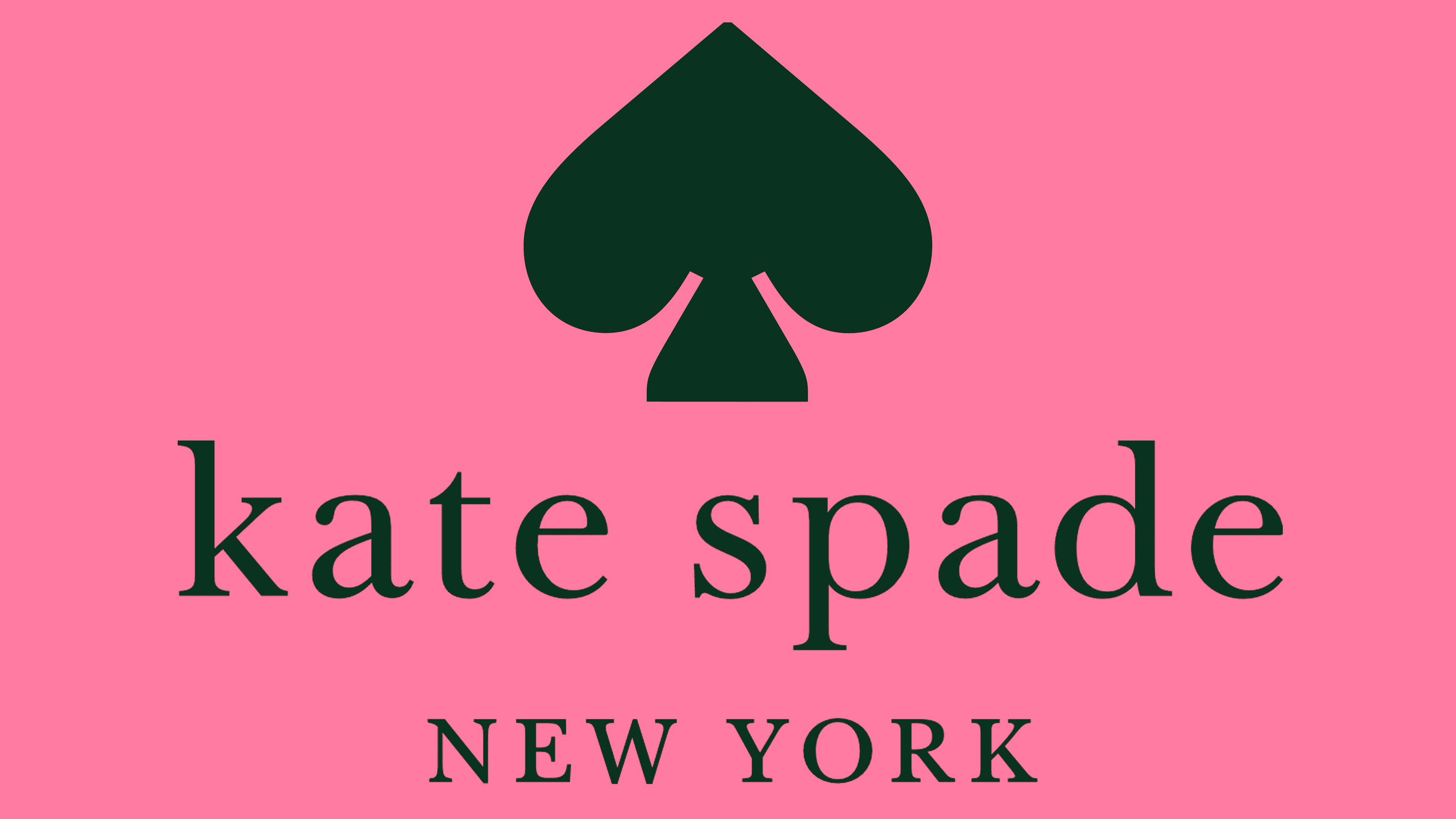
2019 – today
![]()
The current logo uses the same elements as before, but with a different design. A year after its acquisition, the brand’s new owners decided to add brightness without changing the old style. As a result, the text is set against a soft fuchsia rectangle with a wide smoky-pink frame. The spade sign is separated from the verbal part and can be used independently as a marker or a miniature icon. The upper inscription on the logo is bold; the lower one is thin and smaller.
Font and Colors
A key link in the chain of identity is the name. It is preserved in its original form and has never changed. Its peculiarity is the difference in writing formats: the first part is big, but it has lower case letters; the second part, on the contrary, is small with capital letters.
Both lowercase and uppercase letters are in ITC New Baskerville Roman. It is a modernized version of the old typography, created in the 18th century by John Baskerville, a printer from Birmingham, England. John Quaranda created the modernized version. The logo’s color scheme was initially reserved: black and white, with two shades of pink added for brightness.