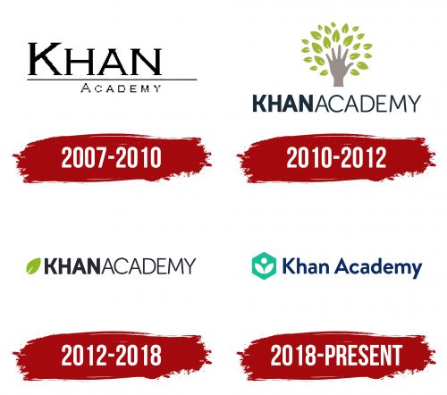
Although the Khan Academy logo looks quite simple, it reflects the ideas of development, growth, and self-improvement, which are fundamental to the brand’s concept. Thus, the emblem is fully adapted to the educational organization’s goals, symbolizing a passion for knowledge and inspiring new students to join the video lessons.
Khan Academy: Brand overview
Meaning and History
Khan Academy positions itself as an organization that helps with growth and development; most of its emblems feature a plant theme. It all started with a metaphorical symbol of knowledge – a tree resembling a palm with leaves. Then, it was decided to remove many small details, including the hand itself, and leave only one green leaf. It is still associated with knowledge, but unlike a full tree, it scaled much better. In 2018, designers again modified the logo, depicting a stylized book opened in front of a student reading it. This graphic sign symbolizes a passion for learning.
What is Khan Academy?
Khan Academy is an organization created by American Salman Amin Khan to make education accessible to all. It offers students free video lessons and teachers various tools and practical exercises. All materials are originally released in English, but volunteers translate them into other world languages. The content covers many fields – from sciences to humanities, from mathematics to art history. However, the lessons do not replace comprehensive education but are only a useful supplement. The organization does not profit from its activities.
2007 – 2010
The old Khan Academy logo differs from the others in the absence of plant motifs. It contains only the name of the educational organization, divided into two levels, between which a thin horizontal line is drawn. The first word is much larger than the second, but both are written in uppercase letters. A serif monospaced font is used for the top line. It creates balance, although there are enough details in the emblem that introduce imbalance. For example, the line passing through the inscription is shortened on the left and asymmetrically extended on the right.
2010 – 2012
Although this logo is no longer in use, it is still associated with Khan Academy. Its main element is a tree – a gray hand from which small green leaves grow. The wrist and palm act as the trunk, while the splayed fingers serve as branches. Unofficially, this is known as the Tree of Knowledge, also known as the Bodhi Tree. It is believed that sitting under its canopy, Buddha achieved enlightenment. Similarly, educational organizations offer people the opportunity to learn and discover many new things to achieve success in the future.
The drawing, which looks like a hand tossing up leaves, is placed above the black inscription “KHAN ACADEMY.” The space between the words is as narrow as the spacing between letters, visually separating the two parts of the text only by font: “KHAN” is much bolder than “ACADEMY.” But the style of glyphs is the same everywhere: designers chose a geometric grotesque of balanced form.
2012 – 2018
In 2012, the organization made a green leaf its main symbol, now used in the logo instead of the hand-tree. Its color represents a student in the first stage of acquiring knowledge. The brand name is located on the right side and has a familiar design, meaning the words are written together and differ only in the boldness of the letters.
2018 – today
The educational organization underwent rebranding to mark its rapid growth as it expanded its range of educational programs, added new types of content, and began creating useful tools for students and teachers. It needed a universal emblem, one without many small details and easily scalable in digital space. Thus, a symbol consisting of simple geometric figures appeared.
At its core is a turquoise hexagon. It was chosen for its shape, often found in nature (e.g., bee combs), art, and mathematical sciences, essentially a “building block.” Inside, in the white negative space, is a circle placed above two connected leaves. The drawing can be interpreted as a diligent student bent over an open book. It is also a stylized plant – a symbol of growth, development, and prospects. The name Khan Academy is located on the right side and is colored dark blue. Now, the space between the two words is wide enough, and both parts of the inscription have the same boldness, making the logo look cohesive.
Font and Colors
The brand’s logo uses a variant of the Museo Sans font. It is also roughly similar to Brandon Text Office Bold by HVD Fonts. As for the color palette, it includes two proprietary shades: Khan Blue (#0A2A66) for the inscription and Teal (#148F96) for the hexagon. These are complemented by white negative space, forming a plant pattern.


