


![]() Krispy Kreme Logo PNG
Krispy Kreme Logo PNG
The cafeteria chain’s visual identity looks like an open menu folder. Therefore, the Krispy Kreme logo clearly indicates that the order should be branded donuts with the same name. The writing is neat and handwritten. The emblem testifies to the company’s confidence, customer care, and the right marketing move.
Krispy Kreme is an American coffee shop chain and confectionery company that manufactures sweet pastries, particularly several types of donuts. In addition, it sells non-alcoholic, iced, frozen (soft drinks), and hot drinks. It was founded in 1937 by Vernon Rudolph. The recipe’s author is Chef Joseph LeBeouf from New Orleans. The head office is located in Charlotte, North Carolina. The number of network power points is 1,400.
In 1937, Vernon Rudolph founded Krispy Kreme in Winston-Salem, North Carolina. He opened the first store using a special doughnut recipe he bought from a French chef in New Orleans. These doughnuts quickly gained popularity for their unique taste and texture.
Krispy Kreme became known for its “hot” doughnuts right off the conveyor belt, a new and exciting concept at the time. By the 1970s, Krispy Kreme expanded its presence across the United States, opening shops in malls and busy areas. Watching doughnuts being made became a key feature of the brand.
In the mid-1990s, Krispy Kreme faced challenges stemming from rapid expansion and quality issues, but it overcame them.
The early 2000s marked a period of international expansion for Krispy Kreme, with new stores opening in Canada, Australia, and the UK, and later in Asia, the Middle East, and Latin America. In 2000, Krispy Kreme went public, attracting significant investor interest. In the mid-2000s, the company faced financial scrutiny and issues with its franchising model, leading to a restructuring.
From the late 2000s to the early 2010s, Krispy Kreme, led by new management, focused on refining its operations. It closed unprofitable stores and concentrated on key markets. The menu expanded beyond doughnuts to include a variety of flavors, beverages, and snacks, positioning Krispy Kreme as a breakfast and snack spot.
In 2016, JAB Holding bought Krispy Kreme for $1.35 billion, taking it private again. This move helped Krispy Kreme grow its international presence and refresh its brand. Today, Krispy Kreme operates over 1,400 stores in 33 countries.
Despite challenges, Krispy Kreme has maintained its focus on its original hot doughnut, endearing itself to millions worldwide. Krispy Kreme’s journey is a story of resilience, innovation, and lasting success, marked by significant milestones and strategic shifts that have shaped its global brand identity.
Meaning and History
![]()
This cafeteria chain began by purchasing a donut recipe from one of New Orleans’ floating establishments in the early 20th century. After obtaining the “formula” of sweet yeast products from Joseph LeBeouf, young entrepreneur Vernon Rudolph eventually rented a building and launched a production shop. He sent the products to local convenience stores and also sold them himself.
But the young man did not decide right away; he gained experience as a merchant, working in his uncle’s store with his brother Lewis Rudolph. This was in 1933. At the same time, soft donuts were in great demand among buyers. Noticing strong interest in them, entrepreneurs decided to master this business, especially since their stores brought in little income during the Great Depression.
After moving to Nashville, Tennessee, an uncle and nephew opened The Krispy Kreme Donut Company. The products sold well, so their father and brother gradually joined them. However, a few years later, Vernon Rudolph decided to run a donut business independently and opened a company in Winston-Salem, North Carolina. Benny Dinkins, a local architect, designed the sign. The first out-of-state bakery opened two years later, in 1939. This was followed by a major expansion of the enterprise with a network of the same name, including foreign points of sale.
After a series of transformations (a purchase and a merger), the company went public again and, in 2021, was renamed Krispy Kreme Inc. But before that, a special activation in its activities was noted in the 70s of the last century. Naturally, at each new stage of development, the brand changed its logo. In general, it offers four signage options.
What is Krispy Cream?
Krispy Kreme is an American company that owns a chain of coffee shops of the same name, which sell branded yeast donuts and several types of drinks. The brand has existed since 1937 when Vernon Rudolph opened a bakery and confectionery in Winston-Salem (North Carolina). Now, the number of food outlets has reached 1,400, dispersed worldwide, with the main office in Charlotte, the same state.
1937 – 1978
![]()
At first, the confectionery company operated under a sign featuring a red-and-white image. It was the company name, handwritten in slight italics. The inscriptions are connected, with upper and lower underlining. There were two upper bands: they came from the letters “K” in each word separately. But the bottom line was the same: it started at the last “e,” turned to the left, and ended at the first character. The background for the phrase “Krispy Kreme” was an installation resembling the butterfly’s wings or the pages of an open book. Above it was a red oval with two white “K.” The glyphs looked like miniature men in crowns. They stood with their hand outstretched in front of them, holding a round doughnut.
1978 – 1991
![]()
After the redesign, the logo became much simpler. The developers removed all the fine details and curls on the printed letters. As a result, an emblem with slanted, flowing sans-serif symbols was approved. However, each word in the company’s name remained in its segment of the “wings” or “ship,” forming a double figure. Above it, in the middle, was an ellipse with two “K”s. Instead of crowns, miniature squares were visible above them. At the same time, the red and white colors were swapped: everything that had been red became white, and vice versa.
1991 – 2017
![]()
After the brand’s activation, its visual identity was radically revised. The designers kept the geometric shape with a central recess in the form of an open book, but divided it into two parts. At the top, the phrase “Krispy Kreme” remains the same as in the design from before 1978. That is, the text was handwritten and italicized, with wide stripes of over and underlining and curls at “s,” “y,” “r,” and “K.” Under the company’s name appeared the word “Doughnuts,” typed in small and thin white glyphs. It was placed on a dark green stripe that turned into a frame. There was a very large space between the characters, which facilitated readability.
2017 – today
![]()
The modern logo is almost identical to the previous version. The main difference between them is in the lower part of the geometric figure. Previously, there was a wide green strip, but now it has been halved and rounded, occupying the central zone.
The key changes in Krispy Kreme’s identity concerned font and color. In the first, third, and fourth logos, the inscription’s style is identical, whereas in the second it is radically different. The same goes for the palette. During the modernization of the confectionery chain’s visual identity, the red and white colors were reversed: over time, the white letters became red, while the background remained white.
Font and Colors
The current logo for the name uses a grotesque font close to two types: Freehand 521 and Lobster. The lower inscription is made with a typeface identical to Futura Bold (designed by Paul Renner). The corporate palette features a classic red-and-white combination, with dark green added.
FAQ
Does Krispy Kreme have a slogan?
Krispy Kreme’s slogan, “Krispy Kreme, Hot Now & Anytime!” highlights its commitment to serving fresh, high-quality doughnuts whenever you want them. The “Hot Now” part means you can get doughnuts right after they’re made, thanks to a special light that signals when they’re ready. This feature promises an exceptionally fresh experience that’s rare to find.
“Anytime” signifies Krispy Kreme’s availability to satisfy your doughnut cravings, whether early morning, post-lunch, or late night. They’ve expanded their menu to include a range of drinks and snacks, catering to diverse tastes and preferences.
What colors are the Krispy Kreme logo?
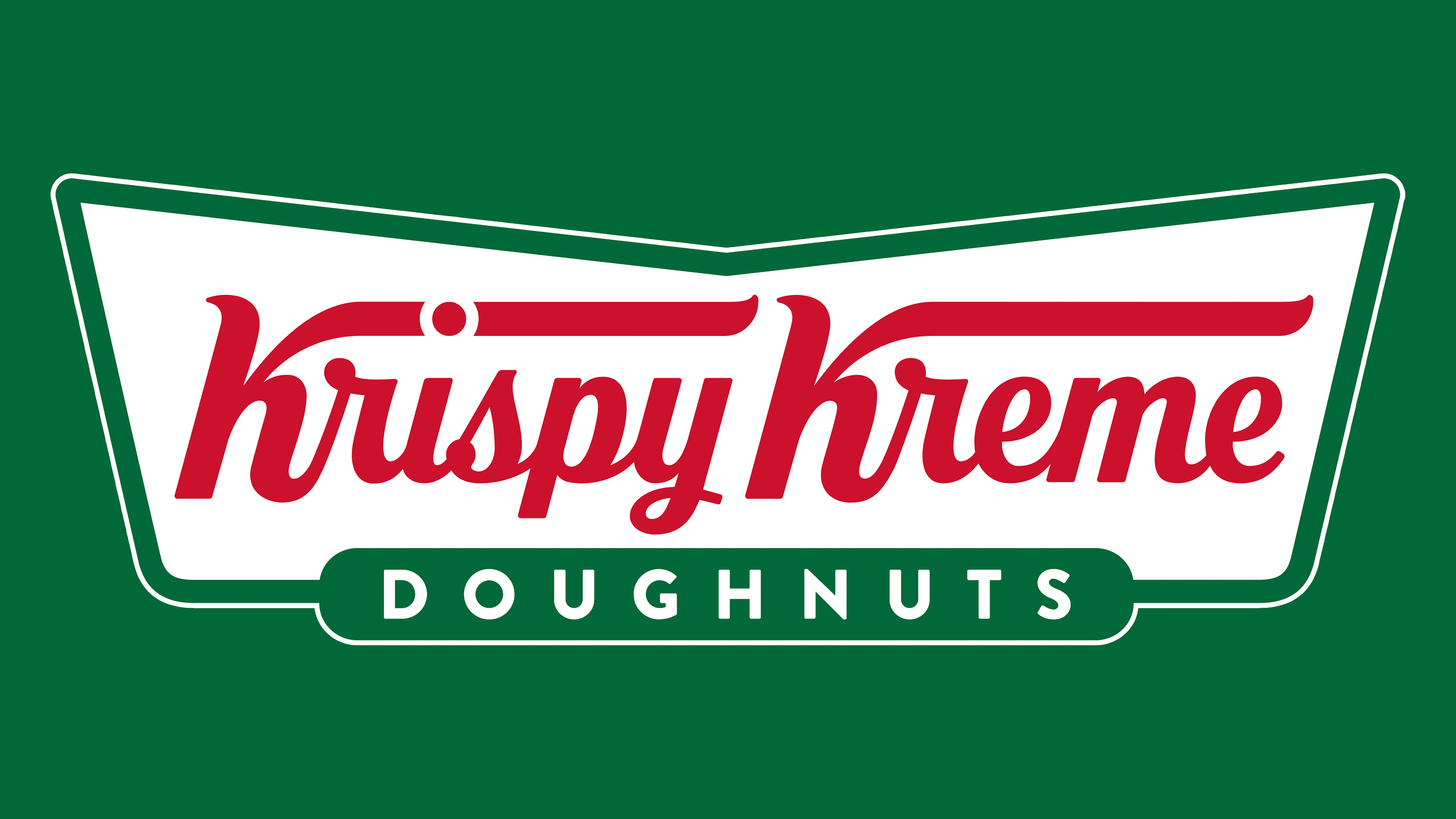
The Krispy Kreme logo is well-known for evoking the taste of warm, delicious doughnuts. It features green and red colors on a white background, and these colors have special meanings.
The green color represents the freshness of their doughnuts. Krispy Kreme makes its doughnuts daily, often in front of customers, highlighting its commitment to offering fresh, delicious doughnuts.
The red color is eye-catching and represents the excitement of enjoying a fresh doughnut. It also triggers feelings of happiness and appetite, which is clever for a food brand like Krispy Kreme.
The logo design is engaging, with green forming a bowtie around the “Krispy Kreme” name, written in white with a red outline. This combination of colors makes the logo stand out and communicates the message of tasty, fresh food.
What does the white light at Krispy Kreme mean?
The Krispy Kreme “Hot Light” is a white sign that lights up to tell you when doughnuts are fresh and warm. It’s a clever way to let customers know it’s the best time to buy a doughnut for a warm, tasty treat. This light makes people want to buy doughnuts because it shows they’re getting something delicious right then.
Some stores might give out free doughnut samples, but this isn’t what the light means. Whether a store gives out samples depends on the store itself. You might feel let down when you realize the light doesn’t mean free doughnuts. However, the real goal of the light is to let you know the doughnuts are fresh. Krispy Kreme uses the light to show they’re all about giving you the freshest, warmest doughnuts.
Why are they called Krispy Kreme?
Vernon Rudolph created Krispy Kreme with a vision for the ideal doughnut – one that’s slightly crispy on the outside and soft and creamy inside. The unique name “Krispy Kreme” reflects this perfect balance, with “Krispy” highlighting the exterior texture and “Kreme” indicating the deliciously smooth interior. This careful naming choice demonstrates a dedication to quality in every doughnut. Rudolph’s decision to spell “crispy” and “cream” with “Ks” was a move to make the brand more memorable and set it apart from competitors.
What’s the secret of Krispy Kreme?
Krispy Kreme doughnuts stand out for their signature sweet glaze, which wins over hearts with its shiny, sweet coating. This irresistible glaze is a simple mix of icing sugar, vanilla, and milk. If you prefer a thicker, sweeter coating, just increase the icing sugar.
Dipping doughnuts into this glaze transforms them into the beloved Krispy Kreme treats. They emerge completely coated, their shiny appearance making them even more appealing. Vanilla is a game-changer, enhancing the sweetness and elevating the doughnuts to a luxury treat. The secret behind their success lies in this special glaze, a perfect blend of sugar, vanilla, and milk that makes their doughnuts irresistibly delicious.