


![]()
Kulturstadt Hannover has introduced a new visual identity that reflects the city’s cultural energy and creative diversity. Developed by Hamburg-based design studio EIGA, the branding captures Hannover’s vibrant arts scene with a dynamic and unconventional logo.
At the heart of the design is a stylized star with fluid, curved lines that create a sense of movement and spontaneity. Instead of following rigid geometric rules, the shape feels organic and expressive, as if it bursts into form with creative energy. Its asymmetry gives the impression of expansion, reinforcing the idea of culture as something constantly evolving.
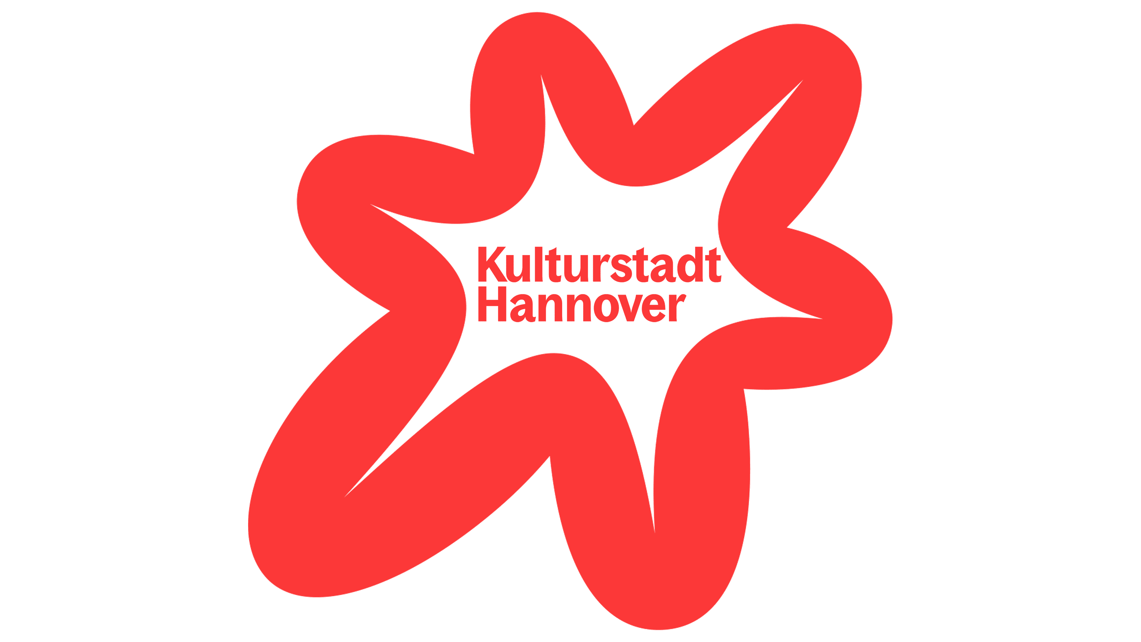
Typography balances out the design. The name “Kulturstadt Hannover” is set in a bold, modern sans-serif typeface arranged in two lines to create a structured and cohesive look. The contrast between the clean, evenly spaced text and the energetic star creates a visual interplay between stability and creativity, reflecting Hannover’s mix of tradition and experimentation.
The color scheme centers around a striking red, chosen for its energy, passion, and intensity. The bold hue makes the logo stand out and recognizable across different settings.

Beyond the logo, the star is a flexible design element throughout the branding. It can stand alone as a symbol, framing device, or backdrop for cultural content. This versatility makes it easy to integrate across different media, from digital platforms to public installations around Hannover.
The new identity blends structure with creativity. The refined typography, expressive emblem, and bold color palette create a strong and engaging presence for Kulturstadt Hannover. The design reflects the initiative’s mission to position Hannover as a cultural hub while staying true to the energy of its artistic community.