


![]() LDS Logo PNG
LDS Logo PNG
The LDS logo makes one stop and look into God’s eyes, peer into one’s soul, and ponder faith in the Almighty. It offers tranquility and peace, invites dialogue with Heaven, and points the way to problem-solving. Its purpose is to attract more followers to this denomination.
The Church of Jesus Christ of Latter-day Saints traces its origins to the religious revival culture of New York in the 1820s. Joseph Smith, raised near Palmyra, later described the “First Vision” of 1820 as the beginning of his mission. In 1823, he said that the angel Moroni had shown him the location of the golden plates, and in 1830, the Book of Mormon was published.
On April 6, 1830, about 50 people gathered at the home of Peter Whitmer Sr. in Fayette, New York. Six became the first official members of the new Church of Christ, later renamed in 1838. Smith and Oliver Cowdery ordained each other as the first and second elders.
The church grew quickly but faced violent opposition. Smith moved followers to Kirtland, Ohio, then Missouri, where the 1838 expulsion order forced members to flee. In Nauvoo, Illinois, the community expanded, but disputes over power and plural marriage deepened conflict. On June 27, 1844, Joseph Smith and his brother Hyrum were killed in Carthage Jail.
After a succession crisis, most members followed Brigham Young west in 1846. In July 1847, they reached the Great Salt Lake Valley and founded Salt Lake City. Federal conflict over plural marriage lasted for decades, until Wilford Woodruff issued the 1890 Manifesto, clearing the way for Utah statehood in 1896. In the 20th century, the church expanded worldwide, developed Brigham Young University, comparable to Notre Dame among religious universities, and built FamilySearch from its genealogical work. In 1978, Spencer W. Kimball ended the priesthood restriction on Black men. By 2024, membership exceeded 17.5 million.
Meaning and History
![]()
Although the roots of the Mormon church date back to the first half of the 19th century, it emerged in its modern form about a century later. It then acquired its final identity, backed by a concept. As a result, each of its temples has a specific design and a unique emblem characteristic of this religious movement. Based on spiritual principles, it incorporates church motifs expressed through the inscription’s style, structure, graphics, and even colors.
However, until 1974, “The Church of Jesus Christ of Latter-day Saints” lacked a consistent, common visual identity. Randall Smith and his team created the LDS logo, and the main spiritual body approved the emblem in 1975, even though it resembled a layered pie.
What is LDS?
LDS refers to the Mormon church, whose abbreviation stands for Latter-Day Saints. Its full name is The Church of Jesus Christ of Latter-Day Saints, or LDS Church. It was founded by Joseph Smith in 1830 as the religious organization known as the Church of Christ, which later split into three denominations. Initially, the main administration was concentrated in the Fayette area of New York, but over time, it relocated to Salt Lake City, Utah. The denomination now has over 17 million followers.
1975 – 1995
![]()
The emblem is textual. It presents the name of the Mormon church, divided into four lines: “The Church of,” “Jesus Christ,” “of Latter-Day,” and “Saints.” Their lengths differ because of the unequal number of words and the absence of a common vertical alignment boundary. Therefore, the first and third rows extend far to the left, the second to the right, and the fourth is approximately in the center. The inscription is in uppercase with thin glyphs that widen at the ends, resembling serifs. The concise “J” is particularly striking. Usually, it is a restrained letter, but here, due to its expansion, it visually enhances the word “Jesus,” set in the Baker Signet BT font. The font’s author, Arthur Baker, created it for VGC ten years earlier.
1996 – 2019
![]()
The modified LDS logo also lacks graphic elements; it’s text-based. Yet, it exudes a sense of high aesthetics, as the lines (a three-tier emblem) are perfectly aligned horizontally. The transition from a four-line to a three-line inscription is not just about the emblem’s appealing look but also about other significant factors. One is psychological. Surveys showed that a logo with uneven rows did not inspire trust, was not appealing, and did not create a favorable image of Christ. At the same time, three lines fit well into the church’s trinity image: the Holy Spirit, God, and His son, Jesus. This logo creates a Christocentric impression, emphasizing religious themes and serving as a welcoming invitation.
The font is significantly modernized, based on Roman inscriptions once found on columns of ancient sanctuaries. Adrian Pulfer and McRay Magelby developed it using the HTF Deseret typeface from Jonathan Hoefler of the Hoefler Type Foundry (then Hoefler & Frere-Jones). The elegant glyphs look great in any weight, allowing for subtle emphasis on specific text segments. The authors utilized this feature by highlighting the words “Jesus Christ”: the uppercase letters in the middle line are twice as large as those in adjacent lines.
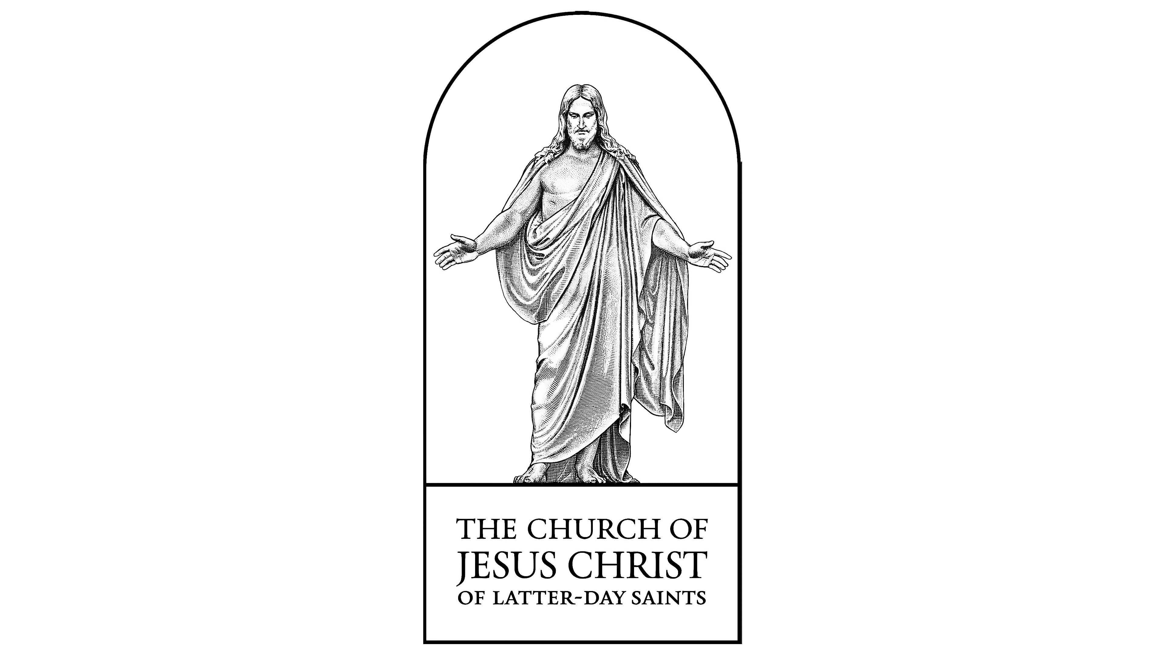
2020 – today
![]()
Maintaining the previous inscription style, designers added a full-body image of Christ. He stands in a blue archway, draped in a flowing garment. This is a himation, a rectangular piece of cloth thrown over a chiton. The soft folds, gentle curls on the shoulders, open palms, a humble gaze, and a welcoming gesture positively affect the subconscious, inspiring trust and a desire to accept the invitation. The statue stands on a thin white line separating the text. Interestingly, all lines are now of equal length, aligned on both sides.
Fonts and Colors
Despite its seeming uniformity, the LDS logo uses several font styles. The early version features the inscription in the free Baker Signet BT typeface, created by Arthur Baker. In other versions, the text is set in the custom-designed HTF Deseret, developed by Adrian Pulfer and McRay Magelby. In all instances, the letters are uppercase, semi-bold, with miniature extensions at the ends. Their closest analog is the Trajan font.
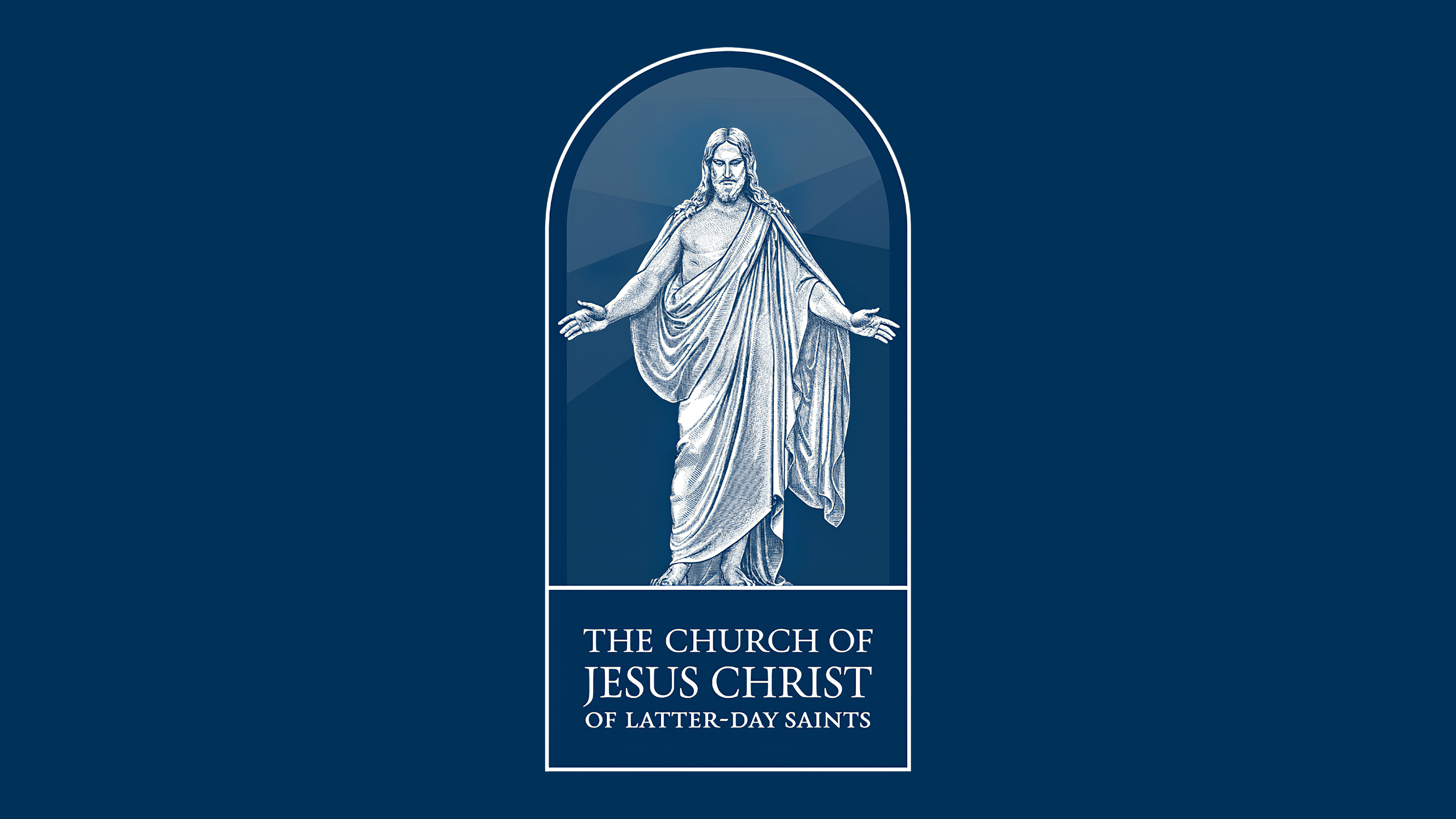
The emblem’s palette is restrained, reflecting the seriousness of the theme. It mainly features a classic black-and-white combination, though the background can vary depending on the building material on which the sign is mounted. Later, monochrome was supplemented with a blue spectrum of several shades. This choice is linked to the color’s association with the sky, hope, and faith. Additionally, it’s traditionally believed that Jesus wore a blue himation.