


![]() Leeds United Logo PNG
Leeds United Logo PNG
The football club’s Leeds City logo is distinguished by its elegant font and attractive color palette. Its symbolism lies in the desire to preserve important historical moments, to pay tribute to past successes, and to honor the fans’ consistency.
Leeds United was formed in October 1919 after the collapse of Leeds City. The new club took over Elland Road, which had been purchased for £250, and entered the Midland League before joining the Football League in 1920. Promotion followed in 1924, though the team soon dropped back after inconsistent seasons.
In the 1950s, John Charles emerged as a key figure before his 1957 transfer to Juventus for a record £65,000. His departure weakened the squad, and by 1960, Leeds returned to the Second Division under financial pressure.
A turning point came in 1961 with the appointment of manager Don Revie. He rebuilt the team, introduced an all-white kit inspired by Real Madrid, and developed players like Billy Bremner and Jack Charlton. Promotion arrived in 1964, followed by trophies including the League Cup in 1968 and the Inter-Cities Fairs Cup.
Leeds won the league title in 1969 with a strong defensive record and again in 1974. The period also included the 1972 FA Cup. After Revie’s departure, Brian Clough briefly took charge, but results declined, though the club reached the 1975 European Cup final, losing to Bayern Munich.
Decline continued through the 1980s, culminating in relegation in 1982. Under Howard Wilkinson, Leeds rebuilt and won the 1992 title, the last before the Premier League era, with players like Eric Cantona, who was later sold to Manchester United.
In the early 2000s, a young squad reached the Champions League semi-final in 2001, but rising debts led to player sales, including Rio Ferdinand. By 2004, Leeds were relegated, and in 2007, financial collapse pushed the club into the third tier. Promotion back to the top division came in 2020 under Marcelo Bielsa after a sixteen-year absence.
Meaning and History
![]()
Over nearly a hundred years, “United” has changed its emblem approximately ten times. Fans of the Yorkshire club have seen everything: owls (a tribute to the city’s coat of arms), peacocks (referring to the club’s nickname), smileys (a nod to the minimalism of the 70s), roses (Yorkshire whites, of course!), and even just the inscription LUFC, executed in an intricate font. Let’s consider each logo variation!
What is Leeds United?
It is a football club, also known as “The Whites” due to its uniform color. It was formed in 1919 and has since won many prestigious championships. One of the club’s most important achievements is its promotion to the Premier League.
1908 – 1964
![]()
After the club appeared in 1919, Leeds United continued the tradition inherited from Leeds City. The basis of the mark was the Leeds city coat of arms with three owls and the Latin motto PRO REGE ET LEGE. The inscription was removed, while the shield shape, the owls, and the golden lamb in the center were retained. In this way, the emblem retained its connection to the city and local symbolism while shedding excess detail.
In the first half of the twentieth century, the nickname The Owls referred not only to the Sheffield club but also to Leeds United. It is notable that Sheffield Wednesday officially adopted an owl logo only in 1956, nearly forty years later. For Leeds, this symbolism existed much earlier and was already perceived as part of the region’s football culture.
The mark of this period was circular. Along the edge ran a wide blue ring with thin yellow lines inside a black outline. The text followed the curve. At the top was the name LEEDS UNITED, at the bottom the abbreviation A.F.C. The letters were even, rich yellow, and close in spirit to popular geometric typefaces such as Eurostile or Futura.
Inside was a white circle with a shield in the British heraldic tradition. The upper part of the shield was black and contained three white five-pointed stars. The lower zone was blue and featured a golden ram. On the sides, the shield was supported by two white owls wearing top hats, standing on decorative ribbons. Above the composition, another owl rose, placed on symmetrically spreading decorative leaves.
Below, the designers added a stylized ribbon and a dark olive rose with five rounded petals. The image referred to the White Rose of York, a symbol of the historic region, and, logically, completed the emblem’s structured composition, uniting the urban context and football tradition.
1964 – 1971
![]()
In the 1960s, the club moved away from official city heraldry and adopted a freer visual approach. The owl, a familiar club motif, became the foundation. The emblem took on an unusual look, with a bird silhouette in a purple-blue palette set inside a simple circle.
The bird is shown facing forward and perched on a thin branch. The image is constructed through white cutouts within a solid fill. The eyes, head outline, wings, and legs break through the background, forming the figure. The construction relies on a minimal set of elements.
The mark was used with the white home kit and lasted for eight seasons. The image did not endure. Head coach Don Revie insisted on abandoning the owl, considering it an unfavorable symbol for results. Soon after, the club revised the emblem’s appearance again.
1971 – 1973
![]()
In the early 1970s, Leeds United undertook a radical rethink of its visual identity. In the view of head coach Don Revie, the previous owl emblem was associated with on-pitch failures. The club needed a restrained mark that could influence overall perception and the players’ mindset.
In 1971, a version appeared that differed from any previously used. The focus shifted to the abbreviation LUFC. The four letters were rendered in a rich yellow color and arranged diagonally. The forms resembled handwritten lettering. The lines are soft, with rounded shapes and smooth transitions, without mechanical rigidity. Each character is outlined with a thin black contour.
The public received the diagonal LUFC inscription positively. The simplicity and lightness of the form resonated with many supporters. Despite the warm reception, the mark was used briefly and disappeared after two seasons.
1973 – 1976
![]()
The smiling football mark became one of the most unusual chapters in the visual history of Leeds United. During the 1970s, the club sought an image in tune with the era, and the result was a symbol that sparked mixed reactions and debate.
At first glance, it appears to be a smiling face, although there is no literal portrait in the emblem. The image’s basis is very clear. A blue circle represents a football, and inside it are stylized letters L and U. Their relative placement creates an optical effect. The lower L, due to its smooth curve, resembles a wide smile, while the upper U is perceived as a pair of eyes. Both letters are colored yellow.
This style set Leeds United apart from most clubs of the time and became a subject of active discussion among supporters, who were divided over the new image.
1976 – 1977
![]()
Sometimes an attempt to fix a controversial design leads to new difficulties. In Leeds United’s history, this occurred when the creator of the previous logo sought to reduce the image’s excessive playfulness and change its tone.
The designer rotated the letter U by 45 degrees, recolored both characters in a dark blue, and placed the composition on a bright yellow background. The goal was to tone down emotions and give the mark a more serious character.
Despite the changes in color and orientation, the perception of the composition barely shifted. The letter L still sat at the bottom, the U remained on top, and their relationship continued to resemble an abstract smile. Supporters and club management did not accept the updated version, so the mark lasted less than one season.
1977 – 1980
![]()
After a series of disputed attempts to update the symbolism, the club decided to return to a mark that had previously received support from the stands. This was the classic emblem with the yellow smile. The return came without changes to shape or proportions. The image was restored in its original form.
The entire composition is circular. The outer contour forms a dark blue circle. Along the upper arc is the full name LEEDS UNITED, and along the lower arc the abbreviation A.F.C. Both inscriptions are set in white uppercase sans-serif letters. In feel, the typeface is close to Helvetica Bold or Futura.
Inside the circle is the smiley-like symbol. Supporters welcomed the return of the emblem for its clarity and positive mood. The restoration of the classic version confirmed the connection between the mark, the era, and the club’s fan culture.
1980 – 1984
![]()
With the arrival of a new technical partner, Umbro, Leeds United revisited the team’s look. The yellow smile was replaced by an image linked to Elland Road, the home ground’s past. The stadium was previously known as Old Peacock Ground, which brought the peacock motif to the forefront.
The mark’s shape remained circular and retained the club’s color palette. The outer section is a dark blue ring with the inscriptions “LEEDS UNITED” along the upper arc and “AFC” along the lower arc. The letters are white, uppercase, and sans serif, closely resembling Helvetica Bold or Futura Bold. A thin white line separates the text band from the inner circle.
The inner area is divided horizontally into two fields. The upper is yellow, the lower white. Against this background, a blue peacock figure more closely resembles a swan. The head is topped with a small three-pointed crown, the neck is elongated upward, and the body is heavy, widening toward the lower part.
The most unusual element is the bird’s tail. Instead of a traditional fan shape, an abstract circular loop is used.
This logo marked a shift in imagery, connecting the stadium’s past to a new stage in the club’s visual history and signaling a move toward a different interpretation of club symbolism.
1984 – 1997
![]()
In 1984, the club introduced an updated emblem that emphasized its connection to Yorkshire and its symbols. The image was inspired by the White Rose of York, a symbol associated with regional identity and the club’s football culture.
The mark took on a circular shape, with a purple outline defining the composition’s boundary. Inside is a large white rose with five petals. The petals feature thin, light blue lines and a network of inner veins. Oval light blue elements are placed between them, supporting the symmetrical structure of the design.
At the very center of the flower, imitating its core, is a football with a classic pattern of pentagons and hexagons. The panels alternate in color. White segments sit next to bright yellow ones, separated by black lines.
The club name is integrated into the mark’s middle zone and curves around the ball. The upper part of the circle reads LEEDS UNITED, while the lower part shows the abbreviation AFC. The letters are rendered in a strict sans serif style and resemble sports typefaces such as ITC Machine or College.
1997 – 1998
![]()
When Peter Ridsdale initiated a refresh of the club symbolism, the reference point was Leeds United’s entry onto the European stage. The public was shown a redesigned mark, but its use proved minimal, limited to a single season.
The image was still centered on the White Rose of York, but its interpretation changed. The petals took on a richer appearance, with purple outlines and decorative strokes. The spaces between them were filled with teardrop-shaped elements in a similar shade, forming an ornamental ring.
At the center, the football had alternating pentagonal and hexagonal panels. The panels were colored yellow and light purple, while the dividing lines were rendered in lilac. The team name LEEDS UNITED AFC was placed along an arc in the middle of the mark, tying all elements into a single composition.
The attempt to align the club’s image with broader European trends did not continue. After one year, the emblem was withdrawn from use, and Leeds United resumed its search for a suitable visual direction.
1998 – 1999
![]()
In the late 1990s, Leeds United moved away from familiar outlines and introduced a mark never used before in the club’s history. The circular form was replaced by an elongated shield, pointed at the bottom and softly rounded at the top. The connection to the past was preserved through the Yorkshire rose, but the presentation gained a different form and scale.
The edge of the shield is formed by a blue contour with a sense of depth. The inner field is richly gold. Against this background is a dark blue element resembling an arch. Inside the arch sits the classic White Rose of York, with a yellow football at its center.
The lower section is occupied by a vertical white ribbon bearing the abbreviation LUFC. The letters feature decorative strokes and soft curls, evoking handwritten lettering.
The mark is built on a layered structure with shadows that create the impression of raised elements. The new shield was a bold step toward rethinking tradition and offered supporters a fresh perspective on Leeds United’s visual identity.
2000 – 2002
![]()
Once again, the club changed its symbolism. Shadows and dimensional contours were removed from the design. The shield became flat, strict in presentation, and free of visual complexity.
The overall shape of the previous version was retained. The viewer still sees the same elongated shield with a pointed bottom and a softly defined top line. However, the internal content changed. The palette was reduced to two club colors, blue and yellow, with white used as an accent. In the upper blue section is a white Yorkshire rose. In the lower area, a white ribbon bears the abbreviation LUFC. The letters retained their calligraphic character.
The club returned to a minimalist approach, abandoning visual overload.
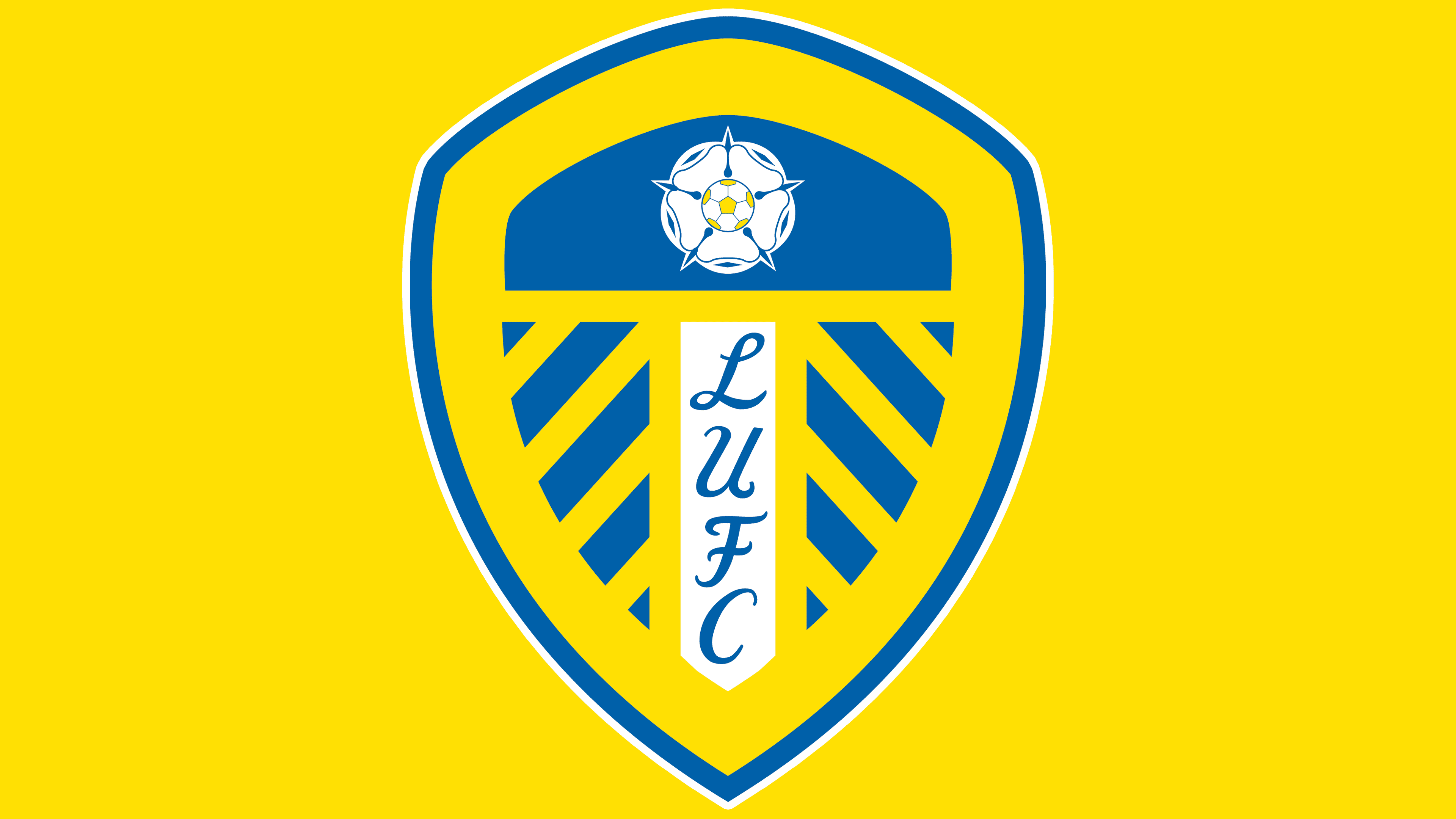
2002 – today
![]()
In 2002, another redesign took place. The top of the shield received a rounded line; the angular projection disappeared, and a similar shape appeared in the upper inner arch, softening the outline.
The blue color with a purple tint was removed and replaced with a cleaner blue tone.
2018
![]()
On January 24, 2018, Leeds United, competing in the English league, presented an updated logo. The presentation was intended as a gesture of attention toward supporters, but the response was the opposite of what was expected. The emblem existed for only a few hours, triggering a wave of criticism on social media, after which the club publicly abandoned the new design.
The designers proposed a different shield shape. The upper area featured the inscription LEEDS UNITED. Below, a headless figure appeared, its clenched fist pressed to its chest.
This gesture is known among supporters as the Leeds salute. Its history dates back to the 1980s, when fans used it during away matches to recognize one another in the crowd. In 1987, the gesture gained wider recognition after players began repeating it during goal celebrations. Glyn Snodin, Vinnie Jones, and Chris Kamara were among the first players to perform the salute on the field. Over time, the sign became a symbol of the connection between the stands and the team.
Nevertheless, the historical context and the gesture’s meaning within supporter culture did not change public reaction. Fans perceived the image as unsuccessful and overly abstract, and it failed to elicit the desired response. As a result, the logo remained only a brief episode in Leeds United’s visual history.
Font and Colors
Each “Leeds United” graphic sign series is dedicated to a specific theme. But most of all, fans remember the 1970s version with the so-called smiley. It competes with the most “football”- like logo, featuring the ball and shield. In 2018, an attempt to update the design was unsuccessful, but the proposed emblem lasted only a few hours.
Centered inside the shield is the inscription “LUFC.” The letters are arranged vertically, top to bottom, within a rectangle. An elegant handwritten font makes the abbreviation look more striking. The primary colors of the emblem have never changed: the palette, as it was many years ago, includes yellow and light blue, with the addition of white.