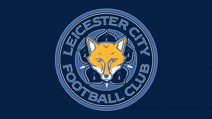
The “Leicester City” logo has a long history, just like the football club itself. It is easily memorable due to the contrast of various colors and shapes. The imagery used in it perplexes those who know nothing about the national symbols of Leicester County.
Leicester City: Brand overview
| Founded: | 1884 |
| Founder: | King Power |
| Headquarters: | East Midlands, England |
| Website: | lcfc.com |
FC “Leicester,” a well-known football club from England, was founded in 1884. It’s noteworthy that the team was initially called “Leicester Fosse,” and the team was comprised of ordinary guys who studied at the same school. The football club received its first name from a street located near the football field.
Leicester Fosse existed for quite a long time, and only in 1919 was it decided to rename the club to FC “Leicester City.” By that time, the club had made its mark in the 1st and 2nd divisions of the League. Along with the renaming of the club, the county of Leicestershire became Leicester.
It’s worth noting that the team’s second name (Foxes) is connected to the county. The most devoted fans call their favorites “foxes.” This nickname has a long history. In the 19th century, the county was known to many thanks to the organization of fox hunting, which was frequently encountered there. This symbol is reflected in the “Leicester City” logo.
Meaning and History
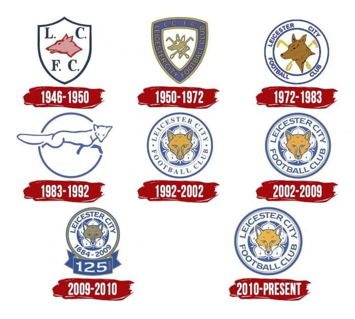
Since 1946, the club has had a crest with the image of a sky fox. Although the logo has undergone some changes over the years, this image has not undergone significant changes. This graceful animal is a real source of pride for devoted fans.
The logo has changed several times. First, it was the animal’s profile, resembling a dog surrounded by golf clubs. In the eighties, the emblem was presented with the silhouette of a running fox. Perhaps this was the most crucial sign distinguishing the emblem from other versions of the club’s logos.
In 1992, thanks to the development of graphics, the modern round emblem of “Leicester City” was introduced to the world. The club based it on the Potentilla plant (not a lotus or water lily, as some sources indicate) – a five-pointed white flower visible against the background of a fox’s head. It is known as one of the symbols of Leicestershire County.
This animal was hunted in this county for centuries, so it was decided to “compensate” for the foxes by making them the club’s symbol. The symbol of the fox on the “Leicester City” emblem returned to the classic version of the cunning yellow face, which is still depicted there to this day. Since then, the emblem has undergone only minor changes (for example, the writing of letters) and has hardly been corrected since 1992.
It’s worth mentioning that “Leicester” traditionally remains faithful to the club’s blue and white colors, earning another nickname, “The Blue Army.”
All “Leicester City” logos feature a fox – the symbol of Leicestershire County and the city of Leicester. The blue and white design corresponds to the club colors adopted in the 1948-1949 season. The prototype of the modern emblem appeared in 1992. Since then, its style has not changed: the latest version differs only in color design.
What is Leicester City?
“Leicester City” is a football club formerly known as “Leicester Fosse.” Its history began in 1884, but it only acquired its current name 35 years later. It’s now a successful Premier League participant, gaining fame in recent years due to a series of victories.
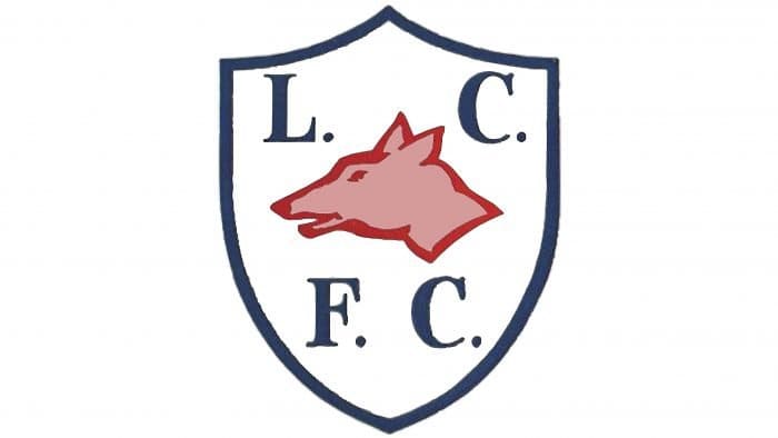
1946 – 1950
The team’s earliest logo is dedicated to the revival of British football after World War II. It has a traditional crest shape. It is surrounded by a wide, dark blue line. Inside, on a white background, the letters “L,” “C,” “F,” and “C” – the abbreviation for Leicester City Football Club – stand out contrastingly. In the center is the head of a red fox.
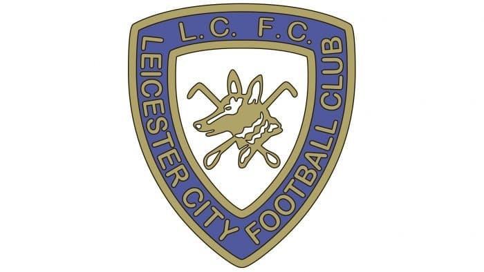
1950 – 1972
In the early 50s, the emblem became more complex. A pointed shield is adorned with a triple outline, on which the full name of the club is written. Above are the abbreviations “L. C.” and “F. C.”. The font is a rounded sans-serif. In the center is the profile of a fox. It’s executed in white and gold colors. Two hunting lanyards crossed behind the head – a tribute to British hunting traditions.
1972 – 1983
In 1972, the logo returned to minimalism. A white circle replaced the heraldic shield with a blue border. The letters denoting the team’s abbreviated name disappeared. Only the inscription “Leicester City Football Club” remained. The style of drawing changed: the animal’s head is depicted in more detail. The hunting loops in the background became yellow.
1983 – 1992
In the 1980s, the emblem radically changed. The central place is occupied by the silhouette of a crouching fox emerging from the circle. Smooth blue lines form the figure of the animal. The background is white.
1992 – 2002
At the end of the 20th century, the “Leicester City” logo with modern graphics appeared. The design is similar to the 1972 version, only the fox’s head is depicted not in profile but in full stature. In the background is a white, five-petaled flower. This cinquefoil is a symbol borrowed from the city of Leicester’s coat of arms.
2002 – 2009
Thanks to the change in contours, the fox looks more realistic. The colors have become more saturated. The inscription “Leicester City Football Club” has been enlarged and moved closer to the center.
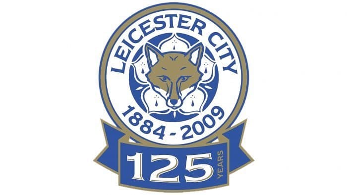
2009 – 2010
In the year of the club’s 125th anniversary, the club introduced an anniversary emblem. It’s similar to the previous logo but has a different color scheme. Instead of orange, grey-gold is used. The ears and lower part of the fox’s head are white. The full name of the club is replaced with the inscription “Leicester City 1884 – 2009.” Under the circle is a blue ribbon with the stylized number “125” and the vertical word “Years.” The font is old-fashioned, with short serifs.
2010 – today
The current emblem is similar to the 2002 version. The only difference is the white elements on the fox’s face. They have remained unchanged after the anniversary logo.
Leicester City: Interesting Facts
Leicester City Football Club, also known as the Foxes, is a well-known soccer team with a lot of history.
- How It Started: The team was created in 1884, first called Leicester Fosse because they played near Fosse Road. They became Leicester City in 1919 when Leicester became a city.
- Their Stadium: They play at King Power Stadium, which opened in 2002 and can hold over 32,000 fans. Before this, they played at Filbert Street since 1891.
- Big Win: In the 2015-2016 season, they won the Premier League against all odds, surprising everyone.
- Playing in Europe: After winning the Premier League, they got to play in the UEFA Champions League for the first time in the 2016-2017 season and made it to the quarter-finals.
- Winning the FA Cup: They won it for the first time in 2021 by beating Chelsea 1-0. They had tried four times before but hadn’t won until then.
- The Team and Its Fans: The team is a big part of the local community in Leicester and has many loyal fans. They’re called the Foxes because of the area’s history of fox hunting.
- New Owners: A company from Thailand bought the team in 2010. After the owner, Vichai Srivaddhanaprabha, sadly died in 2018, his son, Aiyawatt, took over.
- Famous Players: Some famous players include Gary Lineker, who started his career with Leicester, and Jamie Vardy, who was key to their Premier League win.
- A Great Coach: Claudio Ranieri, the coach during their Premier League win, is very celebrated for his leadership.
Leicester City’s story is filled with surprising wins and a strong connection to their fans, making them a beloved team.
Font and Colors
Absolutely all graphic symbols of “Leicester City” are dedicated to the fox, which is one of the main symbols of Leicestershire County. Initially, artists depicted the fox’s head quite abstractly, so it wasn’t very clear what animal it was. In addition, two crossed hunting lanyards were more associated with hunting than with football.
Subsequently, the club adopted an emblem with an abstract fox: its silhouette was easily guessed in the graceful blue lines. And in 1992, the “ancestor” of the modern logo appeared in the form of a seal. Designers placed the brand elements inside the circle: yellow-white fox head, cinquefoil (symbol taken from the city’s coat of arms), and the inscription “LEICESTER CITY FOOTBALL CLUB.”
The full name of the club is written in the ITC Newtext font. This font, with small sharp serifs and expanded glyphs, was developed by the American typographer Ray Baker.
The main part of the “Leicester City” logo, including the inscription, is blue (#003090). The only exception is the fox’s head: it’s predominantly gold (#FDBE11), although it also contains a small number of blue and white elements. White color is also used for the cinquefoil and the ring, allowing the designers to create the necessary contrast.
Leicester City color codes
| Blue | Hex color: | #003090 |
|---|---|---|
| RGB: | 0 48 144 | |
| CMYK: | 100 67 0 44 | |
| Pantone: | PMS 286 C |
| Yellow | Hex color: | #fdbe11 |
|---|---|---|
| RGB: | 253 190 17 | |
| CMYK: | 0 25 93 1 | |
| Pantone: | PMS 7549 C |

