1948 was the year of creating a brand called LEKI, which later became a manufacturer of unique sports equipment – innovative trekking poles. From that moment on, the brand began its ascent to the pinnacle of success, the conquest of which is closely connected with the history of the Lenhart family – the founders of the company. The history of this success is full of enthusiasm and dedication to the sport, a constant search for improvement, and aspirations for a better future. The company was started by the turning workshop of the Lenhart family – Karl and Gertrude, also called Karl Lenhart, Plastik + Metall, which was founded in Dettingen/Teck. Initially, the brand produced letters for signs, thus laying the foundation for LEKI Lenhart GmbH. The switch to sports equipment was driven by the personal dissatisfaction of Karl, who was an avid skier, with the poor quality of ski poles. In 1960 we started our production of handles and tool baskets. The name LEKI 1970 first appeared on the company’s products. It became a reflection of the owner’s name and the location of the headquarters – “Lenhart” and “kirchheim.” Production expanded, products improved, and in 1974 the Makalu era began – the world’s first adjustable trekking pole, which brought the brand worldwide fame. Today the company is a world leader in glove systems, folding poles, and trail running technology. Innovation, high quality, passion, and maximum performance are the foundations of a recent rebrand that ushered in a new era for the company and a new generation of users.
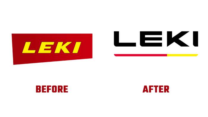
The creation of a new brand started three years ago. During this time, a unique strategic framework has been developed to achieve an important goal – strengthening and increasing the company’s influence around the world. The development of the logo and corporate design was formed based on the early elements that ensured the company’s success. Fine-tuning visual elements carried out their evolution according to the requirements of modern minimalist design. The logo in the form of a verbal module – the name of the brand, ensured the simplicity of its perception and ease of remembering. It is represented by a wordmark in a clear and large sans-serif font in contrasting black. Its execution made it easy and simple to distinguish the brand from many others, ensuring recognition and long-term use of it.
The official color scheme has been retained as a tribute to the brand’s rich and successful history. A strip of these two colors, bright red and yellow, was made under the name itself to ensure minimalization and better visual perception. Her performance refers the viewer to the stylized form produced by the product brand, providing a subtle link between aesthetics, design originality, and brand awareness.
