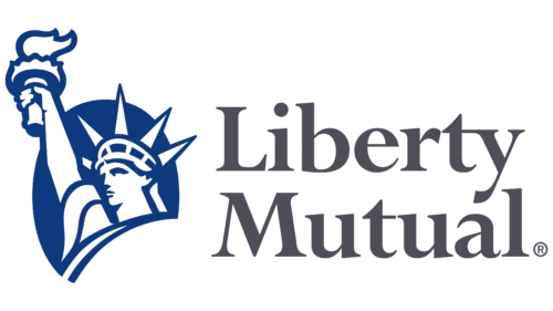
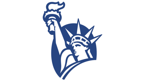
The Liberty Mutual logo is not just multivalent – it is imbued with the spirit of the country in which this company operates. It concentrates on the desire to enlighten the world population about insurance benefits, their effectiveness, and their crucial role in protection from any risks. The emblem’s depicted symbol is significant in itself and speaks of the aspiration for safety.
Liberty Mutual: Brand overview
| Founded: | July 1, 1912 |
| Founder: | Cuong Tran |
| Headquarters: | Boston, Massachusetts, U.S. |
| Website: | libertymutual.com |
Meaning and History
Liberty Mutual Group took a meticulous approach to choose its visual identity, like any finance-related organization. But it didn’t settle for clichés or traditional images, instead opting for an unexpected character that, at first glance, has nothing to do with the insurance sphere. This is the Statue of Liberty.
What is its role in the concept? It is both primary and multi-purpose. First, it resonates with the organization’s name. Second, in the hands of the impressively tall statue is a torch – a symbol of light illuminating the entire world. Thus, the company has taken on the role of enlightening the public about insurance matters.
What is Liberty Mutual?
Liberty Mutual is an insurer from the United States. By size, it’s the sixth-largest insurance company in the country. Its professional activities cover a wide range of complex cases: protection against the risk of health loss (disability), personal transport, housing, services and products, fire hazards, and much more. It has an extensive network with offices in the United Kingdom, Turkey, Spain, Portugal, Thailand, Ireland, Poland, India, and several other countries.
1912 – 1917
At its inception, the insurance company was called the Massachusetts Employees Insurance Association. It focused on protecting workers by providing compensation in difficult situations. Then, the company fully transitioned to insurance services and opened its branch within two years. In 1914, it issued its first auto policy.
1917 – 1918
The MEIA company changed its name to Liberty Mutual Insurance Company, actively offering auto insurance policies with full compensation.
1918 – 1919
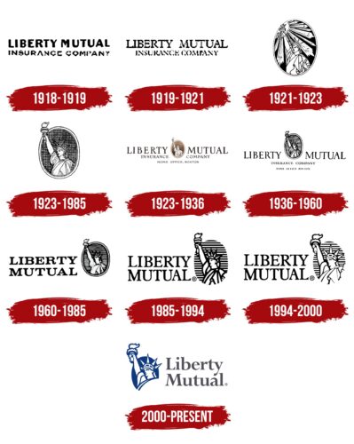
The Liberty Mutual logo was completely textual. The insurer’s name was divided into two fragments and occupied two levels: the first line contained the phrase “Liberty Mutual,” and the second line contained “Insurance Company.” The top inscription was executed in a bold, large font without serifs, the lower one – smaller. Letters in both parts were capital.
1919 – 1921
The designers chose a different font for the emblem – semi-bold, with expressive serifs. The first and second rows were centered. The only thing that remained unchanged was the size of the letters: in the upper line, they were larger than in the lower one. There were no frames.
1921 – 1923
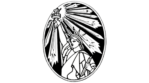
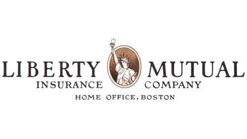
The Liberty Mutual emblem was turned into an oval medallion with an image of a fragment of the legendary Statue of Liberty. The woman held a burning torch in her highly outstretched hand. The beams of light were wide and diverged in a circle in different directions. The rays were linear and sharp at the ends. The background was a black space.
1923 – 1985
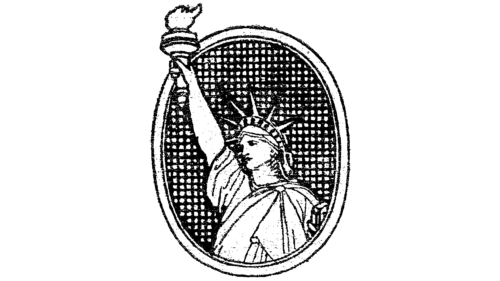
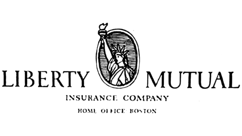
The logo’s shape was oval with a vertical orientation, but the woman’s hand with the burning torch extended beyond the frame. This was done to emphasize the concept of enlightenment because the authors removed the rays. The outline, on the contrary, was improved – the frame became wider and more distinct. The background had a mesh structure. This graphic sign was used with various types of texts and was not changed for a long time.
1923 – 1936
Various inscriptions were located around the oval medallion: on the left – “Liberty” and “Insurance”; on the right – “Mutual” and “Company”; at the bottom – “Home Office, Boston.” The side text occupied two levels: the words in the first line were large and in the second – half as small. The font was uppercase, with serifs, but not with sharp ones, but with rounded ones at the ends.
1936 – 1960
The grid background on the Liberty Mutual emblem became streak-like. The lines were arranged horizontally and covered all the space. Typography was also modernized: the inscriptions received other fonts. In the first row, the letters were tall and thin; in the second – low and squat; in the third – small and barrel-shaped. Serifs became thin and sharp.
1960 – 1985
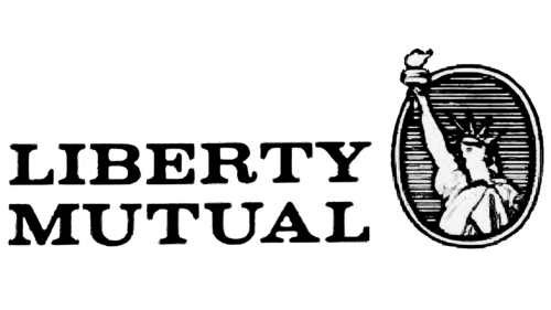
This was the last period of using a medallion with a frame. The company’s name was shortened to two words, which were moved to the left and aligned on both sides. The inscription was made in a bold Roman font in uppercase.
1985 – 1994
The two-level inscription on the left side of the picture was preserved but became taller, with elongated and clear letters. However, the image of the Statue of Liberty was completely changed:
- The border frame disappeared.
- The background lines widened.
- The fine detailing of the face and clothes disappeared.
1994 – 2000
In this version of the Liberty Mutual logo, designers redrew the background oval: it was stretched at the top and bottom. The artists also changed the features of the woman with the torch, adding a resemblance to the real Statue of Liberty.
2000 – today
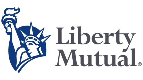
The emblem received a new visual interpretation. First, it gained color, which harmoniously fit into the black-and-white palette. Second, the statue was left with one arm, a head with a spiky crown, and a torch with a burning fire. The oval background became entirely blue. The inscription was moved to the right, maintaining a two-level text structure.
Font and Colors
The logo uses a bold uppercase font called Perpetua Bold. Older emblems also used other typefaces, roughly similar to Pierpont Regular, RinseWash Regular, Dustismo Roman Regular, and Deca Serif New Medium. The color scheme consists of a combination of blue, gray, and white, whereas it used to be monochrome only.
Liberty Mutual color codes
| Dark Liver | Hex color: | #4e4e58 |
|---|---|---|
| RGB: | 78 78 88 | |
| CMYK: | 11 11 0 65 | |
| Pantone: | PMS 7540 C |
| Dark Midnight Blue | Hex color: | #0f397e |
|---|---|---|
| RGB: | 15 57 126 | |
| CMYK: | 88 55 0 51 | |
| Pantone: | PMS 288 C |
