


![]() Liberty University Logo PNG
Liberty University Logo PNG
The Liberty University logo is business-like. With it, it precisely conveys an attitude toward education, demanding and rigorous, with which the university approaches knowledge assessment. High expectations guarantee high results, which LU has already proven by being among the leaders in student numbers among Christian educational institutions.
Liberty University is a private Baptist university affiliated with the Southern Baptist Convention, established in 1971 in Lynchburg, Virginia, by Baptist pastors Jerry Falwell Sr. and Elmer L. Towns. Initially named Lynchburg Baptist College, the institution aimed to provide academic education integrated with Christian values, analogous to universities serving other religious communities. In 1975, it was renamed Liberty Baptist College, secured accreditation, and relocated to Liberty Mountain, significantly expanding its campus. The institution attained university status in 1985, initiating doctoral and distance education programs, including Liberty University Online. Despite financial challenges in the 1980s and 1990s, it continued to grow through substantial donations, campus modernization projects, and academic expansions, including the addition of law and medical schools. Under Jerry Falwell Jr.’s presidency, enrollment in online education increased dramatically, positioning Liberty as one of the largest Christian universities globally. The university’s athletic teams advanced to the NCAA Division I FBS competition, contributing to its national recognition. Currently, Liberty University comprises 17 colleges, offers over 700 programs, and educates more than 130,000 students worldwide, maintaining its commitment to combining rigorous academics with Christian principles.
Meaning and History
![]()
From its operation, the Baptist University LU preferred a business emblem. The strict, minimalist sign reflects a measured approach to education and high demands, as a concise symbol must be impeccable. Otherwise, any flaws will be visible. The designers made an effort. They carefully crafted the logo’s concept, style, and appearance to ensure it would make a strong impression on those seeking an education at a Christian university.
The key trend in Liberty University’s identity is seriousness. It became the foundation of the concept because it was the main requirement set by the developers. Business styling brought the higher educational institution’s name to the forefront, so the academic emblem is textual. At the same time, the university-wide sign, besides the inscription, contains drawn elements.
What is Liberty University?
This is the largest private Christian university in the United States, in Lynchburg, Virginia, and offers over 700 educational programs in traditional and online formats. The university comprises 17 colleges and schools, spanning the humanities and natural sciences to aviation and medicine, and emphasizing Christian values in education. The uniqueness of this institution is highlighted by its extensive 7,000-acre campus, which includes advanced educational facilities such as an Olympic-sized swimming pool, a winter sports complex, and one of the largest Christian fitness centers in the country. In addition to various extracurricular activities and student ministries, featuring over 100 clubs and regular performances by Christian music groups, the campus is home to the Flames sports teams, which compete in NCAA Division I.
Before 2005
![]()
The Liberty University logo combines classic typography and a symbolic emblem. At the center of the composition is a circular seal, which divides the university’s name, “Liberty University,” into two parts. The font features refined serifs, giving it an academic and distinguished appearance.
At the top of the emblem, a torch is depicted at the center, symbolizing the light of knowledge, spiritual guidance, and the pursuit of enlightenment. Below is an image of a building that represents the university campus and its educational mission. On the open pages of the Bible, the words “Knowledge Aflame” are inscribed, emphasizing the university’s Christian foundation and its commitment to spreading knowledge.
The founding date, 1971, is displayed at the bottom of the emblem on a ribbon, completing the composition. The logo’s color scheme is rendered in a classic dark blue shade traditionally associated with education, stability, and trust.
2005 – today
![]()
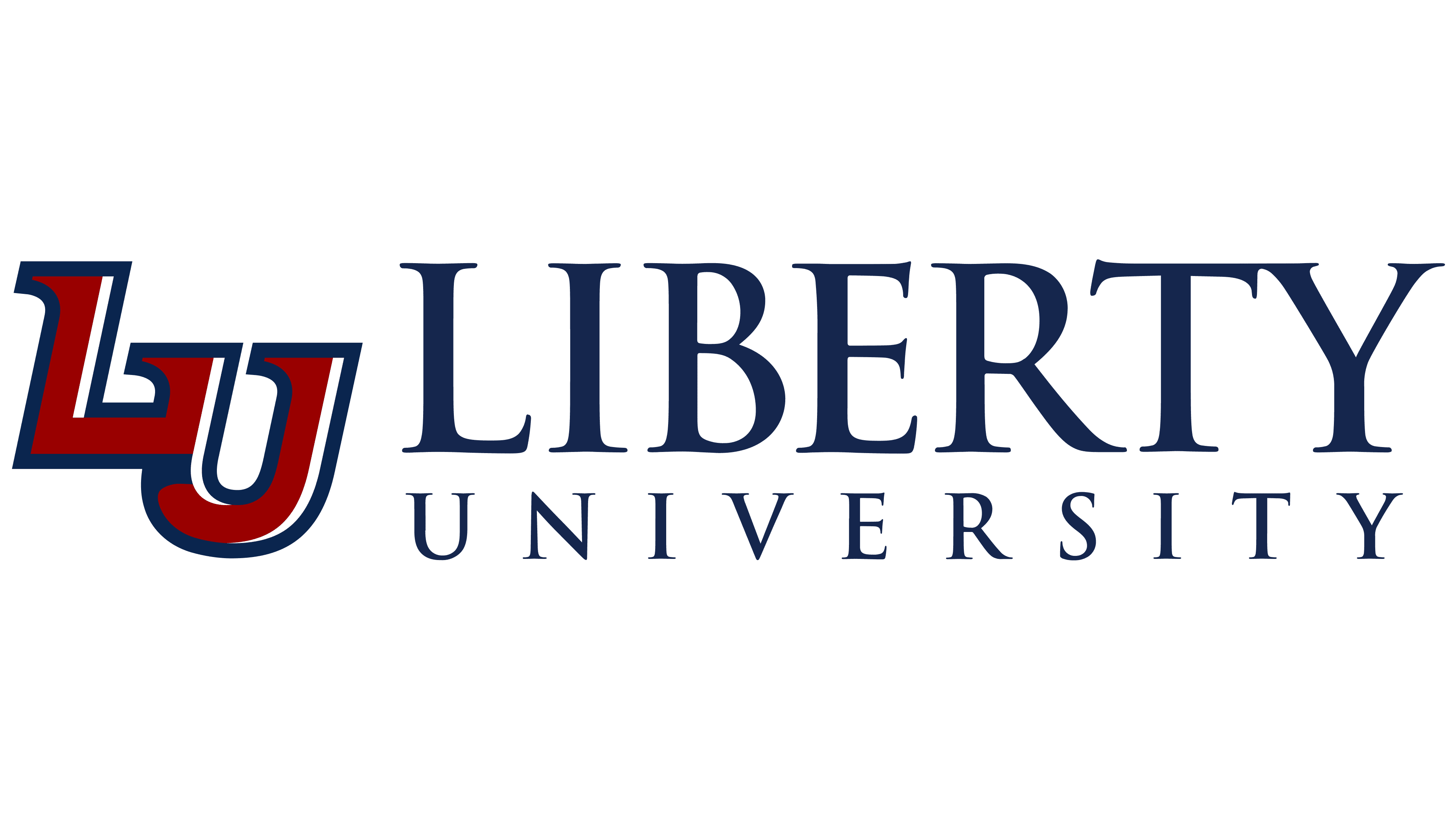
The textual logo has a two-level structure, with each word on its own line.
- The upper inscription is three times larger than the lower one. It uses bold, uppercase, serif letters. Due to the specific structure, the last glyphs merge. Specifically, “T” and “Y” touch.
- The second line has smaller but distinct characters. This effect was achieved thanks to the wide distance between them. The letters here are thinner than in the first row, but also bold.
Visually, the emphasis is on “Liberty,” highlighting the university’s name and concept. Both parts of the inscription are aligned on both sides and colored in dark blue, one of the three official colors of Liberty University.
The Seal
![]()
The university seal symbolizes a commitment to education and God. It contains many legendary elements that have left a deep mark on the university’s history, including:
- A triangular heraldic shield (symbolizing the trinity, faith in Christ, and dedication to the Almighty);
- A bell (a copy of the real attribute located under the dome of the tallest building on the main campus);
- A bonfire (fire represents burning knowledge and the light of the Gospel that students bring to the world);
- A book (representing the Bible, considered the heart of the university and a key part of the logo);
- An octagon (the basic architectural style of the first university building);
- A tower (this is the Freedom Tower – a landmark of Liberty University, firmly standing on the Bible and forming a cross at the intersection with the year of foundation);
- Branches with leaves (stylization of a laurel wreath, given in Ancient Greece to outstanding individuals and winners).
Font and Colors
The logo and seal contain inscriptions set in uppercase. It has a strict style and sharp serifs. According to university information, this is Trajan Pro. Both symbols are colored in Liberty University’s official colors: blue (main), red, and white.