Linde: Brand overview
Founded in 1879 by Carl von Linde in Germany, Linde originally began its journey under the banner of Linde’s Eismaschinen Aktiengesellschaft, emphasizing innovation in refrigeration and gas separation. In the late 19th century, Linde accomplished a number of pioneering technological feats. By 1897, an innovative air separation plant had been built that allowed important gases such as oxygen and nitrogen to be extracted from liquid air.
As Linde entered the twentieth century, it expanded its product range, starting acetylene production in 1904 and hydrogen production from water in 1907. – production of hydrogen from water. The next few decades were marked by constant expansion and innovation. Linde strengthened its presence in Germany and expanded beyond its borders to countries such as France, Italy, the UK, and Sweden. By 1965, the company had successfully asserted its presence in the vast US market.
In 1978, Linde AG, Knapsack-Griesheim AG, and Woelm Pharma GmbH & Co. KG resulted in the formation of Linde AG, which at the time was the world’s largest gas and mechanical engineering company. In 2006, Linde AG and The BOC Group plc merged to form the Linde Group, strengthening its position as a leading industrial gas conglomerate. The legacy of mergers has continued, with the most notable one in 2018 when Linde AG and Praxair, Inc. merged to create Linde plc, an industrial gas giant.
Meaning and History
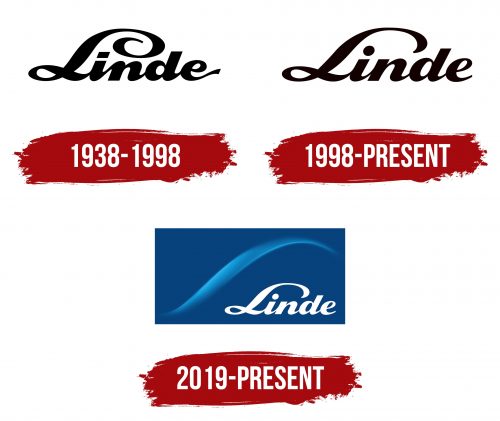
1938 – 1998
1998 – today
2019 – today
The Linde logo features just one word: the name of a chemical company based in Britain but registered in Ireland. This dual nature is subtly reflected in its visual identity, dominated by cool tones. Against a blue background, there’s a diagonal wave painted in various shades of blue. This wave’s shape is mirrored by the capital “L” at the beginning of the company’s name, which appears to be handwritten. The following letters are lowercase, connected, italicized, and bold, giving the logo a cohesive and dynamic look.
To enhance the effect, designers incorporated a large rectangle as a backdrop for the company name. This design choice highlights the logo and adds depth and a layer of sophistication. The gradient of blues and the fluidity of the wave symbolize Linde’s innovative and fluid approach to the chemical industry, while the cool color palette hints at the company’s expertise in gases and engineering. The handwritten “L” brings a personal touch to the logo, making it stand out in a typically formal industry. Through its thoughtful design, the Linde logo communicates the company’s unique identity and commitment to leading in its field with a blend of tradition and modernity.


