


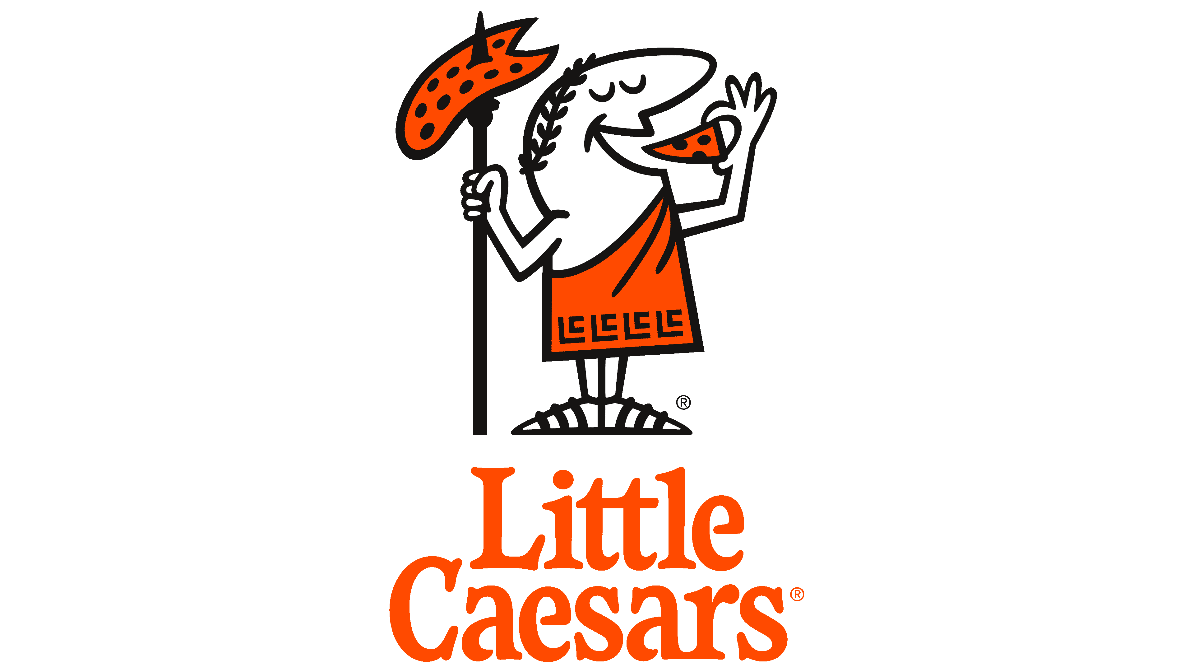
![]() Little Caesars Logo PNG
Little Caesars Logo PNG
The emblem hints at the pizza’s origin. The company is trying to show that the network offers a dish prepared according to original Italian recipes. The Little Caesars logo also reflects the pizzeria’s longevity.
Little Caesars began in 1959, when Mike and Marian Ilitch opened Little Caesars Pizza Treat in Garden City, Michigan, near Detroit. The first shop was small, but the model was built for growth: simple pizza, low prices, and service aimed at families and quick meals. By 1962, the Ilitches began franchising, helping the brand expand beyond Michigan.
The breakthrough came with the “Pizza! Pizza!” idea, which offered two pizzas for the price of one competitor’s. The slogan, introduced in 1979, became the brand’s most recognizable line and helped Little Caesars stand apart from Pizza Hut and Domino’s Pizza. During the 1970s and 1980s, the chain expanded fast, and by the end of the 1980s, it had more than 4,000 locations worldwide.
In 1989, Little Caesars introduced a signature pizza built around mozzarella, tomato sauce, and its own seasoning blend. In the 1990s, the brand increased its sports visibility by buying naming rights to the Pontiac Silverdome, which was renamed the Little Caesars Arena. The company later added products such as Deep! Deep! Dish Pizza and bacon-wrapped crust pizza.
In 2017, Little Caesars launched Pizza Portals, automated pickup machines for preordered pizzas. By 2020, it ranked as the third-largest pizza chain in the United States. The company remained under Ilitch Holdings, with headquarters in Detroit’s Fox Theatre building. At the same time, its franchise network reached Canada, Latin America, the Caribbean, the Middle East, and Asia.
Meaning and History
![]()
Mike Ilitch and his wife, Marian Ilitch, once opened a mini-pizzeria at the Garden City Mall of Michigan in suburban Detroit. It was called Little Caesar’s Pizza Treat and became the basis for a large-scale food service chain. That store lasted an incredibly long time, closing in the fall of 2018.
At first, the company caught visitors’ attention with an advertising slogan that included the word “pizza” twice. This was because the firm offered two combined pizzas for the price of one. This was her way of fighting off the competition. At first, the baked goods were served in a square corrugated cardboard box. Staples connected packages. However, the management switched to standard boxes because the previous ones were too bulky.
This brand is famous because, in 1998, it fulfilled the largest order, baking 13,386 pizzas for a single customer. The order came from VF Corporation in Greensboro, North Carolina. She’s also known as the first company to use an innovative conveyor-belt oven to quickly make pizzas. In addition, the catering chain also served fish, shrimp, chicken, and hot dogs.
Since 2014, the company has been expanding its representative offices by building new facilities. Little Caesars Arena opened late, not until 2017. In parallel, it redesigned the center’s logo for its launch. The changes were mostly about details, not the logo’s concept. The developers made Caesar’s chest hairless, updated the wreath on his head, and changed the ornamentation of the toga so that the monogram “LC” (meaning “Little Caesars”) was visible in the pattern. In addition, the company used the updated image in its advertising, replacing the cartoon character. In all, there are four logos in its history.
What is Little Caesars?
Little Caesars is the trade name of a pizza chain officially registered as Little Caesars Enterprises, Inc. It has existed since 1959 and is a private enterprise of the American company Ilitch Holdings. The network is growing rapidly because it actively sells its franchises. Its restaurants are open in the US and abroad, including in Asia, so the famous Little Caesars logo is known to pizza connoisseurs worldwide.
1959 – 1971
![]()
The debut logo was not very creative. It consisted of a rectangular frame with the then-named pizzeria, Little Caesars Pizza Treat, written on a white background. The long phrase took up two lines. The text at the top resembled handwriting and was slightly slanted to the right. It had many curls and rounded lines. The letters “tt” were connected by a single horizontal stroke, and the “L” stood alone and did not blend in with the other characters. The inscription in the lower part was typed in a printed font with wider inter-letter spacing (compared to the first half of the name).
1971 – 2000
![]()
The catering establishment undertook a major rebranding after expanding its number of pizzerias and entering new service areas. It abandoned the long, old name and chose a shorter one: Little Caesars. The logo depicted exactly what the name said: Little Caesars.
The man was standing in a toga, slung over his shoulder, holding a piece of pizza he was about to eat. The contented smile on his face indicated this: his mouth was open, his eyes closed, as if he were enjoying a delicious meal. He held a spear with a round pizza on the spike in his right hand, from which a triangular slice had been cut off.
The image was on a white background inside a thin ring. Beneath it was an inscription in stylized lower-case letters. Only the “L” and the “C” at the beginning of the word were capitalized. All signs had spike-shaped serifs that resonated with the tip of a spear. The vowels “a” and “e” originally had a design: miniature spaces within the solid lines.
2000 – 2017
![]()
The changes were mostly about color, dislocation, and element scaling. The designers moved the network’s name to the right and painted it orange with a black outline. They enlarged Caesar, using only a fragment from the previous image. The developers also tilted the person to the left (diagonally) and circled the frame to depict an order-dispensing window, such as those in catering outlets.
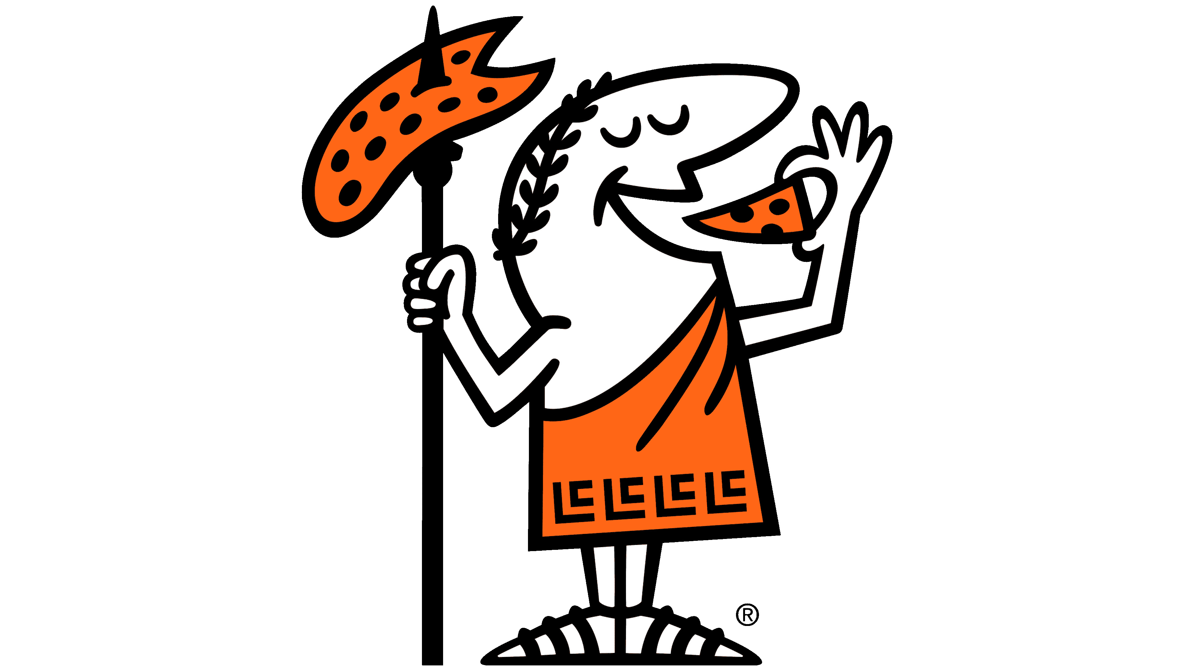
2017 – today
![]()
Although the corrections are not conspicuous, they are fundamental and play an important role in the brand identity. For example, on the toga’s hem, the authors depicted an ornament in the form of the acronym “LC,” which stands for the company’s abbreviation. The letters are thin, do not overlap, and are arranged inside the other. Another change is in the wreath: it is much more noticeable thanks to the clear rendering of the leaves.
The artists removed the hair from the chest, slightly shifted the man’s eyes to the right, and enlarged them, adding expressiveness to the image. In addition, the character now holds three fingers outstretched instead of two, which is more realistic. This gesture suggests the pleasure Caesar takes in putting a dainty slice of pizza into his mouth, anticipating its great taste. The designers used vintage lettering, evoking a 1971 style and adding the word “Pizza.”
Font and Colors
10 years after its opening, the fast-food chain’s management abandoned the unimpressive logo, which had been used mainly as a signboard. They took the basic image from the name, depicting a miniature Caesar, famous for his ability to do everything all at once, a lot, and perfectly. It appeared in 1971 and was subsequently slightly tweaked.
The Little Caesar emblem features bold, elegant lettering in a custom serif font. This font is thick and smooth, with slightly narrowed, rounded characters, giving the logo a unique, modern look. While similar to the Waverly RR ExtraBold Condensed and Sabre Medium fonts, it has been slightly tweaked to better fit Little Caesar’s style.
The logo uses a striking mix of orange, black, and white colors. Orange brings energy and vibrancy, black conveys strength and authority, and white adds a clean, professional touch. This combination makes the logo stand out and embodies the brand’s dynamic and confident nature.
FAQ
What is Little Caesars’ slogan?
In 1979, Little Caesars introduced the slogan “Pizza! Pizza!” and it quickly gained popularity. This phrase was effective because it communicated that customers could receive two pizzas for the price of one, a unique offer at the time. This strategy distinguished Little Caesars, making it recognized for its exceptional value. The slogan conveyed the pleasure of sharing an affordable meal. As a result, Little Caesars became a popular choice for families seeking a budget-friendly pizza option. The “Pizza! Pizza!” slogan effectively made Little Caesars memorable as a source for delicious, economical pizzas, demonstrating the impact of a well-crafted slogan on brand recognition.
When did Little Caesars change its logo?
In 2017, Little Caesars updated its logo to coincide with the opening of its new arena, making subtle changes. They removed Caesar’s chest hair for a neater appearance and adjusted his wreath to look fresher. The most creative change was incorporating the letters “LC” into Caesar’s toga, blending traditional elements with a modern flair. These changes were aimed at keeping the brand’s image vibrant and appealing while maintaining its unique characteristics.
Why is it called Little Caesars?
Little Caesars began as a small business and has grown into a large pizza chain. The founders, Mike and Marian Ilitch, named it “Little Caesar’s Pizza Treat” in 1959. They wanted to offer something special beyond pizza. Marian nicknamed her husband “Little Caesar” because he was ambitious and a strong leader, reminiscent of the Roman leader Julius Caesar, but kinder. They later renamed the business to “Little Caesars.” This change gave the brand a more personal touch and made it stand out. It suggested that Little Caesars was family-oriented, not merely a pizza shop. The story behind its name underscores the importance of choosing a meaningful one.
Who was Little Cesar?
“Little Caesar” is a 1931 movie about Rico, a small-time criminal with big ambitions. Directed by Mervyn LeRoy, the film has influenced the portrayal of gangsters in cinema. Edward G. Robinson’s portrayal of Rico became iconic thanks to his tough demeanor and expressive acting. The character Rico is thought to be inspired by Al Capone, a real crime boss, due to similarities in their rise and downfall. “Little Caesar” and its main character, Rico, are significant in film history for depicting the life cycle of a gangster and incorporating elements reminiscent of figures like Capone.
What is the meaning of the Little Caesars Logo?
The Little Caesars logo is smart and engaging. It features a cartoon Roman man wearing a toga, which reflects the company’s name, Caesar. This design cleverly combines elements of ancient Roman style with the modern-day enjoyment of pizza. The character is depicted enjoying a slice of pizza, perfectly capturing Little Caesars’ essence. This blend of historical and contemporary elements makes the logo memorable and distinctive.
Including a Roman figure in the logo connects the brand to the historical Caesar, lending it a sense of history and credibility. However, the character is shown holding a pizza rather than a weapon, which injects a sense of humor and makes the brand more approachable. An ingenious aspect of the logo is the subtle incorporation of the letters’ LC’ into the toga’s pattern, cleverly integrating the brand’s initials into the Roman attire. The Little Caesars logo narrates a story of uniting tradition with the contemporary pleasure of enjoying pizza.
What does the Little Caesars logo represent?
The Little Caesars logo, with its fun Roman character, does more than look good. It pays homage to pizza’s rich origins in Italian culture and the Roman Empire. By showcasing a Roman figure, the logo ties pizza back to its ancient Italian roots and to its importance during the Roman Empire. Using “Caesar” in the character’s name highlights the brand’s commitment to quality and a nod to history. The image of the Roman figure holding a slice of pizza makes the brand seem welcoming and friendly, suggesting that Little Caesars is a place where everyone can share in the joy of pizza. Overall, the logo is a meaningful representation that celebrates pizza’s history and the happiness it brings today.
What is Little Caesars’ mascot?
The Little Caesars logo for Little Caesars Enterprises Inc. is a big part of what the pizza chain is all about: fun, history, and delicious pizza. Here’s why Little Caesar is so appealing.
Little Caesar is easily recognizable with his bald head, big nose, and friendly smile. His outfit is an orange toga with black designs, similar to what Julius Caesar might have worn, linking the mascot to ancient Rome while keeping things lively with a bright color that grabs your attention. Little Caesar also wears black sandals, further connecting him to Roman history. He wears a laurel wreath, symbolizing victory and suggesting that choosing Little Caesars pizza is a smart choice. Instead of a weapon, Little Caesar holds a spear with a pizza on it and a pizza slice in his other hand. This replaces a traditional symbol of power with one of happiness and delicious pizza, showcasing Little Caesars’ fun, imaginative side. Little Caesar is more than a logo; he’s a character that connects ancient Rome to the joy of eating pizza today.
Is Little Caesars mascot Julius Caesar?
The Little Caesars pizza mascot is inspired by ancient Rome, even though it’s not meant to be Julius Caesar himself. This character is dressed in a toga, wears a leaf crown, and carries a pizza, all to convey a Roman leadership vibe with a fun twist. Using the name “Caesar” and giving the mascot a Roman-themed look helps evoke a sense of old Rome. The mascot is a cartoonish figure that blends elements of Roman style with the joy of modern pizza culture. It aims to evoke thoughts of victory and celebration, reminiscent of Roman times, but does so in a friendly, appealing way for pizza lovers.
Who designed the Little Caesars logo?
The Little Caesars Pizza Guy logo was created unexpectedly. In 1959, the same year the first pizza shop was opened, a friend named Don Silverstein sketched the original design on a napkin. This sketch, far from being just a casual drawing, became the basis for the iconic logo we recognize today. Don might not have been well-known as an artist, but his connection to the founders, Marian and Mike Ilitch, and his simple drawing had a significant impact. This initial doodle eventually evolved into the official logo, featuring the pizza man with a spear. It’s a playful icon that reflects the brand’s name and essence, incorporating Roman elements with pizza. This story illustrates how a brand’s most iconic symbol can originate from a spontaneous moment shared between friends.
What is the Little Caesars mascot’s name?
The Little Caesars mascot, “Little Caesar,” fits perfectly with the pizza chain’s theme. This character helps make the brand easily recognizable. The name “Little Caesar” strengthens the brand’s connection and makes it more memorable. It’s a fitting choice since the mascot is small but full of character, offering a playful take on history. This mascot is central to Little Caesars’ brand, symbolizing its focus on enjoyable, affordable pizza. It helps the chain differentiate itself in a competitive market and make Little Caesars known worldwide.