London Underground: Brand overview
The London Underground came into existence in 1863 when the Metropolitan Railway opened the city’s first underground subway, connecting Paddington and Farringdon stations. Later, in 1890, the City and South London Railway made history by launching the world’s first electric deep underground railroad, which is today a section of the Northern line of the Underground.
As London prospered in the following years, new rail lines were laid throughout the city, and stations opened. However, by 1933, to ensure unity and orderly development, most of these independent railroads were merged under the banner of the London Passenger Transport Board. This unified structure streamlined the network and encouraged its expansion.
London’s urban landscape changed over time, and the Underground developed in parallel. Before and after World War II, significant extensions to the Underground were conceptualized and implemented, including the Central Line and Victoria Line. Toward the end of the 20th century, the government approved a number of critical infrastructure projects that significantly modernized the Underground, from stations and trains to safety mechanisms.
The London Underground, as it stands today, is a model of urban planning and communications. With an extensive network of 270 stations, a length of over 400 kilometers, and an annual passenger traffic of 1.3 billion, it ranks among the world’s best metros in terms of coverage and use. Beyond mere transportation, the Underground is firmly embedded in the cultural fabric of London, and its signature map and roundel logo have become the emblem of the city itself.
Meaning and History
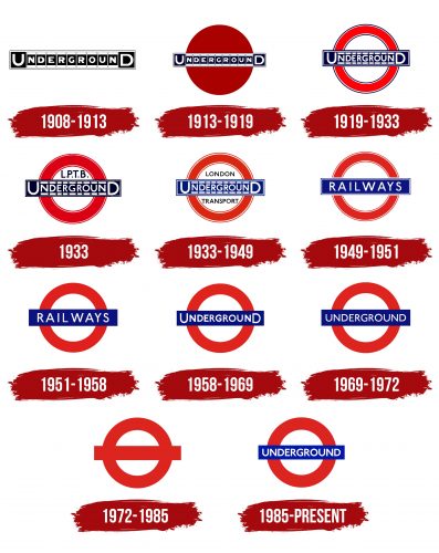
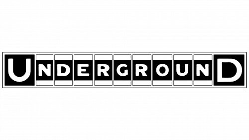
1908 – 1913
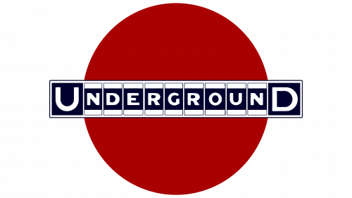
1913 – 1919
1919 – 1933
1933
1933 – 1949
1949 – 1951
1951 – 1958
1958 – 1969
1969 – 1972
1972 – 1985
1985 – today
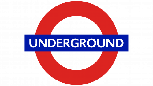
The logo of the metropolitan subway from Britain features its name in a business-like and precise manner. This design choice deliberately evokes the image of train cars securely linked together, traveling through the underground rails. Each letter is uniform, sans-serif, semi-bold, and white, ensuring the text stands out sharply against a deep blue-cobalt rectangle background.
Behind the text, a red circle subtly symbolizes the subway’s circular route, expanding from the center to the outskirts. This element adds a layer of meaning to the logo, representing the subway network’s reach and connectivity.
The contrast of the white letters against the blue background makes the logo visually striking, while the red circle adds depth and a touch of vibrancy. This thoughtful design captures the essence of the subway: efficient, reliable, and expansive. Using bold, clear typography reflects the subway’s commitment to straightforward and accessible service. Through this logo, the metropolitan subway presents itself as a vital part of urban life, connecting different parts of the city with precision and ease.
