


 Los Angeles Football Club Logo PNG
The Los Angeles Football Club logo looks simple and stylish. The wing motif evokes the city’s freedom and energy, while the color palette gives the emblem strength that reflects both Los Angeles and its team.
Los Angeles FC is a professional soccer club competing in Major League Soccer’s Western Conference. Its journey began on October 20, 2014, when MLS disbanded Chivas USA and granted a new expansion team to Los Angeles.
The team joined the League on the condition that a new stadium be constructed, with completion planned for 2017. However, unforeseen circumstances delayed the opening of the soccer-designed Banc of California Stadium by a year, pushing the club’s MLS debut to 2018. Investors paid MLS an $110 million entrance fee.
Until September 15, 2015, the team used the name “Los Angeles FC” temporarily. After consulting with fans, the team’s principal owner, Henry Nguyen, announced that the official name would be Los Angeles Football Club. The club unveiled its colors and logo on January 7, 2016. The official color scheme includes black and gold, with red and gray as accent colors. The LAFC logo also uses these colors. According to the LAFC concept, gold symbolizes success, glamour, and Los Angeles’s urbanism, while black represents strength and triumph.
A group of 26 investors owns the franchise. Peter Guber, Tom Penn, Henry Nguyen, Ruben Gnanalingam, Vincent Tan, Brandon Beck, Larry Berg, and Bennett Rosenthal own the majority of the shares.
Meaning and History
Matthew Wolff, Tue Nguyen, and Spark International co-founder Tai Nguyen designed the original LAFC logo. Their task was to create an identity that would distinguish the franchise in Major League Soccer from Los Angeles’ existing sports market. They presented the logo on January 7, 2016, at Union Station. The team has used this logo since its inaugural game.
What is the Los Angeles Football Club?
It is a young soccer team from Los Angeles, California, bringing together professional-level players. It’s part of MLS and represents the Western Conference. The club was established in 2014 and began playing in 2018 as an expansion franchise. The club’s home arena is BMO Stadium in Exposition Park.
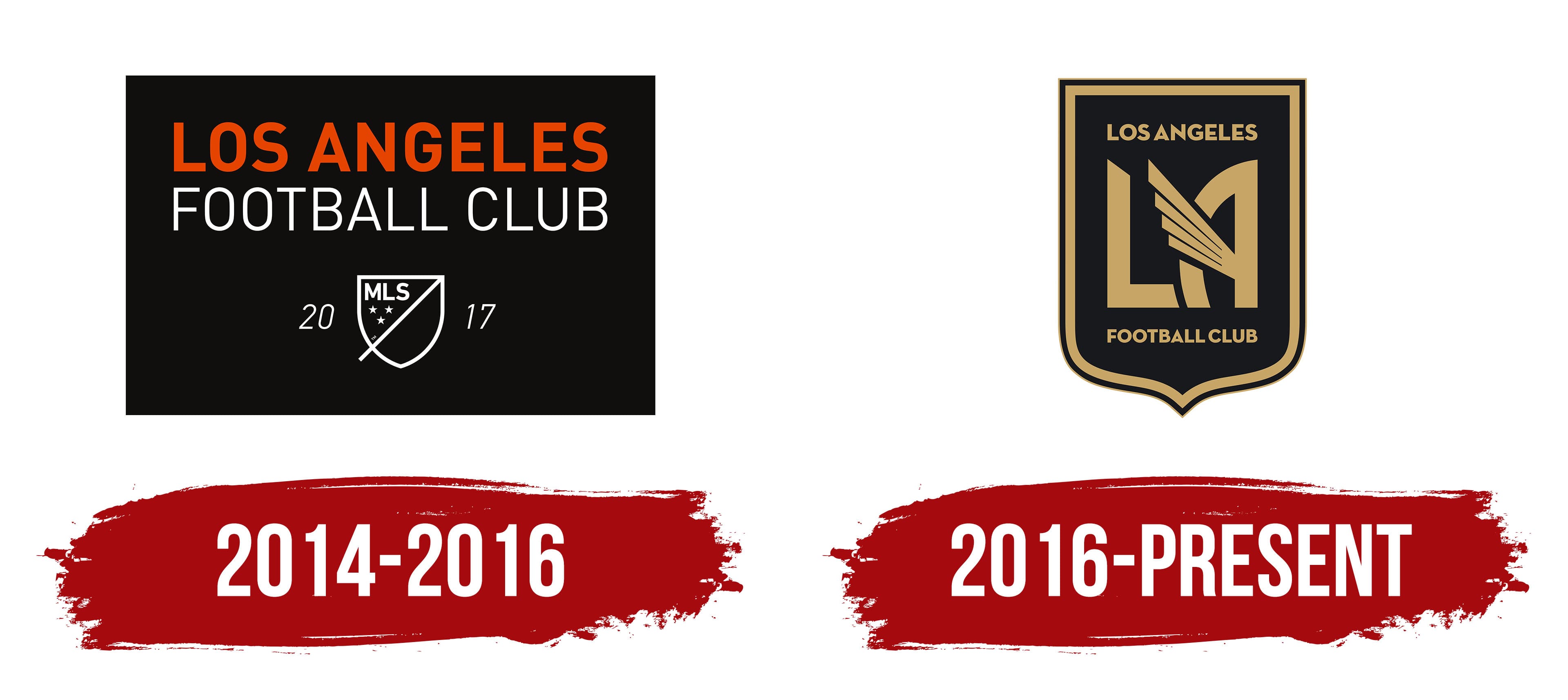
2014 – 2016

Los Angeles FC began its history with an emblem that emphasized its connection to Major League Soccer. It was a horizontal rectangular design.
On top of the black rectangle, the first line features the city name set in a clean orange typeface. The font resembles classic Helvetica or DIN. The second line, FOOTBALL CLUB, is set in a thin white typeface and subtly complements the main name.
At the bottom is a white outline of the official MLS logo. A diagonal line divides it. The upper left half of the shield contains the abbreviation MLS and three five-pointed stars. The lower right half is empty.
The numbers 20 and 17 flank the shield, marking the team’s league debut. The numbers are white and italic.
2016 – today

The current Los Angeles FC logo reflects the city’s urban identity and its connection to the region. The club emblem is a heraldic shield, inspired by the coat of arms of Los Angeles. The top line of the shield is straight, while the lower part tapers smoothly.
The shield outline is finished with a double gold border. In the inner field, in the upper segment, the city name is placed. The inscription LOS ANGELES is set in a strict sans-serif typeface. The letters match the outline’s tone, creating a unified style.
At the center is the LA monogram. The letter L is bold and concise. Next to it is the letter A with an unusual construction. The right vertical stroke is straight, while the left line forms a soft arc. The crossbar is interpreted as a wing. The wing shape is built from four slanted lines that extend beyond the letter’s outline. The wing motif is linked to Los Angeles’s nickname, the City of Angels. The image also references ancient Aztec culture and the metropolis’s Mexican heritage.
Below the monogram is the inscription FOOTBALL CLUB. The typeface and color repeat the upper text, but in a smaller size to maintain visual hierarchy.
All lettering uses the Neutraface typeface, developed from Richard Neutra’s architectural legacy and Art Deco-era signage. The black-and-gold color pairing creates a restrained, prestigious look.
Font and Colors
Los Angeles FC boasts a memorable, symbolic emblem that hints at the city’s unique cultural and historical heritage. It also references the emblem of the Los Angeles Aztecs, a North American Soccer League team that played from 1974 to 1981 and was disbanded shortly before the league folded.
The graphic mark consists of the abbreviation “LA.” The letter “A” appears poised to take flight: its horizontal stroke is replaced with a large wing with four feathers of varying lengths. The wing extends far beyond the letter and almost reaches the top of “L.”
All inscriptions, except for the abbreviation, are set in the geometric sans-serif Neutraface font, developed in 2002 by typographer Christian Schwartz for digital font manufacturer House Industries. It’s based on the signage of modernist architect Richard Joseph Neutra and was created with his son’s involvement.
The palette includes only two colors: black (#000000) and gold (also known as California Gold, #C39E6D). This was done deliberately to ensure the inscriptions stand out brightly against the dark shield.