The Lucky Me logo represents the brand’s status as a top instant noodle brand in the Philippines. Launched by Monde Nissin in 1989, Lucky Me became a household name for quick, affordable, and tasty meals suited for busy lives. The emblem signifies the brand’s dedication to convenience and flavor, showcasing its innovation in offering a variety of flavors tailored to Filipino tastes. The logo projects reliability and familiarity, appealing to consumers who rely on Lucky Me for satisfying and comforting meals.
Lucky Me: Brand overview
In 1979, Betty Ang founded the Monde Nissin Corporation in Quezon City, Philippines. She aimed to offer high-quality yet affordable and easy-to-prepare food for Filipinos. This vision gave rise to “Lucky Me!,” which quickly became a favorite brand.
Ten years later, in 1989, “Lucky Me!” launched Instant Mami noodles. These noodles were a hit because they were affordable, tasty, and quick to prepare, perfectly fitting the busy lifestyle of many Filipinos.
Throughout the 1990s, “Lucky Me!” expanded its range by introducing new flavors like Beef, Chicken, and Pork Mami. These additions helped the brand grow and cemented its place in many Filipino homes.
Entering the 2000s, “Lucky Me!” didn’t slow down. It introduced new products like Lucky Me! Supreme and Lucky Me! GO Cup, meeting the evolving tastes of its customers. The brand also started to gain popularity in other Southeast Asian countries thanks to its commitment to flavor, quality, and affordability.
In the 2010s, “Lucky Me!” faced more competition. In response, the brand focused on the quality and authenticity of its flavors. Collaborations with celebrities and influencers also helped “Lucky Me!” maintain its appeal, especially among younger people.
In 2016, the “Family Meals Matter” campaign highlighted the importance of family meals, reinforcing Lucky Me! ‘s role in Filipino dining culture. This became even more significant during the COVID-19 pandemic, as family meals provided comfort and a sense of togetherness.
Today, “Lucky Me!” remains a leader in the Philippines’ instant noodle market, offering various flavors to cater to different tastes.
Meaning and History
What is Lucky Me?
Lucky Me has become a leading brand in the Philippine instant food market, known for its wide range of instant noodles and quick meal options. The brand is celebrated for its diverse flavor selection catering to traditional Filipino tastes and international preferences. Local favorites like Sisig and Adobo offer a convenient taste of Filipino cuisine, while international flavors such as Tom Yum and Spicy Seafood expand their appeal globally.
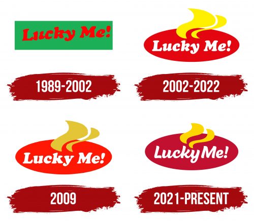
1989 – 2002
From 1989 to 2002, the “Lucky Me” brand used a green rectangle for its logo, which was different from typical noodle packaging. The brand name was written in red inside this rectangle. This combination was striking and easy to remember. Green stands for nature, growth, and luck. Red represents energy and passion. These colors strongly represented the brand’s message and promised a unique taste and positive feelings.
The name “Lucky Me” suggests that choosing this product can make someone feel fortunate. The logo was designed to be optimistic and encouraging, pushing people to try the noodles with the hope of bringing joy and luck. The logo’s slight tilt added movement and made the overall feel more dynamic and engaging—this design aimed to create a feeling of ease and confidence in the future.
2002 – 2022
In 2002, “Lucky Me” updated its brand, introducing a new logo highlighting the product’s delicious and aromatic features. The new design featured a red oval that resembled a plate with tasty food, universally symbolizing nourishment and warmth, which made people want to try the dish. The yellow streaks, representing steam from hot food, made the logo more dynamic and enticing as it suggested fresh and ready food.
The logo’s red and yellow colors were chosen for their strong associations: red for luck and rich flavors and yellow for the color of noodles and broth, enhancing the logo’s appeal and intuitiveness. These colors aimed to represent delicious, popular instant noodles that offer satisfaction and genuine pleasure with each meal.
A white inscription against the red background highlighted the brand’s ongoing innovation and commitment to adding new flavors, ensuring that “Lucky Me” kept its position in the market and continuously offered new culinary experiences to consumers.
2009
For its 20th anniversary, “Lucky Me” released a special version of its logo to celebrate and showcase key elements of its history and philosophy. The logo was redesigned in a bright red color to represent the brand’s energy, passion, and confidence, underscoring its ongoing growth and readiness for future challenges.
The logo featured gold accents in yellow steam streaks, traditionally representing hot and aromatic food. This time, gold added elegance and sparkle, symbolizing the brand’s prosperity, achievements, and high quality. These features emphasized “Lucky Me’s” commitment to innovation and leadership in the fast-food industry as it anticipates future successes.
2021 – today
Lucky Me is written in curved letters that mimic the brand’s main product, noodles. The designers used a handwriting style font to achieve this effect and connected some glyphs. The exclamation mark at the end of the line serves as an expression of delight. The words are arranged inside a red oval and are accompanied by two wide, wavy yellow stripes. These wavy shapes are associated with pasta and the hot steam from freshly cooked food.
The choice of a red oval is likely meant to attract attention and evoke a sense of passion or appetite, which is appropriate for a food brand. The wavy yellow stripes symbolize the product and make the logo dynamic, bringing thoughts of movement and vitality.
Font and Colors
The “Lucky Me!” logo features a playful, script-like font reminiscent of styles such as Malvie Regular or Beach Bar Bold, with unique design elements to create a distinctive image. The font is bold and smooth, conveying a sense of easy-going friendliness and approachability, perfectly suiting a brand that aims to evoke positive emotions and a sense of personal connection.
The font is in uppercase to enhance readability while maintaining a stylistic flair. Its size fits well within the logo’s oval shape, making the brand name immediately eye-catching.
The logo’s colors—rich red for the oval background and bright yellow for a flame design, combined with white text—create a strong visual contrast. The red background expresses energy and passion, the yellow adds excitement and creativity, and the white text stands out clearly for easy reading.
A distinctive ‘L’ and an exclamation mark in “Lucky Me!” add character to the logo, making it more memorable. Using an exclamation mark emphasizes the brand’s enthusiasm and fun nature.
The lively font style and warm color palette make the Lucky Me logo appealing and easily recognizable, aligning with the brand’s identity of providing enjoyable and comforting food products.
FAQ
Is Lucky Me a Philippine brand?
Lucky Me! is a famous noodle brand from the Philippines, created by Betty Ang in 1979. The brand is a key player in the Monde Nissin Corporation’s portfolio. It has grown significantly and sells products in the Philippines and other countries.
The brand was introduced in 1989 to enter the instant noodle market. It quickly became loved for its affordability, ease of preparation, and delicious taste. “Lucky Me!” provides a variety of flavors and types, including noodle soup, stir-fry noodles, and dry noodle meals, making it popular in many Filipino households.
Despite increasing competition, “Lucky Me!” remains a leader in the noodle market. Monde Nissin focuses on quality and explores new food categories, always keeping an eye on consumer preferences. Lucky Me! has evolved from a single product to an essential element of Filipino food culture.
Where is Monde Nissin from?
Monde Nissin Corporation started in the Philippines over 35 years ago and has become a big name in the food industry. The company focuses on making tasty, high-quality food and always looks for new ways to improve.
Today, people in over 45 countries enjoy Monde Nissin’s products. This shows they can make food that people worldwide like while still keeping their Philippine culture. They make a range of foods like instant noodles, biscuits, and plant-based meat products. Their “Lucky Me!” instant noodles are especially loved for their comforting taste. Being from the Philippines is a big part of who they are. This influences everything they do, from creating new products to expanding into new markets.
What is the tagline of Lucky Me?
Lucky Me! is a well-known instant noodle brand from the Philippines, created by Monde Nissin. The slogan “Lucky Me! Happy We!” is significant. It reflects the brand’s dedication to pleasing its customers through its products. The slogan suggests that enjoying “Lucky Me!” noodles goes beyond eating something that tastes good and is easy to prepare. It’s about the joy of sharing these meals with family and friends. Its slogan, “Lucky Me!” aims to foster moments that bring people closer together, promoting unity and happiness among noodle lovers.
Is Lucky Me and Nissin the same?
Lucky Me! is produced by Monde Nissin Corporation in the Philippines and is very popular there. It offers a wide variety of flavors and noodle types. The brand is about the joy of sharing meals, with the motto, “Lucky Me! Happy We!” On the other hand, Nissin Foods, originating in Japan, is known for introducing the first instant noodles and for its famous products like Cup Noodles and Top Ramen.
Even though Lucky Me! is a separate brand under Monde Nissin, it sometimes handles Nissin products, too. This is why, especially in the Philippines, people might see both brands coming from the same company due to certain business agreements to distribute or manufacture Nissin items.
What is Lucky Me’s production process?
Making “Lucky Me!” instant noodles is a straightforward process with eight steps. Here’s a simpler explanation:
- Mixing Dough: We combine flour, water, and other ingredients to form a dough. This step is crucial because it determines the noodles’ texture and flavor. We mix everything until the dough is perfect.
- Flattening Dough: We then roll the dough to make it thin, adjusting the thickness for different noodles. This ensures we achieve the ideal thickness for our noodles.
- Making Noodles: The flat dough is cut into noodles. We control the rollers’ speed to create the noodles’ unique curly shape, ensuring they have the correct shape and size.
- Steaming: Next, the noodles are steamed. This pre-cooks them slightly, preparing them for a quick meal at home. Steaming is crucial for the right taste and texture.
- Cutting Noodles: After steaming, the noodles are cut to the length that fits our packets. The cut is adjusted to match the packet size and ensure each packet has the right amount of noodles.
- Frying: The noodles are then fried in high-quality oil. This step removes moisture, extending their shelf life and enhancing their texture and flavor. It also allows for quick cooking.
- Cooling: Once fried, the noodles need to cool. We spread them out to cool down and let any excess oil drip off, preparing them for packaging.
- Adding Flavor and Packing: Finally, we add seasonings for flavor and package the noodles with seasoning packets. Machines handle this part to keep the noodles fresh and delicious.
We focus on every detail throughout the process to ensure the final product meets high-quality standards. From the initial ingredient mix to the final packaging, we aim to maintain quality control so that every packet of “Lucky Me!” noodles delivers taste and quality.
