 Macmillan Cancer Support Logo PNG
An expression of care and comprehensive support for the most vulnerable patients is what the Macmillan Cancer Support logo reflects. It is kind and sweet, like the atmosphere that the organization’s staff creates for troubled patients. The logo conveys an atmosphere of kindness, warmth, and hope.
Macmillan Cancer Support: Brand overview
| Founded: | 1911 |
| Founder: | Douglas Macmillan |
| Headquarters: | London, United Kingdom |
| Website: | macmillan.org.uk |
Meaning and History
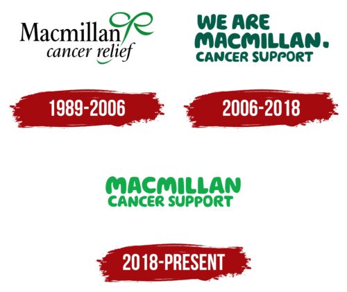
The visual recognition of the company logo is high among scientists and cancer patients in the UK. The first known variant was introduced in 1989, but the organization has used emblems before.
What is Macmillan Cancer Support?
This is a charitable organization dedicated to research in the field of cancer treatment, as well as support for patients suffering from this disease. It has over a century of history.
1989 – 2006
The original version of the logo was introduced in 1989. It consisted of a verbal inscription and a stylized emblem on the right. The name of the organization was made in two lines. On the first was the word “Macmillan.” It was done in a classic serif typeface. All letters, except for the initial, are in lowercase. On the bottom line was the inscription “cancer relief.” This inscription was much smaller and used serif cursive. It was much smaller than the first line.
If we talk about the emblem, the green letters “cr” is in the first line’s upper right corner. They are made in green. All the lines in the “r” are elongated, and then they catch the main inscription.
2006 – 2018
At this stage, the entire inscription was presented in dark green, and now it was located on three levels, and the emblem was completely removed. The first line was occupied by the words “WE ARE,” the second “MACMILLAN.”, and the third “CANCER SUPPORT.” All of them are written in the same font. This is a classic bold sans-serif typeface with thick and straight lines rounded at the corners. The last two words are smaller in size, making it possible to focus on the founder’s surname.
2018 – today
Starting in 2018, the word “WE” was removed from the logo. This allowed us to make it more concise and minimalistic. Now the inscription was located in two lines. On the top, “MACMILLAN,” and on the bottom, “CANCER SUPPORT.” The font is identical to the previous version, as is the slight difference in the size of the letters on each line. The color, in turn, was changed from dark green to light green.
Font and Colors
If the first version used a more classic font with serifs and thin lines in the letters, then in further redesigns, it was decided to change it to bold and more eccentric. Thus, a pleasant style in the inscriptions was supposed to evoke positive emotions in people suffering from one of our time’s worst ailments.
Throughout the development of the charity Macmillan Cancer Support, its logo has been haunted by various shades of green. The first and last versions use brighter tones, which are replaced by dark green in the 2006-2018 logo. This color has long been associated with life and hope; therefore, it is not surprising that it was customary to use the presented color palette.
Macmillan Cancer Support color codes
| Pigment Green | Hex color: | #11ab4b |
|---|---|---|
| RGB: | 17 171 75 | |
| CMYK: | 90 0 56 33 | |
| Pantone: | PMS 354 C |


