


![]() Make-A-Wish Logo PNG
Make-A-Wish Logo PNG
The Make-A-Wish logo conveys the organization’s noble purpose: to fulfill the dreams of critically ill children. It symbolizes the support of caring people, hope, happiness, and optimism. Simple images in the emblem allow the foundation to remain recognizable worldwide.
The idea for Make-A-Wish was inspired by the story of a terminally ill seven-year-old child who dreamed of becoming a police officer. Police officers gave him this opportunity: they took him on a helicopter ride, making him the only honorary Arizona Department of Public Safety officer. The boy received a custom-made police uniform as a gift, and he was buried in it, as he died from leukemia two days later. His mother, Linda Greicius, Scott Stahl, and Frank Shankwitz founded the Chris Greicius Make-A-Wish Memorial in early 1981. Following an NBC report, the Arizona DPS officers’ project became famous throughout America, and many people wanted to create something similar in their communities. To make this possible, in 1983, the local fund was transformed into the national Make-A-Wish organization.
In 1980, the Make-A-Wish Foundation was born from a compassionate deed in Arizona, where law enforcement officers made 7-year-old Chris Greicius’s dream come true. Chris, fighting leukemia, wished to be a policeman for a day. Moved by the impact of this experience on Chris and his family, the officers decided to create an organization to fulfill the wishes of children with serious health conditions.
Starting in Arizona, Make-A-Wish quickly grew, spreading its wings across the U.S. By 1990, it had over 70 chapters nationwide. The foundation didn’t stop there; by the mid-1990s, it had gone international, with branches in Canada, the UK, and more, and now operates in over 50 countries.
Throughout its 40 years, Make-A-Wish has granted over 500,000 wishes worldwide, from simple toy requests to unforgettable experiences like trips to Disneyland or celebrity meet-ups. The foundation collaborates with medical professionals and a dedicated team of volunteers to identify and fulfill the wishes of these children, bringing them hope and joy.
Studies have highlighted the positive effects of wish fulfillment on the well-being of seriously ill children, providing them with much-needed happiness in tough times. Supported by celebrities, businesses, and individuals, Make-A-Wish continues to expand its mission, touching more lives each year. It’s recognized globally as a beacon of hope, making a significant difference in the lives of children with serious illnesses and their families.
Meaning and History
![]()
Make-A-Wish volunteers, like true magicians, fulfill the requests of critically ill children. This noble mission is reflected in the organization’s identity, not directly, but through symbolic images. The small five-pointed star that appeared in the logo in the 1990s embodies dreams and hope. The initial version evoked a sense of magic, like the flying star above Disney’s fairy-tale castle. In 2018, the charity decided to adapt to the modern digital world and commissioned the company Rule29 to develop a new system of visual symbols. The designers created a more stringent and minimalist emblem while retaining key elements. It reflects the brand’s global nature and its commitment to serving people.
What is Make A Wish?
Make-A-Wish is an organization that fulfills the dreams of critically ill children and teenagers. These can be expensive gifts, visits to amusement parks, meetings with celebrities, and any other wishes that are medically permissible, not related to weapons, fishing, or hunting. The charitable foundation was established in the United States in 1983 and went international ten years later to fulfill the requests of dying children worldwide.
1980 – 2018
![]()
The Make-A-Wish logo emerged in the 1980s when the charitable foundation expanded internationally. Before that, the organization did not have a unified symbol. The main idea behind the design was to convey a sense of magic, hope, and wish fulfillment, aligning with the foundation’s mission.
The name is written in uppercase letters, with “M” and “W” emphasized. The letters have serifs, but their rounded edges appear softer. Instead of standard hyphens, diamond-shaped separators are used between the words, adding visual cohesion. A key element is the diagonal stroke of the letter “A,” which extends to the right and spirals upward. This curl seamlessly transitions into a star above the “W,” creating the illusion of a floating spark. The line is not solid but appears dashed, resembling a flash or a firework.
According to the designers, the stroke’s trajectory symbolizes upward movement, evoking light, children’s dreams, and hope.
The logo is recognizable among children because it combines text, a symbol, and a graphic element. In the original version, the font had a classic shape, but the rounded edges and connection to the spiral made the letters stand out.
Make-A-Wish explains that the star represents hope, while the spiral resembles a meteor streaking across the sky. The inspiration for the logo came from the joyful emotions of children whose wishes the foundation grants. The swirling line is drawn to make it look handmade, adding a sense of warmth and humanity.
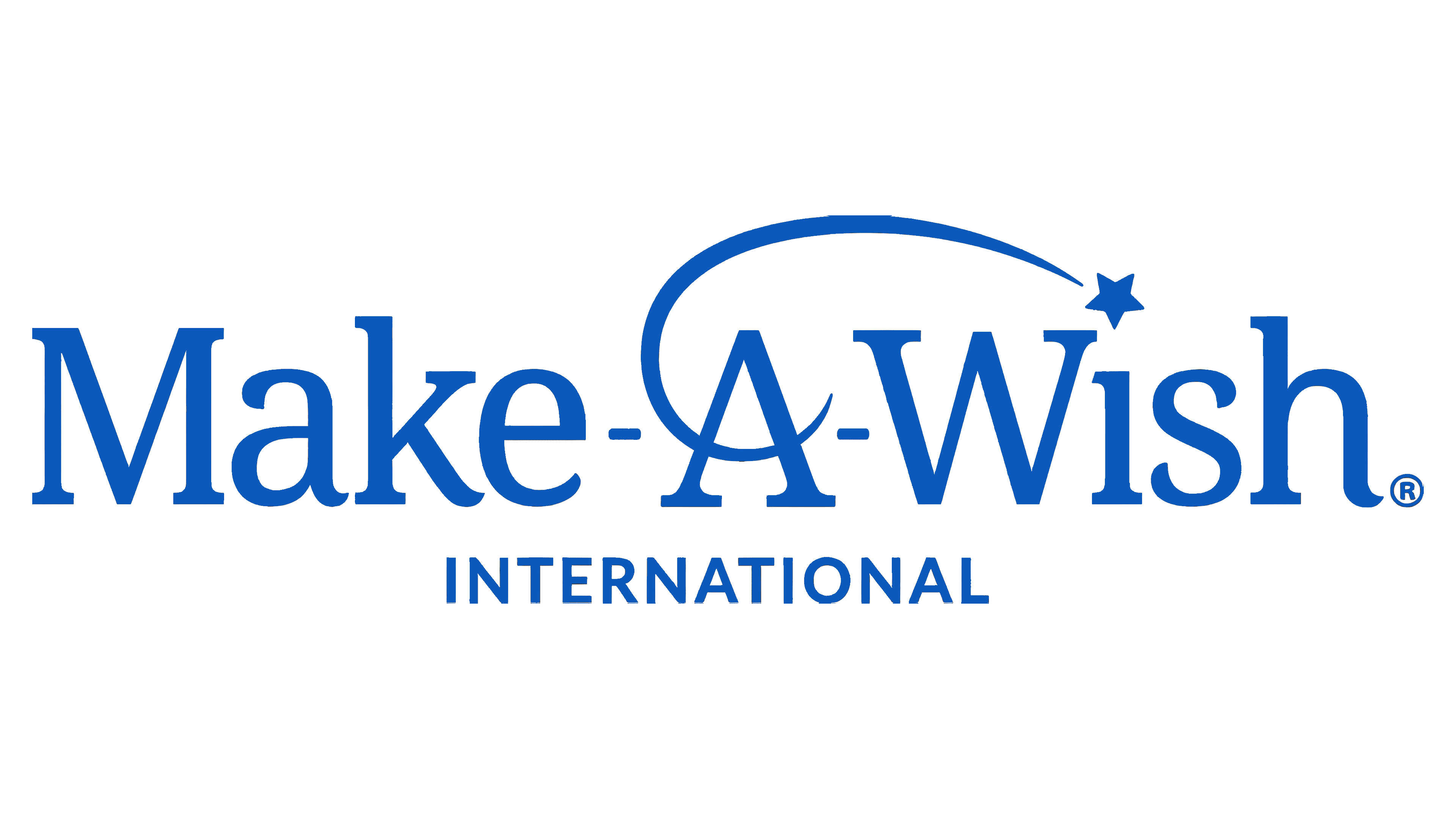
2018 – today
![]()
The organization turned to the creative agency Rule29 to update its logo and adapt it to modern trends. The designers retained the traditional structure but altered the details. The wordmark is still written in a serif font that conveys confidence and authority. However, most letters are lowercase and have soft curves at the ends.
The spiral has taken on a simpler form as the emblem’s authors reduced the number of twists. The line starts from the central “A,” then heads left and follows an ascending trajectory, not intersecting with the inscription. This arrangement freed up space under the words “Make-A-Wish” for the names of the foundation’s branches and departments.
The smooth end of the spiral points downwards, so the five-pointed star depicted next to it seems to be falling, not rising. This symbolizes that children can make any wish upon seeing a falling star, which will surely come true. It is frozen right where the dot over the “i” should be. The logo has won several awards, including the Indigo Design Awards and the Worldwide Logo Design Award.
Font and Colors
The Make-A-Wish Foundation logo beautifully combines design elements to reflect its mission of bringing joy to children facing critical illnesses. Central to its design is the choice of fonts Futura Std and Century Schoolbook. These fonts, with their smooth and rounded letters, echo the emblem’s falling star, adding elegance and subtly reinforcing the message of hope and the fulfillment of dreams.
The logo’s color, a specific shade of blue (#0057B8), plays a significant role in its identity. This blue conveys trust, stability, and depth, mirroring the foundation’s dedication to supporting children and their families during tough times.
Flexibility in the logo’s use, with allowable black or white versions, ensures it stands out in any setting, be it print, digital, or merchandise. This adaptability underscores the logo as a symbol of hope, continually reminding us of the foundation’s goal of making life-changing wishes come true.
The Make-A-Wish logo’s thoughtful combination of fonts and colors establishes a strong brand identity and enhances its message of hope and giving. The design effectively communicates the foundation’s commitment to helping children believe in the power of their dreams, touching hearts around the globe.
FAQ
What is the symbol of the Make-A-Wish Foundation?
The Make-A-Wish Foundation’s logo, marked by a swirl and a star, holds deep significance, symbolizing children’s joy and fulfillment when their wishes come true. The swirl represents the journey of hope and joy children embark on with their wish fulfillment, while the star captures the magical moment of a wish being granted, casting a glow of hope and positivity. This emblem also motivates volunteers and donors, reflecting the foundation’s aim to transform the lives of children with serious illnesses. It’s more than just a logo; it symbolizes hope and encouragement, rallying everyone to support a cause that brings joy to children in difficult situations. The logo’s design is a global emblem of the happiness and hope the foundation delivers.
What is the slogan for Make-A-Wish?
The Make-A-Wish Foundation’s slogan, “A wish begins with hope,” succinctly yet profoundly embodies the organization’s core mission. It underscores the importance of hope in fulfilling wishes, suggesting that the first step towards realizing a child’s dream is to believe in the possibility of better outcomes, even amid critical illness. This philosophy is rooted in the idea that instilling hope in children with serious health challenges can lead to transformative experiences that benefit not just the kids but also their families, volunteers, and the broader community engaged in wish fulfillment. The slogan serves as a reminder of the foundation’s dedication to providing not only moments of happiness but also lasting encouragement for children to confront their illnesses with optimism and strength.
What font is the Make-A-Wish Foundation logo?
The Make-A-Wish Foundation’s logo features fonts from the Futura Std and Century Schoolbook families, chosen for their clear and adaptable design. This ensures the logo is easily read and effective in various settings, even against detailed photographic backgrounds. The goal is to place the logo where it stands out clearly. Futura Std’s geometric clarity, combined with Century Schoolbook’s classic readability, mirrors the foundation’s modern yet timeless nature. These font choices help communicate the foundation’s message broadly and effectively, emphasizing the critical role of hope and the life-changing impact of granting a wish.