The March Madness logo, used by the television broadcast, fully aligns with the emblem of the NCAA Division I men’s basketball tournament – an annual elimination tournament to determine the best team. They share the same concept, expressed in traditional elements, and a deep idea conveyed in a classic design.
March Madness: Brand overview
Meaning and History
The project started with the risk of leading U.S. television studios to lose rights to broadcast men’s basketball tournaments. ESPN tried to outpace everyone to become the sole media owner for future game broadcasts. However, the NCAA renegotiated its contract with CBS and Turner Sports (later, this division transitioned to Warner Bros. Discovery, as its parent studio WarnerMedia was acquired). This initiated the era of two March Madness brands with the same name and identical emblems – sports and television. This way, they demonstrate their close interconnection.
What is March Madness?
March Madness is a television broadcast that has been in existence since 2011, airing matches held in the NCAA Division I men’s basketball tournaments. It covers everything happening on the sports field, being the sole officially permitted media. The competitions are conducted with the support of CBS Sports and Warner Bros. Discovery Sports and broadcast in the USA on channels like truTV, TBS, TNT, and CBS.
2011 – 2014
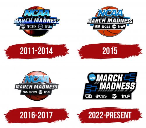
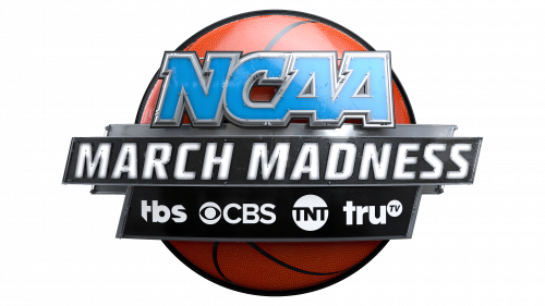
The key element of the logo is a basketball. It “holds” all other details, acting as a thematic background. The gradient is distributed such that the ball’s top side is light, and the bottom is dark. In the foreground are inscriptions divided into three lines. The first is reserved for the single word “NCAA.” It’s slanted, continuous, extra bold, and provided with serifs veering left. All letters are colored blue and framed in silver. The second line is the longest, containing the brand name – “March Madness.” This part is executed in bold grotesque with white-blue glyphs. In the bottom row, on a black rectangle, are the logos of channels broadcasting the basketball tournaments: TBS, CBS, TNT, and truTV.
2015
The old structure of the March Madness logo is completely preserved, but the style has become simpler for easier viewing on screens of different devices. The gradient and color depth are things of the past. Now, precise and uniform colors reign, without shade changes: yellow, light blue, black, gray, and white.
2016 – 2017
The designers changed the yellow color to brick red and added a gradient that creates a bright reflection on the basketball. They also toned down the color intensity of the black background with inscriptions, resulting in a muted black color with a pastel shade. The top line again looks three-dimensional due to the glare on the last two letters in “NCAA.” The gray shadows in the middle row moved from the outer side of the glyphs to the inside, meaning they previously formed half-frames but now look like dust at the edge of the signs. The emblem also featured black and silver dots and a chrome plaque behind the phrase “March Madness.”
2018 – today
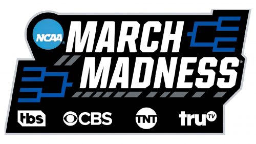
The redesign of the March Madness logo resulted in a complete change of the familiar format. Almost all traditional elements disappeared from the emblem, and the remaining ones were relocated. For example, the name of the sports broadcast occupies not one but two lines. The inscription is now maximally large, bold, and chopped. A slight right slant is retained. The word “NCAA” was recolored to white and reduced, placed in a small blue circle at the top left. The background became entirely black. The channel logos also changed.
2022 – today
This version of the logo almost entirely corresponds to the previous one, except for two minor details: the colors and the shape of the catches. The background geometric shape turned coal-black and received a previously trimmed corner at the bottom right. Designers added volume to the inscription using gray parallelograms that form short shadows under the letters.
Font and Colors
The inscription in the March Madness logo is done in a custom font developed by Joe Bosack & Co. specifically for the NCAA. It’s called NCAA Legacy. Its geometric letters with numerous cut corners look strict yet dynamic. The closest substitutes are considered to be the Garamond and Arial Black typefaces.
The color palette of the television broadcast emblem is restrained, as it does not contain loud tones, even if red is present. It, by the way, is closer to a brick shade. There are also yellow and blue in light and dark variants, white, gray, and black.
