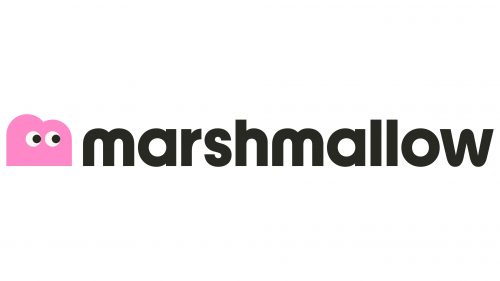
The Marshmallow logo stands out for its vibrant hues and a whimsical character resembling a cloud with eyes. The insurance company aimed to differentiate itself from competitors by attracting a diverse audience. The caricature radiates warmth and kindness, while the unique font, especially the rounded “w,” exudes accessibility and openness.
The playful character in the emblem symbolizes an unconventional approach to business, reflecting the company’s willingness to work with clients who defy norms. The character acts as a mascot, representing the company’s core values of empathy, warmth, and customer-centricity. The cloud-like form signifies flexibility and adaptability associated with insurance products tailored to individual needs.
With the cloud figure taking center stage, the logo connects easily with a younger and more dynamic demographic. Clouds are associated with dreams, creativity, and unlimited possibilities. This image portrays the company as a dream enabler, helping customers achieve their goals by providing insurance solutions that are as flexible and versatile as a cloud. It is a testament to the company’s commitment to innovation and receptivity to unconventional ideas.
Marshmallow has gone the extra mile by choosing a unique and rounded font, breaking from rigid and traditional corporate scripts. The rounded “w” in the logo enhances the notion of accessibility, making the company appear more inviting and less intimidating. It reiterates the welcoming nature of the brand, which prides itself on serving a diverse clientele.
The choice of colors further emphasizes the company’s aspirations. Vibrant hues capture attention, yet they are soft enough to convey the warmth and kindness the mascot embodies. The colors highlight the company’s enthusiasm and positive energy, aligning well with the target audience’s expectations for a service that’s as cheerful as it is reliable.
The emblem captures the essence of an insurance provider unafraid to challenge conventional norms to serve an audience as diverse and dynamic as its colorful and unique logo. It distinguishes the brand in a competitive market and resonates with a target audience that values authenticity, warmth, and a hint of playful creativity.
Marshmallow: Brand overview
| Founded: | 2017 |
| Founder: | Alexander Kent-Braham, David Goate, Oliver Kent-Braham |
| Headquarters: | UK |
| Website: | www.marshmallow.com |
Established in 2017 by Alexander Kent-Braham, David Goate, and Oliver Kent-Braham, Marshmallow originated as a UK insurance firm with a mission to rectify the inequities in car insurance pricing. The trio identified a significant gap in the market: traditional insurance firms in the UK often failed to accurately assess the risk for newcomers to the country, which resulted in inflated premiums.
With a focus on employing technology to evaluate risk more precisely, Marshmallow aimed to offer car insurance that was both affordable and inclusive. The outcome was promising; the company succeeded in presenting quotes that were, on average, 45% less expensive than those for drivers without a prior history.
The growth trajectory for Marshmallow has been steep. The company has sold more than 342,000 policies and has had its application downloaded over 300,000 times. The firm has also disbursed an impressive £66 million in insurance claims.
Marshmallow achieved a notable milestone in 2021 by earning the title of the second-fastest growing firm in Europe, as reported by the Financial Times. With a steadfast commitment to advancing its technological capabilities, the company keeps broadening its insurance products to enhance accessibility and cost-effectiveness.

