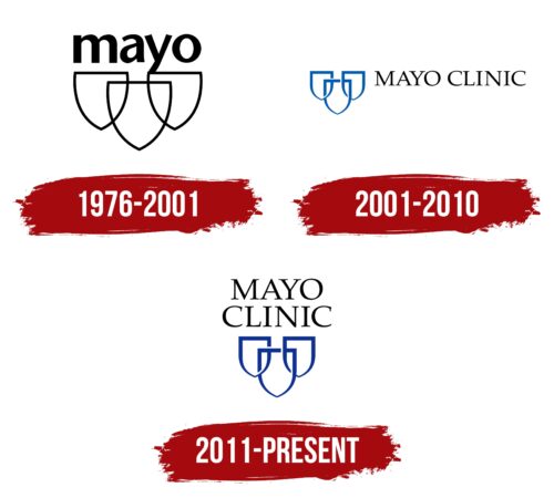
The Mayo Clinic logo is based on the organization’s three values: education, research, and patient care. These priorities are reflected in the triple-shield emblem, which has evolved significantly in recent years.
Mayo Clinic: Brand overview
| Founded: | January 27, 1864 |
| Founder: | William Worrall Mayo |
| Headquarters: | Rochester, Minnesota, U.S. |
| Website: | mayoclinic.org |
Mayo Clinic advances medical discovery, develops educational programs, and provides healthcare services. It has three main campuses and an extensive network of dozens of laboratories, hospitals, and other organizations. The main principle of the company’s work is a team approach, which allows it to remain first in the annual ranking of US News & World Report, and in several specialties at once.
Now Mayo Clinic is one of the largest medical complexes in the world, and patients from different countries highly trust its brand. And initially, the company did not rely on marketing. It was named after William Worrall Mayo, who, in 1864, went into private medical practice. Then he formed a partnership with specialized doctors so that their skills were complementary. A little later, they undertook to train new specialists, improve their skills and share their experience with them.
Meaning and History
The organization was officially named the Mayo Clinic in 1914. Physicians still lead it, and all decisions are jointly made by committees representing research, education, and practice. These three areas of work formed the basis of the logo, which depicts three shields connected to each other. Each of them symbolizes one of the key principles of the conglomerate.
What is Mayo Clinic?
Mayo Clinic is a conglomerate of medical and educational institutions. It has its research staff, its own Mayo Clinic College of Medicine, and a network of hospitals where doctors provide comprehensive patient care. All this allows you to integrate promising discoveries into medical practice instantly.
1976 – 2001
The logo of that time featured three white heraldic shields with black outlines. They intersect with each other like the Olympic rings. At the same time, the dark contours of all three shields were visible. The word “mayo” was written in black lowercase letters at the top. The bold sans-serif looked austere, but it was playful because of the asymmetry of the letters—particularly the ‘y’, whose diagonals were cut at different angles.
2001 – 2010
In 2001, the outlines of the shields changed to blue. At the same time, they were wide at the top and gradually narrowed towards the bottom. Blank gaps appeared where the lines intersected, making the shields look like links in a chain. The inscription moved to the right side and was supplemented with the word “CLINIC.” A capital contrast font with thin serifs was used for the organization’s name.
2011 – today
After the redesign, the composition of the three shields was at the bottom. The phrase “MAYO CLINIC” has been moved to the top and split into two lines centered. At the same time, the font and colors of the logo remained practically unchanged. The shields, as before, symbolize the protection provided by the conglomerate of medical facilities. On the one hand, it is caring for the sick. On the other hand, a responsible attitude to scientific research and the training of doctors.
Font and Colors
The first shield represents clinical practice, that is, the direct treatment of patients. The second is a symbol of education because Mayo Clinic has its educational institution. The third shield represents the research being done to improve medical techniques. But the logo adopted on the 150th anniversary of the organization looked completely different. It looked like a black postage stamp with a beige border. Inside was the inscription “MAYO CLINIC 150 YEARS SERVING HUMANITY”. The number was increased; zero contained a fragment of a globe depicting North America.
TeX Gyre Pagella Regular by GUST e-foundry, Nazanin Light by Linotype, and Mv Jadheedh Regular by Ibrahim Jadheedh Ahmed are roughly similar to Mayo Clinic. These are all typefaces with long thin serifs and contrasting stroke thicknesses. Used colors: black for the inscription and blue for the outlines of the shields. But on the buildings, you can also find a completely black logo.
Mayo Clinic color codes
| Black | Hex color: | #000000 |
|---|---|---|
| RGB: | 0 0 0 | |
| CMYK: | 0 0 0 100 | |
| Pantone: | PMS Process Black C |
| Dark Powder Blue | Hex color: | #0d3293 |
|---|---|---|
| RGB: | 13 50 147 | |
| CMYK: | 91 66 0 42 | |
| Pantone: | PMS 286 C |


