![]() Medaille College Logo PNG
Medaille College Logo PNG
The Medaille College logo is a branding element that helps the educational institution remain recognizable. It reflects the corporate colors and the institution’s name. This approach to identity has not changed after obtaining university status.
Médaille College began in 1875, when the Sisters of Saint Joseph opened a teacher-training institution in Buffalo, New York. Its first role was narrow and religious: it prepared nuns and other women connected with church service for work in Catholic schools. Secular students were not admitted.
In 1937, the New York State Board of Regents granted a charter allowing the institution to award bachelor’s degrees in education. It became Mount Saint Joseph Teachers’ College. In 1964, as the programs expanded beyond teacher training, the name was changed to Mount Saint Joseph College. In 1968, under Sister Alice Huber, the charter was revised again, creating Médaille College as a nonsectarian, coeducational institution with an independent board of trustees. The name referred to Jean-Pierre Médaille, the 17th-century Jesuit linked to the founding of the Sisters of Saint Joseph.
During the 1970s, Médaille expanded its programs and built Downey Hall for the sciences. In the 1980s and 1990s, it added evening and part-time study for working adults. Campus housing began in 1991, followed by the Kevin I. Sullivan Campus Center in 1994 and residence halls in 2001 and 2003. The Mavericks competed in NCAA Division III, with the men’s soccer team winning conference titles from 2005 to 2010.
On May 17, 2022, Médaille became Médaille University. Financial pressure soon overtook the new status: enrollment fell from about 2,600 students in 2012 to around 1,600 by 2022. A planned merger with Trocaire College failed in May 2023. The final commencement was held on May 5, operations ended on August 31, 2023, and Niagara University took over academic records for more than 20,000 alumni.
Meaning and History
![]()
Medaille College was officially founded in 1968, though some sources list its founding date as 1937. This educational institution attracts students from across the state, for which purpose the Kevin I. Sullivan Campus Center, designed for study and recreation, was opened in the mid-1990s. The Mavericks sports teams are also based there. After the university concept was expanded, Medaille College met its standards. Therefore, the Board of Trustees upgraded the institution’s status and amended the charter appropriately. The changes were approved on May 17, and Medaille University was created.
What is Medaille College?
Medaille College is the third college in Buffalo, New York, to gain university status. This happened on May 17, 2022, when the New York State Education Department Board of Regents officially approved the amendment to the institution’s charter. Since then, it has been called Medaille University, in recognition of its rich history and expanded higher education programs.
before 2006
![]()
The left part of the logo depicts the educational institution’s seal. It contains several concentric circles, in the center of which are interwoven letters Alpha and Omega from the Greek alphabet. This is one of the most common Christian symbols, representing God as the beginning and the end. Its use is related to the Roman Catholic community; the Sisters of St. Joseph founded Medaille. In the middle ring, the words “ΣΟΦΙΑ” (above), “1937” (below), and laurel branches (on the sides) are located. The outer frame contains the phrases “MEDAILLE COLLEGE” and “BUFFALO, NEW YORK.”
To the right of the seal, the educational institution’s name is duplicated. Its font resembles FretQwik Regular by Robert Allgeyer, MV Boli Regular by NAADHu Maldives, or Thor Regular by GemFonts. The letters have thin gray shadows, barely noticeable on the blue background. All inscriptions and images are white, and the logo’s base is dark.
2006 – 2010
![]()
The official colors of the Medaille College logo are blue, gold, and dark blue. They are presented as three elongated pentagons arranged in a single row. The geometric shapes are connected, each outlined in dark blue. To the right is the name of the educational institution, executed in a thin font with serifs of varying shapes and lengths.
2010 – 2022
![]()
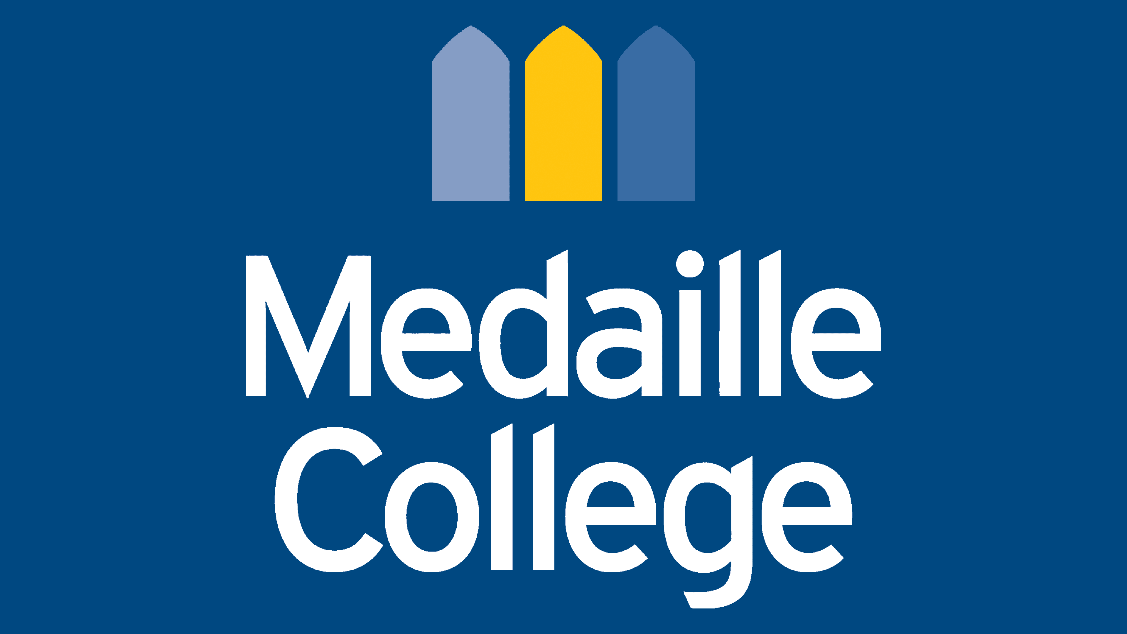
Before renaming, Medaille College used a logo with its former name. In addition, it was represented by a symbol featuring three figures, painted in the official college colors: blue, gold, and dark blue. After the institution’s status was raised, a rebranding was carried out, and the wordmark contained the inscription “MEDAILLE UNIVERSITY.”
As for the Medaille College logo, it included the old name, which was valid until the charter amendments were made. It was written in a bold sans-serif font with vertically elongated glyphs. The protruding tops of “d,” “l,” and “g” were cut at the same angle. The free end of “e” was shortened, creating a visual disproportion. The phrase was centered at the bottom and spanned two lines. A dark turquoise color was used for it. Above it was a composition of three differently colored pentagons arranged in a single row.
The three-component sign of pentagons resembles a crown – a symbol of supremacy, glory, honor, victory, and power. It also looks like a fence, which, in turn, is associated with reliability, security, and order. On the other hand, the emblem’s elements resemble precious gem crystals – something that needs to be cut to take the perfect form. Similarly, students carefully polish their knowledge and skills.
2022 – today
![]()
Medaille College changed its name to Medaille University. As a result, the logo changed: the image remained the same, but the text now reflects the institution’s new educational level. The word “College” was replaced with “University,” reinforcing the updated status. The color scheme remained unchanged blue and yellow dominating the design.
Font and Colors

The font used in the Medaille College (now Medaille University) logo has much in common with Red Hat’s Overpass Regular and Overpass SemiBold. The color scheme includes three shades of blue (two transitioning to gray) and gold. This combination makes the institution’s emblem noble and memorable.