Mega Millions: Brand overview
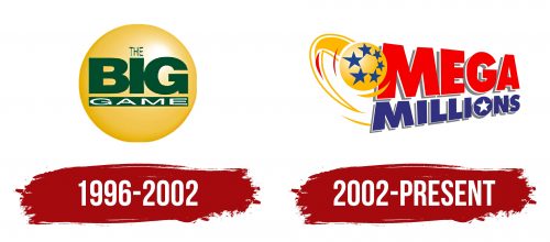
The Mega Millions lottery came into existence in 1996 under the name “The Big Game” and was introduced by six founding state lotteries with the goal of creating a multi-state lottery. A few years later, in 2002, the game underwent a change, taking the name “Mega Millions Big Game” and changing the jackpot structure. In 2010, the game further evolved and finally settled on its widely known name, “Mega Millions,” dropping the original “Big Game” and creating a single identity for all participating regions.
Mega Millions quickly gained momentum and expanded its reach, with 45 states eventually joining the game, as well as Washington, D.C., and the U.S. Virgin Islands. Drawings are held on Tuesdays and Fridays. In 2018, a jackpot of $1.537 billion was drawn in South Carolina. In addition, in January 2021, the game made the world’s media headlines by celebrating a whopping $1.586 billion jackpot win in the state of Michigan.
The Mega Millions lottery, run by the Multi-State Lottery Association, has not only been a beacon of hope for numerous participants but has also changed the lives of many people, turning them into millionaires and some even into billionaires. From its humble beginnings in the mid-1990s, Mega Millions has grown into a giant lottery and has become one of the premier and most coveted games in America.
Meaning and History
1996 – 2002
2002 – today
The Mega Millions lottery logo is designed to be eye-catching, meeting the essential criterion of being visually spectacular. It’s colorful, complex, and full of movement. The sense of motion is conveyed through red and yellow streaks on the left side, capturing the excitement and dynamism of the lottery. Near these streaks, at the top, there’s a ball adorned with six stars, symbolizing the lucky moment awaiting every player. This suggests that winning the lottery could be anyone’s “star” moment.
A wide band encircles the ball, adding to the logo’s sense of completeness and focus. On the right side, the brand name is prominently displayed. It’s large and bold, with a slight diagonal tilt that makes the letters appear as if they are lying on their side, increasing the logo’s dynamic feel. This effect is enhanced by the letters gradually decreasing in size towards the end, and adding grey shadows to the glyphs adds depth, making the text stand out more vividly.
Overall, the Mega Millions logo encapsulates the thrill and hopes associated with the game. Its design elements—vibrant colors and the star-adorned ball to the bold, slanted text—create an impression of movement and opportunity. This logo doesn’t just represent a lottery; it symbolizes the possibility of a life-changing event, encapsulated in a moment of winning that’s as bright and promising as the stars themselves.
