![]() MetLife Logo PNG
MetLife Logo PNG
For an insurance company, it’s important to inspire trust. Hence, the MetLife logo embodies collaboration, confidence, and stability. It reflects the holding company’s commitment to partnerships and to building strong ties to help customers achieve financial security.
Meaning and History
![]()
From 1909 to 1964, Metropolitan Life used the image of a tower known as the South Building in its visual identification. This skyscraper in Manhattan was its headquarters. The top of the building shone every night because an octagonal electric lantern would light up on the 50th floor. That’s how MetLife came up with the slogan “The Light That Never Fails” and a symbol of rays spreading in different directions.
Later, the company introduced an abstract emblem made of connected ‘M’s. To some extent, it was associated with light because a stylized eight-pointed star could be seen in the negative space. Then, the modernism of the 1960s was replaced by a cartoon style. In 1985, Metropolitan Life began using cartoon characters in advertising to shed its image as a bureaucratic, impersonal company striving for profit. Snoopy and other Peanuts characters helped it create a warm and slightly humorous image.
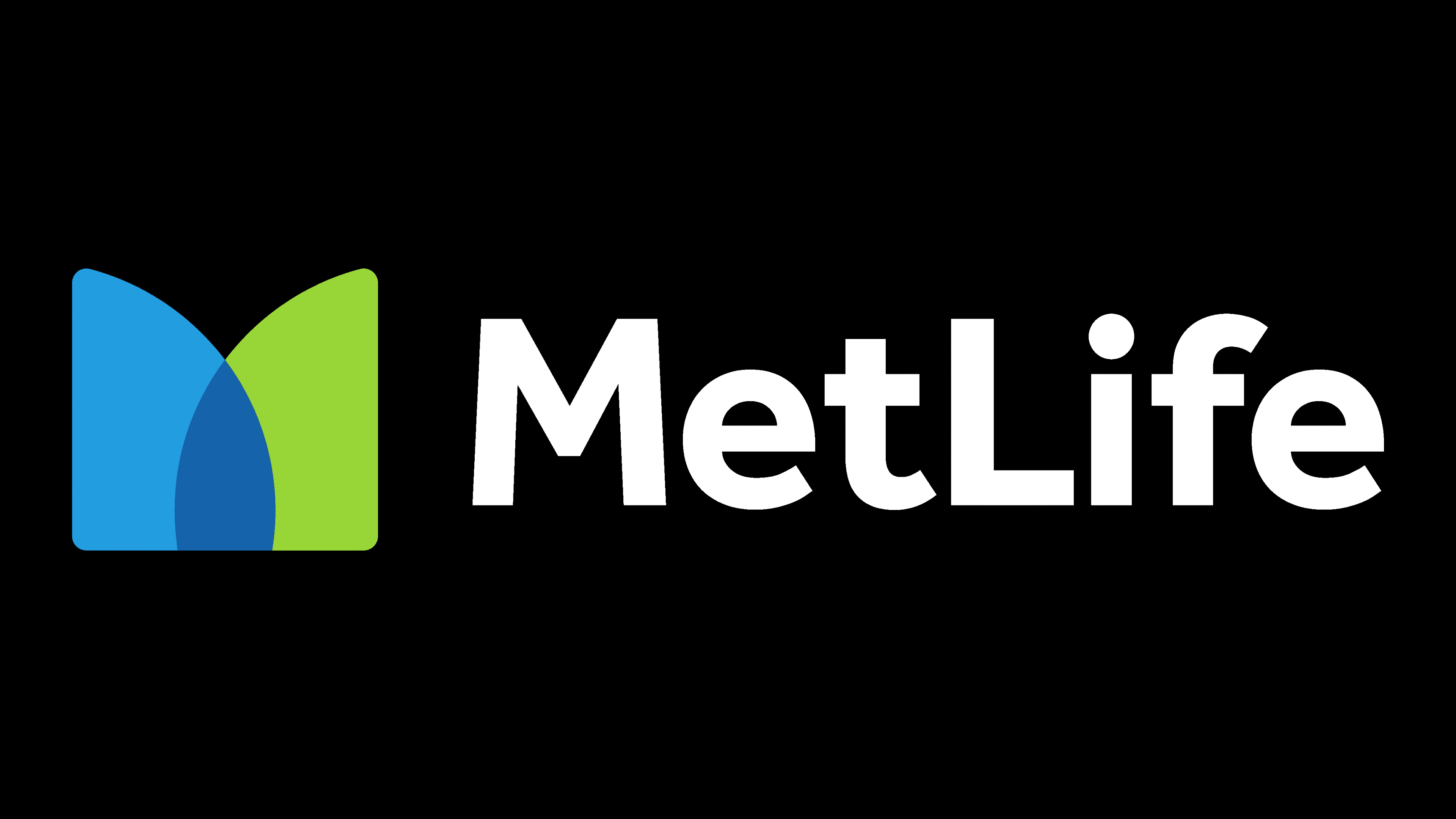
This continued until 2016, when the holding corporation decided to abandon the Snoopy mascot and underwent a serious rebranding. It introduced a new corporate logo with a stylized ‘M,’ formed by two hills in blue and green. Interestingly, a similar emblem is used by the website Diffen (which it adopted back in 2013).
What is MetLife?
MetLife is the abbreviated name for Metropolitan Life Insurance Company. It’s an American holding corporation that provides insurance and pension services and offers a range of financial products. It has been in operation since 1868 and is one of the largest in the US.
1967 – 1998
![]()
In the 1960s, graphic designer Don Ervin from Sandgren & Murtha designed an abstract logo for MetLife in the form of symmetrically folded ‘M’s. Four ‘M’s, joined by their free ends and slightly compressed at the edges, form the black outline of a geometric figure. Their unbroken connection embodies reliability and durability – qualities that any insurance company should possess. A stylized eight-pointed star is visible in the white negative space. It refers to the old MetLife symbol – the glowing tower – and to the slogan “The Light That Never Fails.”
In the U.S. in the 1960s, modernism was in vogue. Therefore, an emblem designed in this style was considered a bold statement of the company’s ambitions. To create contrast, the designer supplemented the image with the inscription “Metropolitan Life.” The wordmark is set in Helvetica Bold with narrow letter spacing. Until 2017, the logo, made up of four ‘M’s, could be seen at the top of the MetLife Building.
1998 – 2016
![]()
To appear caring and friendly, the company began using a logo with a light-blue inscription, “MetLife.” The abandonment of black and the removal of symmetrical abstraction allowed it to soften its corporate image. The brand name is now set in Futura Bold.
2016 – today
![]()
In 2016, the company underwent rebranding and introduced a new logo that symbolizes close collaboration with customers. This idea is embodied in an abstract image consisting of two “hills” in blue and green. They converge in the center, forming a stylized ‘M.’ Where the two parts of the figure overlap, a dark blue color appears. As usual, the word “MetLife” is placed nearby. It is set in a black sans-serif typeface called Effra Bold.
Font and Colors
The grotesque Effra Bold, used in the logo, was created by Swiss designer Jonas Schudel based on the Caslon font family. It has no serifs, but it does have a balanced combination of angles and roundness. The black inscription is complemented by a tricolor symbol in the form of a stylized ‘M.’ Bright green symbolizes strength and development, while the two shades of blue pay homage to the historical heritage of the Metropolitan Life Insurance Company.