Club players on the field represent their hometown and fight for its honor. Every ball that enters the goal is scored for the glory of Italy. The Milan logo demonstrates that being a football team member is a road to the sporting elite’s top echelon.
Milan: Brand overview
| Founded: | 1899 |
| Founder: | Elliott Management Corporation |
| Headquarters: | Milan, Italy |
| Website: | acmilan.com |
A.C. Milan was founded in 1899 by two English expatriates. This explains the English spelling of its name: “Milan” instead of the Italian word “Milano.” The club has received dozens of trophies and has become an excellent launching pad for top echelon players. But he is remembered primarily because it was bought by the former Italian Prime Minister Silvio Berlusconi, who in 1986 saved the team from bankruptcy.
The official colors of Associazione Calcio Milan are black and red from the very beginning. This is related to the nickname Rossoneri – “red-black” in translation from Italian.
Meaning and History
Between 1900 and 1940, the club’s logo was the state coat of arms of the city of Milan. It consisted of two intersecting red stripes that were inside a white shield. But this is not the cross of St. George, as many are accustomed to think, and the regional symbol is the cross of St. Ambrose. The same sign is present on the modern team logo.
What is Milan?
Milan is the short form for the professional football team Associazione Calcio Milan from Italy. It was established in 1899 and has spent almost its entire existence in Serie A, except for two seasons. The club ranks fourth in the world rankings. They have achieved numerous victories in prestigious high-level competitions, including three Intercontinental Cups and one FIFA Club World Cup.
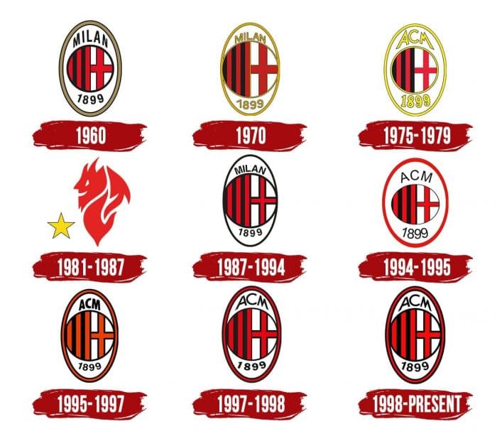
The 1960s
After the owner of the club was Silvio Berlusconi, the design of the emblem changed. The final version looked like a large white oval with a light brown border. Inside was a circle enclosed in a black ring and divided into two parts. Its left half consisted of red and black vertical stripes, and on the right was a St. Ambrose. Also, the name and year of the foundation of Milan fit inside the oval.
The 1970s
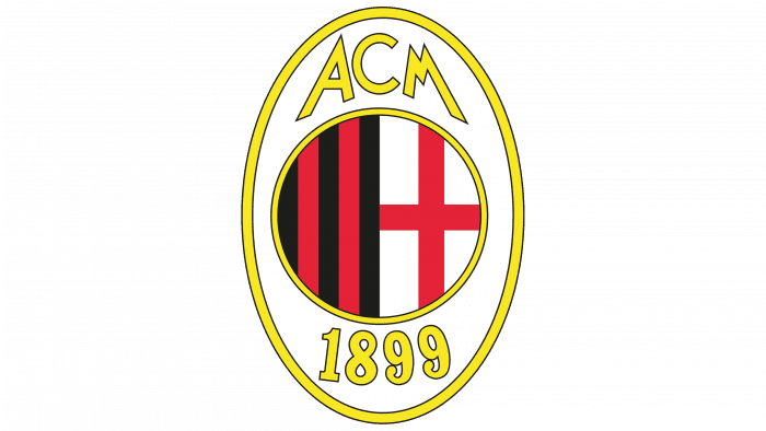
In the 1970s, the central circle has been enlarged, so the inscriptions have decreased. Outlines, letters, and numbers turned to gold. An additional black stripe has appeared on the left side.
1975 – 1979
The creators of the emblem returned the circle to its original size and replaced the word “Milan” with the acronym “ACM” (short for Associazione Calcio Milan). At the same time, they made all the inscriptions and outlined bright yellow.
1981 – 1987
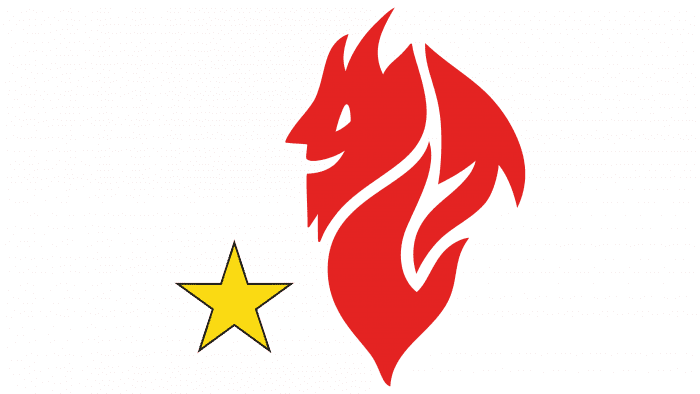
In the early 1980s, the club got a logo that reflected its nickname, Devil. The team got this unofficial name because of the red color of the uniform. The main character of the emblem was a cartoon demon. It looked abstract because it consisted of three red shapes that resembled flames. The artists depicted a straight nose, a triangle eye, and a smiling mouth on one of the fragments.
In the lower-left corner was the Golden Star for Sports Excellence. Milan received the right to use this sign-in 1979 after winning the tenth championship, customary in Italian football.
1987 – 1994
The club returned the 1970s logo by making the outlines black and reducing the size of the numbers.
1994 – 1995
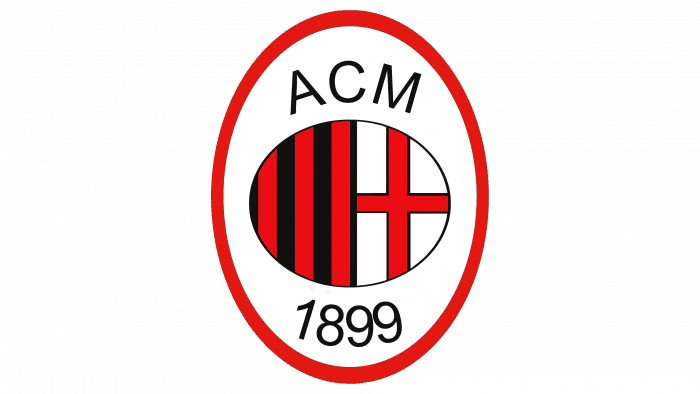
Another design experiment ended with the circle turning into a small oval and the large oval outline turning red. An acronym has again replaced the word “Milan.”
1995 – 1997
The center circle is back. The large white oval now has a black and red outline. The number of vertical lines has decreased: now there are five of them, as it was at the very beginning.
1997 – 1998
In 1997, the frame’s proportions around the oval shield changed: the right side is now wider than the left. The emblem was supplemented with a red five-pointed star in the same period, received by the club for ten championship victories. The designers removed the star, and at the same time, made the stroke symmetrical.
1998 – today
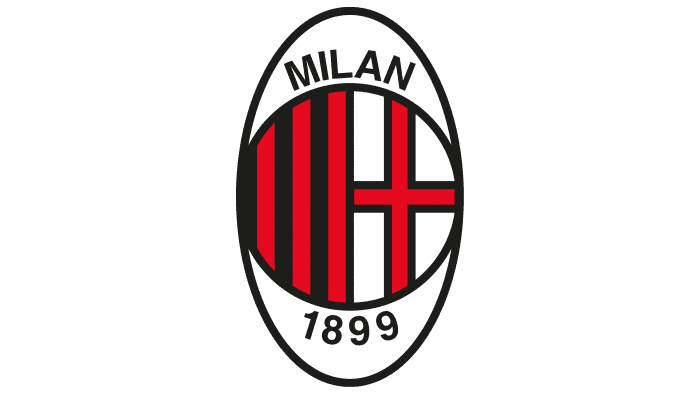
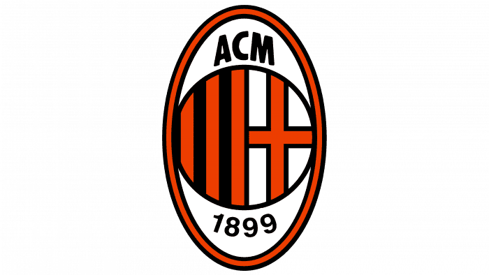
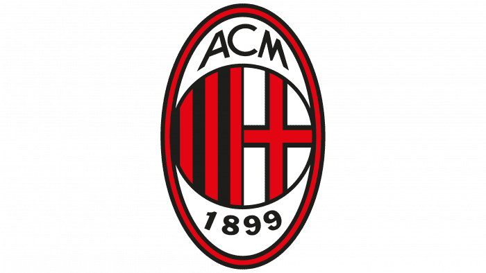
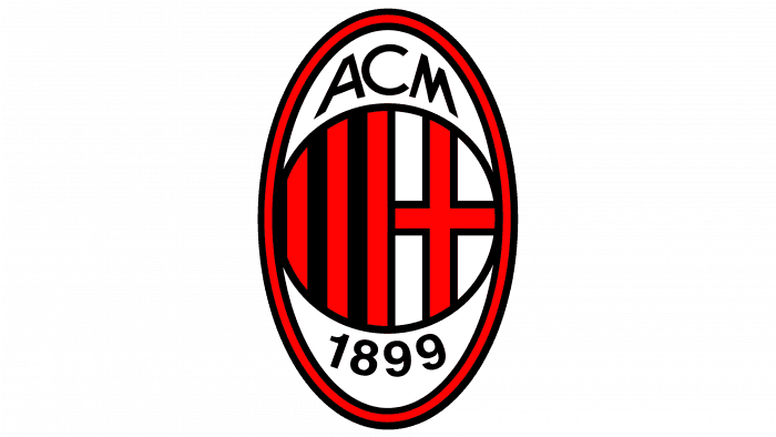
The latest redesign concerned only the typeface: the numbers below the circle indicating the year Milan was founded have been increased. The shades of red and black also changed, but only slightly.
Milan: Interesting Facts
AC Milan, often just called Milan, is a famous soccer team that has had great success in Italy and worldwide.
- How It Started: In 1899, two guys from England, Alfred Edwards and Herbert Kilpin, decided to start a club. Even though it had “Cricket” in its name, soccer quickly became their main sport.
- Team Colors: They’re known as “Rossoneri” because they wear red and black. The red represents their passion, and the black shows they’re a tough team to beat.
- Home Ground: Milan plays in a big stadium called San Siro, which it shares with its city rivals, Inter Milan. It’s a famous place, especially when the two teams play each other.
- Champion of Europe: Milan has won the UEFA Champions League, a big European tournament, seven times. Only Real Madrid has won it more times.
- Fans All Over: They have fans everywhere in the world. People love them for their history and the exciting soccer they play.
- Famous Players: Some of the best players, like Paolo Maldini and Kaká, have played for Milan, which is why the team is well-known.
- Milan Lab: In the 2000s, they started Milan Lab to use the latest technology to help their players stay fit and play better.
- Big Rivals: The biggest games are against Inter Milan. They share the same stadium, and these matches are super important for bragging rights in the city.
- A Global Team: In the ’95-’96 season, Milan was the first Italian team to win the league with all foreign players, showing that it was open to bringing in talent from anywhere.
- Helping Others: Milan isn’t just about soccer; they also do a lot of charity work with Fondazione Milan, helping kids and supporting different causes worldwide.
So, AC Milan is more than just a soccer team; it has a long history, is involved in its community, and has fans all over the globe.
Font and Colors
The main symbol of the football club is St. Ambrose, which is very similar to the similar St. George. But they should not be confused because both the emblem of Milan and the coat of arms of the city of the same name depict the cross of St. Ambrose – two intersecting red lines on a white background. The modern logo is combined with red and black vertical stripes – the same as on the players’ shirts.
The individual font of the acronym “ACM” is unparalleled: the emblem creators developed the original lettering design back in the 1960s and just modernized it until the current version came out. The logo’s main colors are black (# 000) and red (# FB090B). The first symbolizes the fear of opponents, and the second denotes the players’ zeal and will. A calm white background balances Their emotionality.
Milan color codes
| Red | Hex color: | #fb090b |
|---|---|---|
| RGB: | 251 9 11 | |
| CMYK: | 0 96 96 2 | |
| Pantone: | PMS 172 C |
| Black | Hex color: | #000000 |
|---|---|---|
| RGB: | 0 0 0 | |
| CMYK: | 0 0 0 100 | |
| Pantone: | PMS Process Black C |
