


![]() Minnesota United FC Logo PNG
Minnesota United FC Logo PNG
The Minnesota United FC logo showcases the club’s unique identity. Designers employed metaphorical imagery to convey the club’s story and its connection to the home state. The smooth lines and curves symbolize the ease with which the players claim victories.
Minnesota United FC is an American professional soccer club based in Saint Paul, Minnesota. The club plays in the Western Conference of Major League Soccer. It began competing as the league’s 22nd club, replacing the North American Soccer League (NASL) franchise. The previous franchise with the same name was established in 2010. Initially, it was owned by the National Sports Center and known as NSC Minnesota. In 2011, NASL became its temporary owner because NSC’s capital was less than $20 million, which didn’t meet the accepted standards.
On January 9, 2012, the club announced its new name. The nickname “Stars” became part of the official name. That same day, the new Minnesota Stars FC logo, featuring the state motto “L’Etolie du Nord,” was unveiled. On November 9, the team was acquired by Bill McGuire. On March 5, 2013, the team was renamed Minnesota United FC. The word “United” signifies the unity of a wide range of fans and symbolizes the sports union of the cities of Saint Paul and Minneapolis.
On March 25, 2015, Major League Soccer Commissioner Don Garber announced Minnesota United as the 23rd club in the league. However, the club joined the league earlier than planned (in 2017) and finished 22nd, behind the Los Angeles team. It retained the intellectual property rights, including the old name, logo, and color palette. The team’s colors are sky blue, gray, and black, with a red accent.
As before, the franchise is owned by a group of owners led by Bill McGuire. The group includes Wendy Carlson Nelson, Glen Nelson, Glen Taylor, Jim Pohlad, and the Pohlad family, who also own other Minnesota sports organizations.
Meaning and History
![]()
In 2010, NSC Minnesota used a blue-and-yellow logo shaped like a triangular shield with a star. In 2012, along with the new name, Minnesota Stars FC received an updated logo featuring the inscription “L’Etolie du Nord” and a soccer ball. Another logo change occurred in 2013 when the NASL team became known as Minnesota United FC. The Minnesota United FC logo remained the same when the franchise transitioned to Major League Soccer (MLS); only minor details changed.
What is Minnesota United FC?
Minnesota United FC is a professional soccer club in the USA, based in Saint Paul, and represents the Western Conference of Major League Soccer. The team was established in 2015 and began playing in 2017, replacing the NASL franchise of the same name. Home matches are held at Allianz Field, and Bill McGuire owns the team.
2010 – 2012
![]()
The first version of the NSC Minnesota Stars emblem is designed as a blue shield with yellow and white details, resembling the sports badges of American teams. The shield’s background color transitions from dark blue at the bottom to a brighter shade at the top, highlighting the energy of the soccer club founded in 2010.
At the top is the inscription “NSC,” set in bold yellow sans-serif letters with a slight three-dimensional effect. Just below is the word “Minnesota,” written in simple, thin white letters spaced widely apart.
In the center is a yellow star crossed by two diagonal lines. It became a symbol of the team’s determination and its connection to the sports center in Minnesota. Beneath the star, the club’s founding year, “EST. 2010,” is written in neat white font.
The entire logo has a sporty, energetic look, reflecting the team’s focus on active play and pursuit of set goals.
2012 – 2013
![]()
The 2012 logo update made the Minnesota Stars emblem less formal and more animated. The overall colors remained unchanged – blue, yellow, and white. However, all lines and shapes became flatter and smoother.
The central yellow star became larger, with light strokes inside it adding a sense of motion. Surrounding the star are five light-blue triangles that slightly refresh the image.
The club name “STARS” is set on a blue arched ribbon below the star, in a clean, precise font. At the very bottom, on a small yellow field, is the “FC” designation. At the top, “MINNESOTA” is written in white block letters.
Another notable element is the French italic inscription “L’Étoile du Nord” (“The North Star”) on the upper part of the yellow frame. The phrase echoes the official motto of the state of Minnesota, reminding us where the team is from and the region it represents. The logo appears athletic and light, fitting for a soccer club with a youthful audience.
2013 – today
![]()
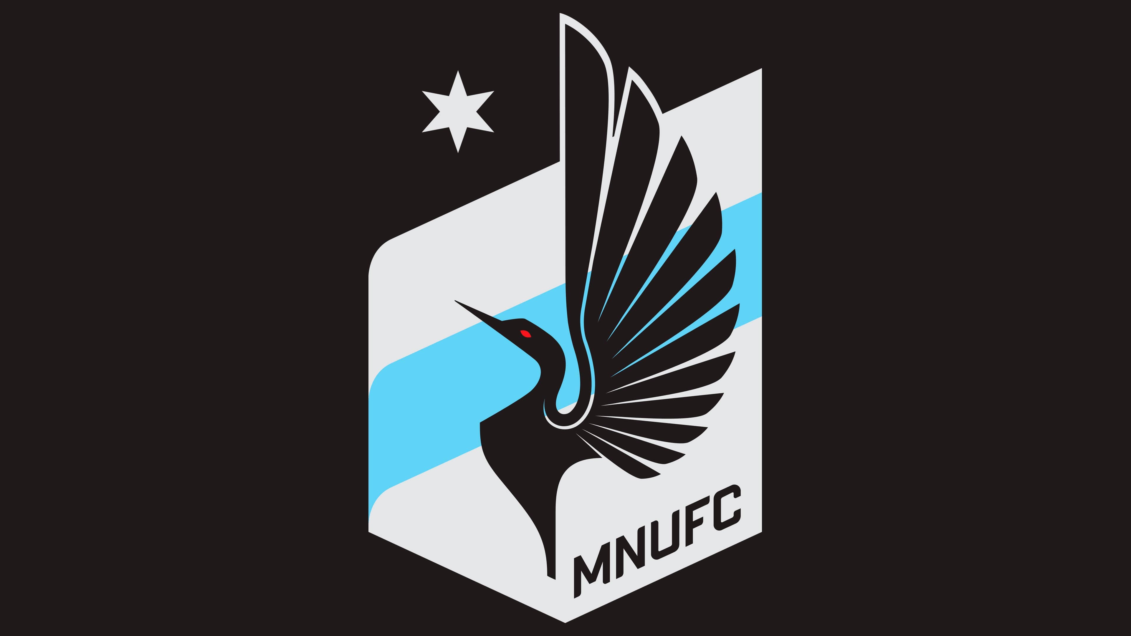
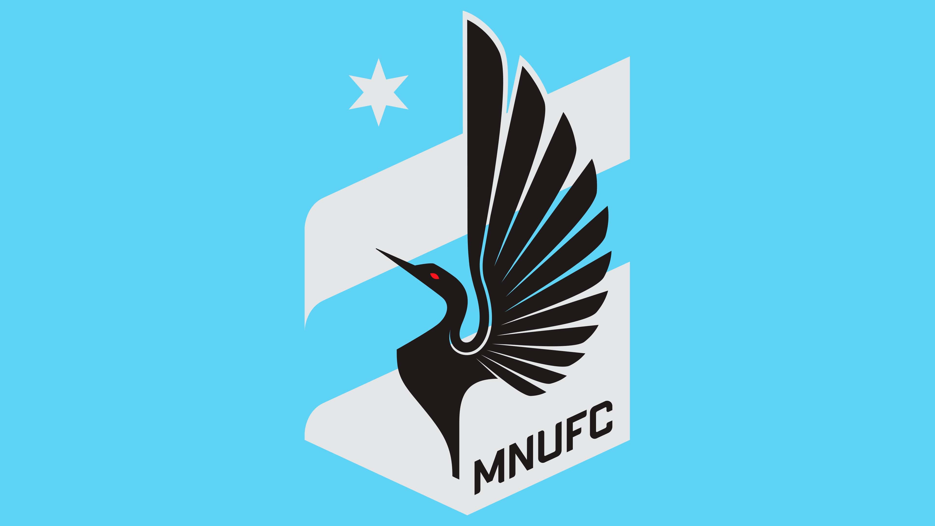
Minnesota United decided to completely redesign its logo after joining a new league and hired the agency Zeus Jones for the project. Instead of the familiar star in the center, the emblem now features a black loon with a red eye and eleven spread feathers, representing the number of players on the field. The loon was chosen not just as a striking image, but as the official bird of the state of Minnesota.
Three diagonal stripes form the background of the logo on a shield. The top and bottom stripes are gray, referencing Minnesota’s Iron Range region. The central blue stripe symbolizes the Mississippi River, which separates the state’s two largest cities: Minneapolis and St. Paul.
A six-pointed star is drawn in the top left corner, reflecting the state’s motto “L’Étoile du Nord” (The North Star). The club name “Minnesota United FC” is placed at the bottom of the shield, written in a clean, italicized, sans-serif, all-caps font.
This emblem is highly local, connecting the team to the region’s nature and culture, and emphasizing local identity without overloading the design with unnecessary decorative elements.
Font and Colors
Minnesota United FC has changed its emblem several times, but fans widely recognize the current one. At the center of the logo is a loon, a bird important to the people of Minnesota. It inspired the team’s nickname, Loons, so its appearance on the emblem was a logical decision.
The emblem’s design style is abstract. The loon is depicted as a black silhouette with a red eye, standing with its wing feathers raised high. Above it is a six-pointed gray star. This is the North Star, a symbol of navigation and an important element in Minnesota’s symbolism.
The lower part of the shield sometimes features the abbreviated club name, Minnesota United FC. The inscription is italicized, and the sans-serif letters were developed by the local studio Process Type Foundry. The font is simple and stylish, and the letters “MNUFC” (a shortened version of the name used in an alternate visual mark) are evenly spaced against the emblem’s background. An interesting detail is that the lower bar of the letter “F” is exactly half the length of the upper one.
The shield’s background is rendered in two calm colors. Light gray reflects the nature of the Iron Range region, while the sky-blue stripe represents the Mississippi River. Black is used for the bird and text, while red appears only in the loon’s eye. This is the only contrasting element, making the emblem visually striking.