Belgium’s popular radio station MNM, known for its lively shows and chart-topping music, has recently updated its visual identity. This change aims to keep the station appealing to its younger audience by adapting to current trends. The new logo highlights the station’s dynamic energy, matching its upbeat and entertaining content.
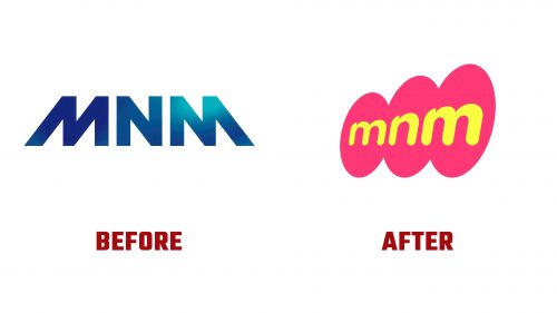
The old design was sleek and modern, featuring blue gradients. The font was geometric and structured, giving off a sense of professionalism. While clean, it lacked the playful spirit that defines the station’s lively programs.
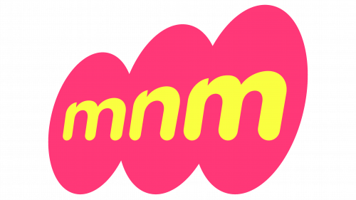
The new logo takes a different approach, embracing a fun and energetic style. The most noticeable feature is the bright pink, cloud-like shapes surrounding the letters. Paired with a bold yellow font, it creates a sense of lightness and joy, reflecting the station’s mission to “Make Life Sing.”
The font is more relaxed and friendly. The rounded letters give a youthful vibe, appealing to the station’s primary audience. The yellow text represents energy and optimism, while the pink background enhances the playful tone and makes the logo stand out. Together, these elements create a sense of positivity, encouraging listeners to associate the station with fun and good vibes.
These updates show the station’s desire to stay connected with its audience. By choosing a brighter, more playful design, the station intends to be a source of enjoyment and entertainment. The new look modernizes the image and captures the dynamic nature of its shows, adding a fresh touch to its visual identity.
This redesign demonstrates the station’s commitment to growth and innovation while staying focused on entertainment and engaging with listeners. The transformation reflects its cheerful programming and sets the tone for an exciting new chapter.


