The Montreal Impact emblem embodies speed, energy, and motion, as the lightning-fast reaction is one of the best qualities upon which sports success depends. At the same time, the emblem reflects the club’s glorious history and its connection to Canada, as it’s customary in the world of football to emphasize one’s affiliation with a particular country.
Montreal Impact: Brand overview
| Founded: | 1993 |
| Founder: | Joey Saputo |
| Headquarters: | Montreal, Quebec, Canada |
| Website: | en.cfmontreal.com |
Montreal Impact is a Canadian professional soccer team based in Montreal, Quebec. The team competes in Major League Soccer. It was founded in 1992 when the Saputo company established it on the ashes of the former team “Montreal Supra” from the dissolved Canadian Soccer League. After that, the team changed several leagues: in 1993, it joined the United Soccer League; in November 2009, the North American Soccer League; in 2010, it was forced to move to the USSF Division 2 Professional League; and in 2012, it joined the MLS ranks.
The “Saputo” company was the sole owner of the club until 1999, when Giuseppe Saputo sold it to a group of shareholders. In the 2001 season, the club went bankrupt, and investors turned away from it. In the fall of the same year, Giuseppe announced the revival of the “Montreal Impact.” The club rose from the ashes in 2002 and was created as a non-profit organization owned by the Quebec government, Hydro-Quebec, and Saputo.
In November 2009, Impact announced its intention to leave the USL First Division and become co-founders of the new North American Soccer League. The league was not yet sanctioned by the United States Soccer Federation, so Saputo tried to obtain an MLS franchise for Montreal. He succeeded: on May 7, 2010, Impact owner Joey Saputo received the Major League Soccer franchise.
Although legally, the MLS expansion team of Montreal is an entirely separate legal entity, the new team bears the name “Impact” and retains the MLS team’s legacy. They also kept the old roster and the blue and white color scheme. Its full name is written this way: Impact de Montreal. This is because Quebec is a French-speaking province of Canada. The only thing that was changed was the logo adopted after the relaunch in 2002.
Meaning and History
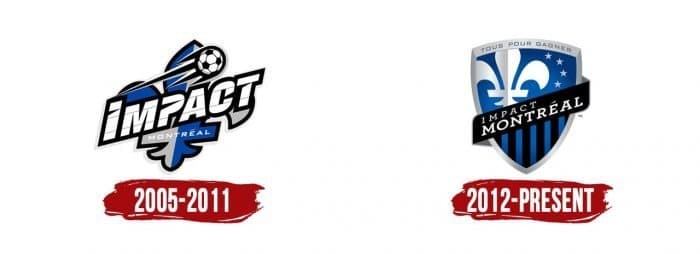
The club had two logos. The first Montreal Impact logo was used until joining MLS, and the second one after partial rebranding. They are similar in style and color palette, but their messages are different. Common to both is one symbol – the stylized fleur-de-lis, a universally recognized symbol of French heritage and prominently featured on Quebec’s flag.
What is Montreal Impact?
Montreal Impact is the former name of the Canadian soccer club CF Montreal, which was established in 1992. It is a member of the Eastern Conference, representing it in MLS since 2012 as an expansion franchise. The team has won Canada’s most prestigious sports trophy, the Voyageurs Cup, eleven times. The team plays its home games at Saputo Stadium. The team adopted its current name in 2021.
2005 – 2011
When the team resumed as a non-profit organization, it adopted a new logo designed by the Pigeon Company. At the emblem’s center is a blue and silver fleur-de-lis. It is tilted to the right and outlined with two wide lines – black and white. The team’s nickname is in the foreground.
The word “Impact” is written diagonally and crossed by two thin lines. “Montreal” is on the lower horizontal bar of the flower. The “E” is French: above this letter is a short diacritical mark – acute, indicating a short sound. All letters are uppercase and white with a dark outline. The font is sans-serif, without any frills.
Above the words is a traditional soccer ball with hexagonal stitching in flight. It flies upwards: a long trail, similar to a comet’s tail, indicates the trajectory of movement. Four sharp “rays” extend to the left from the black outline.
2012 – today
The latest Montreal Impact logo was timed with the team’s move to MLS. The official team logo was unveiled at the start of the match between the NASL Montreal Impact and NSC Minnesota Stars on August 6, 2011. The concept was developed by The Pigeon Company. “The new logo has become more refined and created in the image of famous international clubs. We are proud of our participation in developing this top league symbol,” explained Olivier Chevillot, Creative Director of Pigeon. Designers retained the main elements (fleur-de-lis and team nickname) and modernized the classic shapes.
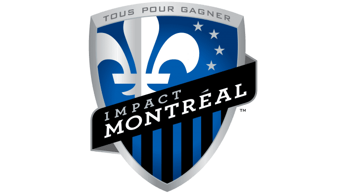
The key element of the Montreal Impact emblem is a triangular old French pointed shield. Gradient shades make it distinct, imitating a 3D effect. The heraldic element has a wide silver outline. At the top of the shield is written “Tous Pour Gagner” – the team’s new motto, which speaks to the importance of unity for victory.
The crest’s blue color represents Quebec’s flag, symbolizing the Saint Lawrence River that bathes the island of Montreal. In the top left corner is a white and silver fleur-de-lis – the official emblem of Quebec and a historical symbol of the French monarchy. The fleur-de-lis embodies the unique Francophone character of the province.
On the right side of the heraldic flower are four silver stars. These four stars symbolize Montreal’s four founding communities: the French, English, Irish, and Scottish. The bottom of the Montreal Impact logo features black and blue stripes. The black and blue stripes refer to the club’s early years, especially the time when the club won its first championship in 1994.
A black scarf with the white inscription “Montreal Impact” runs through the entire shield. The scarf with the club’s name represents the club’s fans. The upward tilt symbolizes the team’s constant growth and development over the years and its evolution in Major League Soccer. It is also a symbol of continuity, as it hints at the 1993 Montreal Impact logo and the 2002 version, which predominantly had an upward tilt. The letters in both words are uppercase. The font is straight-lined geometric Bank Gothic with small tildes.
Montreal Impact: Interesting Facts
Club de Foot Montréal, which used to be called Montreal Impact, is a soccer team with a lot of history in Montreal.
- How They Started: In 1992, they began as Montreal Impact, bringing professional soccer to Montreal for the first time.
- Moving to MLS: In 2012, they became Major League Soccer (MLS) ‘s 19th team, helping to grow soccer in Canada even more.
- New Name and Look: In 2021, they changed their name to Club de Foot Montréal, or CF Montréal, and got a new logo to better showcase Montreal’s diverse culture and goals for the future.
- Where They Play: Their main stadium is Stade Saputo, designed just for soccer. Fans create an exciting atmosphere. They use the Olympic Stadium for bigger games, which can hold more people.
- Winning Titles: They’ve won the Canadian Championship several times, competing against other Canadian teams for a spot in the CONCACAF Champions League.
- Big Competition: In 2015, they reached the final of the CONCACAF Champions League, showing they can compete with top teams from North and Central America.
- Famous Players: Stars like Marco Di Vaio, Didier Drogba, and Ignacio Piatti have played for them, becoming favorites for their great play.
- Fans Who Love Them: They have dedicated fan groups like Ultras Montréal and 1642 Montréal, who bring lots of energy and support to the games.
- Training Young Players: They focus a lot on training young players in their academy, helping them become professionals in MLS and beyond.
Club de Foot Montréal has built a strong soccer tradition in Montreal. Its new name reflects the city’s culture and a history of exciting soccer.
Font and Colors
The Montreal Impact soccer club has had two emblems during its existence, and both were created by the design company Pigeon. Perhaps this explains their obvious similarity, as the 2005 style has hardly changed. Even the redesign conducted in 2012 didn’t affect the overall appearance of the emblem.
The logo looks presentable and modern – partly because the developers combined several graphic techniques, such as 3D effects and gradients. As a result, a protruding shield transitions from dark blue (on the edges) to light blue (in the center).
A wide black band with the inscription “IMPACT MONTREAL” runs through the entire shield. Both words use the Bank Gothic font, created in the early 1930s by typographer Morris Fuller Benton for the American Type Founders studio. It’s a square sans-serif font that shouldn’t have serifs, but the logo developers still added them. The original version of Bank Gothic can be seen at the top of the shield, where the motto “TOUS POUR GAGNER” is located.
As for the color palette, the emblem seems very minimalist. This is a misconception because it’s actually composed of five different shades: blue (#2B63AD), dark blue (#28477D), black (#373536), dark silver (#929397), and light gray (#BBC3C6). Some are used to create a gradient, giving the image a three-dimensional look.
Montreal Impact color codes
| Shukra Blue | Hex color: | #2b63ad |
|---|---|---|
| RGB: | 43 99 173 | |
| CMYK: | 75 43 0 32 | |
| Pantone: | PMS 285 C |
| Black | Hex color: | #000000 |
|---|---|---|
| RGB: | 0 0 0 | |
| CMYK: | 0 0 0 100 | |
| Pantone: | PMS Process Black C |
| Spanish Gray | Hex color: | #929397 |
|---|---|---|
| RGB: | 146 147 151 | |
| CMYK: | 3 3 0 41 | |
| Pantone: | PMS Cool Gray 7 C |

