


There are about 20,000 breweries in the world. This figure is constantly growing, but even today, it seems impressive. But each such company can have up to a hundred brands for different types of foamy beverages. It turns out that the exact number of beer brands is impossible to determine. At least for now, many of them are known only within a single country or region. The giants of the alcoholic beverage market are pushing craft producers’ goods off store shelves by supplying their products to all retail chains.
This raises the question: why have they become so popular? Maybe it’s because of the rich history of their breweries or unique beer recipes. Or maybe success came to them thanks to successful marketing and memorable logos? After all, what can better characterize a brewery than an emblem associated with coolness and freshness? This is exactly the effect created by the cool blue palette. Other producers, on the contrary, use warm golden shades reminiscent of the barley or wheat from which the malt is made. Sometimes, though, bold brands experiment with abstract designs.
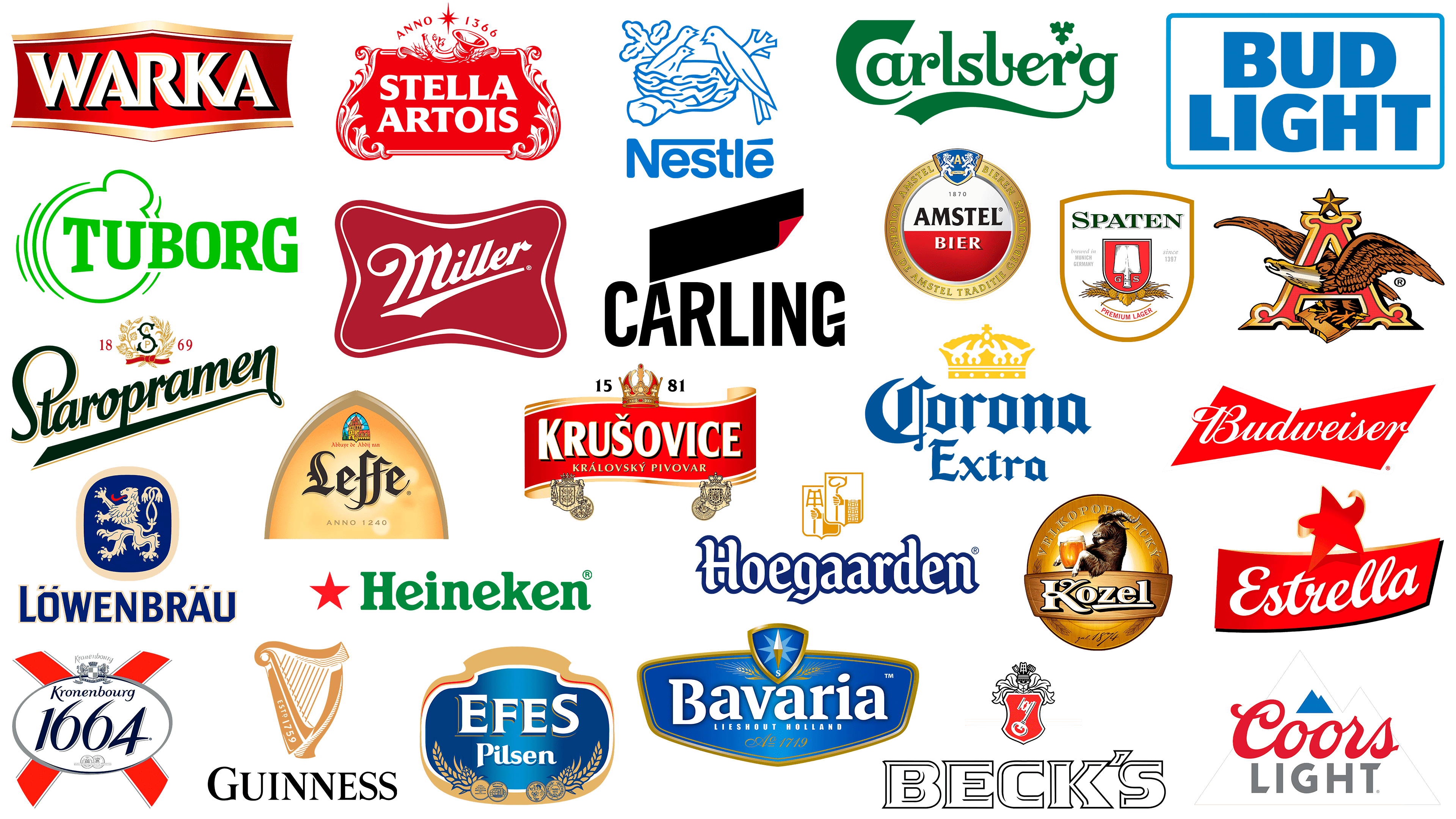
Let’s see which variant turned out to be the most winning. Take, for example, the logos of the most famous beer brands, such as Heineken, Bud Light, or Velkopopovicky Kozel. They belong to different companies and are lined up in random order, regardless of market demand.
Guinness
![]()
Guinness is the most popular Irish beer, with a history dating back to 1759. But the roots of its modern logo date back to 1862. It was then that the producer released its first bottle with a harp on the label. It was taken from the country’s coat of arms and turned in the opposite direction to distinguish it from an element of the national heraldry. A traditional Irish symbol is associated with Briana Boru’s harp. It is believed that the former King of Ireland loved to play this musical instrument, and his son later used the relic as atonement for his sins. In the modern beer brand logo, the harp is shown in gold, and on one side of the frame is a white inscription “ESTD 1759”. At the bottom is the black word “GUINNESS” in Phil Martin’s Agenda URW Light font.
Estrella
![]()
Estrella is one of the five most famous Spanish beer brands. Its logo is presented in red and embodies the name, which translates from a foreign language as “star.” The five-pointed star depicted on the label is slightly deformed: its side tips are bent in different directions, and the lower-left corner is unnaturally straightened and elongated, unlike the rest of the star. This gives the impression that it is cut from plastic. The front side of the star has a red gradient, while the back side is colored in several golden hues. At the bottom is a red quadrangle curving upward. Its outline is outlined in two colors: black and gold. Inside, the word “Estrella” is written in white handwriting. All elements, including the inscription, appear dynamic due to the uneven line thickness.
Velkopopovicky Kozel
![]()
The Czech brand Velkopopovicky Kozel is also quite well-known in Europe. It hides a bottom-fermented beer with the funniest label in its segment. Since the word “Kozel” means “goat” in Czech, this farm animal is the centerpiece of the identity. The artists drew every hair and detailed the horns, eyes, ears, mouth, and nose to make the image as realistic as possible. The logo shows only the front of the goat’s torso, but it can be assumed that it stands on its hind legs to make it more comfortable while holding a large mug of beer. The animal is leaning against a wooden sign bearing the brand name. It is written in white letters with a black-and-gold outline. The background is a golden oval bearing the inscription “VELKOPOPOVICKY” (the year the company was founded) and two artistically decorated spikelets.
Tuborg
![]()
The Danish company Tuborg, which produces the beer of the same name, has a recognizable emblem that became neon green after the redesign. The color scheme corresponds to the Carlsberg Group Corporation’s palette, as it owns the legendary brewery. The logo consists of two parts: an inscription and an abstract pattern. The manufacturer’s name is set in bold capital letters with large serifs. The size of the letters is uneven: they gradually decrease toward the center and increase toward the edges. The design consists of several arc-shaped lines and a large circle passing into a small oval. The central element is shaped like a bottle opener.
Efes
![]()
Among Turkish brands, we can distinguish Efes Pilsen, which is part of the Anadolu Efes holding. This is the case when the logo is made in two symbolic colors: blue and gold. The first one is associated with quenching thirst and the freshness of chilled beer on a hot day. And the second one reminds me of the golden grain from which malt is produced. At the same time, the label of Efes Pilsen features miniature spikelets and hop cones. They are located in the lower part and decorate the images of won medals. Above them is a white inscription: the brand name, divided into two lines. The upper word is in capital letters of different sizes: the initials “E” and “S” are enlarged compared to the “F” and “E” between them. For them, a bold font with triangular serifs is used. A customized set of glyphs was developed for the second part of the inscription. The logo’s background is a blue figure of indeterminate shape, outlined in white, red, and gold.
Stella Artois
![]()
The Belgian brand Stella Artois is recognized by its red-and-white emblem, which features many elements. The composition is based on a figurative tablet, decorated on the sides with a floral ornament. In the center, the beer brand name is written in a custom font based on Friz Quadrata, with triangular serifs on the letters. The phrase is divided into two lines and centered. Above is a hunter’s or shepherd’s horn with two spikelets and a small sprig of hops. Even higher is an eight-pointed star, located between the word “ANNO” and the number “1366”.
Staropramen
![]()
Staropramen is another famous Czech beer brand. It belongs to the brewery of the same name and uses the brewery’s logo elements, created by illustrator František Tichy. Over time, the design has changed, but the essence has remained the same. The main decoration of the label is a golden wreath of a hop branch and a barley ear tied with a red ribbon. The inner space is occupied by a dark green letter “S” with small leaves. The letters “A” and “P” are also written here. Next to the wreath is the year of the company’s foundation: “18” on the left and “69” on the right. At the bottom diagonally is the dark green word “Staropramen,” written in cursive and emphasized by a long stripe coming out of the last “n.”
Paulaner
![]()
The Paulaner logo resembles a medallion featuring a portrait of the founder of the monastic order, whose representatives opened a brewery in Munich. Its roots go back centuries, starting in 1634. Therefore, the first thing that catches the eye in the emblem is the proud profile of a bearded man in a toga with a high collar. The image is made of thin blue strokes and painted in a beige-golden color. The background is a red circle, with rings of white and gold. These are followed by a wide, dark-blue stripe displaying the company name and location. There is a tight border on the outer side. The inscriptions are written in capital letters. Another name is located below the graphic icon. This text consists of massive blue glyphs with golden outlines and barely visible shadows, making the letters seem to float in the air. At the same time, the designers highlighted the central letter “A” by drawing a curve at its top and aligning it in height with the letter “P.”
Corona Extra
![]()
Corona Extra is a Mexican brand and the undisputed leader in sales in the light-lager market. Its visual identity is based on the concept of beach mood. The choice of colors is also related to this, as blue and yellow are associated not only with soft drinks and cereals but also with other things, such as the sky and the sun, or the sea and sandy beaches. At the top is a yellow crown that displays the brand name, which appears below in blue letters. The text’s gothic style emphasizes the beer’s originality. It indirectly hints that the brand was named after the crown from the Cathedral of Our Lady of Guadalupe.
Bud Light
![]()
The American brand Bud Light introduced a light beer formerly known as Budweiser Light. Its current logo is very similar to the one used in 1984-1990: it also features a blue two-level inscription on a white, rounded rectangle with a blue border. Only now has the color of the main elements become lighter, associated with coolness and freshness, and the border has acquired a clearer outline. The designers kept the bold sans-serif font but reduced its contrast by thickening some strokes. This grotesque belongs to the Univers Next family.
Spaten
![]()
The Spaten Brewing Company sells alcohol under the Spaten brand, which is particularly popular in its home country, Germany. Since the word “Spaten” translates from German as “shovel,” the shovel is the star of the logo. The fact is that the brewery got its current name in 1622 when malt began to be mixed with shovels. The artists depicted the tool’s working part, turning it upside down with its sharp edges facing up. Beneath it, on both sides, are the letters “G” and “S,” the initials of brewer Gabriel Zedlmayr. The central elements are set against a red coat of arms on a round base. It is inside another shield, already white. And on the last one, there is a dark green word “SPATEN,” a red phrase “PREMIUM LAGER,” and light gray inscriptions, “brewed in MUNICH GERMANY” and “since 1397”. A composition of barley spikelets, hop leaves, and cones is also shown. The logo is outlined with a wide gold band.
Warka
![]()
Polish beer Warka is in demand in Europe, and outside of it is inferior to other, more popular brands. But its logo is easy to remember, with white lettering set against broken gold outlines and black shadows. It’s just one word, the brand’s name, which is in a bold font with triangular serifs. All letters except the first “W” are connected, but the lack of spacing does not impair readability. The background is a red hexagon, complemented by gold stripes at the top and bottom. The gradient makes the image three-dimensional; it seems that the middle of the emblem is slightly convex.
Coors Light
![]()
The emblem of the American beer Coors Light is probably one of the most famous on this list. After all, the manufacturer not only depicted a mountain landscape but also made it an indicator of temperature: the drawings on the cans and bottle labels change color when it gets cold. The composition consists of two connected blue triangles, representing a simplified “2D-model” of the Colorado mountain range. Underneath the polygonal figure is the red word “Coors,” and below it is the gray word “LIGHT.” An elegant cursive font is used for the former, and a customized sans serif with incised horizontal lines for the latter. Designer Turner Duckworth designed them.
Asahi
![]()
Japanese beer brand Asahi chose an oriental logo. Asian motifs are clearly visible in the cursive font, with elongated letter tops that resemble Arabic hieroglyphs. All the elements in it are diagonal, from the slices at the ends to the crossbars in the intra-letter space. Because of this peculiarity, each detail has a rhombic shape: in some symbols, it is clear; in others, it is remotely similar. At the same time, the line thickness varies, giving the text an Asian charm and emphasizing the company’s regional affiliation. At the same time, the glyphs are smooth, soft, and even mysterious. They are located on a white background and colored in ultramarine. This also testifies to the beer producer’s desire to stand out among competitors.
Carlsberg
![]()
Carlsberg is the flagship brand of the Carlsberg Group, one of Denmark’s best-known breweries. Its iconic logo consists of recognizable letters in dark green. Each letter is unique in its own way: “C” resembles a hook, “l” and “s” merge into one abstract figure, “b” has an unconventional shape, and from the last “g” to the left side stretches a wavy band, which looks like a descending ribbon. Above the letter “r,” there is a small hop leaf, stylized as an Irish trefoil. And overall, the wordmark is Irish-inspired, perhaps reflecting Ireland’s widespread beer culture, especially during St. Patrick’s Day celebrations.
Miller Beer
![]()
The Miller Brewing Company, an American brewery, has many brands that begin with “Miller.” All of them have different logos. The manufacturer itself uses a dark red mark for its identification in the form of a quadrangular “pillow” with rounded corners and concave sides. A white line is drawn inside with a small indentation from the edge. Its thickness increases in places of deflections and, on the contrary, decreases in protrusions. In the center is the first word of the brewery’s name. It is also white, as this color is best seen against a dark background. The inscription rises and is emphasized by a speed line in the form of a stylized arrow. To make the emblem dynamic, the designers developed a cursive font with a pronounced right slant and decorated the letter “M” with an elegant swirl.
Carling
![]()
Carling Premium Beer is named after the company that produces it. What’s more, both the lager and the brewery share the same logo: black lettering, complemented by an equally black band with a small red triangle representing a bent corner. The font used to type the word is Carling Regular, created by typographers from the British design studio BrandOpus. The basis for this grotesque was Trade Gothic Bold Condensed. The developers tweaked the glyphs a bit by adding holes in some lines. These holes emphasize the internal dynamics of the letters. As for the polygon at the top, it looks like a diagonal parallelogram with a bent corner. The figure looks stylish and modern; besides, it is not associated with beer at all.
Lowenbrau
![]()
The German brand Lowenbrau belongs to one of the world’s oldest brewing companies. Its history (according to the company itself) dates to the 1380s, though the evidence indicates it was established somewhat later, in 1524. But on the beer labels, 1383 is indicated. The iconic logo with a heraldic lion turned to the left is also depicted there. It is believed that this image was taken from an ancient fresco decorating the building where beer production began in 1524. In other words, the animal symbolizes the brand’s rich heritage. The lion is drawn in the style of the coat of arms and painted in gold, but not completely: its tongue is bright red. The base is a dark blue square with rounded corners, placed in a gold frame. And below it is the word “LÖWENBRÄU.” It consists of bold letters with barely visible serifs.
Budweiser
![]()
Budweiser’s iconic bowtie logo was redesigned several times before becoming minimalist. The symbol of the American beer brand now consists of two dark red triangles connected by sharp ends. The name of the alcohol brand is written across. Especially for this purpose, designer Michael Hagemann developed a special version of the handwritten font based on the existing Brewmaster. The word turned out elegant, with harmonious proportions and a slight rightward slant. The lettering uses white, which makes it look like part of the negative space. At the same time, the outermost letters slightly protrude beyond the “bow tie” and, in these places, acquire a broken red outline.
Krusovice
![]()
The list of beer brands with the most famous logos includes another Czech brand, Krusovice. This brand belongs to the Dutch corporation Heineken through its parent company, Royal Brewery of Krusovice. Many connoisseurs of Czech beer are well aware of its emblem: a red ribbon with a golden border and a large crown. Below are the awards that the producer has received. And to the right and left of the crown are the numbers “15” and “81”, which add up to the year the brewery was founded. In large white letters on the ribbon is the word “KRUŠOVICE.” Below is the phrase “KRÁLOVSKÝ PIVOVAR” in gold. In the first case, a custom font with sharp serifs was used; in the second, a sans-serif font similar to Vera Humana 95 Bold from BX Fonts was used.
Holsten
![]()
This German beer brand strictly adheres to tradition, respecting generational continuity in everything it does. Given that it has existed since 1879, the best visual image is a traditional one. As a consequence, the Holsten logo features a classic design. It is characterized by a shield held in the hand by a knight on horseback. On the other side, the warrior has a long, straight sword raised high above his head. The rider is depicted in profile, facing left. The horse and the knight are drawn with thin white lines and colored black. The shield is red, three-dimensional, and large. This is done so that the letter “H”, the first letter of the brand name, is clearly visible on it. Below is the company’s full name. The inscription is typed in a geometric antique font.
Beck’s
![]()
Beck’s is one of the few beer brands that use a key in their logos. The thing is, this trademark appeared in Germany, in the city of Bremen, whose coat of arms depicts the very tool used to open locks. On the labels of alcoholic beverages, it is placed inside a bright red, double-lined figurative shield. At the bottom, the word “BECK’S” is written in capital letters. The base of each glyph is white, and the outlines are black. Additional lines drawn in some places create a 3D effect. The chosen font is Serpentine Sans Serif. Short triangular serifs characterize it.
Hoegaarden
![]()
The symbols on the Hoegaarden beer logo are related to the brewery’s history. Two blue rectangular shields with pointed bases depict hands holding various attributes. The first shows a staff with a spiral tip, a tribute to the bishops who began brewing beer at the monastery. It is also a sign of the patronage of the Bishopric of Liège. A hollow spatula was once used to stir the wort on the far shield. Both hands with tools are painted in gold and outlined in black. The brand name is written at the bottom in white letters with dark blue lettering. The font is similar to AurelisADFNo2Std-Regular.
Anheuser Busch
![]()
Anheuser-Busch is an American company that is part of the Belgian-Brazilian InBev Corporation and owns numerous national and international beer brands. The manufacturer’s colorful, multicomponent logo features a large, non-standard-shaped letter “A”. Its main part is red, and its contours are outlined in different shades of gold, creating a three-dimensional effect. The ends are decorated with small, rounded protrusions. A bald eagle, standing on a heraldic shield, and three arrows look out of the intra-letter slot. One wing of the bird is also threaded through the hole in the letter “A”; the second wing is on the other side, along with the tail and torso. A five-pointed gold star rises at the top of the letter.
Leffe
![]()
The Anheuser-Busch Brewing Company has an international brand called Leffe, which is produced in Belgium. It is a so-called abbey beer, an ale brewed specifically and containing a high alcohol content. That’s why its logo features an image of the Notre-Dame de Leffe cathedral as a colorful stained-glass window, since the brand’s creators bought the right from the monks to use the monastery’s history in its visual identity. After a redesign in the 2010s, only the Gothic-style large black lettering “Leffe” and the phrase “Bière Belge d’Abbaye Belgisch Abdijbier” recall the abbey’s connection. In the brand name, the letters are asymmetrical: the second letter, “f,” is slightly smaller than the first, although they share a common horizontal stroke. The text is set against a bright yellow coat of arms.
Bavaria
![]()
Bavaria is one of the many brands of Royal Swinkels Family Brewers, formerly known as Bavaria Brewery. Despite being named after a German federal state, the brewery is Dutch. The company’s head office is located in the Netherlands, in the small but picturesque village of Lishout. The Bavaria trademark is recognized by the compass logo, depicted inside a blue triangular shield. At the bottom is the same blue plate bearing the brand name, written in white serif letters. The second line contains the phrase “LIESHOUT HOLLAND,” and the third line contains the number “1719”. In addition, two golden spikelets are drawn directly below the shield with the compass.
Kronenbourg 1664
![]()
Kronenbourg 1664 is a premium light lager produced in France from local hops. The year 1664 marks the foundation of the brewery that produces it. It is reflected not only in the brand name but also in its logo, which occupies the central position within the white oval. Above the dark blue numbers is the cursive word “Kronenbourg” of the same color. Below are two awards received for the product’s high quality. The oval is placed in a silver ring and topped with the image of two heraldic lions holding a shield with a crown overhanging it. This element is borrowed from the coat of arms of the area where the brewery moved in 1850. The background shows two intersecting red ribbons.
Amstel
![]()
Amstel is another brand of the Dutch brewing company. Production has been moved to Heineken breweries, where several types of beer are brewed. They are united by a logo: a circle placed in a golden frame with the text “AMSTEL BIEREN VOLGENS DE AMSTEL TRADITIE GEBROUWEN.” Inside the circle, divided into two halves (red and white), the brand name is written. It is also two-colored: the upper word is black, and the lower one is white. Just above it is the year the brewery was founded: 1870. Above it is a blue shield with two heraldic lions holding the letter “A.”
Heineken
![]()
The last on this list, but not the least in importance or popularity, is the logo of the Dutch brand Heineken. Here, the beer brand name is painted on the bottle’s glass. The inscription is made in the Heineken Serif brand font. Eden designers used the Horizon font for its creation. To the left of the word is a red five-pointed star, a long-standing symbol of the brewery that first appeared on the emblem in 1884.