


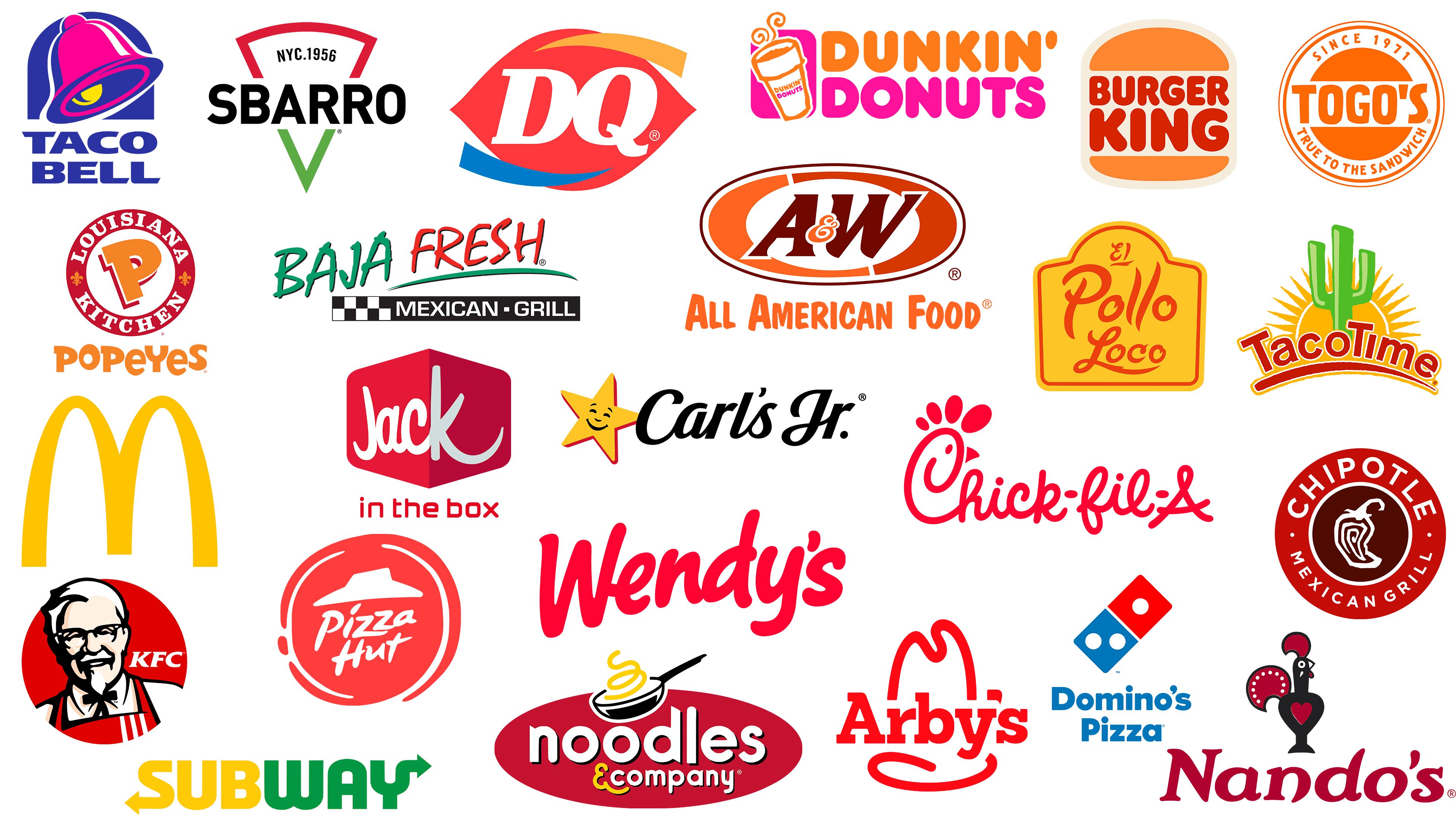
Fast-food restaurants are not only the most ubiquitous in the world but also the most popular. Many people use their services daily. Some chains are international, others are local, but they all share the same goal: to feed the population comfortably. Yes, so that visitors still want to come to a cozy place and sit at a table with hot pizza, hot tacos, flavorful chicken, or a tasty sandwich.
And to do that, you need to create the right atmosphere, backed up with delicious food and a nice personality. This helps fast-food restaurants stand out in a crowded market, attract customers, and generate steady profits. However, this is not the only common trait of the competitors in this review. There is another one: colorfulness. They all strive to make their logos unique, ensuring they are recognizable and whetting others’ appetites. These tones include orange, shades of red, and yellow.
We suggest looking at food company logos from this perspective and starting with simple shapes with little detail. This approach will help us understand how visual perception shapes human experience. In other words, why do we choose this or that fast food chain? After all, delicious and original dishes are served everywhere. What is the secret?
McDonald’s
![]()
The McDonald’s logo is the undisputed leader of this rating. This chain has a simple visual identification sign. With a limited color palette, it attracts many visitors: it is known in America and beyond. Super-minimalist style has made this fast-food restaurant the number one worldwide: it has many of its own outlets and franchises. And on each one, a big letter “M” with a rounded top instead of sharp corners. Elegant twin arches of pale yellow color associatively remind one of the side of a hamburger, fries, scrambled eggs, and a bun. It is, as they now say, a “delicious” emblem. However, the single bold letter conveys the founder’s last name, Ronald McDonald. The extended lower part of the emblem conveys the company’s unwavering commitment.
Subway
![]()
The Subway emblem features two arrows pointing in opposite directions. Both are sleek, sharp, and precisely angled. One is at the bottom of the letter “S,” and the other is at the top of the letter “Y.” Each side of the name of the world’s largest fast-food restaurant is individually colored. The lettering “Sub” is in pastel yellow letters, while the word “Way” is in light green. In general, the designers paid close attention to this because this is a text emblem with no other elements. The color palette is very thoughtful: yellow is close to the shade of baked goods, and green reminds me of spinach. Despite the simplicity of visual identification, it is very winning for a chain that offers popular dishes. The capitalized letters with rounded edges contribute to this.
Wendy’s
![]()
The specialty of these establishments is hamburgers. They are served with different fillings and different volumes. And since ketchup is a key ingredient in most of these dishes, the Wendy’s logo resembles a ketchup bottle. A thin strip of “tomato sauce” on a white surface forms a semi-erased inscription. The letters are handwritten, italicized, bold, and rounded. The color is a naturally rich red. The softened ends of the glyphs make the emblem attractive and welcoming. Despite its brevity, this style works well for a wide web audience, evoking trust and warmth in visitors.
Chick-fil-A
![]()
The Chick-fil-A logo, of course, features a chicken, since it is the main ingredient at these fast-food restaurants. The logo is mostly text, with a few graphics. But despite its simplicity, it is very memorable. The artists turned the first letter of the company’s name into a funny chicken head. The drawn bird turned out attractive and original because “C” features rounded shapes, smooth transitions, and soft lines. This glyph has a curve and a loop, complemented by a beak and a scallop. The remaining symbols are also similar to the handwritten glyphs. They are evenly spaced and closely related. The last letter “A” is capitalized. All elements of the logo are rendered in bold red lines. The background is white.
Carl’s Jr
![]()
The American restaurant chain Carl’s Jr. has a friendly and elegant logo. It consists of calligraphic lettering. Italicized letters are black, wide, and neat. Almost all of them are connected. Only “r” and “l” are missing, which are connected to “s” not in one but in two points at once, forming an inner loop. To the left of the “s” is a yellow star. It appears as if she is holding on to it, smiling welcomingly. Each ray has a thin red outline, giving it a three-dimensional feel. It’s a simple and timeless emblem that conveys a sense of hospitality.
Nando’s
![]()
The Nando’s logo comes from South Africa. That’s where the headquarters of the fast-food restaurant chain specializing in chicken dishes is located. And the brand’s visual identity speaks directly to this: the rooster above the name. The bird is depicted as a clay toy. It’s standing up straight. Although its head is turned to the left, it is looking straight ahead, as all feathered birds have their eyes on the sides. In addition, a high crest and a large tail are drawn. The front of the rooster is in the shape of a double heart: red inside, black outside. The inscription under it is in italics and lowercase letters. The letters have a streamlined, rounded, and grotesque shape.
Arby’s
![]()
The American restaurant chain Arby’s offers sandwiches with various fillings. Its logo is well known in the United States, ranking second among similar chains operating there. The logo reflects the professionalism and historical roots of the specialty cuisine. The color palette is red: both the lettering and the stripes, reminiscent of squeezed ketchup, are made with it. At the same time, it serves as a background for the brand name. The text is set in a large serif font. The letters are typed in lowercase, except for the first character of the name. It’s also a simple, minimalist logo.
Swiggy
![]()
The Swiggy logo launched in 2014 and quickly gained popularity as an online platform for ordering and delivering food, aligning with our consumer niche. Its symbol can be compared to a superhero icon, as it is designed in an identical style. This is how the design of the letter “S”, the first letter of the name of the restaurant chain, looks. It is a monoblock, rounded at the top and pointed at the bottom, which resembles a geotag on an electronic map. This comparison is very favorable, as it aligns with the fast-food chain’s objectives and points to its location. The pictogram’s bright orange color facilitates this. Intra-letter spaces are narrow and stretched vertically. Under the pictogram, the name of the food delivery service is typed in a grotesque style.
Sbarro
![]()
The specialty of these fast food restaurants is Italian pizza, as you can tell from the Sbarro logo. The chain is quite popular in the US, so it operates as a franchise. Its visual identity is simple: a triangular slice and the brand name. And that’s it. It was enough to attract visitors’ attention. The designers originally approached the logo by placing the pizza vertically, with the slice pointing downward. In the upper part, the authors indicated the city and the year the pizzeria was founded, and in the middle, the pizzeria’s name. It is written in uppercase black font. There are no serifs anywhere. The wide side of the triangle is colored red, and the bottom side is green. In combination with the white background, they repeat the colors of the Italian flag.
Dairy Queen
![]()
The Dairy Queen logo is characterized by simplicity and clarity. It includes the abbreviation “DQ” and a geometric figure resembling an eye. In the center is the fast-food restaurant chain’s abbreviated name. White letters on a red background are very effective because they are clearly visible. The inscription is slightly slanted to the right side. Both symbols are connected. They are large and bold. Next to them, from above and below, are two curved stripes: orange and blue. They have one side sharp and the other blunt, with a diagonal cut.
KFC
![]()
The popularity of this American restaurant chain is incredibly high, so the KFC logo is familiar to everyone. Its main element is a portrait of the network’s founder, Harland Sanders. It occupies almost the whole area of the circle. Against a dark red (carmine) background, a man smiles welcomingly. At the same time, he looks professional, dressed in a three-line apron and a white shirt with a bow tie. His glasses, beard, and noble gray hair give him a solid appearance. Next to it is a three-letter sign that reads “KFC.” It is white and wide, with bold letters and a slight rightward slope. The logo is also not complicated, consisting of three elements: the name, the founder’s portrait, and a circle.
Pizza Hut
![]()
The Pizza Hut logo does a great job of tracing the evolution of the chain’s identity from simple to complex forms. It includes three main elements: a circle with arc-shaped stripes along the sides, a miniature hat, and the name in two lines. They stand for a pizza with an appetizing crust along the edges, the national heritage of the cuisine on which the company is based, and the original name of the world’s most popular pizza chain. All of them are artistically stylized: made with careless but confident strokes. The text is divided into two parts and arranged in a diagonal pattern. The letters are uneven and vary in size. The logo’s color palette is a contrasting combination of red and white.
Burger King
![]()
The Burger King restaurant chain did not overload its logo with elements; it is quite minimalist yet clear and multilingual. To achieve a successful combination of the idea and its realization, the designers used the name as the basis. They divided it into two lines and placed it between two semicircles as if it were stuffing. This is how a truly royal burger turned out: big, tall, and appetizing. Despite the minimalism, the concept proved successful, as the American company has since become an international fast-food chain. The emblem’s color palette is as close as possible to the food palette: muted orange, pastel red, and beige.
El Pollo Loco
![]()
The Mexican cuisine that this chain of fast-food restaurants in Europe represents is encoded in its identity. That’s why the El Pollo Loco logo was designed in bright, sizzling colors: red and yellow mustard. The shape of the letters exactly mimics the red chili pepper, which has an unusually spicy flavor. Therefore, the glyphs have elongated, curved, and pointed shapes. The inscription lists the names of restaurants, divided into three parts. The shortest is the first one. In it, one element is emphasized by a bar divided at the end. All words are written in capital letters. A red, shaped border surrounds the text. It has a flat bottom and a convex top, mirroring the background figure painted in a muted yellow.
Food Darzee
![]()
This company has a lot of fans, as the Food Darzee logo is well known to those who love to eat but watch their figure. This Indian restaurant chain specializes in healthy, delicious food with delivery. She considers it the key to good health, vigor, and vitality, as she uses only natural products. And her menu promotes weight loss. The result of this concept was an emblem in the form of a key, drawn with thin lines. The complex geometric figure is an octahedron with an elongated leg, at the end of which two oblique stripes are drawn. The entire composition is painted in gold. At the top and bottom are the motto, website address, and the location of the healthy food delivery service. The inscriptions are in an uppercase sans-serif font.
Domino’s Pizza
![]()
The Domino’s Pizza logo reflects the concept laid down by the pizza chain’s founder at the very beginning. He wanted to designate the number of restaurants with dots on his knuckles. But later, so many were opened that the number did not fit on the knuckles of dominoes; they turned out to be about 17,000. So, the owner abandoned the idea and left everything as it was originally. Now, this simple emblem is known worldwide. A minimalist composition in blue and red features a domino knuckle with three dots: one on top and two below. The title is located below it in two rows. It is set in a geometrically proportional font, in which rounded corners harmoniously combine with right angles.
Dunkin’ Donuts
![]()
In this case, the visual identification is more complex in form, composition, and color. It advertises the main specialization of this chain of restaurants: coffee and desserts. Therefore, the Dunkin’ Donuts logo contains a coffee cup in front of the text. It is slightly tilted to the left, and above it, you can see jets of improvised steam, indicating that its contents are very hot. The background is a vertical rectangle with rounded corners. The drawing is made with uneven red strokes, and the company’s name is centered on the glass. On the right side is a large version of the name. The top word is red, and the bottom word is purple.
Taco Bell
![]()
The Taco Bell logo is an example of a medium-sized identity among fast-food restaurants. It is a Mexican brand that has become world-famous for its national cuisine. The logo consists of three key components: the name, the bell, and the tower opening. The elements of visual identification are made in blue, pink (a shade of fuchsia), and yellow. The bright palette attracts potential visitors and helps popularize the network. The lines that make up the design are smooth. There are also white stripes that indicate glare and reflections. At the bottom is the name, typed in a grotesque font and aligned on both sides. The letters are broad, capitalized, and bold.
Jack in the Box
![]()
This chain is popular in the United States but little known outside of it. At the same time, it has more than 2,000 fast-food outlets and is in high demand among the local population. The Jack in the Box logo consists of two connected trapezoids. One of them is dark red (crimson), and the other is light red (scarlet). They are connected to form a corner of the improvised box. It is this rib that divides it into two fragments. The one on the left is labeled “Jac,” and the one on the right is labeled “k.” All the letters are white, handwritten, and sans-serif. At the bottom are the rest of the names of the fast-food restaurant chains. It is set in lowercase, reminiscent of programming language symbols. The glyphs are flat, small, and rounded.
TacoTime
![]()
The TacoTime logo represents the country whose cuisine the chain serves. Its specialty is Mexican cuisine. The best personification of Mexico is the prickly cactus and the hot sun. They are depicted on the emblem. But it is quite a multi-component image, consisting of small details, for example, a large number of sharp rays. They surround the solar disk, which is separated from them by a white line. The cactus is also multi-component, with a central trunk and two branches. The company name has a long stroke at the bottom. It emphasizes the word “TacoTime” as it tapers towards the end. The letters and the bottom bar are double-outlined in white and yellow.
Baja Fresh
![]()
At first glance, the Baja Fresh logo seems simple, but if you look closely, you can see a lot of details. For example, a black-and-white mosaic emphasizes the line, and an unusual font clarifies the information. This chain cooks and serves Latin American cuisine, particularly Mexican, as indicated by the horizontal rectangular sign next to the checkerboard pattern. The main lettering consists of the names “Baja” in emerald and “Fresh” in red. The letters are sloppy as if written hastily by a trembling hand.
Togo’s
![]()
Togo’s logo is like a brand. It is complex in structure but simple in color. It is dominated by the color orange, with white elements visible in the background. This shape and color are not accidental. This restaurant chain offers all sorts of sandwiches, and the color of their toasted bread matches this warm hue. The medallion consists of the name (it runs in a circle on a separate strip) and several clarifying inscriptions. The letters are bold, large, and vertically elongated. The text around the perimeter of the frame is in small upper-case font.
Chipotle
![]()
The logo of the international restaurant chain Chipotle features one of the main ingredients of Latin American cuisine, chipotle pepper. It is located in the center of the circle and drawn with slightly curved stripes. In this way, the designers showed that it is soft and ready to eat. The drawing is in white and set against a brown background. This contrast makes the image distinct. Around the center element, on a wide red stripe, are the restaurant’s name and the qualifying phrase “Mexican Grill.” The restaurant chain offers Mexican cuisine, cooked mainly on the grill. Tiny dots separate the two sections.
Popeyes
![]()
The visual identity of the Louisiana-based restaurant chain is also quite sophisticated. The Popeyes logo is shaped like a seal, with a single “P” at its center. It is diagonal, in a muted orange color, with a tiny protrusion at the top. Beneath it is a dark red shadow that makes the letter look as if it’s hanging in the air. The white middle is taken in a red ring with the inscriptions “Louisiana” and “Kitchen.” The heraldic characters, fleur-de-lis, are drawn between them. The heraldic figures are colored orange. Under the medallion is the name of the American fast-food restaurant chain. It is executed in a jumping font with glyphs of different heights. This gives the text an informal character and contrasts sharply with the upper strict font.
Hooters
![]()
The American restaurant chain, known for its distinctive menu, has adopted a corporate marketing style. Indeed, the name plays with two meanings at once: a woman’s breast and an owl. Both are reflected in the Hooters logo. It depicts a night bird with huge eyes shaped like prominent parts of a woman’s body. The double “OO” serves as the base for them. The owl is colored in gray, white, and two shades of brown. The inscription is orange. It is set in sans-serif uppercase. The letters are bold, large, and rounded, with a barely visible dark border. The text is superimposed on the image.
A&W
![]()
The A&W logo is complex, comprising several distinct elements. It is built so that each successive component serves as a background for the next. Therefore, the details in the foreground are miniature, while those in the background are large. For example, the smallest is the “&” icon. The ampersand is on the “A” and “W,” not between them. It is soft and smooth, resembling the handwritten letter “E.” The lowercase letters, on the other hand, are strict and smooth. These glyphs are slightly slanted to the right, have sharp serifs, and overlap the figures behind them. Two semicircles are drawn behind them. All the above elements are in a horizontal oval. Below is the slogan. The color palette is restrained, featuring several shades of beige, from peach to brown.
Noodles & Company
![]()
The fast food restaurant chain Noodles & Company has the most complex logo. It consists of four key components: two lines of the name, a pan of noodles, and an oval uniting them. What’s interesting is that the ampersand is done in the Old English manner. It’s perfect for styling the signage to match the noodles served at this American chain’s restaurants. The letters are bold, white, and chopped.