The color green has many meanings. It symbolizes life, rebirth, nature, growth, profit, prosperity, progress and money. Companies in most industries use each of these meanings. Thus, we can be sure that green is one of the favorite colors among modern consumers. After all, brands that have chosen it for their visual identity are popular all over the world. This means that they are noticed, respected, and trusted.
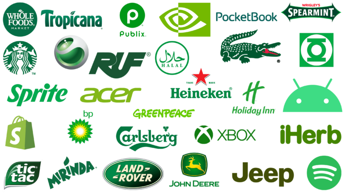
We have collected the most interesting and famous logos made in the green palette. And they are played with all shades of color – from neon-light green to mysterious emerald. Each company has its own motive. Delving into their concept, we will try to trace the relationship between the emblem and the demand for the trademark. And we are sure that we will find it. After all, it is not for nothing that organizations, manufacturers, and world-class brands spend money on self-realization through identity. It’s like advertising: the more accurate it is, the more profitable it is.
Here is a list of green logos arranged in order of increasing complexity. This way, it is easier to understand the meaning of the green color and what semantic support it has from the surrounding elements.
iHerb
Our “pantheon” opens with an online platform that sells vitamins, supplements, and organic and natural products. So it’s no surprise that she chose the color green for herself. It emphasizes its line of business, shows a connection to nature, and promotes the concept of natural habitat. The simple icon consists of the name of the web resource in its original spelling, where the lowercase letter “i” first comes. This is followed by the capital letter “N.” All letters are dark green in color, grotesque, and rounded. The lowercase “b” is the same height as the uppercase letter, so the lettering is visually balanced.
Acer
The Acer logo is also green in color. It’s a light green shade of the pastel spectrum: it’s rich in color but slightly muted in palette. The lettering is smooth and lowercase, which adds to its practicality. The glyphs are slightly italicized and elongated, which creates a sense of dynamism and emphasizes progressiveness. In addition, they are interconnected: each successive character is closely related to the previous one. Particularly interesting is the connection between “a” and “c,” which are literally “attached” to each other’s sides. Green color, in this case, indicates the company’s aspiration for constant development and improvement.
Jeep
The automobile company Jeep also has a logo from the category of “there is no simpler.” There is nothing in it except for one inscription – the name. It is typed in sans serif font with a narrow character spacing. The color of the text is khaki (also called swamp). This shade of green is associated primarily with heavy machinery and military uniforms. Therefore, the emblem looks brutal and balanced, emphasizing that the cars of this brand are very durable, reliable, and practical.
PocketBook
The manufacturer of electronic books for reading, PocketBook, chose a simple logo: it consists only of text. Thin letters are rounded at the ends and look elegant but strict. Letters “P” and “B” are capitalized, with spaces in the middle; the rest of the characters are lowercase, in the classic spelling. The letter “t” is missing from the left side of the crossbar. The color of the emblem is emerald – a mixture of green and blue. It is also called aquamarine. Such a combination balances the word logo, makes it harmonious, and embodies the craving for creativity, the emergence of knowledge, and the manifestation of wisdom.
Sprite
The color palette of the Sprite logo is inspired by the recipe of the soft drink, which uses lime and lemon. Therefore, the brand’s emblem used to be yellow, but in the modern interpretation, it became green – the color of spring grass. The simplicity of the symbolism is explained by the fact that it must accurately represent the product and be placed on a small label. Therefore, the letters are typed in italics but in bold type. There are no serifs, but there are dots at the ends and many right angles.
Greenpeace
If we talk about the integrity of tasks, concepts, and identity, then the Greenpeace logo is a perfect example of such realization. The green color, in this case, stands for ecology, nature, organic products, and the unity of man and the Earth. A special font was developed for the emblem – with bold and uneven letters as if written with a marker on a white sheet. Each glyph is different from the other: no two letters “E” are the same. The lettering is in upper case and colored in a light green hue.
RUF
German car manufacturer RUF has a progressive and bold logo. The visual identity is based on a stylized inscription, transformed from a regular text into a graphic element. The designers found common lines and connected all the letters into a single “construction.” Thus, they have interlocking sides: “R” smoothly passes into “F,” and between them, there is a part of “U.” They are painted in dark green, which emphasizes the business qualities and seriousness of the car company.
Android
The Android logo is one part green, as it has no gradient or glare. The logo shows only a half circle with a solid fill. It is distinguished from standard geometric shapes by two small white dots. These are the eyes of the “robot.” In the upper part, there are two small antennas located diagonally. In general, this image denotes an unearthly creature – an alien or, as it is also called, a green man. Hence the choice of color. The palette is calm, non-aggressive, soft, and light to show the friendliness of the operating system, which has become the most popular among smartphone and tablet owners.
Spotify
Internet streaming service Spotify chose a simple logo – a graphic one. It represents a green ball with three diagonal semi-arcs. “Half-arcs” – because the lines only vaguely resemble arcs: they’re more like diagonal strokes with slightly dropped edges. They are waves that broadcast music for music lovers. The upper stripe is bold; the lower one is thin. The color of the background circle is light green, a moderate shade. Three white arcs are visible on it.
Shopify
The Shopify logo is concise. It depicts a shopping bag – a paper bag with handles that is given to supermarket customers. It is the most iconic attribute in stores, so the online platform is well recognized. The online shopping service allows users to select and buy everything they need in minutes from the more than 1.5 million outlets it features. The calm green color contributes to this: it inspires trust, inspires confidence. The handles and the front of the package are light, while the left side is dark to indicate the side wall. In the center of the bag is a single “S” in white.
Lacoste
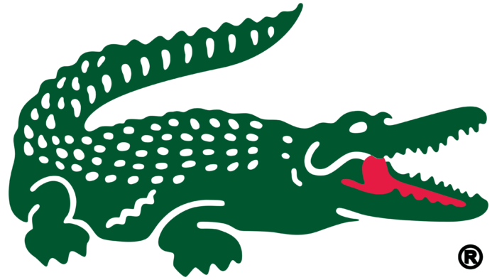
The Lacoste logo features a toothy crocodile, the mascot of this fashion brand. As expected, it is green in color. The shade is a very saturated, dark spectrum. For greater expressiveness, it is supplemented with two colors: white (eyes, dots on the crest) and red (mouth, tongue). This contrast gives the animal realism, confidence, and seriousness. The alligator is turned to the right. It has massive paws and a curved tail.
Carlsberg
The Carlsberg logo is another medium-sized visual identity mark. It represents the brewing company and consists of its name. The green color was chosen because the foamy beverage is bottled in green glass bottles – darkened so that the contents do not lose their properties when exposed to sunlight. Therefore, this shade evokes a feeling of professionalism and perfection. The inscription is made in a calligraphic handwritten script with a vertical arrangement of letters. The letters “C” and “g” have wide ribbon-like stripes, and the upper element “r” is depicted in the form of a leaf. Above it are three connected hop cones.
Tropicana
The green color scheme is ideal for a producer of juices and fruit drinks. That is why the Tropicana logo is green with a subtle gradient: the lower part of the letters is darker than the upper part. The shade of the inscription coincides with the color of the leaves of tropical trees, in which active photosynthesis takes place due to the excess of sunshine. In confirmation, the emblem is a leaf replacing the dot above the lowercase “i.” The cap of the capital letter “T” is made in a similar form: it repeats the outline of the pointed leaf.
Mirinda
The Mirinda logo is also dark green in color and has a leaf above the letter “i.” It differs only in the style of the lettering. In this case, the font is uppercase, geometric, and non-standard. The letters are different, with dots and uneven cuts at the ends, so they look “jumping.” The name of the juice brand is located diagonally.
Land Rover
The Land Rover SUV company uses a green but classic logo. It is an oval in a horizontal arrangement with a triple border of white, green, and silver colors. The middle is also green – with a gradient from light to dark. The brand name is placed in the center of the medallion and is typed in uppercase font with geometric letters. They are italicized, with tiny serifs in the form of pointed extensions. At the end of the first line and the beginning of the second line are triangular hyphens.
Sony Ericsson
The complexity of the Sony Ericsson logo is that it concentrates several shades of green color, forming three-dimensional spots. Thanks to properly selected shadows and highlights, they look like hollows in a gray ball. Moreover, it seems that in the center, there is another ball – a smaller one, completely colored in green. Bright and saturated colors are very appropriate for a cell phone manufacturer. Overall, the emblem looks futuristic.
Holiday Inn
Despite the presence of two elements, the Holiday Inn emblem is simple. The inscription is in the form of a thin grotesque with diagonally cut and pointed ends for almost all letters (except for the “o”). The glyphs are straight, flowing, and rounded. Above the brand name is a single letter “H.” It is made in the same style as the main text but with an elongated crossbar. As a result, the mark looks like a pound sign (#). The color is spring green, i.e., bright and juicy.
NVIDIA
NVIDIA, a developer of graphics programs, chose an abstract logo. The rich light green color looks great with neutral white, as the spiral line combines two colors at once. The left part has green stripes on a white background, and the right part is white on green. In addition, the stylized figure resembles an eye, which echoes the theme of the works of the American company. The name is absent, which gives the emblem mystery and originality.
Green Lantern
The emblem Green Lantern corresponds to the name of fictional superheroes, the first of which was mentioned in the DC Comics comic book in the 40s of the last century. Since then, it has evolved into a media franchise with a sequel in the form of a movie. The sign of these characters is, naturally, colored green. The emblem looks like a square that serves as a background for a white circle with a stylized lamp inside. It is also green in color and has a wide ring between two short lines. The composition of abstract geometric shapes represents the eternal fire in the hearts of those who strive for justice, fight for truth, and have brave hearts.
Halal
The green color in the Halal logo is classic: moderately bright, fresh, and rich, reminiscent of the color of the first spring leaves. It symbolizes Islamic culture, so most Eastern companies often use it in their symbols. The emblem consists of a green ring and a white circle, inside which there are inscriptions in Arabic and English. The font is uppercase, sans-serif. The emblems are flat, with clear corners and thin crossbars. Arabic letters, on the contrary, are rounded. They are made with smooth and soft strokes.
Whole Foods
Like many other brands offering natural, organic products, Whole Foods has chosen a natural logo. The emblem of this supermarket chain is a muted green circle. It contains the full name in three lines. In the first line is an image of an apple from the letter “o.” It is complemented by a cuttings and a leaf. In the second line, two neighboring letters, “o,” are played with. The letters are tightly connected. The third is the word “Market”. This inscription is typed in a thin sans-serif font. All the others have classical serifs. The color of the text is white.
Starbucks
The Starbucks logo has a more complex structure because it depicts a mermaid. The pattern occupies almost the entire space of the background circle and consists of smooth, wide lines that form an unusual image for a chain of fast-food restaurants. Thus, the dark emerald color shows long hair, a friendly face, thin arms, a shapely body, and a massive crown with a star. Also present is the semblance of a forked mermaid tail on both sides. This combination of colors represents a characteristic character endowed with confidence and determination. Thanks to him, the company is actively developing and opening its establishments in new places.
Tic Tac
The visual style of this brand is also well-known to fans around the world since it specializes in the release of small candies with different flavors. At first, the dragees were minty, so the Tic Tac logo contains a small green leaf with white two-tier lettering. It is in lowercase font with wide-rounded letters. The letters “t” and “c” have pointed ends. The leaf is arranged diagonally and is also pointed. It also has short light strokes drawn on it and has a shaped gray shadow at the bottom. There is also a black outline. These details give the logo a dynamic, three-dimensional, and realistic feel.
Wrigley’s Spearmint
The iconic Wrigley’s Spearmint logo has white, red, and two shades of green colors. It consists of multidirectional arrows formed on the base of an elongated rectangle. The geometric figure is arranged horizontally and is complemented by sharp triangles on both sides. In the center is the second part of the brand name. It is typed in upper case with large letters “S” and “T.” All glyphs have elongated dots. The first half of the name is colored red and typed in capital letters sans-serif. The main color of the banner is dark green. It is outlined with a thin, light green outline.
Heineken
Heineken chose a complex logo as it is one of the most famous beer producers in Europe and needed a decent identity:
- The brand settled on the color green, which is usually used to color glass for beer bottle production.
- It presented itself as a premium brand by using a big star.
- All this he succinctly labeled in the emblem.
The largest is the green-colored lettering. The name of the beer is in lowercase letters (except for the “N”). The letters are wide and grotesque. The “n” has a curved right foot, and the “e” has a center crossbar on the diagonal. At the top is a red star with five rays and black shadows, giving it volume. On the sides are the inscriptions “Trade” and “Brand”. These inscriptions are capitalized.
Xbox
The Xbox logo is a direct reflection of the developer’s concept of the console of the same name. It is made in a light and bright palette of the green spectrum. In contrast, white color is also present. This color is neutral, so it perfectly complements the main shade and balances it. The first is a ball formed from four triangles of different shapes. They are combined as if divided by two wide strips running diagonally. So, the designers got a stylized “X”. On the right side is the brand name. It is also green in color and made with thin lines. The letters have no serifs, and the letter “B” has an elongated middle stroke. It extends beyond the borders of the glyph and is cut at a slight angle at the end.
Publix
A dusty dark green color is used in the logo of Publix, an American company that has an extensive network of stores across the country. It also specializes in financial services, event management, and real estate. Therefore, its emblem is a circle that unites the entire scope of its interests. In the center is a single letter “P.” It is colored white and is shaped like a ring road with siding. Below is the name of the company. It is typed mostly in lowercase green letters. Moreover, “p” and “b” have a rounded shape and completely repeat each other. The letter “u” also uses a round geometric font.
BP
The BP logo is the most complex design among green visual identity marks. In addition to green and white colors, it contains yellow. This is explained by the nature of the company’s activities: it is engaged in almost the entire range of gas and oil services. Therefore, its sign resembles a flower consisting of many geometric petals. They look like elongated rhombuses with sharp tops. But the green color, in this case, is not one – they are two. The first row is colored in dark green, the second – in a light shade. In the center is a figure resembling the sun with long rays. The similarity between the letters “p” and “b” is also used. The abbreviation (for British Petroleum) is in the upper right corner.
John Deere
The John Deere logo emphasizes the high professionalism of the American manufacturer of agricultural machinery. It is a multistructured visual identity mark. It contains a pictogram consisting of a geometric figure with four convex faces. It also has two frames: the inner frame is yellow, and the outer frame is green. The central space is painted in a gradient green color: in the middle, the shade is lighter than at the edges. A running deer is depicted in this background. It is depicted at the moment of jumping, which echoes the concept of the manufacturer of specialized equipment. The silhouette of the graceful animal is positioned sideways and pointing to the left side.
