


Colorimetry is the science of colors. It studies hue changes, measures their intensity, and determines their effects on humans. Therefore, color in logos plays a paramount role. It determines how much the emblem will be conceptualized, how many customers it can attract, and what impression it will leave. This approach forces companies to refine their style, correct flaws, and adjust their tone, as the right color is key to success.
As a result, we can observe many variants of logos today. With their help, brands fight for popularity, recognition, and demand. Of course, the catchiest in the color palette is red. Eyes are instantly drawn to it. But how did you make it neither aggressive nor unattractive? This helps company owners enhance their reputation and increase their revenue. What is the secret here? Let’s figure it out!
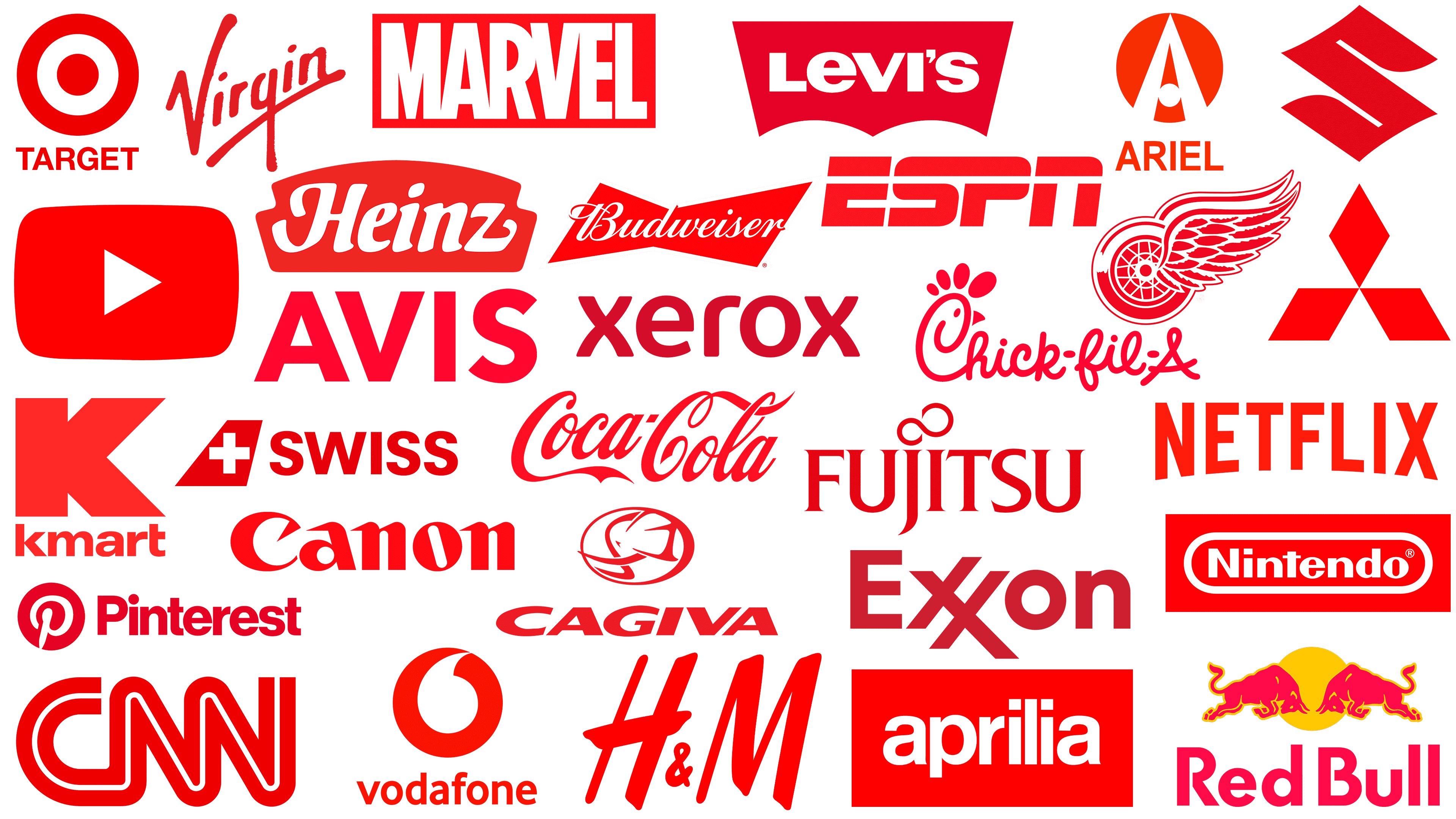
We have selected the emblems of the most famous brands whose visual identities are based on the red spectrum. It is mostly complemented by white, as a neutral background creates a sense of calm and dispels a sense of danger. This combination demonstrates determination, confidence, passion, and strength. Here are the top 30 companies associated with the color red. We have arranged the logos from simple to complex.
Suzuki
![]()
Suzuki’s logo couldn’t be simpler. It is based on just one letter taken from the automobile brand’s name. The stylized letter “S” is painted in a deep, rich shade of red. It looks elegant and unusual, with Asian roots: the symbol resembles a hieroglyph. All the ends are pointed, and the radial lines are curved. This makes it resemble the roofs of Japanese pagodas. This combination of color and shape brings thoughts of peace, tranquility, and confidence. Additionally, the emblem showcases a progressive mindset and a willingness to adopt technological innovations that transcend conventional norms. This manufacturer also chose red because it echoes the Japanese flag.
Mitsubishi
![]()
Japanese laconicism is characteristic of the Mitsubishi emblem, which is also rendered in red. The automaker demonstrated its love for the motherland and its superiority over competitors, as this color represents innovation, leadership, and technological challenge. The pointed badge is formed by three rhombuses connected at their corners in the center. The result is a geometric figure resembling a flower with delicate, petal-like features. In the negative space between them, white triangles are visible. This element was named Mitsubishi Diamond. Thanks to this combination, the corporate badge looks elegant and modern.
YouTube
![]()
This is a simple corporate identity. Moreover, it is practical because it includes a play button for content such as audio or video. Indeed, the international online resource YouTube has chosen a thematic logo that explains its color scheme. The Play button traditionally features a white triangle. This element was already in use before the advent of virtual media players on remote controls, tape recorder keys, and DVD players, among others. The designers combined it with a red horizontal rectangle. This color, as best as possible, conveys activity, dynamism, and beginnings. All sides of the background figure are slightly curved, and the corners are rounded, which gives the logo a friendly appearance.
Detroit Red Wings
![]()
The Detroit Red Wings’ emblem embodies the confidence, energy, and determination of a hockey team, which is precisely what the red color represents. The NHL team’s visual style is dynamic because the circle represents movement. In this case, the circle has wings that give it even more dynamism. One of them is shown in full. The feathers are drawn in detail, with smooth curves ending in sharp points. The second wing is located behind the first, so only the upper fragment with a wavy stripe is visible. The wheel is large, with luminous highlights and spokes. The white color harmonizes perfectly with the red, emphasizing the concept of continuity of movement.
H&M
![]()
Swedish fashion house H&M chose a laconic logo consisting of two capital letters connected by an ampersand. Everything is executed in a dark shade of red. It streamlines the lettering and brings austerity, making the emblem colorful but understated. In addition to confidence and flashiness, this palette symbolizes beauty, given the brand’s association with the fashion industry. The letters “H” and “M” are oblique, capitalized, and grotesque. They consist of lines of varying widths, making them dynamic and unusual. The feet at the ends have rounded corners, so the glyphs do not have sharp elements. The ampersand is miniaturized and not centered but at the bottom. It is also colored red.
CNN
![]()
The color palette of the CNN logo has a profound impact on the population, as it symbolizes the relevance and importance of the news reported by this media giant. The channel’s bright red icon appears powerful and stable, conveying confidence in what is happening. The text of the emblem is in double capital letters, separated by a thin white stripe. At the same time, the large and small glyphs are almost identical in lettering. The only difference is that the inner glyphs have pointed feet, and the outer ones are rounded. The inscription is continuous, consisting of two unbroken bands, so the letters appear to flow seamlessly into one another. A thin white line in the center gives them an airy, light feel.
Avis
![]()
The Avis logo is simple in both shape and color. It uses a dark crimson shade that is calmer than the others. This perspective is based on the demand for the service, as it involves car rental. Such a visual image instills confidence in potential customers considering a rental. The design of the emblem is laconic: it consists only of letters of the same style. No images are absent. The letters are flat, vertical, and classical in style. The inscription is written in bold, grotesque type. Color, in this case, serves as the sole decorative element, as the emblem has no other options.
Xerox
![]()
This is the world leader in printing and scanning a wide range of materials. Therefore, Xerox has chosen a conceptual logo that somewhat reflects the nature of its business. The direction of the work is conveyed in smooth lines, in the curves of the legs, and in smooth strokes. The designers reflected the versatility and flexibility of copiers that can scan and print documents, images, books, and photographs. The text logo color is a soft, non-aggressive red that is eye-catching. The smooth contours of the sans-serif glyphs give it a softness. The inter-character intervals are wide, which visually balances the massive letters.
Exxon
![]()
Exxon, the largest international oil and gas company, has a text-red logo. A double “x plays the role of graphics in it: both letters have one common leg. Because of this, there is a slight bevel reminiscent of the typographical hash “#” (hash). All the lines of the icon end with a diagonal slice; it is present at both the top and the bottom. Other symbols are not connected and are spaced apart. The red color used in the corporate style is light but saturated. It conveys power, strength, and energy, reflecting the essence of business and the oil and gas enterprise.
AirAsia
![]()
The Malaysian airline’s emblem is red and white. Despite its apparent simplicity, the AirAsia emblem has a complex structure. This can be seen in the letter “i.” Both lowercase letters are rendered non-standard: they do not have a flat cut but instead have an arc-shaped depression reminiscent of a smile. This design emphasizes the air carrier’s goodwill, hospitality, and friendliness, despite the catchy palette, because the red used is the brightest shade: scarlet. In addition, the right side of the letter “r” is also replaced by a bold dot, making it look like an atypical “i.” The remaining symbols are classic and are in lowercase. They have smooth curves and proportional rounding, so they do not break out of the usual style, allowing you to better see the characteristic features of neighboring letters.
Canon
![]()
The world leader in camera and lens production has a very simple emblem. It consists only of its name, written in dark red, which signifies the company’s authority, leadership, and high capabilities. The inscription uses bold lowercase letters, which do not make the characters large. The exception is the first letter: it is typed in capital letters. All glyphs (except one) have needle serifs pointing to the left. The letter “o” is slanted in the same direction. The Canon logo, in general, surprises with a harmonious combination of smooth, rounded shapes and sharp corners. The red color plays a significant role in this; it attracts attention and helps to smooth out the dissonance.
Netflix
![]()
The color of the Netflix logo is scarlet. It is such a light and bright shade of red, reminiscent of blood. It fits perfectly with the minimalist design because the emblem of the American entertainment film company shows nothing but the name. It is focused on developers and offers a variant that lets the number of letters be adjusted. As a result, they turned out to be low in the middle and high on the sides, which adds dynamics.
And the expansion occurs only on the lower border of the world. The upper part is flat and horizontal. Glyphs used in the text are uppercase, in a condensed style, and bold. The inter-character spacing is wide, so the lettering looks light and balanced.
ESPN
![]()
Red color best conveys dynamics and energy. This explains the American cable channel’s choice to broadcast sports and extreme sports. The inscription on the ESPN logo is simple, single, and made in a non-standard font. It features massive slash glyphs connected like a racetrack. At the top of each glyph is a white stripe that divides it into two halves.
And this strip is through, as it is open on both sides. The letters have a slight rightward slope. The emblem’s color is bright and saturated.
Virgin
![]()
The Virgin’s emblem resembles a personal signature. Such an image is necessary for this company, as it is simultaneously involved in various areas of the economy. With a handwritten sign, she can more easily demonstrate her personality and show customers her focus on close contact. And it is the red color that helps realize the idea. It has made this brand’s emblem one of the most recognizable in the world. The text is arranged diagonally and composed of smooth, emphasized lines. The letters are lowercase (except for the “V”) and are in a grotesque style. The first glyph has a side stroke. The letter “q” has an elongated stem.
Fujitsu
![]()
In this case, the red color in the emblem originated from a sense of patriotism. The company Fujitsu chose an emblem in the colors of Japan’s national flag, white and red. The basis is the name of the manufacturer of a wide range of electronic devices. It is set in a custom serif font, tiny but clear. The inner lines, on the contrary, are rounded. This is especially noticeable in the letters “U” and “S.” The rest of the glyphs have right angles. All letters have a smooth, soft transition into the serifs. The dots above the letters “j” and “i” are connected. Designers stylized them as two combined circles so they resemble ∞ , the classical infinity sign. All characters are uppercase, except for the lowercase “j” and “i,” which are simply enlarged in size.
Coca Cola
![]()
The Coca-Cola brand has a simple logo. It contains nothing but text based on the name. The lettering is done in cursive calligraphy by hand. It also contains vignette elements: swirls, curved lines, and wavy ribbon-like stripes. The initial “C” in the first word has an extended lower part, and in the second, it has an extended upper part. The rest of the letters are lowercase and rounded. The hyphen is short: it is shown as a parallelogram. The sign is so tiny that it is lost against the large elements in the background. In this case, red conveys passion, energy, love, and confidence.
Motorola
![]()
Passion and progress- that’s what red represents in the Motorola emblem, as this company was one of the first to enter the cell phone industry. The main element of its emblem is the capital letter “M,” consisting of two identical arrows. They are connected in the center and have elongated legs on the sides, clearly reminiscent of the first letter of the name of the American telecommunications company. The upper part of the glyph dissects a sharp triangle, and in the lower part, there are two arc-shaped elements. The single symbol is located in the center of a solid circle. Thus, the red color reinforces the concept of an innovative approach, providing comprehensive coverage of various directions. As a result, the right combination of geometry and palette was a prime example of successful visual identification.
Chick-fil-A
![]()
Fast food restaurant chain Chick-fil-A employs a simple yet thematic logo as it prepares its chicken dishes. The designers harmoniously combined the brand name and the image of the chicken. For this purpose, the developers stylized the first letter by adding a crest, beard, beak, and eye. To match the natural color of the chicken scallop, a red with a slight crimson tint was chosen. The emblem consists entirely of an inscription in a careless handwritten style. In this case, the glyphs are not oblique but straight, with bold, smooth lines. Each part of the name is connected to the other; there are no gaps between the letters, and they are closely connected.
Marvel
![]()
Red, chosen as the color of the emblem of the famous media franchise, is characterized by a powerful energy charge. The color is bright, saturated, and catchy, so the Marvel emblem quickly catches the eye. However, if the letters on other icons are colored red, then it is only the background. The white lettering breaks out of the negative space like a curly element. Although the text is printed, it consists of closely spaced glyphs. “M,” “A,” and “R” touch at the bottom, while “R,” “V,” and “E” touch at the top. The exception is “L”: it is located separately from the other glyphs. For the word “Marvel,” the designers chose a geometric solid sans-serif font. The background is a horizontal rectangle.
Aprilia
![]()
The visual style of this Italian brand is another vivid example of the red square-and-white-lettering combination. However, the shade here is lighter scarlet. This palette is characteristic of Italians, who are emotional and love the unusual. The catchy color in the logo is balanced by a minimalistic design and restrained font. The text is written in classic lower-case block letters. They are neat, and due to the contrast, they seem perfectly white. The peculiarity of the inscription is the squares above the letter “i” instead of the usual dots. Additionally, both signs are aligned in height with the letter “L” between them.
Levi’s
![]()
The red color in the Levi’s logo appeared in the mid-20th century. Since then, it has remained a constant presence in the iconic denim brand’s identity. True, several color adjustments were made, after which red received a dark crimson shade. At the same time, the shape of the company name is not quite rectangular: it has two curved bends at the bottom, which makes the background look like an open book. The glyphs are also white. They are thick, squat, and wide. The distance between the letters is minimal: the characters almost touch each other, but this does not happen because there are no serifs. Of typographical interest is the original combination of the lowercase “e” with the uppercase letter: it is so large that the difference in fonts is not immediately noticeable.
Heinz
![]()
The sauce manufacturer could not choose another visual style: the Heinz emblem is red because that is the color of the tomatoes that form the basis of its products. The emblem is arc-shaped at the top and flat at the bottom. Its base is a shaped trapezoid with “steps” on the sides. The trademark name is white, typed in italics. The letters are slightly wavy lowercase, except for the first one. The “H” has both ends elongated, and the “z” has the lower part elongated.
Budweiser
![]()
The famous beer brand also uses a red background in its logo. However, the Budweiser logo remains distinct from the visual identification signs of other companies, notably in its shape. It resembles a bow tie. Straight lines and right angles emphasize its geometricity. The name, centered, is white, italic, and set in a handwriting-style font. The letters are calligraphic, connected, and have the same height and width. At the narrowest point is the letter “d,” while the “B” and “r” extend beyond the borders of the figure.
Nintendo
![]()
The Nintendo logo indicates the company’s roots, as red is the color of the Japanese flag. In addition, this spectral hue conveys excitement, passion, joy, and energy, as the brand is associated with the gaming and entertainment industry. Its badge is an incredibly red-light scarlet, bright and dazzling. It represents a rectangle stretched horizontally. In the center is an oval formed by a bold white stripe. At its center, on a red background, is a white inscription naming the console manufacturer. The letters are grotesque and flat. Almost all of them are rounded except for the “N,” “i,” and “t.”
![]()
The online platform Pinterest uses a red-and-white emblem. The emblem consists of two components: the pin and the name. The site’s personalized pin is circular with a solid red fill and a white “P” in the background. It has a curved shape with a large cap and flowing lines. The end of the stem is connected to the edge of the circle and is pointed, giving the glyph a pin-like appearance. On the right side is the text part, typed in red letters. They are printed in a strictly vertical, grotesque, lowercase font, except for the first one.
Swiss International Air Lines
![]()
The Swiss International Air Lines logo is also in red and white. It is a complex visual image, as it consists of two components. The first is a figure resembling the tail’s keel and rudder of an airplane. Its lower and upper borders are horizontal, and its sides are diagonal. In its background, there is a flat cross taken from the Swiss national flag. The inscription is bold, chopped, and capitalized. Like the icon, it is colored in rich red.
Adobe Acrobat
![]()
The presence of an encrypted inscription is characteristic of the Adobe Acrobat logo. In addition to the catchy red color, it contains the letter “A.” It is stylized as a Mobius loop, an infinity ribbon with smooth transitions between its sides. The glyph also takes the form of a triangle with bent ends, located at a slight angle to the left. The lines are white, medium-thick, and visible against the light-colored square with rounded corners. Such an icon serves not only as a logo but also as a symbol for mobile applications and as a representation of the site. In this case, the red-and-white scale symbolizes innovation and energy.
Target
![]()
The American department store chain Target has an abstract logo. At first glance, the sign seems non-thematic, but it is not; it is directly related to commerce and sales. The emblem features a target design with a solid center circle and a wide outer ring. Between them is a white stripe of equal width. The concept of this emblem suggests that every purchase is a direct hit on the target. Below is the company name typed in thin sans-serif letters. Partial rounding is only possible for “R” and “G”.
Vodafone
![]()
Cellular operator Vodafone chose a red logo because it is instantly recognizable among competitors and is highly eye-catching. On the background of a red-orange circle, a thick comma was placed in white. Below is the text part. It is the company name, typed in lowercase letters. The bright red letters have a rounded shape, giving them a streamlined appearance. The exception is the letter “v,” which has straight lines and angles.
Kmart
![]()
The block letter “K” in dark carmine is the primary characteristic of the Kmart logo. This color perfectly attracts buyers’ attention and puts them in a serious mood, as the department store chain in the United States offers a vast range of goods. The emblem consists of two parts: a capital letter and text. It is located below and is made in lowercase. All characters (except the first) are rounded. At the “t,” the left side of the crossbar is cut off, allowing designers to optimally position the neighboring “r.”
Ariel
![]()
The Ariel logo takes an opposite approach to red: it is not dark but bright, close to the shade of a carrot. With it, the race car manufacturer makes a loud statement. Its visual identification is a circle with a non-standard letter “A” inside. It consists of two superimposed triangles: a small red one and a large white one. They have sharp tops and rounded legs. The large dot replaces the crossbar. Below the graphic icon is text. It contains the brand name in the same color as the background circle. All glyphs are uppercase, chopped.
Red Bull
![]()
The Red Bull energy drink brand has chosen a logo that matches its name. In this case, red signifies strength, energy, and power. That is why, in its logo, two red bulls are fighting against the background of the rising sun. It is depicted as a disk with yellow reflections on the animals’ bodies. This artistic technique enables you to accentuate the musculature, highlight contours, and introduce tension. The eyes are drawn in the same color. The company name is written at the bottom in a large font. The letters are not serifed, and the curves of the “R” and “B” do not reach the opposite side.
Cagiva
![]()
The Cagiva logo is the most complex among the red-colored logos of other companies. It consists of many thin lines forming the image of an elephant. The head is depicted in profile. In it, the ear, forehead, tusks, and trunk can be guessed. For motorcycle manufacturers, this animal embodies strength, so the emblem is red. The central part is set in an oval frame. Below is the name of the Italian company. It is typed in a grotesque cursive. The letters are large, bold, and capitalized.