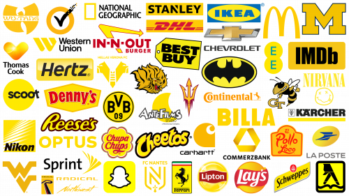
Yellow is like sunlight, filled with warmth, friendliness, and joy. This shade is used in the logo to show teamwork. A friendly team, ready to welcome the customer. The color promises pleasant emotions from using the brand’s products or offerings. It guarantees problem solving, growth, flourishing and a burst of energy. Companies that use yellow in their logo appear energetic, bright, and cheerful to the viewer. They always leave a pleasant impression of ease and simplicity in communicating with them.
Antefilms
In 2003, a remarkable transition took place when the famous French television company rebranded and became known as Antefilms Studios. Their chosen emblem, a shining yellow crescent moon, harmonized with sleek white lettering highlighted by a crisp black border. This mesmerizing design unmistakably echoes the visual characteristics of Moonscoop, a predecessor organization that left its mark from 2003 to 2014. The moon in the logo symbolizes not just a celestial luminary but a dream, a deep understanding, and a wide range of fantasies that the studio skillfully translates for viewers. The Antefilms logo subtly incorporates elements of animation, hinting at the studio’s early beginnings in animation.
Arizona State Sun Devils
In 1946, the Arizona State University athletic team featured a devil’s trident. This emblem is associated with the beloved mascot, Sparky, the brainchild of famed illustrator Burke Anthony. The name of the Arizona State Sun Devils emblem comes from the meteorological phenomena resembling a small tornado and represents the indomitable spirit and resilience of the athletes. Possessing a friendly nature and at the same time, these athletes display impressive skill on the field, effortlessly outshining and outrunning their opponents.
Arkansas PB Golden Lions
It boasts the University of Arkansas athletic teams’ emblem depicting a lavish golden lion mane. The piercing red eyes and open maw give the image an intimidating, almost devilish appeal. Evoking comparisons to the sinuous tendrils of the mythical Medusa Gorgon, the downward-flowing mane radiates a mesmerizing and frightening aura. The Arkansas PB Golden Lions emblem is a testament to the unity and indomitable spirit of the athletes, whose vibrant energy consistently defeats opponents on the field. For those who identify with this emblem, it is a symbolic shield guarding the collective pride of its bearers.
Batman
Appearing in the pages of DC Comics as a black bat against a glowing yellow oval, the Batman emblem has become synonymous with the vigilant protector of the night. When Bruce Wayne puts on his iconic costume, the city is under the protective cover of his outstretched wings. The bright yellow hue emanating from the emblem symbolizes a beacon of hope and safety. With this night guardian tirelessly watching over them, the citizens of the metropolis breathe easier, and their nights are illuminated by this shadowy crusader’s unwavering pursuit of righteousness.
Best Buy
The Best Buy logo, representing one of America’s leading home appliance retailers, stands out with a distinctive yellow hue that is synonymous with low-cost offerings and value for money. This bright color symbolizes the joy of purchasing reliable and practical gadgets and establishes a connection with the consumer psyche. The emblem, similar to the yellow price tag, creates a sense of immediacy and benefit. Such design solutions subtly convey the idea that this institution prioritizes the interests and savings of its customers, reinforcing the idea of favorable offers and high-quality products.
Billa
The Billa emblem, consisting of large yellow letters, is a beacon for shoppers in Austria. The bright hue is not only eye-catching but also shows the brand’s commitment to providing value and creating a pleasant shopping experience. Billa originated as a discount store. Taking its name from “Billiger Laden,” which translates to “cheap store,” the brand has consistently adhered to the principle of affordability. The modern version of the store continues to follow its founding principles, often displaying yellow price tags denoting bargains and making sure that customers always find value in their purchases.
Borussia Dortmund
The Borussia Dortmund emblem uniquely reflects the heritage and excellence of one of Germany’s most respected soccer clubs. The emblem is based on a design reminiscent of a soccer ball, seamlessly incorporating the essence of the sport. This iconic symbol is adorned with bold capital letters representing the club’s initials, taken from Ballspiel-Verein Borussia. The letter “09” indicates the rich history of the club, the year of its foundation being 1909. The black-and-yellow color palette has earned the affectionate nickname “black-and-yellows.” In the emblem, the yellow circle is a symbol of unity, dynamics, and harmonious rhythm of the team on the field. This bright hue radiates an infectious optimism. There is an intriguing contrast in the realm of soccer. At the same time, yellow is associated with positivity and dynamism and is also a shade of caution, recalling the yellow card issued for unsportsmanlike behavior. This duality adds depth to the meaning of the emblem, making it even more appealing.
Carhartt
The Carhartt emblem stands out with a distinctive yellow swirl that immediately catches the eye. The design, complemented by elegant black lettering, emphasizes the brand’s solidity and durability. The emblem elements reflect the strength and stability of the jackets and overalls for large-bodied men. The warm yellow shade of the emblem brings thoughts of comfort, allowing the wearer to feel cozy in the clothing of this brand. Building on more than a century of heritage, the brand pays homage to its founder, Hamilton Carhartt. This time-honored name remains an integral part of the logo, demonstrating the brand’s commitment to tradition and quality.
Cheetos
The Cheetos emblem is instantly recognizable thanks to the bright yellow font, symbolizing the cheesy taste of the product and the corn from which it is made. The clear elements of the font hint at the savory note and crunchy texture of these popular cheese snacks. The deep black background creates a striking contrast, further emphasizing the striking features of the logo and the product itself. Although the snack has been a favorite since 1948, its branding received a boost with the introduction of Chester the Cheetah, the brand’s charismatic yellow mascot. His playful and mischievous nature perfectly captures the spirit of the snack, making him a worthy representative when combined with the logo.
Chevrolet
The Chevrolet emblem, with its distinctive butterfly shape, pays homage to the Swiss roots of the brand’s founders, Louis and Arthur Chevrolet. While many associate this design with the American spirit of automobile design, its origins can be attributed to the cross of the Swiss flag. The dark yellow hue of the emblem, encased in a silver outline, stands for more than just aesthetics. It is a testament to the safety and comfort that Chevrolet vehicles provide to their drivers. Throughout its history, this emblem has remained an iconic symbol of quality and innovation in the automotive industry.
Chupa Chups
The golden flower adorned with a spectrum of colors created for the esteemed Spanish brand is a testament to the creative genius of Salvador Dali. This emblem is filled with happiness and playfulness, reflecting the innocence and warmth of youth. The design of the emblem reflects the sweet taste of the confection, each contour hinting at a characteristic ingredient that leaves behind a pleasant sensation on the palate. The prevailing golden hue in the emblem creates a sense of a universe of pleasure reminiscent of the Chupa Chups logo.
Commerzbank
The emblem of Commerzbank, designed in the form of a golden triangular ribbon, symbolizes one of the most formidable banking institutions in Germany. This design is reminiscent of the logo of Dresdner Bank AG, which merged with it in 2008. The choice of yellow shade and flowing lines are Commerzbank’s distinctive contribution to this single symbol. The triangular shape symbolizes the balance achieved as a result of the joint development of the bank, its customers, and its employees. The dominant yellow color emphasizes the essence of open dialogue and communication.
Continental
The choice of a yellow-orange hue for the Continental logo, especially for a tire company, may seem unconventional. But it is this shade that represents the straightness and maneuverability of automotive “shoes.” These products are famous for exceptional traction, providing smooth and confident driving. The name of the company in this bright color symbolizes a journey with Continental, which eliminates unnecessary worries and complications.
DHL
In bright red letters on a sun-drenched yellow background, the DHL logo embodies a sense of dynamism and urgency. With its distinctive elements, the lettering gives the impression of rushing past, reminding you of the speed and efficiency of delivery. The yellow rectangular field symbolizes the huge number of parcels and shipments that the American logistics giant handles on a daily basis. Beyond aesthetics, the chosen color palette instills confidence and gives customers a promise of reliability and assurance.
Denny’s
The vibrant Denny’s logo, set against a yellow pentagonal background with bright red lettering, exudes the sense of warmth and celebration that characterizes classic American restaurants. This emblem signifies a place to eat good food and enjoy fine dining. The pentagonal shape references the architectural design of the roofs of the first diners and subtly hints at the packaging in which a variety of culinary treats are neatly packed.
EE
The EE emblem, consisting of yellow intersecting circles, becomes a visual embodiment of the essence of connectivity championed by the renowned British cell phone operator. These circles, which evoke the image of interconnected realms, signify the fusion and symbiosis of different communication paths. The choice of a bright yellow hue reinforces the mood of positive interaction, encouraging dialog and overcoming distances. Thus, the logo embodies the company’s mission to ensure smooth communication.
El Pollo Loco
With a design reminiscent of a takeaway container, the El Pollo Loco logo fits seamlessly into the culture of fast food restaurants. The harmonious combination of yellow and orange colors paints a picture of salty dishes, ensuring diners have a gastronomic experience. The eye-catching hues indicate the brand’s commitment to creating a welcoming atmosphere and emphasize ease of access for diners looking for a pleasant dining experience. Emphasizing this warm palette, the bold red font and accompanying trim subtly convey the brand’s promise to provide customers with fast and efficient service.
Ferrari
The Ferrari emblem incorporates elements of national pride and features a bold yellow vertical rectangle adorned with stripes reflecting Italy’s national flag. The bright background depicts a black stallion dynamically raising its head upwards, representing unrivaled speed and vigor. The choice of bright yellow color brings to mind the thoughts of luxury, nobility, and unhurried elegance that fans and admirers often associate with the cars of this respected manufacturer.
Georgia Tech Yellow Jacket
The Georgia Tech Yellow Jacket logo combines bright yellow capital letters in the form of a distinctive weave. This artful combination speaks to the unity, camaraderie, and interconnectedness of the athletic community. Further reinforcing this idea is the lively mascot – the yellow Buzz Jacket. This emblematic insect represents perseverance and dedication as well as frivolity and playfulness, reminding the audience of the balance between dedication and the importance of enjoying the journey.
Hellas Verona
The Hellas Verona emblem is a testament to the rich history of the region, intertwining the heritage of the ancient Scala family with a passion for soccer. The two muzzles of mastiff dogs facing in opposite directions dominate the emblem, reflecting a sense of vigilance and resilience. These canines, stylized as the initial letter of the club, radiate a protective aura as if standing guard over the honor of the team. Central to the emblem is a pure white ladder, symbolizing the path of the team, always looking upwards. The presence of yellow in the design not only enhances the vitality of the players but also represents their collective dedication and unity on the field.
Hertz
The Hertz logo, which symbolizes the leading car rental company in the United States, uses a striking combination of yellow and black. This duo of colors subtly conveys the efficiency and reliability that are the hallmarks of the company’s fleet. The oval-shaped logo emphasizes the brand’s commitment to making rental easy and affordable. The shimmering highlights on the bright yellow background bring to mind sunlight reflecting off the smooth surface of the vehicle, suggesting the elegance and comfort that customers can expect from their vehicles.
IKEA
A golden ellipse on a background of azure color represents a human shelter – comfortable and safe. It is created with products from this Swedish retail chain. Attractive and inexpensive furnishings offer buyers a chic living space. Shades reminiscent of the Swedish national flag emphasize the brand’s commitment to its national heritage, and the IKEA emblem is its iconic symbol.
IMDb
The fusion of a gold rectangular background with bold black lettering is often seen in brand design. In the case of the IMDb logo, this rectangle captures the essence of the extensive archive. The site offers a wealth of details covering the entire movie industry. The look of the IMDb logo serves as a beacon for movie buffs looking for in-depth information.
In-N-Out Burger
The In-N-Out Burger emblem effectively conveys the speed and pleasure of eating with a vibrant combination of red and yellow colors. A gracefully curved yellow arrow serves as a landmark, indicating to potential customers where delicious burgers await them. This symbolic design emphasizes the idea that restaurants are accessible and strategically located.
Kärcher
The Kärcher logo, adorned with a prominent yellow stripe, emphasizes the company’s personality. It is the shade associated with the notions of cleanliness, aesthetic appeal, and organization that are inherent in the offerings of this renowned German equipment manufacturer. The continuous linear elements of the emblem add to its appeal and serve as a testament to the brand’s unwavering commitment to product excellence.
La Poste
Characterized by a bright yellow circle and a whimsical blue bird resembling a compact airplane, the La Poste emblem has remained a constant symbol of the iconic French postal service for nearly two decades since its introduction in 2005. This mesmerizing bird figure gives the impression of being bathed in radiance. The yellow hue of the emblem emphasizes the company’s unwavering commitment to the accurate and careful delivery of each customer’s mail.
Lays
The Lays logo is a glowing yellow circle that resembles a perfectly fried potato chip, shining with a mouthwatering crunch. Rimmed with a bold red ribbon with the brand’s name in white lettering, it subtly hints at the variety of flavors and seasonings that complement the basic chips. This color palette brings to mind pleasant moments spent over salty snacks in friendly groups.
Lipton
In the Lipton emblem, a glowing yellow circle, complemented by white sparkling details, conjures up the image of an outgoing steaming cup of flavored tea. This circle, adorned with a red label with a crisp white brand name, echoes the visual aesthetic of the tea bag label of this iconic British brand. The chosen palette not only conveys the inviting warmth of a well-made cup but also reveals the essence of the drink’s luminous, sun-filled flavor, rich and inviting.
McDonald’s
The iconic golden arches that resemble the initial letter in the name of the famous fast-food restaurant chain are instantly recognizable to many people around the world. These sweeping curves are inspired by the architectural arches of the first McDonald’s restaurant. The elements of the McDonald’s logo, which appeared in 1961, can be compared to the appearance of the signature French fries. Often set against a backdrop of bright red, this color choice evokes feelings of quick and delicious food waiting for eager diners.
Michigan Wolverines
The Michigan Wolverines emblem includes a large letter M, connecting the academic and athletic spheres of the university. With its rich yellow color, the emblem evokes a sense of solidarity, enthusiasm, and camaraderie among players and fans. Attempts to use a real wolverine as a mascot were difficult due to its stubborn nature. As a result, it was decided to symbolize the team’s strength and confidence with the unwavering letter M. This iconic symbol is a testament to the team’s resilience and dedication.
Nantes
The logo of Nantes, representing the famous French soccer club, has the shape of a characteristic pennant. Angular strokes define the boundaries of the bold letter N, and at the bottom is a symbol of an ermine, reflecting the heritage of the city’s historic coat of arms. The lustrous golden hue against the shield, which resembles intricate lace, gives the emblem an aura of prestige. The vibrant color combined with the athletic silhouette of the players has earned them the affectionate nickname “canaries,” which adds a captivating touch to their identity on the field.
National Geographic
The National Geographic emblem, represented by a distinct yellow border, reflects the magazine’s signature format and serves as a symbolic gateway to the world’s wonders. This symbolic entrance allows you to penetrate the incredible mysteries of the Earth. The rectangular frame and prominent letters are a call to embark on a collective journey of discovery and adventure.
Nikon
The Nikon logo is an intriguing visual play symbolizing the Japanese company that manufactures optical and imaging devices. The gilded yellow square emphasizes the luxurious quality of the products and the company’s commitment to excellence, while the diagonal white elements of the emblem hint at innovation and forward-thinking. In the center of the emblem is a black inscription, testifying to the brand’s unwavering reliability. This emblem was introduced in 2003, signifying the brand’s evolution and unwavering commitment to excellence.
Nirvana
The Nirvana emblem, featuring a bright yellow color, captures the spirit of the influential American rock band and its combination of relaxed and introspective moods. The emblem, which appeared in 1991, shows a smiley face with its tongue out against a background of bold letters with pronounced serifs. This combination of playful imagery and assertive text hints at the transformative experience that the band’s music promises. The emblem also emphasizes the sense of transcendence and inner peace suggested by the band’s name, Nirvana. While the origin of the emblem has been the subject of debate, recent revelations by designer Robert Fisher point to his role in its creation. For years, many have attributed this iconic design to the band’s charismatic frontman, Kurt Cobain.
Optus
The Optus logo evokes a sense of reliability and modernity. The dynamically designed symbols create a sense of movement, reflecting the fast and efficient flow of information in the digital age. While the yellow color of the logo has its own particular appeal, there is another option with a hue reminiscent of ocean waves. This hue creates a refreshing contrast and subtly hints at the company’s commitment to modern technological solutions. The choice of Optus logo design reflects the company’s promise to provide seamless and advanced communication solutions to its users across Australia.
Radical
The emblem featuring a navigator on the road course has become a trademark of the British race car manufacturer. These designs echo the unique shape of the letter R. The golden hue of the emblem reflects the excitement of piloting open-cockpit cars for which this manufacturer is famous. The emblem can be seen as Radical’s emblem, representing the company’s identity and ethics.
Reese’s
Often associated with treats, the Reese’s logo evokes the feeling of rich, flowing chocolate. Golden letters on a dark brown background capture the essence of peanut butter. This emblem embodies the velvety and savory nature of the product it represents.
Schweppes
The Schweppes emblem, representing the famous Swiss carbonated beverages, is depicted as a gentle yellow stream reminiscent of a clear spring. Complemented by a silver metallic border, this design radiates an aura of cool freshness. In addition to visual appeal, the emblem evokes a sense of zest and vitality, pointing to the revitalizing nature of the drink.
Scoot
Encased in a bright yellow circle, the Scoot logo radiates enthusiasm and wanderlust. The lettering, characteristic of the Singaporean airline, radiates a sense of anticipation as if anticipating a grand adventure. Within this symbolic circle appears an artful image of an airplane floating confidently against the dazzling sun, symbolizing the new beginnings and adventures that air travel promises.
Snapchat
Snapchat’s emblem, depicting a friendly white ghost on a bright yellow background, signifies the platform’s commitment to privacy and inclusivity. This emblem conveys a sense of belonging and the idea that every user can be welcomed into the fold of communication by embracing their unique qualities. The invitation embedded in the design encourages one to fill the white space within its boundaries, signaling an introduction or a step into a vibrant digital community.
Sprint
Characterized by a glowing yellow wing, the Sprint logo embodies the essence of fast and seamless communication. Each feather can be likened to a communication channel, facilitating the fast and seamless transfer of information to users. The smooth stroke of the wing by Lippincott Mercer’s designers transforms into the tip of an arrow, further emphasizing the idea of speed and agility embedded in the brand’s ethos.
Stanley
The American company Stanley Hand Tools chose a yellow rectangle for its emblem. This symbol reflects a lifestyle of precision and functionality, realized by reliable hand tools. The significance of the emblem is emphasized by the black symbols that spell out its name. The importance of the Stanley emblem, representing such reliability, can not be overemphasized.
Symantec
A deep amber-colored circle containing a rising black check mark represents a beacon of reliability. After acquiring the VeriSign brand, the software company integrated this important element into its identity. The amber circle indicates reliability, while the embedded check mark emphasizes the idea of guaranteed protection and verification. The distinctiveness and value of the Symantec logo, which embodies these principles, is paramount.
Thomas Cook
The Thomas Cook emblem is the embodiment of wanderlust and the beauty of the world, encased in a heart of gold like the sun sheltering in a safe haven. This emblem radiates the attraction of nature, a deep passion for exploration, and the desire to familiarize customers with the wonders of the globe. The emblem’s bright yellow hue underscores the promise of unsurpassed quality, elite service, and unforgettable journeys that linger in the memory.
West Virginia Mountaineers
The West Virginia Mountaineers logo, symbolizing West Virginia University’s athletic teams, embodies determination and sophisticated design principles. The intertwining yellow strokes that form the letters W and V evoke images of towering peaks, symbolizing the athletes’ collective resilience and drive to overcome challenges. The zigzag patterns can be compared to the synchronized beating of a team’s heart; each beat reflecting unity and common purpose.
Western Union
The emblem of Western Union, which has a bright yellow shade, is an intertwined letter W and U. This symbol symbolizes the seamless transmission of messages from one place to another. Inherent in this symbol is the promise of meticulous care and unwavering reliability. The company acts as a bridge that allows people to stay connected and ensures that every transaction or message is executed flawlessly.
Wu-Tang
The Wu-Tang emblem, representing the iconic American hip-hop ensemble, includes a distinct yellow letter W intersecting with the group’s name on a contrasting white stripe. This emblem conjures up images of a DJ’s hands deftly manipulating vinyl or perhaps the flared wings of a bird in flight. The logo conveys the essence of the inspiring martial arts of its namesake, filled with energy and rhythm. It masterfully blends musical prowess with dynamism and fluidity of movement, epitomizing the band’s distinct brand and ethos.
Yellow Pages
The Yellow Pages emblem, also known as “walking fingers,” is a testament to the creative genius of artist Henry Alexander. This symbolic image gives the idea of a person’s journey through the various pages of the guidebook. Just as a person wandering through a busy city encounters many first-class businesses, this emblem illustrates each adventure. The bright yellow square background contrasted with bold black details gives the logo an air of reliability. It acts as a beacon, ensuring users receive complete and detailed information about local businesses and services.
