


The butterfly is considered a symbol of femininity, sophistication, and elegance. Many people see it as just a beautiful insect fluttering around flowers. Therefore, logos with images are often used by companies operating in the fashion or cosmetology sectors. But the natural charm is only the outside. In fact, the image of this creature is much deeper, as it undergoes a complex transformation, turning from an insatiable caterpillar into a delicate butterfly.
Because of this metamorphosis, the lepidopteran insect is associated with rebirth and the immortality of the soul in many cultures. Native Americans considered it a harbinger of joy, and the ancient Egyptians drew analogies between a butterfly chrysalis and a mummy. But in the modern world, it is a symbol of sophistication, used as an appropriate emblem when it is necessary to show the brand’s connection to the beauty industry.
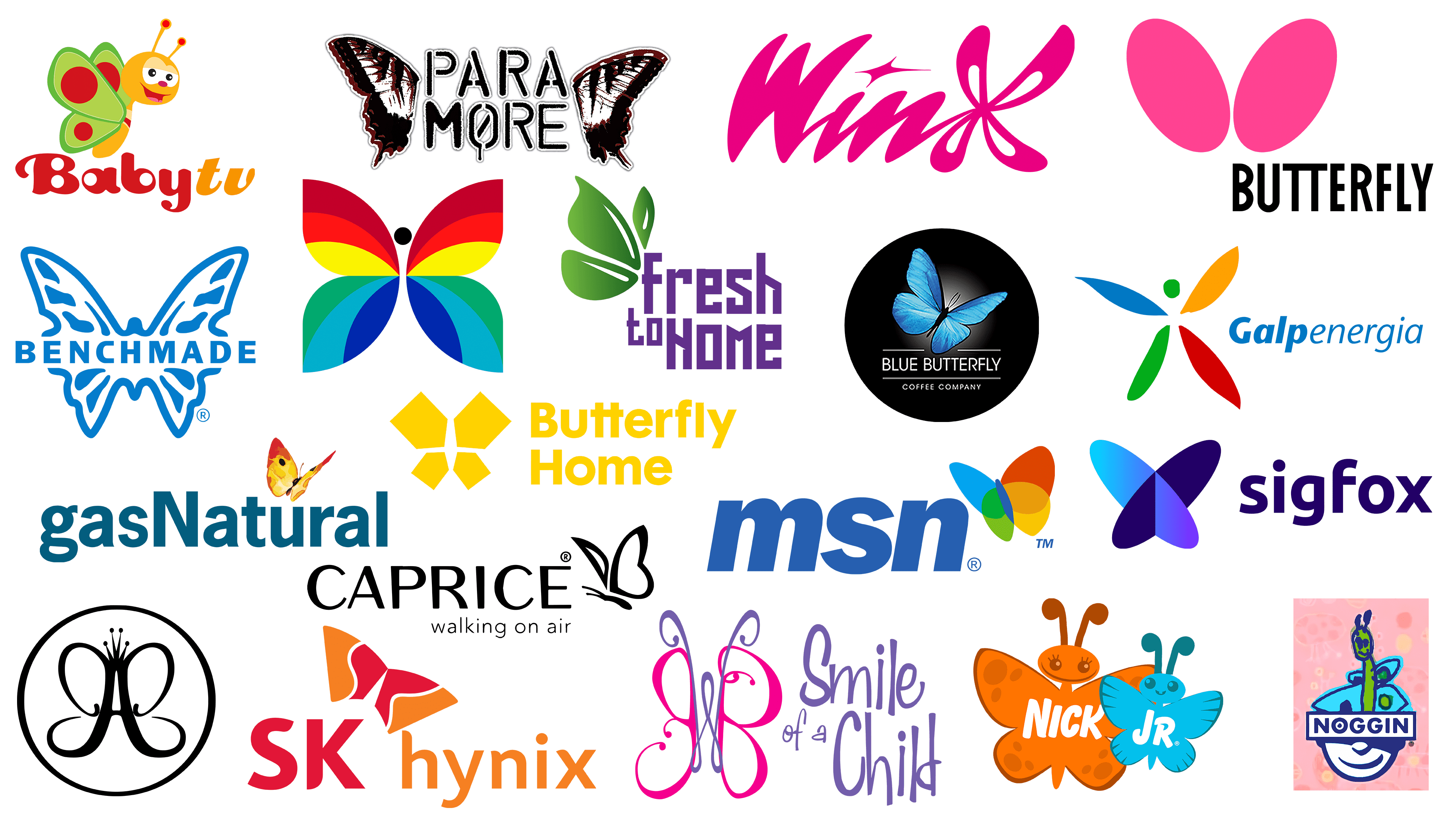
In today’s article, we’ve collected the most striking examples of how the butterfly on a logo can take on different meanings. Considering how many species this insect can have, visual signs of companies vary in color and shape. Let’s see how skillfully designers have played with the same image.
TOP Logos Featuring a Butterfly Symbol:
Galp
![]()
The Portuguese company Galp’s logo, used from 1999 to 2002, features a stylized butterfly. It has long, multicolored wings: blue, yellow, green, and dark red. Due to their atypically elongated shape, they resemble flower petals. The green circle at the top is the head, which hangs in space because most of the body is missing. It would seem that what does a butterfly have to do with it if Galp works in the energy industry and has nothing to do with the beauty industry? The graceful insect on the emblem represents positive energy; it is a universal symbol for any brand. On the right side, there is a solid inscription “Galpenergia” in dark blue color. The designers used italics for visual ease. The first four letters are bolded so that the words do not merge.
Winx
![]()
The designers who created the Winx logo assumed it was a children’s cartoon about fairies. Therefore, instead of the letter “x,” they depicted a figure with four petals or loops, similar to a butterfly’s wings. Most likely, fairy wings are meant here. But since the butterfly was the prototype of a creature from Germanic-Scandinavian myths, the connection between them is obvious. For the inscription “Winx,” a handwritten font with non-standard glyphs is used. A four-pointed star, a magical symbol, is drawn above the letter “i” instead of a dot. The hot pink color matches the wordmark’s style and the theme of the girls’ cartoon series.
Freshtohome
![]()
For the Indian online store Freshtohome, the logo conveys the freshness of its products. Therefore, the butterfly represented on it should not be taken literally: it is used only to evoke subconscious trust in customers. Since the assortment includes fish, poultry, lamb, vegetables, and fruits, the insect symbolizes the connection with nature and the absence of chemicals. That’s why its wings are not multicolored but green with a gradient. They are depicted in the upper-left corner, above the purple inscription “Fresh to Home,” which is divided into two lines. The artist drew only three wings in the form of leaves, but their arrangement and shape make it clear that it is a butterfly and that it sits on the letter “F.” The brand name is executed in a font with rectangular strokes.
Smile TV
![]()
Smile TV’s logo from 2005-2016 consisted of lettering. Even the butterfly was a stylized monogram of Janice Wendell Bethany’s initials. That was the birth name of Jan Crouch, who, along with her husband Paul, founded the free television network for children. Since all the programs were aimed at religious education, the image of a butterfly proved useful. It symbolized the best human qualities: kindness, love, tenderness, and care. On the insect’s antennae and body was a lilac “W,” and on its wings were pink “J” and “B.” To the right of the monogram was a lilac “Baby Smile,” the old Smile TV name used until 2017. The letters looked handwritten. This was indicated by uneven, irregularly expanding lines of different lengths. They added playfulness to the logo.
CBC
![]()
CBC is an acronym for the Canadian Broadcasting Corporation, the country’s oldest broadcasting network. It has operated radio stations since 1929 and entered television in 1952. In 1966, color television began, so the CBC emblem became bright and colorful. The artist depicted a butterfly using almost all the colors of the rainbow. The upper wings are divided into three stripes: maroon, scarlet, and yellow. The lower pair of wings is colored in cold shades of green, blue, and dark blue. The insect’s head is a rich black color. There are no inscriptions next to the butterfly, as the pattern speaks for itself. This logo remained present until 1974, when it was replaced by an abstract composition of fragments of the letter “C.”
Sigfox
![]()
The French company Sigfox provides wireless networking services for low-power devices such as smartwatches and electricity meters. It appeared in 2010 and, from the beginning, used a logo featuring a butterfly image composed of many small dots. In 2016, Interbrand created a 3D insect logo for Sigfox. The wings of the butterfly are formed by two intersecting ellipses arranged diagonally in the shape of a cross. One of them is light blue with a gradient; the second one is dark blue. In the right panel, the network operator’s name is displayed in the same blue color. All letters are lowercase, bold, and without serifs. The font is similar to Ubuntu Bold by Dalton Maag Ltd.
Caprice
![]()
In 2016, design firm Pentagram created a logo for German shoe brand Caprice, which debuted at the beginning of the Fall/Winter 2017 season. Here, the butterfly symbolizes lightness despite its own visual appearance. The winged insect is a reflection of the slogan “walking on air,” written in the second line in a thin sans-serif font. And at the top is the word “CAPRICE” with balanced letters. In it, all vertical and diagonal strokes have uneven thickness: they taper toward the bottom, creating a sense of plasticity, mobility, and airiness. Both the emblem and the word mark are made in dark blue. The wings of the butterfly are formed only by contours, and inside, they are apparently empty to enhance the effect of lightness.
Paramore
![]()
Paramore’s butterfly logo looks very dramatic because the band has its own special philosophy. Apparently, the insect is already dead: only two wings remain, on the right and left. They have a symmetrical pattern of white, black, and dark red spots that resemble bloodstains or claw scratches. This color scheme reinforces the degree of tragedy and vulnerability. The butterfly’s torn wings here symbolize life, death, and rebirth. The central two-level inscription “PARA MORE” corresponds to the chosen style. It is screen printed, but some of the glyphs are custom-designed. For example, an “O” with a drop of ink at the bottom or a slightly blurred “M.” Each element is outlined in white and additionally surrounded by a light gray shadow.
Butterfly
![]()
The Butterfly logo can’t contain anything but a butterfly. But the designers had unusual ideas about this insect: they depicted it as two bright pink ovals with a touch of fuchsia. The geometric figures are angled and tilted in opposite directions, like a mirror image. In addition, they have nothing in common with butterfly wings, neither in outline nor in texture. The brand name is written in the lower right corner. Black letters stretched vertically, in contrast to the pink emblem. Moreover, they are distinguished by a strict, rectangular form. This visually balances both parts of the logo.
Noggin
![]()
Now, the online learning service Noggin has a logo consisting of a multicolored inscription. But the symbol used earlier could be anything, not necessarily a butterfly. The emblem’s concept was that its base was the bottom of a smiling man’s head. At the top were projected his “thoughts,” which took many different forms. According to one version, it was a butterfly. It looked like a fat green caterpillar with big eyes and a friendly smile. It had four blue wings, each a different size, so the image resembled a careless child’s drawing. This stylization was in keeping with the Noggin concept, as the modern streaming service was once a TV channel for teenagers.
Butterfly Home
![]()
The logo created for Butterfly Home is done in a yellow color scheme. The bright hue unites all components, including the wordmark and a stylized butterfly composed of four geometric shapes. Its wings are yellow pentagons with sharp edges towards the center. The upper fragments are almost twice as large as the lower ones. At the same time, the insect is shown only partially: the wings are separated by an empty white space. The butterfly’s minimalist style echoes the lettering’s minimalist design. The company name occupies two lines, aligned on the right edge. The font is bold sans serif with low contrast. Among the non-standard glyphs, the two letters “t” that share a common horizontal stroke stand out the most.
Nick Jr.
![]()
On the children’s TV channel Nick Jr., the logo has many variations. Now, there are different variants of the inscription, but earlier, the images of animals, plants, objects, birds, and people were relevant. Each emblem consisted of a large and a small object, a symbol that preschoolers could watch programs with their parents. One of the emblems used throughout 2003-2009 featured butterflies: a large orange one on the left and a small blue one on the right. The first butterfly had “Nick” written in white on the first butterfly, and the second butterfly had the letters “Jr” with a registered trademark mark instead of a dot. The adult butterfly had a wide smile and long-lashed eyes. The baby, meanwhile, was recognizable by its single tooth. The mother’s wings were decorated with dark orange circles and ovals, while the baby had dark blue stripes.
MSN
![]()
The MSN website contains content and applications for Windows. This platform has been around since 1995, but the first butterfly graphic appeared on it in 2000. The version we are considering dates from 2000 to 2010. Now, the MSN logo is minimalistic and in black and white. The old version, created by the joint efforts of Everbrand, FutureBrand, and McCann Erickson, was very colorful. It featured a butterfly in the upper right corner. It flew, spreading its wings in four colors: blue, red, green, and yellow. For each element, the designers used a gradient, and at the intersection of the wings, new darker shades emerged. The butterfly is necessarily combined with the blue inscription “MSN.” For the abbreviation, the designers chose a clear, bold font: Franklin Gothic Bold Italic.
Blue Butterfly
![]()
Blue Butterfly Coffee Co. Ltd. is a producer of specialty coffee from the Irish city of Waterford. On its official website and on the packaging of its blends, the brand features a stylish emblem that, in fact, illustrates the brand name. That is, the Blue Butterfly logo depicts the corresponding insect. It is depicted in a realistic style: the artists carefully drew the dark body, and the antennae detailed the pattern on the azure wings. The delicate butterfly stands out against a black circle with a white gradient in the center. Because of this, it seems to fly into the light. Below the insect, there is a horizontal line divided into two parts of approximately equal length. Below it is written the brand name, emphasized by a single solid stripe. At the very bottom is the phrase “COFFEE COMPANY.” In this variant, absolutely all letters are capitalized and white.
Benchmade
![]()
The logo of the American knife manufacturer Benchmade can be incomprehensible only to those unversed in stabbing and cutting tools. After all, it contains an image of a butterfly with dark blue outlines. Where did such an image come from? This is an indication of a special kind of balisong knife. Because of the special trajectory of the handle movement when opening the blade, it received the common name “butterfly.” The insect is not detailed, but its general outline is recognizable. It consists of uneven spots and lines on a white background. The drawing is divided into two parts by the black inscription “BENCHMADE.” The designers chose a strict, visually heavy font with large glyphs to convey the company’s seriousness. The angular letters resemble blades and actually “cut” the butterfly in half.
SK Hynix
![]()
For SK Hynix, as a semiconductor memory manufacturer, it is important to show the reliability and durability of its chips. Therefore, the butterfly on the company’s emblem stands for immortality and rebirth. At the same time, it is a symbol of prosperity and adds to the composition. Under the two elegant wings is the name of the company. They are harmoniously combined because the SK Hynix logo is made in two colors: crimson and orange. Both are used in the drawing and in the inscription. The shape of the elements also has a lot in common. The ends of some of the letters are rounded and even slightly curved, making them a perfect complement to the graceful wings of the butterfly. Another notable feature of the font is the case. Only the first letters “S” and “K” are capitalized; the rest of the glyphs are lowercase.
Baby TV
![]()
The designers who created the butterfly logo for Baby TV did not put much meaning into its image. This is a funny character that should attract the target audience’s attention. Given that the channel is designed for kids under 2, the design turned out very bright and colorful. The cartoon insect smiles amiably. And it has not only a mouth but also a tongue, nose, eyes, and even eyelids. The butterfly’s antennae look like two tendrils with pink dots on the ends. The green wings resemble an avocado in section; only in place of the seed is a dark red circle with a scarlet halo. The head and torso are light orange. The wordmark uses a customized set of glyphs. Both parts of the name are written together but separated by color: the first part (“Baby”) is dark red, and the second part (“TV”) is orange. In addition, the letters “t” and “v” are slanted to the right.
Gas Natural
![]()
Gas Natural works in the gas supply and electricity sectors. One of its areas of focus is renewable energy, which is environmentally friendly. To show its maximum eco-friendliness, the company uses an insect-shaped logo. Designers developed a logo for Gas Natural featuring a red-and-yellow butterfly fluttering over the letter “u.” The mottled gradient gives the impression that the emblem is painted with watercolors. The lower lettering is in turquoise. It uses an elegant, bold font similar to Adobe’s News Gothic Std Bold font. The company name is written solidly. Visually, it is divided into two parts only by the glyph case: the word “Gas” is fully lowercase, and “Natural” starts with a capital “N.”
Anastasia Beverly Hills
![]()
For the cosmetics brand Anastasia Beverly Hills, the butterfly logo expresses its individuality. The very essence of the company is to create beauty, so its symbol looks stylish and elegant. Moreover, beauty lies in simplicity because the emblem contains only the letter “A” with a crown superimposed on it. From the letter “A” depart four curved lines, which in shape resemble the outline of the wings of a butterfly. The black figure is inside the same black ring, and the background in the basic version is white.