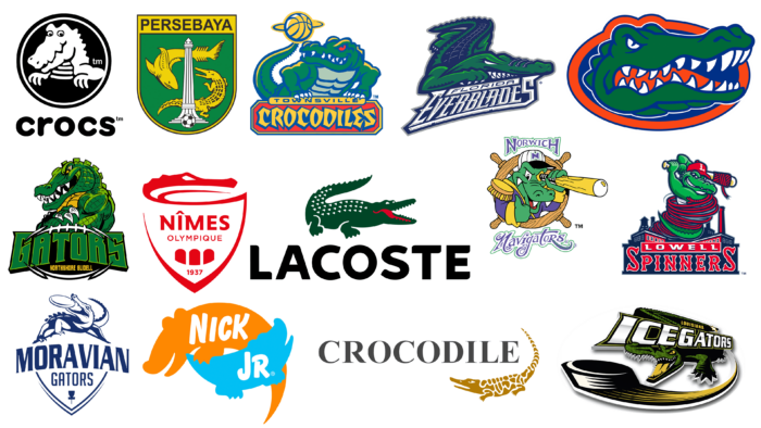
A variety of animals are used as talismans, amulets, talismans, and good luck symbols all over the world. Each of them carries some idea, encourages action, and personifies certain qualities. One of them is a crocodile. He is not only a character in fairy tales and cartoons but also performs a very serious “work.” For example, it can often be seen on the logos of sports clubs, international companies, fashion brands, and even a children’s TV channel. After all, it is a formidable predator and a grasping animal from which it is impossible to escape.
The image of the crocodile is used due to its pleasant color and non-standard shape, allowing you to instantly stand out among competitors. In addition to visual characteristics, the crocodile is valued for its positive qualities: strength, endurance, perseverance, determination, responsiveness, and ability to see and notice everything. These are leadership qualities that any company or organization wouldn’t mind getting.
We offer you the chance to familiarize yourself with the list of crocodile logos that belong to the most famous representatives at the international level. Of course, crocodiles are different for everyone – from angry and aggressive to good-natured and obedient. Let’s start with the most complex emblems.
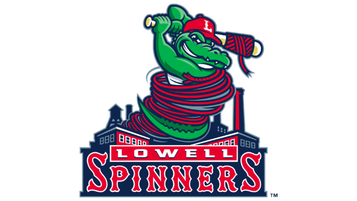
Lowell Spinners
Lowell Spinners emblem symbolizes speed, accuracy, and determination because it belongs to a professional baseball club. The team appeared in 1996 in the city of the same name in the state of Massachusetts. Until 2020, it played in the NYPL. The cartoon alligator was wrapped in red rope, the end of which was on his arm. The sturdy rope encompassed the anthropomorphic character’s entire body. It came out of a building on the left side and twisted into rings. The alligator had a vicious grin, sharp fangs, and a beige club entangled in the rope. On his head was a red baseball cap with the club’s symbol – a big white letter “L.” The wavy outline of the letter stood out clearly against the bright background. Around the crocodile was a typical cityscape: an industrial district with massive buildings and tall chimneys. At the bottom was the name of the team. It occupied two lines: at the top – the word “Lowell” (white, geometric, with serifs), and at the bottom – “Spinners” (red, large, in Old English style).
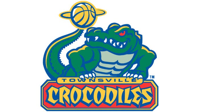
Townsville Crocodiles
The second most complex logo on our list comes from the former Australian basketball club Townsville Crocodiles. This team existed from 1993 to 2016 and used the image of a crocodile. But in this case, he looks extremely angry. The animal leans on the inscription in front of him and looks back. His gaze is focused on the yellow ball that rotates on his tail. The rotation is conveyed by a horizontal line resembling two arcs. The alligator’s body is muscular and embossed, its tail is studded with sharp spikes, huge fangs stick out of its mouth, and the character has claws on his hands. He grasps a rectangular sign with the word “Townsville” written in thin blue letters. Below that is the second part of the club’s name, “Crocodiles.” It is typed in a non-standard font with curly yellow glyphs and blue shadows. The background for the anthropomorphic reptile is a red banner with cut corners and a triple frame. The alligator is colored green with yellow highlights. It has a gray belly and red eyes expressing maximum rage.
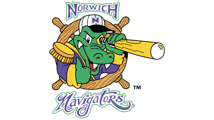
Norwich Navigators
Norwich Navigators chose the most complicated logo. But the crocodile on the emblem of the team of professional futsal players is not evil but rather good-natured. However, the anthropomorphic character is not as harmless as it may seem at first glance: he has large and sharp fangs to instill fear in opponents. The alligator looks out from behind the ship’s wheel and looks through the telescope with his right thumb raised. With this gesture, he shows that he is satisfied with everything.
In addition, the Connecticut Defenders mascot (that’s the name of the team in the 80s of the last century) is dressed in a blue captain’s tunic with yellow cuffs and luxurious epaulets. On his head is a striped cap with a blue outlined “N” sign. The inscriptions at the top and bottom of the emblem have similar framing. One line is flat geometric, and the second – is italicized, with curls. The curved leg of the letter “R” is elongated and in shape resembles the tail of a crocodile. The texture of the helm is wooden, as is the surface of the telescope.
Louisiana IceGators
The Louisiana IceGators professional team also chose the crocodile logo. After all, it shows determination, endurance, and athletic anger, which is very important for players in the Southern Professional Hockey League. That’s why the crocodile on the emblem kicks its tail. From him stretches a black trace of the puck, located in the foreground. According to the designers’ idea, the enraged animal hits it with all its might to score a goal in the opponent’s goal. The crocodile has an open mouth, from which you can see a row of sharp white teeth and a yellow tongue. Claws are painted in black. In general, the whole logo is made in a black and yellow palette. Even the green color looks dark. From the tail to the puck, there is a tapering arc. It conveys the dynamics of the throw and indicates the trajectory of the flight. On the back of the alligator is the name of the club. The word “IceGators” is big and silver like ice, and “Louisiana” is small and yellow.
Northshore Gators
For the Northshore Gators, the logo is done in a modern style. Therefore, the crocodile is muscular, arrogant, and determined. The anthropomorphic animal stands crossed arms and looks at others with an angry look. His body is covered with miniature squares, imitating the tough alligator skin. They are also present on the upper part of the spine. To give realism to the sports mascot of the team from Louisiana, the designers used two shades of green color. The main color is dark green, and the additional color is light green, which forms sunny highlights on the skin. The belly of the reptile is yellow. At the bottom, there is a large inscription, “Gators”. It is made in bold font. The side letters are larger than the central ones. Below the bottom is the inscription “Northshore Slidell” in a small yellow font in capital letters sans-serif. Both lines are set against a black rugby ball with a white border.
Moravian Gators
A professional disc golf club from the Czech Republic also chose the most dangerous reptile. The reason is that the crocodile grabs the victim and holds it tightly, not letting it out of its toothy mouth. The formidable image characterizes the essence of the game in the best possible way: to accurately launch the disc at the target and catch it on the fly. As a result, a stylish logo was chosen for Moravian Gators. It is drawn on a white background with thin blue lines. At the bottom, you can see a triangle formed by double frames. Above is the name of the sports organization: the first line consists of a large inscription, and the second – is small, typed in a thin sans-serif font. The letters in the word “Moravian” are a combination of wide and narrow stripes, which makes them original. There are miniature dots at the ends of the glyphs. At the top, there is a fearsome alligator holding a golf disk in its teeth. His figure is positioned so that it forms the convex part of a makeshift shield.
Florida Everblades
Despite the fact that the team from Estero plays minor league hockey, the Florida Everblades logo can surpass some NHL logos. The crocodile is flat, aggressive, and yet half anthropomorphic. From a human, it has a “hand” with white claws; from an animal, it has a torso, head, and tail. The alligator is depicted crawling forward. Its muzzle is pointed to the right, and its tail to the left. They are ribbed, with a characteristic honeycomb texture to the skin. The eyes and teeth are white, so the contrast adds to the psychological tension. Below is the name of the club, divided into two lines. The light-colored letters are on a dark background, and vice versa – dark letters on a light-colored background. The word “Everblades” is decorated with sharp serifs resembling alligator fangs.
Persebaya
Indonesian professional soccer team Persebaya uses a bright and authentic logo. Its base is a heraldic shield, rounded at the bottom. It is colored green and framed by a yellow border. In the center is a tall column, and next to it – a black and white ball, a long crocodile, and a prehistoric fish. The animals, as well as the borderline, are yellow in color. In the upper part, there is a wide stripe with the name of the sports organization. It is made in the classic grotesque. The letters are black, bold, and printed.
Nimes Olympique
The crocodile has always been part of the identity of this French professional soccer club. But Nîmes Olympique has chosen an emblem with a non-aggressive animal – drawn as a light outline harmonizing with the shield. Unlike the previous emblem, the crocodile uses only the head. It is directed to the right and consists of two lines forming jaws as if the reptile opened its mouth. Under the coat of arms, there is the name of the team, the year of its appearance, and three solid arches. All elements are colored red, which gives the crocodile a dangerous but elegant look.
Lacoste
The fashion brand Lacoste also has a logo with a crocodile. Moreover, its identity is the most famous in the fashion industry. The bright green animal, painted with white spots, is fully represented. It is not anthropomorphic, so it looks like an ordinary crocodile: clawed paws, a massive tail, an evil look from empty eye sockets, and a threateningly gaping mouth. But at the same time, the lines are smooth, curved, and soft, so that the reptile does not seem aggressive. The curved stripe near the mouth is generally perceived as a smile. Below is the name of the French company, made in black capital letters with roundings. In this case, the image of an alligator appeared thanks to a friendly dispute between the founder of the brand and the captain of the tennis team, Alan Moore. The argument was about desire. As a result, the winner chose an unusual character for the fashion brand’s identity.
Crocs
The Crocs logo is visually simple. It is not overloaded with color and small elements. It contains only a good-natured crocodile without sharp teeth and the brand name. Alligators became a symbol of Crocs, as they are similar in name and appearance. The reptile is drawn in white in a black circle and outlined with a double contrasting border. Below it is an inscription consisting of bold, rounded letters that look like puffy bubble glyphs.
Nick Jr.
Nick Jr children’s TV channel logo in the form of a crocodile is used not to intimidate but to attract the audience. Its emblem demonstrates generational continuity, caring, and friendliness as it consists of two animals: a parent and his child. The orange silhouette reads “Nick,” and the teal silhouette reads “Junior.” The alligators have no eyes, spikes, or claws. Moreover, they are stylized like toys: the top one is large, and the bottom one is small. Both inscriptions are sleek and grotesque.
Florida Gators
The Florida Gators logo contains an image of a crocodile, as this animal is found in the state where the University of Florida, which owns the athletic department, is located. The crocodile stares menacingly out of a red oval frame with a dark blue background. But he is not fully depicted – only the head. The animal’s mouth is open, from which sharp white teeth and a red tongue peek out. To the left of him, three crests can be seen.
Crocodile Garments
The Chinese company has existed since the 1950s and has always used a crocodile in its symbolism. But not a green one, but a golden one. It is decorated in an oriental style as if assembled from small fragments of different shapes and glued together like broken pottery. Crocodile Garments has an almost abstract logo: only the head with an open toothless mouth is solid. The animal is positioned sideways and looks up at the name of the textile company. The design of the inscription is strict, businesslike, and practical. It perfectly balances the image of the fragile figure of the alligator. The letters are uppercase, dark gray, with clear serifs.
