


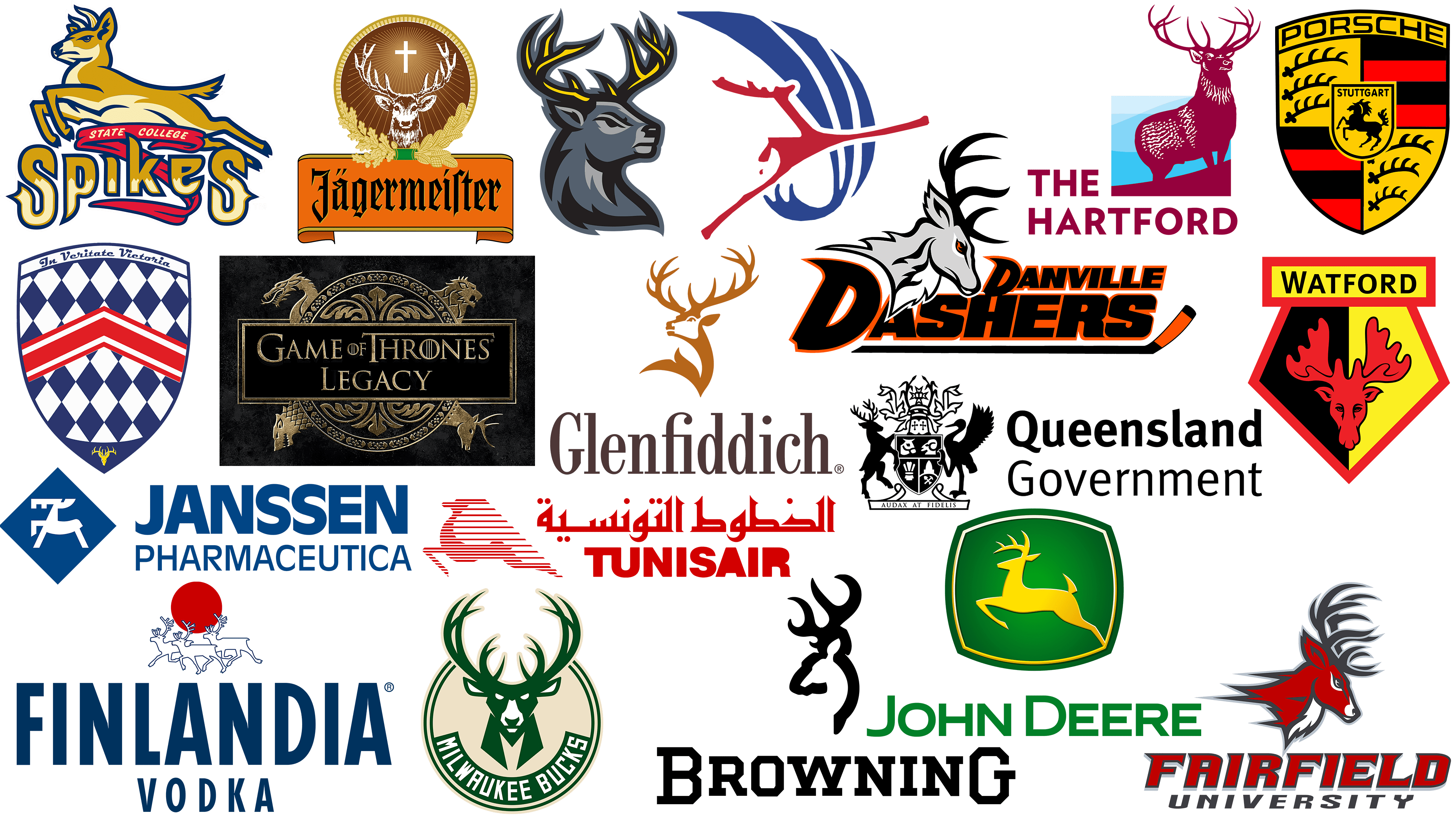
The deer is considered a symbol of good fortune. Its image is often associated with spirituality, creation, rebirth, renewal, purity, light, sunrise, and sunshine. The huge branching antlers symbolize fertility, as they are associated with the Tree of Life. However, it is less common to see a deer in the logos of popular brands than it is to see other animals that dominate pop culture.
The horned giant looks luxurious, elegant, and noble. At the same time, he is incredibly strong, fast, bold, and aggressive, making him a universally recognized image. Artists can convey the graceful beauty and hidden energy of the deer, allowing various companies to incorporate these qualities into their visual identities. To make the animal unique, it can be stylized in an interesting way that highlights its antlers or body shape.
In heraldry, the deer stands for moderation and grace. Christianity, it symbolizes religious zeal; the Celts served as mediators between the world of men and the gods; and the ancient Maya revered a sacred creature. Formidable, friendly, calm, running, strong, and graceful animals are often used on the logos of global brands. In today’s article, we will examine what these images can look like and the meanings designers assign to them, opening up limitless scope for creativity.
Jägermeister
![]()
Jägermeister’s deer logo is a mandatory attribute of its green bottles. It has always adorned rectangular labels and has remained largely unchanged for over a hundred years, except for minor adjustments. The name of the alcoholic brand is derived from the German phrase “Master of Hunting” or “Master Hunter.” The emblem features the head of a deer against a circular background with diverging rays. Between the horns is an Orthodox cross with an interesting story. According to legend, St. Hubert was a count and an avid hunter. One Christmas night, he went into the forest and saw a deer with a glowing cross above its head. This event prompted him to go into a monastery and become a monk for the rest of his life. Thus, Jägermeister is a conceptual framework that is reflected throughout its identity, from its name to its logo.
Watford
![]()
Watford also has a deer head on its logo, but without the religious connotation. As a professional soccer club, this animal symbolizes power, strength, speed, self-confidence, and the desire to win. Therefore, the artists chose a rather aggressive color scheme, combining bright red, yellow, and black shades. Notably, the deer has atypical coloring: completely red, with thin black contours. The drawing style is far from realistic: the artists simplified the image, making the animal look like a cartoon character. The head is depicted on a pentagonal shield, with a rectangular plate bearing the brand’s name in large letters.
Iowa Heartlanders
![]()
The Iowa Heartlanders logo, with a deer, radiates inner strength and power at the professional hockey club. It also conveys latent aggression, but there are no bright, provocative colors. Designers settled on restrained shades of gray, diluting them with small yellow blotches for contrast. The yellow color is used only for the antlers to emphasize their branching. The deer’s eyes are narrowed threateningly, and the corners of the mouth are lowered. The gaze is confident, and the head is turned to the right, as if the animal is looking into the future with a challenge. The fur flutters in the wind, creating the image of a “superhero.” To make the drawing more modern, the artists emphasized uneven color and detailed certain contours.
Tunisair
![]()
For Tunisia’s national airline, Tunisair, the logo symbolizes the speed of air travel. For this purpose, the artists depicted the deer with many thin lines, drawn parallel and slightly inclined diagonally. They form a graceful silhouette of the animal, followed by so-called speed line stripes that emphasize the energy of movement. The animal is running, but it seems to be floating due to its flying pose and visual lightness. This perfectly captures the concept of an aviation company. Besides, reindeer can fly in fairy tales if we remember the New Year stories about Santa Claus. On the right, in bold red sans-serif letters, is the word “TUNISAIR,” and above it, on the top line, is Arabic text.
Hartford Insurance
![]()
The Hartford Financial Services Group, Inc., has been in the insurance business since 1810. In the case of Hartford Insurance, the logo references the company’s name, as the word “Hartford” historically refers to a Ford used by deer to cross from one bank to the other. Coincidentally, the flag and seal depict a deer and a deer wading across a river near the same name. The graceful animal stands on the ground, representing the financial brand. You can see that it is perched on a hill, and in the background, somewhere below, there is a blue expanse, either sky or water. By the way, “hart” is a medieval hunting term for a deer. Therefore, the choice of the logo image was quite justified. The animal appears menacing and seems dissatisfied with something. To the left of the image, the article “THE” appears in maroon letters, and below it is the main word in the organization’s name.
State College Spikes
![]()
The State College Spikes logo also features a deer, but its antlers are very short, unbranched, and bent forward, resembling those of a cow or bull. The animal is depicted jumping as if about to attack someone. The artists also drew sharp hooves in detail to convey a sense of danger, despite the drawing’s cheerful cartoon style. This aggressive attitude is justified because the emblem belongs to the university baseball club, which is important to show its readiness to fight for victory. However, the color scheme is quite restrained: the designers used dark yellow and beige colors, complemented by blue contours. Only the red ribbon, which serves as the basis for the inscription “STATE COLLEGE” and wraps around the lower end of the originally conceived word “Spikes,” stands out brightly.
Hainan Airlines
![]()
China’s largest private airline, Hainan Airlines, has used a logo featuring characters and a stylized lotus since 2004. At the same time, the old emblem, used from 1989 to 1993, featured an unusual composition of a deer against a blue swirl. The animal’s silhouette was dark red, with a long, thin neck, graceful legs, a triangular body, and a tasseled tail. The front and hind legs were widely spaced, as if the forest beast were not leaping forward but taking off. This impression was strengthened by the deer’s gaze upward. In the background, the artists depicted a blue wave or wing of three fragments. All elements of the logo symbolize the lightness of flight, which fits well with the concept of the Chinese air carrier.
SSC
![]()
Shelby Super Cars is a privately owned sports car manufacturer in the United States. The deer is a powerful animal that can reach tremendous speed, so its image characterizes the cars from the best angle. Therefore, the developers incorporated this animal into the brand’s visual identity. The designers who created the SSC logo used a traditional heraldic shield as a basis, featuring a pattern of dark blue and white rhombuses. In the center, it is crossed by an inverted chevron of red-and-white stripes of varying thicknesses. At the very top is written the elegant cursive Latin phrase “In Veritate Victoria.” And below, on the pointed tip of the shield, there is a miniature deer head with branched antlers. It is painted in gold to stand out against the blue background. In this case, it symbolizes luxury, high status, and good taste.
Glenfiddich
![]()
Following the example of German liqueur JagermeiJägermeistersh, Glenfiddich decorates its bottles with a stag emblem. However, Glenfiddich has a different emblem: the animal’s head is depicted not in full face but in profile, facing left. At the same time, part of the back makes it clear that the deer is looking back, as if something has attracted its attention. The silhouette is not detailed, but the artists emphasized the thin neck and huge antlers with sharp forks, depicting them with expressive brown lines. To show the visible part of the head, they used negative space by painting that part white. At the bottom, the alcohol brand name is written in black letters. The vertically elongated font, featuring small, sharp serifs, lends the logo an elegant appearance.
Queensland Government
![]()
The logo is a crucial component of the Queensland government’s corporate identity. In its structure, it almost completely repeats the coat of arms of this Australian state. The deer is represented here as a heraldic figure. He stands on his hind limbs on the left side and, together with a crane, holds a shield, on which in four segments are depicted the heads of a ram and a bull, a sheaf of wheat, and a golden pole with tools for mining. At the top are two stalks of sugar cane and a knight’s shield, and at the bottom of the ribbon is the state motto in Latin: “Audax at Fidelis.” The symbols on the shield represent the state’s major industries in the 19th century, and the stag symbolizes Australia’s connection to Great Britain, as the coat of arms of the colony of Queensland was a personal gift from Queen Victoria.
Game of Thrones
![]()
The Game of Thrones logo also could not do without a stag, although it is not the main symbol. The logo of the famous franchise, based on the TV series of the same name, depicts the heads of four real and mythical animals: a stag, a dragon, a lion, and a wolf. The first represents House Baratheon, the second, House Targaryen, the third, House Lannister, and the fourth, House Stark. They are arranged on the four sides of a circle, framed by an ornamented ring with a stylized floral pattern. In the center, in a large horizontal rectangle, the phrase “GAME OF THRONES LEGACY” is written, divided into two lines. The “O” letters are crossed by three vertical bars, resembling the strings of a musical instrument.
Porsche
![]()
In the case of the German automaker Porsche, the logo features an image of a horse and only antlers from a deer. And, judging by the number, they would be enough for three animals at once. These elements are contained within a rectangular heraldic shield with a narrowed base, divided into approximately four equal segments. They are balanced by patterns of alternating red and black stripes. The entire graphic composition, including the forked horns, recalls the coat of arms of the Free People’s State of Württemberg, which was previously used (until 1938) as Porsche’s emblem.
Finlandia
![]()
The logo on all labels varies slightly by Finlandia vodka type. However, the official version contains blue two-tiered lettering and an image of a deer under the sun. In the 1998-2003 emblem, the animals ran to the left. They were completely white, with only a blue outline around the edges. This created a sense of frosty freshness. The sun appeared as a large, dark red circle. The name was set in a bold sans-serif font with elongated vertical strokes. In Finland, reindeer have a special significance: they are bred on farms and harnessed to sleds.
Milwaukee Bucks
![]()
Designers created an emblem for the Milwaukee Bucks professional basketball team featuring a deer, its mascot. Previously, the emblem was cartoonish, but after several changes, the main symbol evolved into a severe deer, which appears formidable and impressive. His eyes shine with white light, his mouth forms a perfectly straight line, and the horns have many sharp spikes. The head of the forest beast is predominantly dark green, with white elements that create negative space. A beige, incomplete circle is used as the base. It breaks off where the branched horns begin. The circle is framed by two dark green rings with an inscription. The club’s name is written in large white letters on it. The font perfectly complements the design’s brutal style.
Fairfield Stags
![]()
The Fairfield Stags have a logo and name that are closely related. Indeed, for Fairfield University’s sports teams, the deer symbolizes strength, tenacity, courage, and perseverance. Therefore, the animal on the emblem is not just standing calmly but rushing forward. Dynamics are visible even though the artists depicted only the head and neck. To create the illusion of movement, they added sharp, elongated lines behind the deer’s forked antlers, directed straight ahead as if he were going to attack. The main part of the head is dark red, with patches of gray and black. The two-line inscription at the bottom is in italics and looks dynamic. The letters of the first word are decorated with triangular serifs, which are associated with sharp horns.
John Deere
![]()
In 1837, John Deere founded a steel plow manufacturing company, which he named after himself. Now, it is one of the largest American manufacturers of agricultural machinery, recognized by its original emblem featuring a deer’s head. At John Deere, the logo, like the name, is a tribute to the company’s founder. Designers depicted a proud forest animal at the moment of jumping: it pushes off the ground with its hind legs and bends its knees with its front legs. The yellow silhouette of the animal is set against a convex square background with a green gradient. The base has a double border of yellow and dark green. The lower part contains an inscription in capital letters without serifs. Although all characters are in uppercase, the first letters “J” and “D” in the two words are enlarged.
Danville Dashers
![]()
The Danville Dashers hockey team also has a deer emblem. As in the emblems of other sports clubs, the animal looks powerful and aggressive. Its sharp antlers are set forward, and its orange eye glows with confidence in victory. Light gray fur is diluted with white spots and outlined in black. Only the head and neck are present, which ends where the “D” of the word “Dashers” begins. The inscription “Danville” is located slightly above and to the right of the image. A customized bold font is used for the inscription. All letters are uppercase, italicized, black, with an orange outline. Underneath is the same black-and-orange club.
Janssen
![]()
Designers who created a logo for the pharmaceutical company Janssen depicting a deer did not portray it as a majestic animal. They presented it as a funny cartoon character. The head of the forest animal looks very strange, resembling a half-carved door key. The white silhouette is placed in a dark blue rhombus. To the right of the emblem is a wordmark: the brand name, split into two lines. It is colored the same dark blue and features bold sans-serif letters.
Browning
![]()
The Browning Gun Company has one of the most iconic logos in the industry. It contains massive lettering that adorns this American company’s pistols, rifles, and shotguns. With many sharp, straight angles, the letters convey a sense of strength, reliability, and permanence. The light silhouette of a deer balances the visually heavy font. The animal’s head is outlined by a single graceful line, interrupted from below. At the top are the same graceful antlers.