


The face is a mirror of a person’s inner state. Looking at it, we feel either a pleasant disposition or a strong dislike. Therefore, in the era of consumerism, hundreds of thousands of companies compete with it for customers’ attention. Logos play an important role in this, as they convey a lot. Some brands prefer realistic designs, others prefer abstract ones, but both use visuals to attract customers. And imagination has no limits! Someone uses restrained individuality; someone competes in the richness of graphics and colors.
In any case, physiognomy (the science of facial features and expressions) becomes one of the key tools for increasing the number of consumers and, with it, income. Companies pay the most attention to this question because a person’s image (especially a happy, satisfied one) inevitably evokes trust in those around them. Then, people from the potential customer category move into the group of real buyers.
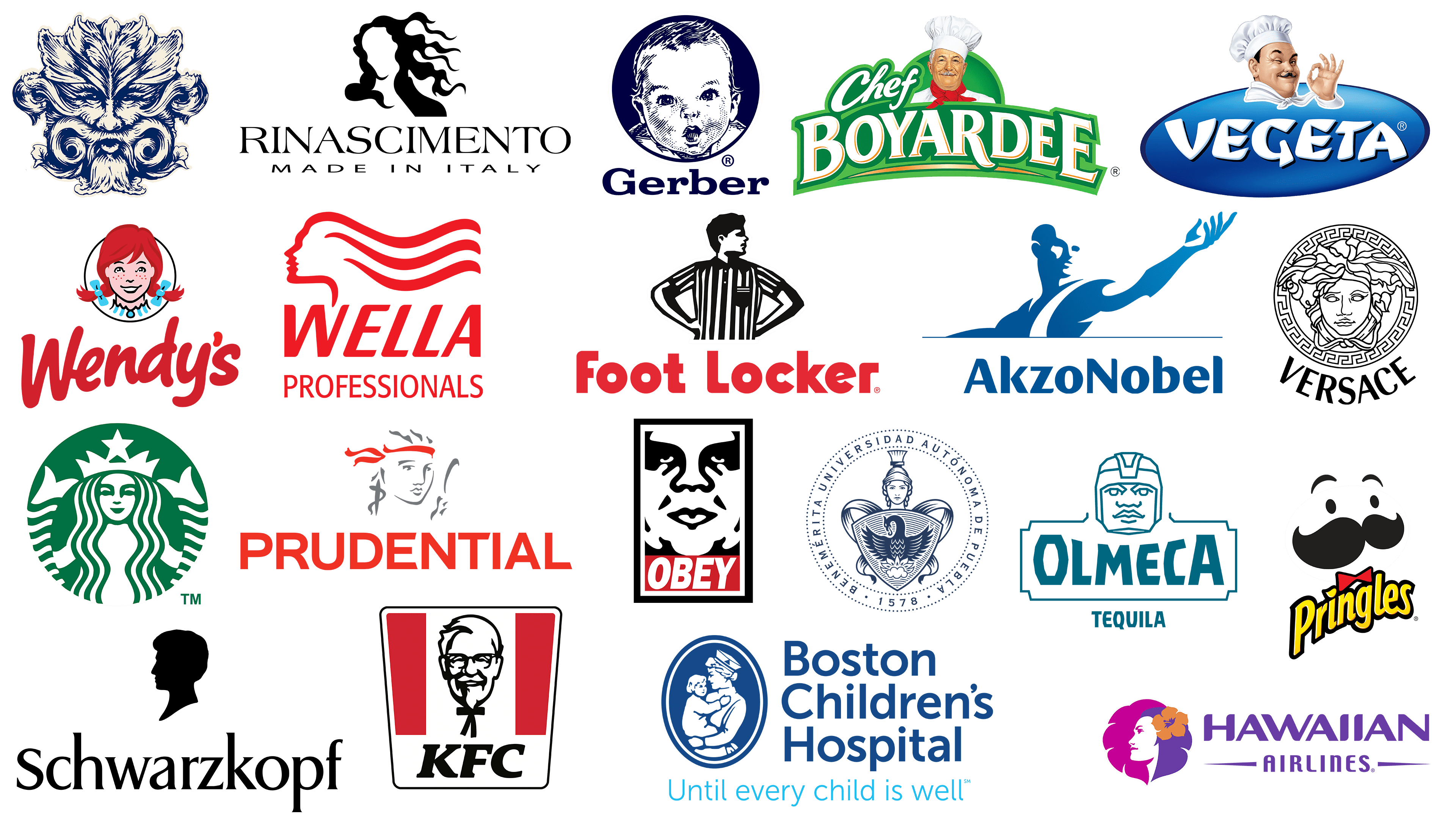
We propose studying this issue by examining logos featuring faces to better understand the marketing mechanism at work. After all, identity is a decisive factor in the worldwide recognition of firms, organizations, and enterprises. The presented emblems have different colors and styles, but they are united by one thing: a face. The brands are arranged in order of visual simplification.
Boston Children’s Hospital
![]()
Boston Children’s Hospital has the most complex logo in terms of the number of elements it contains. It has a lot of details, arranged so that it is immediately clear to a person what kind of organization it is and what services it provides. After all, medicine is one of the most relevant in the search, selection, and treatment. In some cases, procrastination can become a real tragedy, so the identity, although complex, is understandable. The emblem depicts a female health worker holding a young child in her arms. The woman’s welcoming face is turned toward the baby, and he, in turn, is holding onto her hands. Both figures are arranged in a vertical medallion with a double border. Next to it is the medical institution’s full name. It is typed in a classic sans-serif font. Below is the slogan, highlighted in blue.
Wella
![]()
The American-German hair care product manufacturer also uses a triple symbol as part of its visual identity. The Wella logo has been in use since 1880, perfectly capturing the essence of its products. The designers used a female profile with no specific facial features to emphasize hair care. There is only a contoured image with an emphasis on the strands. They are wavy, fluttering in one direction as if blown by the oncoming air. The face is raised and outlined in shadow, so the emblem seems to depict not one woman but two. The lines are light, relaxed, gliding. The emblem is complemented by an inscription in two lines: above, “Wella”; below, “Professionals.” The first word is typed in bold font with smoothed corners of letters, and the second is thin glyphs of strict form.
Rinascimento
![]()
Italian clothing brand Rinascimento chose a stylish, minimalist logo associated with the world of high art. Its emblem depicts not just an undetailed woman’s face but also a hint of artistry. The hair’s contour, the head’s turn, and the neck’s slope remind me of the famous figure in Sandro Botticelli’s painting “Birth of Venus.” The image symbolizes beauty, the goddess Venus, as the Romans call her, and the Greeks call her. Below is the company name, set in an elegant antique font. The letters are tall, uppercase, and a combination of thin and wide lines. Next is the phrase “Made in Italy”. It is, on the contrary, grotesque and low. The logo is in monochrome.
Hawaiian Airlines
![]()
The Hawaiian Airlines emblem has three elements and a face, but the style is completely different. The emblem reflects the aspiration to new heights, the fullness of life, its colorfulness, and brightness. Artistic boldness and a diverse palette make the emblem modern, unlike the standard symbols of air carriers. The portrait of a young girl is painted in purple and blue, and her hair is transformed into part of a palm leaf against the background on which she is set. The hairstyle is decorated with a large red flower, the symbol of Hawaii. On the right side is a two-tiered inscription. The word “Hawaiian” is large, bold, with diagonal slits and rounded ends, and “Airlines” is narrow, small, tall, with horizontal stripes on the sides.
Chef Boyardee
![]()
The culinary brand Chef Boyardee uses an emblem to represent its products shipped to all corners of the world. The emblem is colorful and detailed, so the chef in a white cap with a red band around his neck is depicted in detail. The face is in profile and looks more like a photograph than a drawing. Behind the man’s back is an archway with the cursive inscription “Chef” to the left of it. It is written in cursive, semi-erased script. Below it is the second part of the title, “Boyardee.” This line is large, typewritten, and capitalized, with a red border around each letter, making it appear three-dimensional. The background is green in two shades.
Olmeca
![]()
One of the most famous tequila brands, Olmeca, chose a historical logo. It depicts an Aztec warrior. His face is drawn large: it seems composed of geometric shapes. All lines are smooth, clear, and even. The head is depicted at full height. The man has a wide nose, large lips, a massive chin, and a tightly fitting helmet. Below is a shaped banner with the name of the alcohol brand. The lettering is in a very bold sans-serif font. The side letters are high, and the center letters are low, so the warrior’s head appears to be squeezing the letters “M” and “E.” At the very bottom is the word “Tequila.” It, like the rest of the elements, is colored turquoise.
BUAP
![]()
The Mexican university, Benemerita Universidad Autonoma de Pueblo, has an elegant symbol in classical heraldry. Moreover, all the elements of the BUAP logo are arranged within a single circle, resembling a seal. It shows a woman’s head in a monfortino, a traditional Roman helmet. In front of her is a triangular shield with a dragon, cloud, and flames arranged in a semicircle. From behind, wide ribbons protrude to the right and left; they are identical and mirror each other. The background is an empty white space. The central part is encircled by the full name of the institution of higher education and the year of its foundation (1578). The borders are thin and dotted. The logo is colored blue.
AkzoNobel
![]()
The famous Dutch manufacturer of paints and varnishes, AkzoNobel, has a monochromatic logo. This is very unexpected for a company that deals with paints, supplying them to more than 80 countries worldwide. Its emblem consists of two parts: graphic and text. The drawing shows a man waving his arm. He stretches it forward and raises his palm as if to call others to him or point to something important. The figure occupies ¾ of the icon and seems to emerge from negative space, as it is blue on a white background. However, the palette is not homogeneous; it is a gradient: the fingertips are the lightest, and the opposite hand is darker. Below the person is the name of the international firm. It is written in a bold font with a mixture of lowercase and uppercase characters. The letters “A,” “k,” “N,” “b,” and “l” have semicircular tops. Only “z” retains its corners and sharp protrusions.
Foot Locker
![]()
American online sportswear store Foot Locker also has a face in its logo. It depicts a man turning his head to the right and looking straight ahead as if assessing the future. This shows the retailer’s commitment to constant development and improvement. The character is dressed as a judge in a black-and-white striped shirt. This image is ideal for the retail site, as it conveys a focus on sportswear and footwear, highlighting them and tracking current trends. The man stands with a confident posture, his hands on his hips, ready to come to the aid of anyone in need. This approach to identity reflects the core concept of the e-commerce company. Below is the verbal part of the store’s name. It is made in a mixed font with red letters: “F” and “L” are uppercase, and the rest are lowercase. All glyphs are rounded.
Vegeta
![]()
Croatian brand Vegeta also has a logo featuring a realistic face. Moreover, it is thematic because Podravka, a food company, owns the brand. Under it, various seasonings are produced, from the packages of which everyone invariably smiles at the cook. The man is drawn half-turned to the viewer. He is wearing a cap and a neckerchief. One eyebrow is raised, and a gracefully curved mustache is visible above his lip. The left hand is shown in a gesture of approval: the thumb and index finger are brought together, and the other fingers are extended, as if the professional recognizes the product’s high quality. The background is two ovals. The inner one is blue with a gradient. On it is the brand’s name, set in a custom font. The letters are wide, angular, and chopped. The outer oval is white. It blends perfectly with the lettering and the chef’s cap.
Prudential
![]()
This is the most famous financial and insurance organization in Great Britain. It was founded in London in 1848 and has since used the name associated with Prudential. Translated from Latin, the name means “prudent, wise, intelligent, prudent” – these qualities were originally incorporated into the company’s concept. Therefore, it is unsurprising that Prudential chose the logo featuring a portrait of the woman after whom it is named. The symbol is crafted in an elegant yet modest design, using only two colors: gray and red. The emblem depicts a beautiful girl’s face. She holds a mirror in her hand and stares intently into it. The portrait is drawn in contour, as if it were a sketch for an unfinished painting. A red ribbon is visible in her hair, echoing the color of the corporate name below. It is typed in capital letters with narrow character spacing. Some characters even merge into each other, such as “UDENT” and “IAL.” Only “P” and “R” are written separately. All glyphs are smooth and have no serifs.
Gerber
![]()
Baby food manufacturer Gerber has used a logo with a face since it opened in 1931. It is now the largest structure whose visual identity is known worldwide, thanks to its line of complementary foods for babies. The Nestlé Corporation owns the brand and still uses the baby-faced icon. Over the years, the emblem, designed by Dorothy Hope Smith (an American artist), has remained almost pristine. Ann Turner Cook took the portrait. It was from her that the image of a carefree child was copied. The face is realistic, with small strokes forming large eyes, raised eyebrows, a mouth slightly ajar, a tiny nose, small ears, and short hair. The child’s shoulders are also visible. Other details are absent. The head is placed against a dark circle, which it nearly fills. Below is the company name. It is typed in a smooth font with rounded serifs. The first letter is uppercase; all other letters are lowercase.
Versace
![]()
The world leader in the fashion industry, Versace, has a simple logo. It has only two elements: a round icon and a large headline. The graphic part is a medallion with Medusa’s head. According to mythology, this creature made people fall in love with themselves and forever turned them into its crude “admirers,” freezing them with a single look. That’s why the face expresses no emotion; it’s like stone. The empty eye sockets confirm this. The details are similar: cold, smooth, but flawless. Only the haphazardly arranged hair, strands of which hang carelessly around the face, brings dissonance. A wide stripe girdles the contour seal, with ancient Greek ornamentation in a single continuous line. At the bottom is the fashion brand’s name. It contrasts with the image, consisting of bold letters in a different style. The glyphs are tall, expressive, and readable due to the wide inter-character space.
Wendy’s
![]()
The third-largest American fast-food restaurant chain, Wendy’s, has a friendly and attractive logo. It depicts the daughter of the company’s founder, Melinda-Lou Thomas. The emblem has not undergone significant changes for many years (the first restaurant appeared in the late 60s of the last century). Adjustments were insignificant, so the face of a cheerful girl is still painted on the emblem, in almost pristine condition. The colorful badge is a black ring featuring a smiling child. The girl has round eyes, raised eyebrows, a snub nose, bright freckles, and a white-toothed smile. She also has red hair gathered into two pigtails, decorated with blue bows. The collar also attracts attention. In this case, it is scalloped and rendered in a black-and-blue palette, but previously its shape was quite different and underwent several changes. Below the portrait, in the italicized handwritten script, is the name of the fast-food restaurant chain. The line is slanted and extends upward. The sans serif letters are unconventional: they appear to have been written fluently by hand with a marker on a piece of paper.
Schwarzkopf
![]()
The name of this brand translates as “black head,” so in Schwarzkopf’s identity, the logo reflects its name. It suits them thematically, since the company produces scalp and hair care products and is Henkel’s cosmetics division. The man’s head is depicted in profile and turned to the left. The design of the drawing is close to portraits on classic medallions: it has the same facial line, flowing smoothly into the neck. This age-old sophistication is necessary for a skincare brand to show the continuation of tradition. The dark pattern is placed on a white background. The company name is also in black. It is typed in an elegant font with tiny extensions at the ends that end in sharp serifs.
Pringles
![]()
The American chip manufacturer is very popular. Therefore, the logo remained unchanged after Pringles’ ownership change, as it is already well known to consumers. The fact is that until 2012, the brand belonged to Procter & Gamble, and now it is owned by Kellogg’s Corporation. On the product packaging, an improvised face of a mustachioed man is painted. He also has arched eyebrows, black-dot eyes, and a red bow tie. Below the abstract head is the title. It is diagonal, bright yellow, with a black stroke. Above the letter “i” is a miniature chip. The font is sans-serif, bold, and lowercase.
OBEY
![]()
OBEY’s youth clothing brand has a logo designed by its founder, contemporary artist Frank Shepard Fairey. He chose Andre René Roussimoff, a French actor and wrestler better known by his nickname Andre the Giant, for the image on his label. His face has become an integral part of the brand’s logo. It is drawn in black paint on a white background, as if in negative space. The eyes, mouth, temples, nose, and folds near it are dark; the rest is white. Below him is a red rectangle with the company name typed in grotesque uppercase. All elements are placed within a double-rectangular frame.
KFC
![]()
The KFC logo is one of the most recognizable visual identifiers of fast-food chains. As in the previous case, it shows the founder’s face. It is Harland Sanders. It is drawn with a black contour line, smiling at visitors from the center between two red rectangles. Geometric figures are arranged vertically, and the emblem itself has the shape of a plastic cup, i.e., it is trapezoidal. In the same frame, the brand name is written. It is written in black, italicized, and in capital letters.
Starbucks
![]()
Starbucks, a coffeehouse, chose a very unusual logo, unlike that of fast-food establishments. However, this did not prevent it from becoming a popular franchise, as customers perfectly remembered the white entity depicted in a green circle. The emblem features a mermaid, often associated with water. Her head is decorated with flowing hair and a crown with a five-pointed star. Her face is friendly and smiling.
Whistling Straits
![]()
This is a luxury resort in Wisconsin, United States. Its visual identity is that of a fictional character, drawn in thin, dark blue strokes and tinted flesh-colored. The Whistling Straits luxury vacation resort chose the logo based on mythology. The fact that it depicts the god of wind means the lines are flowing, curly, and “moving.” In some places, they resemble a leafy ornament. The designers did their best to make the symbol match the resort’s name.
Goodwill
![]()
Telenet
![]()
Playmobil
![]()
Alibaba
![]()