


Fire is a complex and controversial image. However, it is often used for visual identification because it clearly and accessibly explains the concept of brands. In addition, the flame clearly conveys the main direction of work, quickly reflects the organization’s position in life, and emphasizes its social significance. As a result, there are many types of flames represented in the identity:
- Ever-burning passion
- Torch of Knowledge
- Sincere concern for others
- Sizzling beauty
- Incendiary energy
- Destruction
That is, companies need to choose the right emblem style to avoid double interpretation.
Indeed, the flame will begin to shine in all its glory if you approach its creation professionally. In this case, the emblem will only appear as part of the corporate image. Therefore, it is often seen in various shapes, compositions, colors, and sizes. Not a bad option is the transfer of love, which is preferred for health-related services. Fire, as a means of enlightening minds, is an ideal solution for educational institutions.
We offer you the opportunity to get acquainted with the “fire” symbols of the world’s most famous brands. We collected them randomly, without any criteria. And our selection opens with a brand everyone has long heard of. Thus, by comparing popular logos, you can discover a hidden pattern that contributes to the rapid promotion of companies.
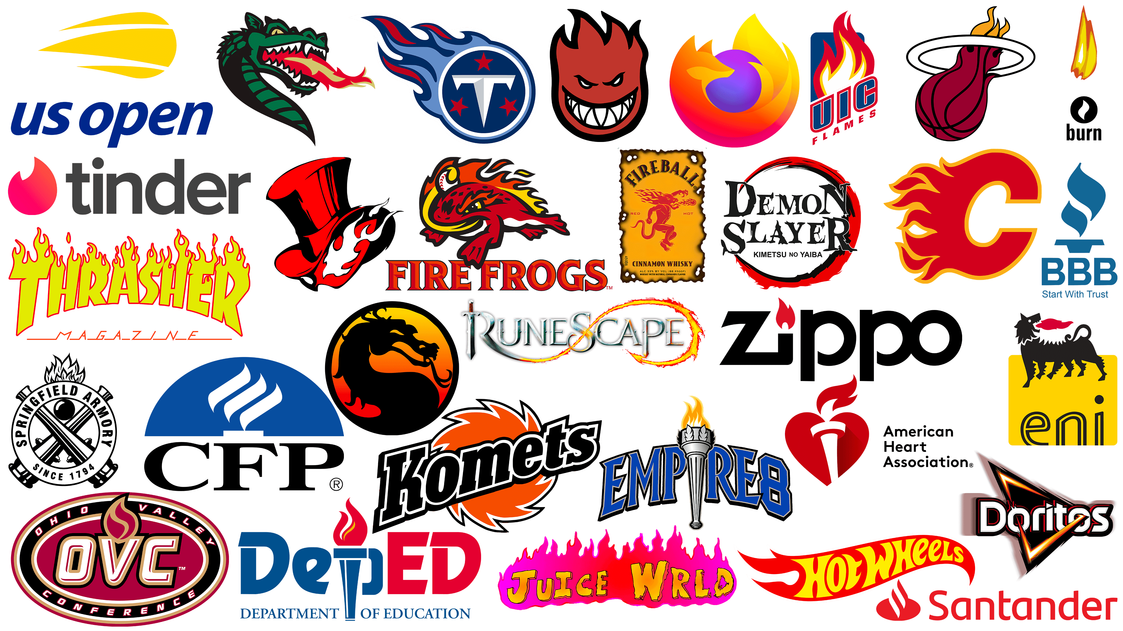
Zippo
![]()
Lighter manufacturer Zippo has one of the most recognizable logos. Instead of the classic dot over “i,” red tongues of fire are used, which is original and practical. Two main components are combined simultaneously: the picture and the text. Secondly, it helps to correctly understand the direction of the company’s work without additional instructions. The flame is tilted to the left and almost touches the top of the letter “Z.” To resemble a lighter, the designers lengthened the right side and connected it to the next letter. The rest of the signs are rounded.
Agip
![]()
A company producing fuels and lubricants is destined by fate to have fire in its symbolism. Designers proposed the Agip logo in a bright palette, featuring a fire-breathing black wolf with six paws. The mythical creature stands, looking back, with red flames bursting from its mouth. The animal’s spine and paws are covered with triangular spikes. The wolf is in the upper part of a yellow square with rounded corners. Underneath it is the lowercase inscription “eni” made in black outline.
US Open
![]()
The US Open, the most respected tennis championship, has a two-part logo. The first is a yellow lantern. It has three tongues and a rounded beginning, which combines horizontal stripes of different lengths. Next, the name of a famous sporting event. It is written in blue lowercase letters. The lettering is cursive; all symbols are smooth and streamlined. In this case, the flame means the powerful pressure with which the tennis ball flies. It also conveys the dynamics of the hot serve, which turns the sports attribute into a burning clot. This infuses the emblem with movement and energy.
American Heart Association
![]()
Given the specifics of this organization’s activities, it simply can not have another emblem. Therefore, the emblem designed for the American Heart Association is a heart with a lit torch dividing it in half. Because the emblem uses only two colors, it gives the impression that the torch is set against negative space. For naturalness, it casts a small shadow in the right part of the composition. Two tongues of flame rise above the heart: one large (upper), the other small (lower). They symbolize care for those who need it. A three-level black inscription complements the emblem.
UAB Blazers
![]()
The fire-breathing dragon is the foundation of the University of Alabama athletic department. It’s a cool, powerful mark that signals superiority over competitors and instills fear in the team. The UAB Blazers logo is one piece: it has no lettering. The mythical animal is depicted just below the neck level and is colored in black and green. It has a scary mouth with several sharp fangs, between which is a red-yellow fire that harmonizes with the shade of its eyes. Together, they enhance the sense of aggression and danger and demonstrate the desire to win over competitors.
Better Business Bureau
![]()
A nonprofit service that helps accredit businesses and resolve business conflicts has an unconventional fire. Designers proposed a logo for Better Business Bureau in an original color scheme, blue and white, an unconventional combination of flame shades. Therefore, it looks abstract, protruding above a small disk on a short leg. Below is the organization’s abbreviated name. The abbreviation, as is the text below it, is also blue: “Start with Trust.”
Tinder
![]()
A light that resembles a thick crab claw has become the app’s main symbol for romantic dating. It symbolizes passion and love. It is these feelings that the developers conveyed through the proposal of a flame logo for Tinder. The emblem turned out to be stylish, minimalistic, and modern. At the bottom, the fiery tongues are rounded; at the top, they are forked, with a barely noticeable orange tint on a pastel-red background. On the right, the resource’s name is listed. It is lowercase, uppercase, and black, in contrast to the first element. The font is bold and sans serif.
Burn
![]()
This brand is well known to energy drink fans because the flame is present in everything: the name, logo, and can contents. The Burn company chose this logo because it “ignites” the body, accelerating through the veins. It is depicted in two forms: white within a black circle and yellow-red above it. The upper element resembles a candle flame. Below is the brand name. It is lowercase, black, and vertically elongated. Such a drawing is perceived very powerfully and vividly conveys the drink’s purpose.
Thrasher
![]()
The magazine’s name stands out because the designers chose a bright and original logo for Thrasher, reminiscent of a wall of raging flames. The word “Thrasher” is massive and glowing. Yellow flames are drawn above each letter. All elements are outlined in red. The center characters are short, and the side characters are long, so the word forms an arc. The lower text is colored red. It consists of thin uppercase glyphs supplemented by horizontal strokes. The inscription is in cursive and does not contain serifs.
Calgary Flames
![]()
The Calgary Flames, a Canadian hockey team, have a very aggressive logo. The burning letter “C” resembles jaws ready to close or classic red-hot iron tongs. The monoblock glyph represents the pressure of the sports club, the zeal to win, and the increased danger for opponents. On the left side is a raging flame. The entire symbol is colored red and outlined with a medium-width yellow-orange band. The purpose of this emblem is to instill fear in the opponents. In addition, it conveys the heat of the arena and the competition’s tense atmosphere. There is no text on it.
Tennessee Titans
![]()
Fire is also present in the emblem of a famous soccer club from the United States. The Tennessee Titans chose the logo with a burning ball to signify that soccer is incredibly tense. The result is a silver-framed medallion with a large, broad-headed nail shaped like the letter “T” on a dark blue background. Three burgundy stars are drawn around it. To the left of the circle, a tail of flames stretches across the blue-red spectrum, making the badge stylish, bright, and modern and reflecting the athletes’ goals.
CFP
![]()
The CFP logo is an acronym for the full name “Certified Financial Planner.” The flames are symbolic, taking the form of three diagonal strokes raised to the right. They are wide, with pointed ends, arranged one atop the other, resembling flames. Their background is a blue half-disk. Under it is the name of the certifying organization in large, serifed capital letters. The inscription is aligned on both sides and has a small space between characters. The text balances the emblem in composition, giving it strength and stability.
Springfield
![]()
Two cannons are crossed in the middle, and a cannonball is the emblem of this brand. At first glance, Springfield may have chosen an old-fashioned logo, but this impression is wrong, as the emphasis is on historicity and original roots. The black border around the main elements balances the composition, giving it a professional and rigorous look. The central ring is wide enough to accommodate several inscriptions, including the name and the fear. It was founded. They are in bold sans-serif uppercase. Above the circle, there is a bonfire. Like all other elements, it is monochrome. In this case, the fire conveys the company’s lofty purpose.
Demon Slayer
![]()
The fire in the emblem of the popular Japanese manga is ring-shaped, so it appears that the rim is on fire. The bright red color gradually fades to black, eventually forming a dark inner circle. In this case, the flame is abstract and spectacular, with jagged contours. It has neither a gradient nor a clear border, and the mark’s meaning lies in the name, located here in the center. Thus, the logo conveys a sense of danger, threat, and power associated with the Demon Slayer franchise. The lettering is in a designer font with jagged edges. Although all letters are capitalized, the first and last letters are much larger than the others.
Spitfire
![]()
Designed for the company Spitfire, the logo is reminiscent of fire. It shows narrow eyes and a wide mouth with a sly smile. The teeth are white and triangular, giving the impression of critical danger. They are tightly clenched. Instead of hair on his head, there are flames: four curved stripes pointing upwards. The sign is colored crimson and outlined in bold black.
DepED
![]()
This inscription belongs to the Department of Education and reflects the Philippine government’s structure. Especially for DepED, the emblem is made stricter and more serious, as it refers to the civil service. The left side of the text is colored blue, while the right side is colored red. The central letter is transformed into a torch with a burning flame. The red flame is in two parts and has a faint yellow glow. Both letters “D” and the penultimate “E” are uppercase; the rest are lowercase. Below is the book’s full title, aligned on the left edge. The fire here symbolizes the desire for knowledge.
Santander
![]()
For the Spanish financial company Santander, designers chose a business-style logo. It is bright red, which attracts most customers’ attention. The emblem shows an abstract drawing with several diagonal stripes symbolizing fire. It comes out of a horizontal oval. Next to it is the organization’s name, whose letters are distinguished by clear lettering and a perfect balance of spacing. The font is uppercase, sans-serif.
Doritos
![]()
The Doritos brand has a triangular logo shaped like chips, inspired by Mexican nachos. They are spicy due to the original seasoning and have a searing flavor. In the center of the logo is a triangle with an orange-yellow outline and a black center. The stripes run through both letters “o” and taper to the tops. The lettering is white, horizontal, and streamlined. But there are some sharp elements, for example, the mini-triangle above the letter “i” and the ends of the letters “s” and “t”. The glyphs and frame are shaded, so the dark, smoky background is visually concentrated around them. This demonstrates the theme of fire, which is minimal here.
Juice WRLD
![]()
Neon flames are the foundation of the popular American rapper’s visual style. It is the fire of emotions conveyed in music, the burning power of feelings that fills audio compositions. The title is typed in large yellow letters as if shaking through the haze, so the edges are unevenly wavy. The bonfire in which the lettering burns is a gradient: a transition from fuchsia to pale pink and from red to orange. The motif of the Juice WRLD logo is clear: it’s the music of the flames. All over the top of the banner are curling, fiery tongues: they vary in height but all point upwards. Such a badge is full of personality because it cannot be confused with any other. It looks progressive and cool.
RuneScape
![]()
The emblem designed for RuneScape is made in a classic gaming style, as it is a famous MMO video game. The emblem’s base is a volumetric inscription with letters in cool steel. The first glyph is stylized as an old knight’s sword with a brown hilt. Its second half is a long rope of fire that stretches from a sharp blade to a triangular tip, similar to an arrow. The fire loop encompasses the word “Scape” and rushes to the left. The combination of cold gray metal and glowing fiery lava creates a unique atmosphere of magic and cruelty. The title is in the old English style. Each letter is highlighted in black.
Empire 8
![]()
This sports conference is part of the National Collegiate Athletic Association, so its visual image is connected with the theme of victory. The torch is directly related to them: previously, it was used to light a fire on Mount Olympus, which gave the Olympic Games their name. The “Empire 8” logo embodies this very attribute. It is dark gray, in the Empire style, with a narrow handle and a wide top, where the orange-yellow flame blazes. A silver torch decorated with laurel leaves replaces the capital letter “I.” The organization’s name is written in large blue letters with a double border.
Phantom Thieves of Hearts
![]()
The magical-heroic comic is decorated with an emblem that matches the name: the developers chose a fiery red logo for the Phantom Thieves of Hearts. In the opening of the high hat, you can see the heart: it is covered with tongues of white fire. The cylinder has curved margins and black blotches where the shadow falls. There is no text on this symbol because, according to the story, it serves as a sign for representatives of a secret organization. The badge carries powerful energy and looks stylish and bright.
Fireball
![]()
In this case, the interpretation of “fire” is particularly interesting: it is associated with an alcoholic beverage. The Fireball cinnamon whiskey brand uses a logo featuring a mythical creature spitting fire. The red character resembles a devil: he has a long, wriggling tail, sharp claws on his hands and feet, and a head resembling that of a dragon or a dog. Fiery tongues come not only from the mouth but also from the back of the head. The drawing is on a vertical yellow rectangle with burnt edges. Important product information is gathered there, as the emblem also serves as a label and appears on the bottle. Everything on it evokes a rush of heat, from the label’s burned-on edges to its color palette.
Ohio Valley Conference
![]()
The Ohio Valley Conference logo contains an abbreviated form of the name. The acronym OVC takes center stage, with a small bonfire above it, visually divided into two parts and outlined in gold. The flame is located above the letter “V,” stylized as a torch. The letters have double borders and purple highlights that stand out favorably against the white background. The base of the inscription is a dark red oval surrounded by several stripes of different widths. The organization’s full name is indicated on one of them (on the black one). The font is chopped, uppercase.
Florida Fire Frogs
![]()
For the Florida Fire Frogs organization, the designers created a logo featuring a frog, which is quite predictable given their focus on the name. It is colored red and holds a fire on its back. With a long yellow tongue, the animal grabs a white balloon. The frog has an angry look that threatens to instill fear in its opponents. Flames also shoot out of its eyes. At the bottom is the name of the professional baseball club, composed of flat letters with double coloring (orange and red), which makes them appear three-dimensional. All symbols have spikes at the ends.
Mozilla Firefox
![]()
The fire in the identity of one of the most popular browsers is soft, smooth, and beautiful. Mozilla Firefox features a fox’s tail as its logo, which is reflected in the name. It combined these two concepts on the principle of visual similarity. It was a bright and memorable emblem: the flame covered the entire globe, casting a purple glow. On the left side, you can see the ears and muzzle of a fox. In this case, the fire is warm, not hot or aggressive.
Fort Wayne Komets
![]()
Fort Wayne Komets, a professional hockey team from Ai-Diana, chose a logo with a burning puck. However, it doesn’t look at all like blazing sports paraphernalia; it resembles a cutting power-tool disk more. Perhaps this is done on purpose, as athletes must demonstrate their determination and desire to win to intimidate their opponents. The edges of the center element are pointed and outlined with a double contour. The name is located diagonally and is black.
Mortal Combat
![]()
The fire in the “Mortal Combat” logo is not explicit, but the background is. In the red-orange glow of the flames raging somewhere nearby, you can see a black dragon with a forked tongue and spikes on its back. The mythical creature has a maliciously squinting gaze and a gaping maw. The emblem has no inscriptions and resembles a round medallion set in a wide frame.
Hot Wheels
![]()
Designers proposed a fiery emblem for a popular franchise that produces toys and cartoons. This is due to the attention it attracts from children, the target consumer group. Therefore, the Hot Wheels emblem is bright red. It has the form of a wriggling ribbon, with the tail resembling a flame. The right edge is narrow; the left one is wide. The brand’s name is written in bold on the banner. The letters are separate, large, and shaped, and they also vary in size. They are in dark yellow, clearly standing out against the fiery background.
Miami Heat
![]()
The Miami Heat club’s logo depicts a burning ball flying into the ring. The famous basketball team from Florida has been using it in its visual style for many years, as it perfectly conveys the atmosphere of competition, the desire to win, and the unbreakable will of basketball players. The ball is burgundy, with a yellow top, like a flaming tail. The flame rises and is divided by a ring into two multicolored segments. In this case, fire means a game so powerful and intense that the ball literally “burns” in the athletes’ hands. There is nothing else in the badge, not even the team’s name, which does not prevent it from being original.
Illinois-Chicago Flames
![]()
The Illinois-Chicago Flames have a fiery emblem because the club’s character is embedded in its name. The unusual nature of the character is that it is diagonal. Everything is placed under the slant: the fire, the background, and both lines with inscriptions. The top line shows the abbreviation “UIC,” derived from the phrase “University of Illinois at Chicago.” It is large and blue, with a red-and-white border. Below it is the inscription “Flames”. This line is dark red, with large character spacing. All letters are capitalized and grotesque. The flames in the emblem are triple:
- The core is colored white.
- The outer part is red.
- The space in between is yellow.
The image is superimposed over a vertical banner with rounded corners.