One of the original and particularly attractive symbols in emblems is the image of a flower, primarily because of its femininity, beauty, grace, and tenderness. Such features make the sign in demand by manufacturers of underwear and cosmetics, jewelry, and other products designed for the beautiful half of humanity. But adding to the visualization of vitality, power, or progressiveness makes such an emblem indispensable in other directions. Its bright and abstract execution can greatly enhance the visual impact of a musical rock band, draw attention to the coat of arms of the city, reflect the peculiarity of services, or originally present your club. A seemingly simple flower – but how multifaceted and meaningful it can be, will allow you to learn a huge number of logos using flowers as an element of composition.
Naturella
The brand of feminine hygiene, Naturella, has an abstract but delicate logo with a chamomile. This is a symbol of care for women’s health, reflecting the use of the healing and disinfecting extract of the flower in almost every product. The emblem is presented in a gradient color scheme from yellow to white in the design of the petals, which are highlighted by a thin black border. Its appeal is supported by the header text, rendered in bold black and white in a beautiful cursive font with smooth outlines.
Guns N’ Roses
Founded in 1985 in Los Angeles, the rock band Guns N’ Roses used red roses in their emblem. They tightly wrapped their branches around two guns, symbolizing the band’s peace-loving philosophy and its desire to always wage war, including through flowers. The circular emblem with a wide yellow rim framing the central metal core looks bright, and the roses and pistols crossing the image in the center look realistic. The band’s name is engraved along the rim in an elegant black serif font.
Pond’s
The successful history of the American cosmetics brand Ponds, which began in 1845, is reflected in the elegant modern logo. Following the traditions, the company gave preference to the tulip, the stylized image of which in black color provided recognizability. It symbolizes youth, beauty, self-esteem, financial well-being, warmth, and spring mood. A closed bud in an elegant oval demonstrates an inexhaustible supply of loyalty to one’s values.
BlossomBlastSaga
A symbiosis of entertainment and flowers is the 2015 mobile app from King for Android and iOS. To attract attention, the game received a logo in bright colors and a cheerful cartoon style, in which the original round font is made of three-level text. The letters “O” are replaced by cute five-petal lilac buds with a contrasting dark yellow center. They highlight the bright red text with a red border on a light pink background. Its appeal is emphasized by the word Saga in white lettering on a rich green background.
Fiesta Bowl
The emblem of the Fiesta Bowl, America’s college soccer championship since 1971, features a bright, eye-catching flower symbol. A dark blue rounded rectangle intersects a hexagonal pennant shape with a white PlayStation console logo. Below it – in red font with a blue border on a white background is the name of the brand. Above – on a white field are blue elements of Arizona nature. The lower upper part of the pennant is covered by a dark blue circle with an orange-red flower in the form of a sun.
Tulip Computers
Tulip Computers, a Dutch PC clone manufacturer from 1979 to 2009, had a stylized red tulip in its logo. It was a tribute to its country, a pride in its origins. The three-segmented flower stood out against a background of black leaves and a two-level font of the name, in which the letter “i” is formed. The first word is typed in a bold black sans-serif font. The second is rendered in lowercase letters in sans-serif. The long stroke of the letter “p” with a lower notch for “e” unites the whole composition.
Blueband
Dutch company Upfield presents high-quality margarine TM Blueband, having created an attractive corporate identity based on four types of colors of different coloring. Positioned above the bold dark blue brand name, they are immediately eye-catching, providing brand recognition. Different in line thickness, shape, and shade – red, yellow, white, and gradient orange – they symbolize the product’s plant-based origin, diversity, high quality, and naturalness.
Queensland Government
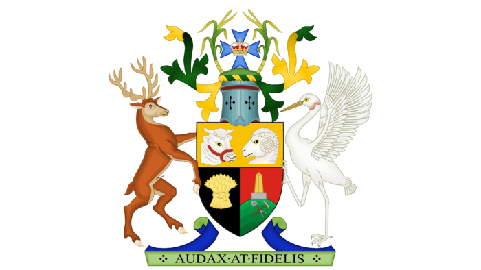
An administrative body, the Queensland Government, formed in 1859, has a bright, memorable emblem with flowers in heraldic design. They are on top, right, and left of a knight’s helmet with a blue Maltese cross with a red-gold imperial crown in the center. A heraldic shield crowns the entire composition with many elements divided into four colored sectors held by a red stag representing the old world and a brolg representing the indigenous people.
FTD
For more than 110 years, the American flower delivery service – FTD, whose symbol is a golden Hermes with a bouquet in her hands, has been delighting its customers. The current emblem pays homage to its past, demonstrating a commitment to modern technology and a desire to guarantee speed and high-quality service. The font of the name abbreviation – Florists Telegraph Delivery, the founding date, and the image of the Greek god is elegant and accurately reflect the company’s goals.
Rose’s
Keurig Dr. Pepper-Rose’s Keurig lime juice, named after its maker Lauchlan Rose of Great Britain, was patented in 1867 and was the world’s first fruit concentrate. Its dark green label features an image of two limes on a grid of five greens in a gradient design of leaves and three pale blue flowers. The composition shares the base date with the yellow color, effectively balancing it. Above it is the name in white elegant serif capital letters, the volume of which is formed by a yellow shadow.
Grünen
For the Grünen party, the logo is fully in line with its purpose, as this political party from Germany fights for and protects nature. It chose a plant theme as its visual identity, more specifically, a rich yellow flower. In its shape and petal structure, it resembles a sunflower, but not with a black, but with a white center. To the left of it are inscriptions in German. They are grouped in two rows, one above the other, and aligned on both edges. There is a blue underline at the bottom. The font is green in color. It is slightly slanted, chopped, and typed in capital letters. The flower, in this case, represents warmth, sunlight, kindness, and concern for nature.
Golden Tulip
The international hotel operator Golden Tulip, founded in 1962 in the Netherlands, uses an elegant stylized golden tulip as its symbol. Stylish and minimalistic, consisting of five fragments, it echoes the name, emphasizing the advantages and benefits of the brand. It is accentuated by the two-tiered name inscription below in a calm navy blue color.
Flowers of Columbia
A colorful and vibrant logo for Flowers of Columbia, an online service dedicated to creating and offering a unique variety of colors in flower painting. The features of the brand, the essence of its name, and its activities are accurately and thoroughly reflected by an attractive and colorful identity in the form of a stylized bouquet of various hand-drawn figures of bright orange and red, yellow and green, pink and purple colors, which is emphasized by the bold sans-serif font of the brand name, executed in purple.
Hilton Garden Inn
Established in 1996, the low-cost hotel brand Hilton Worldwide features a simple but bold logo with a floral theme. On a bright red square white color, apply four petals located diagonally and converging to the center. The original graphic design with straight, thin white veins and dots on top provides the necessary memorability. On the right side is the three-tiered text of the brand name in a bold blue serif font.
Adidas
The Adidas sportswear brand, founded in the early 1920s by the Dassler brothers, is now represented by a modern, recognizable trefoil emblem, the bases of which tend to converge. Its underside is crossed by three white stripes, symbolizing the reach of product sales on three continents – America, Europe, and Asia. It rests on the brand name, rendered in an iconic round solid sans-serif font. This mark has become a recognized symbol of excellence and professionalism.
4chan
In 2004, the NewSia 4chan website was created in New York, which today reflects its popularity and purpose with a modern, minimalist emblem. It consists of four green petals designed in the shape of hearts. The graphics and the spacing of the elements reveal the main purpose of the service – to bridge the gap between people by providing the ability to quickly share images. To the right of the petals is the name of the service in burgundy-brown sans-serif font.
Tulip
Founded in 1887, the Danish canned food brand Tulip has an emblem in the form of three red tulips. On the dark blue background of the round label, an abstract image with white leaves and a border is placed on two diagonally arranged red ribbons with beveled ends. Below is the title in white bold, heavy, stable font, duplicating the text to the right of the label, but in blue color. The mark is in the form of a label adopted in international attributes, which characterizes the high quality of the product.
Huawei
Attractive abstraction and style are characterized by a “floral” emblem of the Chinese manufacturer of electronic gadgets – the company Huawei Technologies Co. Ltd., founded in 1987. A bright and sophisticated composition of 8 elements resembling the petals of a chrysanthemum forms a bud in a red gradient design. This “flower of Asia” is popular in the region and symbolizes the brand’s commitment to its roots. At the same time, the symbol resembles the tail of a fabulous bird that opens up new opportunities.
Chupa Chups
The famous emblem of the Spanish brand Chupa-Chups, founded in 1958, is presented in the form of red text on a bright yellow field, framed by a gray-red-white border in the form of a flower. The composition, created by Salvador Dali himself, has not changed since 1969. Its peculiarity is the elaborate layout, thanks to which, when the candy is wrapped, only the beautiful capital two-level red text of the name is visible, while the attractive lower monogram comes from the letter “p” in the second word.
TheMomsCo
The visual style of the international company, which offers care products for babies and their moms, is multi-part. Its structure includes only one large element – a circle. The rest of the components are small and numerous. So, on the background of the blue medallion are drawn hearts, flowers, birds, berries, curls, twigs, and leaves. They are depicted with thin white lines, which gives birth to a feeling of kindness, softness, and care. In particular, all flowers – both single and on curved stems – are tender. It is this feeling that lies at the heart of a cosmetics company’s marketing. It is a key sales tool. And the plant theme supports it perfectly. In the center is also the name of the brand, made in handwritten letters in lower case. The manufacturer’s slogan is written under the circle. It is colored in gray.
Blackburn Rovers
The floral emblem accompanies the British soccer club Blackburn Rovers from 1875. Its identity in the form of a medallion with a bright red rose with a delicate green stem on a central white circle is a tribute to the city and commitment to its ideals, a reflection of the desire not to deceive the hopes of its fans. The inscription on the light blue rim in yellow capital letters includes the name of the club and the date of its foundation. Below the medallion, on the white end of the pedestal, is the motto – Art and Labor – inscribed in thin black Latin letters.
CoCo Flower
Known to anime fans, the Nature-type CoCo Flower brand appeared in its second season. It is distinguished by a bright, colorfully executed, recognizable logo based on a floral theme symbolizing naturalness. Executed using a vast array of flowers, the delightful hippie motif is set inside an arch with a thin brown border and a white line underneath. The flowers are printed on a light green field with a darker border. The name is printed in a bold, round, white font in a non-standard size.
Google Tulip
For the agricultural sector, Google developed a software, Tulip, whose logo has a bright, modern design. Reflecting the PR was a stylized tulip made up of several geometric elements in the creator’s signature color scheme. Each element has its own color. Minimalism, absence of inscriptions, and graphic overload provided the emblem with a stylish and modern design, delightful representation of the essence of the application, and ease of recognition.
Cyber Florist
Internet platform Cyber Florist, founded in 1997 in Moscow for the delivery of bouquets, flower arrangements, and gifts, is characterized by an original floral logo. Stylish but modest in terms of using plants in the visualization, the logo features an eight-petal pink stylized bud. It replaces the letter “o” in the word Florist, rendered in a light green color, with thin caps and a graceful first. The word Cyber balances the composition, reflecting the company’s activities and direction characteristics.
4H
A network of American-Canadian youth organizations in 1902 – 4H has in its initial visualization the image of a green shamrock. Its four petals are gathered in one bud around a vertical white maple leaf – the symbol of the Canadian division. The essence of the name is reflected in the letters H on each of the petals. Its motto is “head, heart, hands and health”. This symbolizes the flower itself, reflecting the main programs of the brand – citizenship, healthy lifestyle, science, engineering, and technology.
Flower City Union
New York soccer is represented by Flower City Union, a club created in 2021, and has an identity that supports and reveals the essence of the name. A round medallion in light purple with dark purple graphics and trim – the club’s official colors – contains an open-worked multi-unit bud in the center. The symbol is surrounded by the club’s name in square sans-serif capital letters. The flower and club colors are symbols of the city, indicating the club’s connection to the founding city.
Tassimo
Especially attractive is the bright, colorful logo with a “floral” theme of the brand of capsule coffee machines and Tassimo coffee from Bosch, which appeared in 2004. It combines six stylized translucent petals of regular shape into a single bud – each of a different color. The overlapping effect adds darker shades. In this way, the brand symbolizes the diversity of offerings, tastes, and aromas of its products. On the right is the name in a clear, soft black sans-serif font.
Lancome
A perfectly shaped white or golden rose on a black round medallion is the symbol of the French cosmetics brand known to everyone since 1935. Its name comes from the ruins of the Lancome castle (Le Château De Lancome). The logo also includes an elegant inscription made in classic black font in beautiful capital letters with serifs. The rose stands vertically and serves as a symbol of beauty and perfection, revealing for many decades the company’s main goal – to help women become even better, more attractive, and more beautiful.
BP
British Petroleum, today BP, is a British oil and gas company founded in 1909. It is distinguished by a modern, memorable logo in the shape of a cool geometric flower. Its graphic design resembles a mandala, with pointed petals in light yellow and two shades of gray. The core is white. It resembles the sun with rays as a symbol of energy spreading, emphasizing the brand’s professional activity.
Camellia Bowl
The Camellia Bowl, an annual college sports championship held since 2014 in Montgomery, Alabama, has a vibrant and informative visualization. Its logo features two stylized red buds resembling camellia flowers, flanked by the green word Camellia as a visual endorsement. Above them is the sponsor’s name in red and black. The second word of the name is in round, bold blue letters running the length of the emblem and ending with the name of the city and state written in red letters with thin serifs.
BJP
The Indian People’s Party – BJP, founded in 1980 in New Delhi, has chosen the image of an orange lotus as its emblem. It symbolizes a commitment to history, a tribute to the first graphic symbol under which the first mass protests against British rule took place. The bright red bud rises above three small green leaves, continuing with two thin black stems emerging from a stylized image of a body of water.
ICQ
Free, now Russian, online messenger – ICQ in 1996 had a recognizable flower shape and a name consonant with the English expression – “I’m looking for you.” The modern style is laconic but bright. On the inner circumference of the round black element, there are five different-sized light green petals, not combining with each other. The composition brings a playful mood to the general atmosphere of the symbol, providing uniqueness and recognizability.
Zarina
The brand of fashionable women’s clothing and accessories – Zarina, of Russian origin, founded in 1993 in St. Petersburg, presents itself as an openwork and stylish rendition with a floral element. The black-colored logo includes the name, rendered in elegant handwritten italics. Above its end is an abstract element in the form of an openwork flower bud made with an ornate monogram. It is formed by four rounded petals joined in the center to form two neat little loops.
China Airlines
Founded in 1959, Taiwan’s national airline, China Airlines, has a large and elegant plum flower that reflects the brand’s identity. As a national symbol, it not only demonstrates the company’s ownership but also reflects loyalty to its history, respect for tradition, and pride in its origins. The image, made in soft pink tones of petals, light center, and red stamens, evokes the feeling of warmth, affection, and security characteristic of air transportation.
Fiorentina
The soccer club Fiorentina was founded in 1926 on the basis of Fiorenze and the youth club Libertas. Its emblem is a tribute to the club’s history, a demonstration of belonging to Florence, represented in the form of an elongated rhombus. It reflects the team’s signature colors, echoing the city’s heraldry. A white rhombus of regular shape with a gold border is filled with a red heraldic lily. Below it is a blue wedge cut off at the top. The element is filled with two capital white letters, AC and a red letter F, which is the first letter of the club’s name.
Home Instead Senior Care
The Home Instead Senior Care logo is based on the humble but flowering tulip. It is dark purple, as are the rest of the emblem’s details. Among them, the name of the organization stands out. The first two words are arranged separately and occupy two rows. The letter “I” in the inscription “Instead” is stylized under the stem of the flower with two drop-shaped leaves. The rest of the glyphs are traditional: printed, rounded, supplemented with serifs. The last two words are on a single line. They are made in white sans-serif font and are located in a horizontal rectangle. The brand’s slogan is even lower: “It’s personal to us.” This phrase is italicized.
New South Wales Waratahs
The New South Wales Waratahs, an Australian rugby club founded in 1996, is always recognizable by its emblem, a rich, dark red flower with a blue (or white) border. Its shape resembles the giant bud of Telopea, which grows in this region. The composition is complemented by a vertically placed ball in the center – the main element. In this way, the club reflects its professional activities and its affiliation with the city of Sydney. A dense and heavy blue header font, sans-serif, was used for balance.
Kentico
The content management system in the form of Kentico software, released in 2006, has now been replaced by a modern, bright, recognizable logo with a floral theme. The logo is a text module of the name, executed in black, non-standard sans-serif font, with beveled letter elements and a bright orange symbol. Shaped like a flower or sun, it is represented by a small circular element in the center, from which stylized petals or rays branch off, with the upper part beveled to the right and the lower part rounded.
Unilever
The symbolism of the British group of companies Unilever clearly and accurately conveys its characteristics. The original logo is a blue capital letter U, an example of using many small details on a white background to create a simple and concise form. The visualization reflects the unification of many sectors of the food industry and household chemical companies. The main part of the composition is made up of flowers of different shapes, symbolizing the diversity of the brand’s offerings. The name is handwritten in blue italics.
Carlson Rezidor
In 1960, the first hotel appeared, Carlson Rezidor, a Danish-Swedish corporation bought out in 2018 by a Chinese consortium. The brand had an interesting identity, which included a black two-tiered text name of the chain and a small abstract geometric flower centered at the top. Here, it symbolized high-quality services and excellence, distinguished by its complex execution – from an x-shaped element formed by four diagonally arranged red petals and yellow circles.
PetroChina
The logo of the Chinese oil and gas company PetroChina, founded in 1999, includes a stylized image of a bold but modern abstract representation of a flower. It is divided into two parts where the upper one, rendered in a bright yellow gradient, features several thin white rays emanating from the center. The lower one is red. The curved outer contours create the shape of an opened flower bud. It symbolizes the solidity and success of the brand and reflects the specialization with its energy and attention to customers.
Hawaiian Airlines
The largest American company – Hawaiian Airlines 1929 – uses the image of a scarlet hibiscus bud. This national symbol reflects the brand’s affiliation and commitment to its historical roots and ideals. It is buried in the black hair of a beautiful Hawaiian woman whose profile is inscribed in a composition of white, purple, and fuchsia colors. To the right of the sign is the two-tiered text of the brand name, with beveled corners of some letters at the first word and thin, rounded capital letters at the second.
Holiday Bowl
The logo with three flowers represents the American soccer championship since 1978. The fact that the championship is seasonal is reflected in the cold blue-and-white symbolism in the form of a rectangular pennant with a curved top and base, which is “warmed” by red shades of poinsettia – Christmas rose. The two outermost buds have triangular and sharp red petals, and a blue core edged with white lines. The center one has white petals and a white dot, a red core, and a blue border.
China Southern
In 1988, the first flight was made by China Southern Airlines, placing its symbol – a red flower – kapok – on the plumage of the airplane. It is noticeable and recognizable from afar due to its white border on a blue background. As a symbol of Guangzhou, where the company’s headquarters are located, it reflects the nationality of the company, its roots, and its characteristics. The kapok tree was sacred to the Mayans, symbolizing the trinity of the underworld, earth, and sky, which became part of the brand’s philosophy.
Rose Bowl
Rose Bowl is the name of the traditional American soccer game that takes place in early January. Its emblem – a bright red rose with a white border and rich green leaves – is the centerpiece of the logo. As a symbol of sporting passion and love for the sport, blossoming youth, and eternal youth, it emphasizes the age level of the competitors and their boundless devotion to sporting ideals. The arc-shaped badge frames the thin black serif font of the name.
Invisalign
Invisalign Orthodontics is recognizable by its modern, minimalistic logo in a cool blue gradient in the form of a stylized germa flower. Reminiscent of a snowflake, it fits effectively into the overall style of the composition. Eight identical petals with pointed ends are arranged around a common symbolic center, and the color scheme creates the effect of an internal glow, making the logo unique and memorable. The name is embossed to the right of the mark in a round lowercase font.
Braccialini
Braccialini’s leather goods, founded in 1954 in Florence, are now known all over the world. Its logo, in the form of an elegant and delicate rose with a white outline on a red background, reflects the important features of the products, aimed at women, making things more beautiful and increasing the self-confidence of their owners. The icon creates a strong color accent, making it stand out, while the gray text of the name on the right, in light lowercase round sans-serif letters, makes it more stable.
Babor
The original symbiosis of text and image demonstrates the logo of the German cosmetics brand Babor, founded in Cologne in 1956. Its main visual element is a vertically detailed black rose with a stem, beautifully combined with the bold text below. It symmetrically crosses the letter “O” – the name of the brand. The corporate style, unchanged since the company’s formation, symbolizes perfection and preciousness, femininity and beauty.
Lenor
The German brand of fabric softeners, founded in 1963 and owned by Procter & Gamble, stands out with its elegant logo. The light and modern image of a flower made of dark blue clear lines of different thicknesses on a white background is easy to see. Reminiscent of a swirl swirling inward ensures memorability and recognizability. It symbolizes the ease of washing, pleasant fragrance, and lightness, linking the image to the swirl of water in the washing machine. The dark blue text of the name with gracefully curved letters completes the composition.
Warframe
A free-to-play multiplayer action role-playing game developed by Digital Extremes. It appeared in 2013 and was originally designed for Windows PCs and laptops. The general emblem of Warframe (there are several editions of the game) contains a flower with three petals. The central element consists of three pointed arches, the side ones – of two.
Farmers Insurance
This American group insures small businesses, vehicles, homes, and other structures. It came into existence in 1928 and is based in Los Angeles, California. The Farmers Insurance logo, which has been in use since 2015, is a two-dimensional white flower in a blue semicircle. It has a red shield in the background and a two-tiered name below it.
IDBI Bank
The full name of this financial institution is Industrial Development Bank of India. But it is used in a shortened version, becoming the basis of the logo of IDBI Bank in the form of a blossoming lotus. The inscription is to the right of the orange flower. Both elements are located in an emerald rectangle.
