


Many people associate kangaroos with Australia, but they are not only found there. They can also be seen in other countries, such as Indonesia and New Zealand. But in Australia, they are considered the main national symbol. Kangaroos cannot retreat and always move forward, so they represent determination, perseverance, confidence in their abilities, and the will to win.
And these marsupials are very strong, too. They have powerful legs and a tail, on which they lean at rest. Their main diet is plant food, so the animals are considered agricultural pests. You can see kangaroo loggerhead kangaroos less often than some popular predators. And even then, almost all of them belong to Australian organizations. In this selection, we will consider several emblems with animalistic motifs. A common image unites them, but the style varies from cartoonish to futuristic. First on the list are brands unrelated to Australia. They are few in number, but each is well known in their region.
UMKC Kangaroos
![]()
Walt Disney once personally drew the logo for UMKC Kangaroos, but that original version is long gone. The modern symbol looks completely different: the designers decided to show not the animal’s enormous speed but its physical strength, so they depicted it as powerful and muscular. And the University of Missouri-Kansas City’s intercollegiate teams are now called differently: the Kansas City Roos. They were renamed in 2019 when it became clear that the shortened version of “Roos” had caught on both inside and outside of the athletic program.
The current logo debuted the same year as the rebranding. It depicts a very serious and formidable kangaroo who has his hand in front of him with a clenched fist, and the other hand is drawn back as if preparing to strike. Yes, exactly the hand, because the artists made the animal anthropomorphic and even dressed it in a sweater with the monogram “KC.” Below, in a small sans-serif font, is the phrase “UNIVERSITY OF MISSOURI.” Below it is the name of the city, divided into two lines and set in large, bold letters with a personalized design. The logo is in a blue-and-gold palette, as these are the institution’s official colors.
Akron Zips
![]()
There is another university in the United States with a sports program whose mascot is a kangaroo. This is the University of Akron in Ohio. The Akron Zips teams used to have an emblem featuring a marsupial. The drawing was very sketchy, as the artists did not go into detail and used a combination of blue, dark gold, and white spots. The emblem showed only the kangaroo’s head and upper back. A protruding line replaced the horizontal stroke in the letter “A” in the background. The designers made the side strokes of the letter “A” very wide and decorated them with tiny triangular serifs. For greater contrast, the letter was white, and the kangaroo’s base was dark blue. A common gold border united them. Blue and gold are the official colors of the University of Akron.
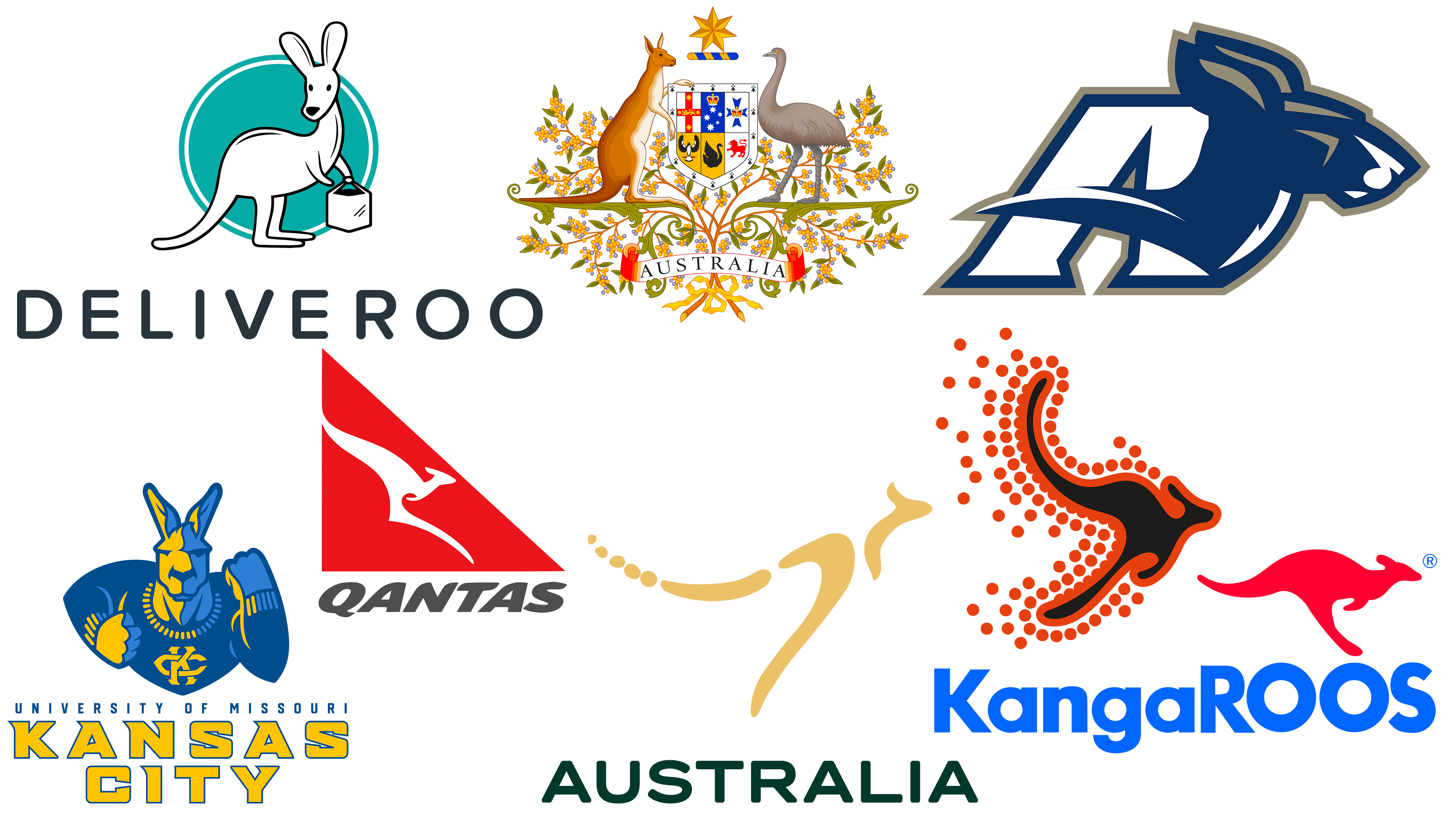
Deliveroo
![]()
For the British company Deliveroo, the logo visually represents fast-food delivery. After all, the kangaroo depicted on it fits perfectly with the brand’s idea. As far as we know, these animals are very agile: they move quickly and can cover long distances in a short time. Therefore, the designers presented a cartoon kangaroo as a courier carrying a bag in its front paws. It is set against a light turquoise circle, and at the bottom, the name of the online service is written in capital letters, set in a black grotesque with rounded corners.
Qantas
![]()
Qantas is the first brand in the review that is directly related to Australia. It is the largest air carrier on the continent, deriving its name from the phrase “Queensland And Northern Territory Aerial Services.” It also has a nickname, The Flying Kangaroo, derived from its emblem of Australia’s national animal. In the past, the kangaroo in the painting actually flew because the artists added wings to it. But even after the wings disappeared, the silhouette remained light and airy, thanks to the relief lines. Thus, the Qantas logo is still associated with flight.
Obviously, the red triangle’s shape imitates the airplane’s tail. But recognizing a kangaroo in a white figure with two long spurs is quite difficult, especially after the 2016 redesign. In the previous emblem, at least the front paws and neck were visible. By the way, here is a clearer version that was used before 2016. It was complemented by the gray “QANTAS” inscription, consisting of bold cursive letters with rounded ends.
Australian Government
![]()
The Australian Government logo contains the official symbol of the state, the Commonwealth coat of arms. It includes many small elements, such as the continent’s two main inhabitants, kangaroos and emus. These are endemic to the local fauna, meaning they are virtually impossible to find anywhere else. In addition, both animals are known for not being able to walk backward. Thus, the designers wanted to show that the country is only moving forward towards a better future. The kangaroo and emu are supported on different sides by the coat of arms, within which the signs of each of the six states of Australia are depicted. A six-pointed gold Star of Federation represents these same states above a yellow-and-blue band. The emblem is decorated with intertwined golden acacia branches and is complemented by a ribbon bearing the country’s name.
Australian Air Lines
![]()
Another local company, Australian Airlines, once symbolized Australia’s national treasure. It operated for five years (until 2006) and provided economy-class passenger transportation services. The Australian Airlines logo also featured an image of a kangaroo, like the aforementioned Qantas, which is rather strange, given the lack of connection between a land animal and flight. But the designers felt that the kangaroo moves quickly by jumping up, and that’s enough to make it the “face” of the airline. The marsupial animal looks indistinct: it resembles a black blob with lines stretched in different directions that mark the head, paws, and a long tail bent upward. A wide red outline surrounds the silhouette, and behind it, a trail of small red circles stretches. Obviously, these dots symbolize rapid movement.
Australia National Brand
![]()
Australia’s National Brand is the youngest on this list. It was created in 2022 to represent the country internationally, increase its competitiveness in the global market for goods and services, and promote its tourist attractions. For the Australian National Brand, the emblem was chosen back in 2020, but it had to be changed because it resembled the COVID-19 virus under a microscope. The authorities recognized that the emblem was very similar to the coronavirus image, so it was decided to change it without increasing the project’s budget.
The new symbol was the result of fruitful cooperation between National Brand Advisory and Indigenous Balarinji. The logo now features a golden kangaroo composed of thin, broken stripes and dots. And at the bottom, the word “AUSTRALIA” is written in dark green. You could say it’s a modern reinterpretation of the iconic green-and-gold Australia-made logo.
KangaROOS
![]()
At KangaROOS, the logo reflects the name exactly. Firstly, there is corresponding lettering. Secondly, in the upper right corner, there is a picture of the animal that inspired the brand’s developers. Logically, the manufacturer of sports shoes, clothing, and accessories chose the kangaroo as a symbol. After all, this inhabitant of Australia has well-developed musculature; besides, it can fight and move quickly. However, the name KangaROOS was adopted after the company’s founder created training shoes with pockets to store a locker key and change. The marsupial animal on the emblem is easy to guess from the black silhouette, as the designers made sure it was proportional. The lettering is in the same black, bold sans-serif font.