Among the diversity of the animal world, the monkey stands out in a special way. After all, on the evolutionary branch, it is the closest to humans, and it is easier to endow its image with human qualities. That is, though, it is easy to convey the necessary idea to consumers. This means that such a character plays an important role in the concept of the visual identity of companies.
Monkey favorably decorates any symbolism, so it is often used not only by serious companies but also by TV channels, show programs, alcohol brands, game developers, and so on. And all because this image is convenient to present both in a humorous and business way. Customer focus, progress, safety, security, development, care, joy, strength, cunning, good-naturedness – everything can be expressed through it, regardless of the palette.
Let’s take a look at a few logos of popular brands from different fields and see who chose this character and why. Let’s see how design experts adapt it to the companies’ requirements. And we will start with more complex forms and move on to the simplest ones.
Tractor Monkeys
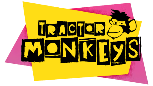
The humorous presentation of Tractor Monkeys chose a bright and unconventional logo, just like itself. This comedy TV show was aired on the Australian channel ABC1 in 2013 and had the format of an intellectual and entertaining game on the topic of social phenomena, various fads, and trends. The show was hosted by Merrick Watts. The emblem was two trapezoidal shapes superimposed on each other. The bottom one was purple, and the top one was yellow. On top were vertical black rectangles with the original letters. They made up the name of the television program. Some glyphs were tall and thin, while others were low and wide. The lettering was grouped in two lines with no edge alignment. At the top right was the head of a monkey. It looked haughty, its lips closed in a sly grin. With its entire appearance, the monkey demonstrated superiority.
Monkey Shoulder
Surprisingly, despite the presence of monkeys in the visual style, this is not a Japanese brand but a Scottish brand. The Monkey Shoulder logo was first used in 2005 when it was founded by the William Grant & Sons family. It quickly made it recognizable and brought it worldwide fame. So, the unusual name and emblem with primates brought the whisky a significant share of success. The badge consists of two parts. The first is an image of three monkeys located one above the other. The drawing is made in the form of a silhouette without the characteristic features of these animals. The black figures are arranged diagonally. The tails have the shape of a hook. The second part is textual, indicating the necessary information. The name is typed in a stencil font and supplemented with miniature serifs. The contours of the letters are blurred. The inscription below the line, on the contrary, does not contain serifs. The glyphs in it are one and a half times smaller than in the first one.
Super Monkey Ball
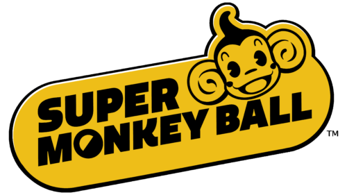
The arcade video game Super Monkey Ball has a funny and fun logo. The monkey depicted on it looks very cheerful. It has round, spiraled ears, raised eyebrows in surprise, a mouth stretched in a smile, a miniature nose, and big black eyes. A high forehead is visible on the head of the perky monkey. The animal’s head is located in the diagonal oval to the left of the Sega series name. The text is divided into two parts: the top line consists of the word “Super,” and the bottom line consists of “Monkey Ball.” The letter “O” is two-colored and resembles a miniature ball. The rest of the glyphs are strict, geometric, and chopped, with a harmonious combination of angles and roundings.
Curious George
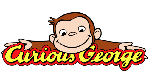
This is a media franchise based on the works of writer Margaret Ray. The book, first published in 2006, tells the adventures of an inquisitive monkey. Therefore, the logo for Curious George was chosen accordingly, with the main character trait of the main character and his nickname. They are very successfully combined. The cheerful monkey spreads his arms out to the sides and tries to hug the yellow inscription on the red background. The letters mimic cohesive handwriting and have a slight slant to the right. The letter “C” has a square serif. The other letters are missing. The monkey is drawn in brown-beige colors: the body is dark, and the face and palms are light. At the same time, the animal is very kind, as evidenced by a wide smile. The ears are small and round, the eyes are directed downward, and three strands of hair stick out of the head. The whole appearance of the primate suggests that this is a carefree and happy creature, eager to learn as much as possible about the world around him.
Stoopid Monkey
The image of the monkey in identity is also found in the animation field. One example is the former animation company Stoopid Monkey. It appeared in 2005 and, after operating for a few years, merged with Buddy Systems Studios. The result was a new organization called Stoopid Buddy Stoodios. Back in the days of Stoopid Monkey, the logo was cartoonish. It depicted a small brown and pink monkey: the head and paws were colored brown, and the snout and ears were pink. The mouth and nose were like thin arches. The eyes were oval and expressive, with a glint in the black pupils. The top of the muzzle was outlined with a heart-shaped line, giving the monkey a welcoming and friendly demeanor. There were two strands of hair sticking out on the top of her head. With its front paws, the monkey held the letters “O” and “P.” In general, the inscription turned out to be very original: an exclamation mark (!) was used instead of “I,” and “E” has no vertical line connecting the three side strokes. The top word of the studio name was white with dark shadows; the bottom word was black with a yellow border.
Yellow Monkey Studios
Yellow Monkey Studios chose a modern, progressive, cool logo. On its logo, the monkey looks at others with an arrogant look. And it looks squinting – as if only it knows the only right step and its consequences. And it suits her very well because the company is engaged in the creation of video games. The primate’s head is painted in yellow (fur), beige (face), and gray (trim, ears, and facial elements). At the same time, the monkey does not smile but smirks, as if challenging to a duel to test the capabilities of the opponent. On the left and bottom is the brand name. The inscription is divided into two lines and printed in lowercase letters. The letters in the word “Yellow” are white and circled in gray. The glyphs used for the word “Monkey” are gray and located on a white background. All the symbols are geometric, even strict, with no serifs.
Drunken Monkey
The Indian chain of smoothie bars Drunken Monkey has chosen an unusual logo and name. After all, firstly, it is the name of one of the styles of oriental martial arts. Secondly, the monkey depicted on the emblem seems cute and kind. What’s the point of all this? Marketing shock to buyers. The dissonance between what is expected and what is seen generates a huge interest in the service. Regardless, the badge looks progressive. It is done in the manner of primitivism: sloppy lines and simple images. There is nothing on it but the standard name and a carelessly drawn monkey. The animal is sitting. It has a disproportionately large head and a small body. The ears are also very large, and the long tail is bent at the end. The cheeks are drawn in pink on the face. Everything else is black: eyes, nose, mouth, fur. The letter “R” in the inscription is tiny and stands out from the rest of the letters. The font is uppercase, geometric, and chopped.
Nick Jr.
Nick Jr. chose a children’s style logo for its visual identity because it shows programs for children. The logo features two monkeys that emphasize the idea of parental care, help, and support. The animals are stylized and drawn without indicating external features. The large silhouette denotes an adult, the small one a child. The first figure is yellow with the white inscription “Nick” on the chest, and the second figure is blue with the inscription “Jr.”. Both monkeys are depicted sitting full-face – facing the viewer. They have long forelimbs, with which they lean on the ground.
Both legs and arms have a similar structure. The head is covered with lush fur, as its outline can be seen on the sides. The text is printed in a smooth font and is arranged diagonally, with a slant to the left. The letters are smooth, sans serifs, with a harmonious combination of rounding and angles.
Monkey Monk
For visual recognizability, Monkey Monk uses a non-standard logo, which is quite justified. After all, this is an extreme sports park in Chennai, India. There are a lot of suspended paths, climbing devices, and everything that allows everyone to feel like a real monkey. Such outdoor activities develop coordination and make a person stronger, more agile, and more enduring. All this is emphasized in the emblem, consisting of one element – a warrior monkey. It is dressed as a Buddhist monk, holding a long stick in his hand and frozen in a fighting stance, stretching his left leg to the side. The anthropomorphic animal is in good physical shape as it looks athletic and trim. The hair is slicked up and styled in a high hairstyle, and the facial hair is seen as sideburns. The eyes are covered by sunglasses, as evidenced by the light glare on the dark surface of the lenses.
Mailchimp
Popular e-commerce platform Mailchimp has been using the monkey logo since its inception in 2001. The animal shown on it is very good-natured: it smiles genuinely and winks with its right eye. He is wearing a cap on his head, the kind that messengers and couriers usually wear. This hints that the service will help you get any goods you are interested in. The chimpanzee’s head is a black-and-white caricature. Underneath it is the name of the online platform. It is made in rounded sans-serif font.
