


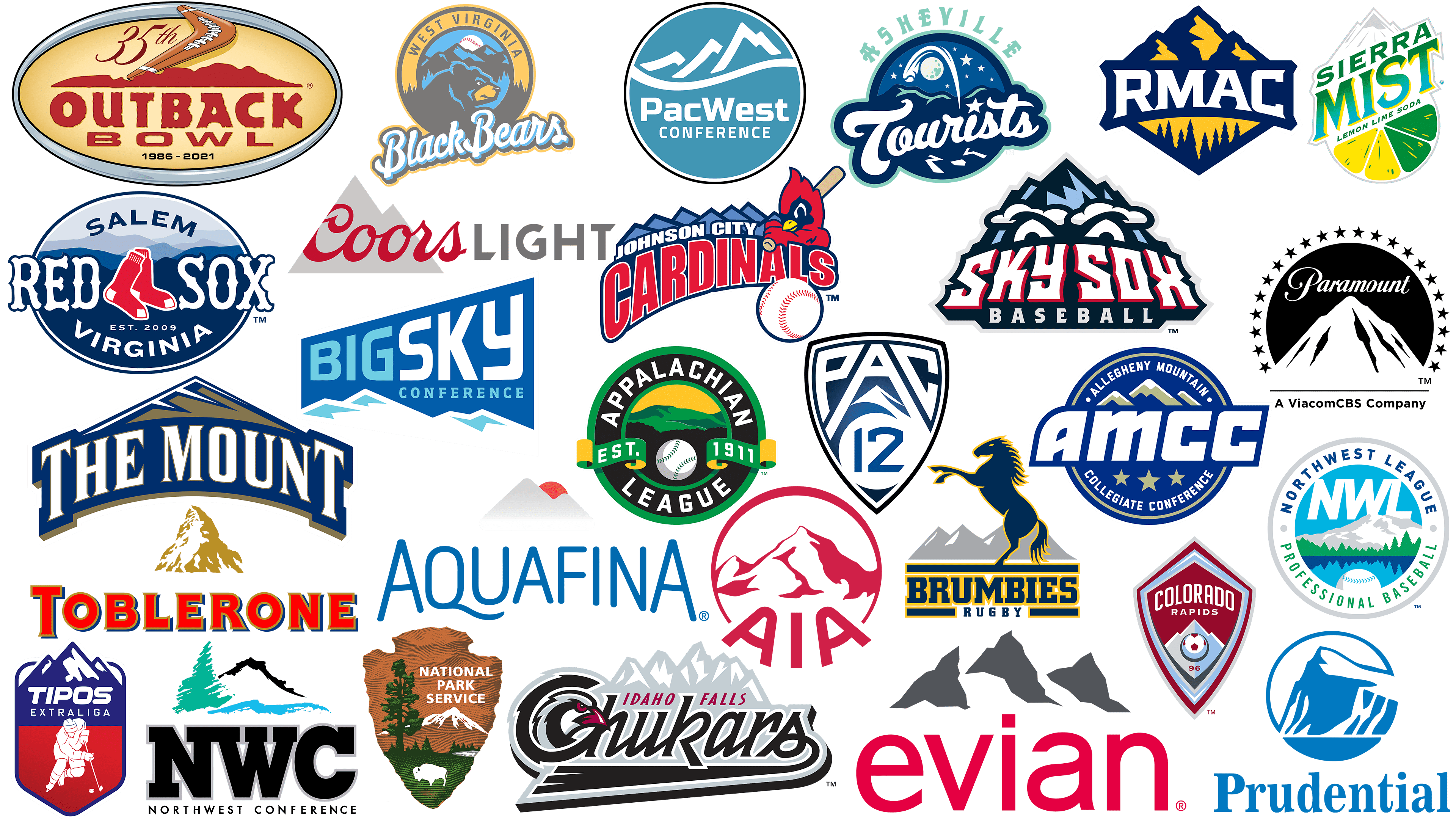
A mountain is an ambiguous symbol. On the one hand, ancient peoples represented mountain peaks as sacred places where the gods lived. An example is Mount Olympus, where, according to the Greeks, Zeus ruled. On the other hand, in many cultures, cliffs and hills were considered a haven for evil forces, as witches and sorcerers gathered there on certain days to perform their rituals.
Of course, the associations have changed in the modern world. Now, mountains symbolize purposefulness, reliability, permanence, stability, steadfastness, superiority, and eternity. White, snow-capped peaks represent purity; a difficult ascent is likened to a spiritual one. In turn, the peak is a desirable goal, which is comparable to the realization of a cherished dream.
Immutability, stability, and confidence are embodied in logos depicting mountains. No wonder they are part of the visual identity of many companies, including world-famous ones. The image of an invincible peak strengthens any brand’s image and creates a sense of strength and invulnerability. Let’s look at the most popular mountain emblems, past or present, that have gone down in history as successful examples of identity.
Mount St. Mary’s Mountaineers
![]()
When creating the Mount St. Mary’s Mountaineers emblem, the designers decided to play with the team names. To do this, they slightly raised the central part of the phrase “THE MOUNT,” creating the likeness of a hill and depicting a mountain peak on top. The triangular hill symbolizes Mount St. Mary’s, after which the university and its athletic program were named. The figure’s interior is brown, but white lines pierce it. This is what stylized snow looks like in the artist’s imagination. The letters have a light beige gradient. The base of the inscription and the general outer contour are dark blue. The triangular serif font complements the mountain’s pointed shape.
West Virginia Black Bears
![]()
The West Virginia Black Bears baseball team has a logo that features its name divided into two parts. The first half is in an orange ring surrounding black and blue mountains. Such a landscape is characteristic of West Virginia, whose official nickname is the “Mountain State.” Sharp peaks rise against the moon’s background, depicted as a baseball. A disgruntled bear’s head is drawn in the lower half of the circle, and below it is a white handwritten inscription, “Black Bears.” The words are raised diagonally as if they were also elevated.
Johnson City Cardinals
![]()
The designer of the Johnson City Cardinals team logo depicted a chain of seven mountain peaks. This refers to the landscape in which Johnson City is located: the valleys at the foot of the Appalachian Mountains. The name of the locality is written in white letters along the dark blue horizon, and below that is the big red word “Cardinals.” On the right, the artists drew a cartoon bird from the Cardinal’s family. Its wings resemble hands as it holds a baseball bat. At the same time, the flying white ball gives the emblem energy and dynamics.
Toblerone
![]()
The Toblerone chocolate bar brand has perhaps one of the most famous logos on this list. It is known by sweet lovers and those who have only seen triangular chocolate on store shelves. The symbol depicts a yellow mountain peak with white snow stripes that form an invisible silhouette of a bear. It is a stylized Matterhorn, the most famous pyramidal mountain in the Pennine Mountains. At the bottom is the manufacturer’s name, set in a bold typeface. The letters with red gradients, golden outlines, blue shadows, and short triangular serifs make the composition three-dimensional.
Idaho Falls Chukars
![]()
This professional soccer club loves its homeland, so it dedicated an entire emblem to it. Since Idaho Falls is located in the Rocky Mountains, the emblem of the Idaho Falls Chukars sports team features a chain of mountain peaks. White represents snow, and gray represents the rocks protruding from the mist. “Chukars” is written in stylized black letters in the foreground. In the curve of the letter “Ch,” a formidable bird with red eyes and a beak is drawn. The first two words of the name are colored in the same dark crimson hue and slightly raised above the mountain background.
Tipos Extraliga
![]()
In the Slovak ice hockey league, the Tipos Extraliga emblem is associated with frosty freshness, ice, and cleanliness. The base is shaped like a shield with a sharp bottom. The upper half depicts three blue mountain peaks with white snowcaps. On them, the word “TIPOS” is written in bold italics and “Extraliga” in thin, straight letters. The second part of the shield is red with a gradient. The white silhouette of a hockey player, dressed in full equipment, holding a stick, and about to score a puck, stands out well against this background.
Evian
![]()
Evian is one of the few non-sports brands on this list. It manufactures bottled mineral water produced in the mountainous region of France, in the heart of the French Alps, on the border with Italy. Given the brand’s specificity, designers created a logo for Evian featuring mountains. There are three gray peaks of indefinite shape. The emblem’s designers made the background completely white to show that the rocks are covered in snow. And at the bottom, in lowercase, large, sans-serif letters, the brand’s name is written. The red color of the word creates a contrast.
Sierra Mist
![]()
Sierra Mist is another carbonated water brand diluted with lime and lemon juice. Here, the snow-capped peaks on the logo are not associated with particular mountains. In Sierra Mist, the logo symbolizes the drink’s freshness and its ability to quench thirst. For this purpose, the rocky peaks are combined with a slice of citrus, which in its yellow-green color simultaneously resembles lime and lemon – a three-level diagonal inscription between white-gray mountains and a multicolored slice of fruit. The first two lines contain the brand name, set in bold with triangular serifs. At the very bottom is the phrase “LEMON LIME SODA.”
Coors Light
![]()
For Coors Light beer, the mountain logo conveys the beverage’s freshness and coolness. In one version, the peaks were depicted as two connected triangles in light gray, which served as the base for the dark red word “Coors,” written in italics. The other half of the name was located slightly to the right on the same line. The designers rendered it in dark gray capital letters, using a bold sans serif font with clipped lines on some glyphs.
Asheville Tourists
![]()
The Asheville Tourists logo also features mountains, although they look more like high hills here. Their silhouette is dark blue, and the designers decided to depict a night landscape with stars, a moon, a comet flying by, and a falling balloon. The moon casts a silvery blue light on the tops. The emblem is the same color, and the word “ASHEVILLE” is drawn at the top. Against the backdrop of a circle with picturesque scenery, a stylized inscription reads “Tourists.” It is handwritten and contains the letter “i” with a five-pointed star instead of a dot.
Salem Red Sox
![]()
The Salem Red Sox team logo is a tribute to the city where the baseball club is located. Its stadium offers a picturesque view of the mountains, where a dark ridge rises on the horizon. Thus, the sports team’s emblem features several blue mountain ranges of varying shapes and shades. A misty outline occupies the upper half of the horizontal oval, and the lower half is painted solid dark blue. In the center, the phrase “RED SOX” is written in a shaped font, separated by an image of red socks. Above it is the arched word “SALEM.” The lower part is occupied by two lines: “EST. 2009” and “VIRGINIA” with the letter “G” in the form of a swirling arrow.
Colorado Springs Sky Sox
![]()
Colorado Springs, like Salem, has its professional baseball team, the Sky Sox. When creating the Colorado Springs Sky Sox emblem, the designers used the Rocky Mountains’ eastern spurs, which are in the sports club’s hometown. The mountains on the emblem are depicted as craggy peaks with dark and light blue stripes. The team’s name is written below in white letters with a pink outline resembling teeth. Directly above them are two stylized eyes with cloud-shaped eyebrows.
Rocky Mountain Athletic Conference
![]()
Naturally, the Rocky Mountain Athletic Conference logo features mountains, as the name suggests. The designers placed them at the top of a rhombus, and in the lower half, they depicted a landscape of dark-blue Christmas trees against an orange sky. The three mountain peaks share the same color scheme, giving the impression that the morning sun is falling on them. The rhombus structure is disrupted by the white abbreviation “RMAC” inside a dark blue plate at the center of the emblem. The small triangular serifs fit perfectly into the overall geometry.
Aquafina
![]()
This list includes another brand that sells purified bottled water. Aquafina’s mountain logo symbolizes freshness, pleasant coolness, and quenching thirst. At the same time, there is no direct connection with mountain mineral springs, as all bottled water is tap water. The artists depicted the two peaks with a light gray gradient against the background of the rising red sun. Blue lettering was added at the bottom in large but rather thin letters for balance. A special font was designed for the brand name, so the two “A’s” are disproportionate.
Prudential Financial
![]()
For Prudential Financial, the logo is a stylized image of the Rock of Gibraltar. The famous peak is depicted as white and blue spots and stripes within a circle. It became the symbol of the investment and insurance company after an advertising agent passed by Snake Hill and was inspired by the beauty of the local landscape. This happened in the 1890s. Since then, the emblem has changed many times until the modern version appeared, a simplified pictogram signed at the bottom with the word “Prudential.”
Colorado Rapids
![]()
The designers who developed the Colorado Rapids’ mountain emblem dedicated it to Colorado’s landscape features. This is another case where geography is directly reflected in the brand’s visual identity. The mountain peak is depicted as a jagged triangle. Its left side is light gray, the right side is light blue, and a white line is drawn on top to simulate snow. In the center, a soccer ball hovers over “96”. At the top, in white letters, is the team’s name. All of this is placed within an uneven maroon rhombic shield.
Paramount Pictures
![]()
Paramount Pictures has a simple but recognizable logo. It features a white mountain silhouette against a black semicircle in an arch of 22 stars. The image is believed to be of the summit of Mount Ben Lomond in Utah, where the founder of the Hollywood film company is from. The brand’s name is written in white handwriting above the mountain.
Brumbies
![]()
Australian rugby club Brumbies chose a galloping blue horse as the star of its emblem. Its name is associated with wild horses that were once domestic but then ran away or were released. The mountains, with their gray peaks and white patches of snow, are depicted in the background. Those who created the Brumbies emblem chose to depict the stylized Brindabella Ranges, located near Canberra, the rugby club’s home.
Pacific-12 Conference
![]()
The “Pacific-12 Conference” logo looks powerful and modern. Its base is a triangular heraldic shield outlined in black. The inner part contains a bright blue numeral “12” in a white circle and light-colored letters “PAC” formed by negative space on a dark blue background. White lines stretch upward from the circle between the two “A” diagonals. They form a right angle, similar to a snow-covered mountain peak.
Pacific West Conference
![]()
The PacWest is another sports association that uses a mountaintop emblem. Designers created a round emblem for the Pacific West Conference and set it within a thin black ring. The blue circle contains white elements, called negative space. Three angled lines at the top form silhouettes of mountains, and a wavy stripe drawn below them resembles hills on the horizon. Below is a two-line inscription: “PacWest CONFERENCE.” Its sans-serif font looks balanced against the abstract background.
Appalachian League
![]()
In the case of the Appalachian League, the logo resembles a rondel in its structure. The central circle depicts the Appalachian Mountains, after which the sports organization was named. They are colored green and rise against an orange sky, while a forest, a solid dark spot, occupies the foreground. Within a black border, separated by two green lines, is the phrase “APPALACHIAN LEAGUE” in white. There are also two ribbons labeled “EST.” and “1911”.
Outback Bowl
![]()
The Outback Bowl logo also featured a mountain, but it was depicted as a long, dark red band with uneven hillocks. A brown boomerang, stylized as an American soccer ball, flew overhead. At the bottom was the championship name. The base was a yellow oval framed by a silver gradient. This emblem is no longer used as the annual competition has been renamed the ReliaQuest Bowl.
Big Sky Conference
![]()
This organization’s emblem is an expanding blue polygon with lettering. The letters in the top line gradually enlarge to create a sense of perspective and depict three-dimensional space on a plane. Below are the White Mountains with light-blue peaks. The designers who developed the Big Sky Conference logo gave the landscape an abstract look.
Northwest League
![]()
Todd Radom, a renowned sports emblem designer, created an emblem for the Northwest League featuring mountains, water, and trees to reflect the region’s geographical features. These elements are arranged in a ring bearing the baseball league’s name. The bright color palette looks stylish and modern.
Northwest Conference
![]()
The Northwest Conference logo also features a picturesque mountain; here, it is presented as a single dark gray band. On the left is an abstract green Christmas tree and a blue river below it. At the bottom, the abbreviation “NWC” is written in block font. The second line contains the full conference name.
Allegheny Mountain Collegiate Conference
![]()
The mountain logo honors the Allegheny Mountain Collegiate Conference’s home region. The three white-and-gray peaks of the Allegheny Mountains, part of the Appalachian Mountains, are stylized. The emblem includes three silver stars and the sports organization’s name in white sans-serif letters. The base is a dark blue circle with the crossed inscription “AMCC.”
National Park Service
![]()
This federal agency manages all coastal conservation areas and national parks in the United States. Therefore, the National Park Service logo consists of elements related to nature. On the horizon, you can see a mountain with a snow-covered peak, and in front of it are a tall tree and many small fir trees. In the background of the picturesque landscape, a lonely buffalo grazes. The drawing is shaped like an inverted arrowhead and is executed in a white sans-serif font.
AIA
![]()
American International Assurance is the largest insurance company in Hong Kong and Asia. It provides life insurance and financial services. The AIA logo contains an image of Mount Everest in a white circle with a dark red outline. The summit is painted in the same colors and appears three-dimensional due to the negative space. In this case, the mountain symbolizes confidence, strength, hope, stability, and inviolability.