


China has appropriated all pandas and given them to other countries only for rent or as a “living gift” with political connotations. There is even such a concept as “panda diplomacy”: the Chinese authorities give black and polar bears to other countries to establish diplomatic relations. At the same time, cubs born abroad must be returned to their homeland.
As China’s national symbol, the panda is associated with kindness, leniency, benevolence, and sincerity. But ever since it became a rental item, it has been seen more as an ornamental animal. Once in zoos with thousands of visitors, the bamboo bear has lost its original meaning. Now, it is considered just a cute and clumsy “exhibit” that children enjoy.
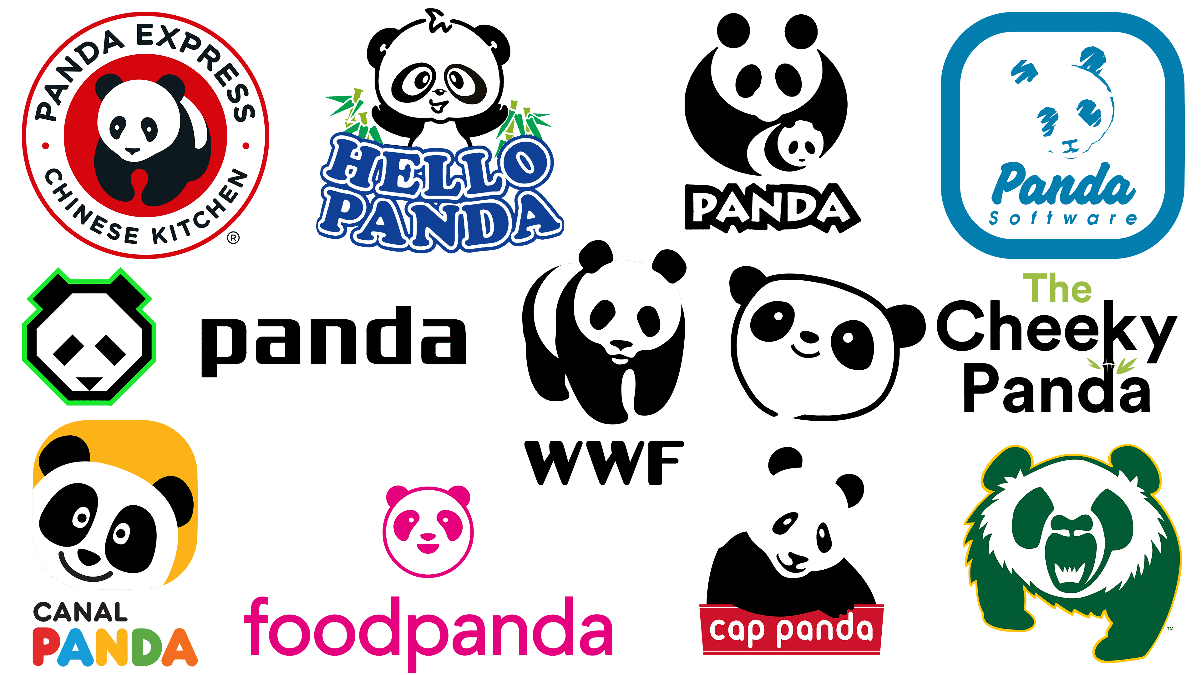
Despite the PRC’s appropriation of these unique animals, no one prevents various foreign companies from using panda emblems. They are depicted as cute and serious, defenseless and dangerous; it all depends on the meaning invested in the brand’s logo. In this selection, we have provided examples of such designs in which the contrast between images is most clearly evident.
WWF
![]()
The artists who created the panda logo for WWF believed the panda was an endangered species in need of protection. But recently, black and white bears are no longer endangered. Even the Chinese authorities have recognized this and have managed to increase their population by expanding bamboo forests. However, the World Wildlife Fund has retained its iconic symbol because, without it, the conservation organization would be perceived very differently. With its change, the brand identity would be lost.
The animal in the logo is partially depicted using negative space. Black paws, ears, nose, and spots around the eyes are visible, while the white body and head form empty spaces. The panda looks depersonalized, as the designers wanted to show that it is disappearing from the face of the Earth, so that people can see its defenselessness. Underneath the image is the dark lettering “WWF.” It is in bold sans-serif font. The rounded edges of the letters create a sense of safety and trust.
Hello Panda
![]()
The Hello Panda company produces tiny cookies with crispy shells and sweet cream filling. They depict funny, sporty pandas kicking a soccer ball, shooting archery, or playing hockey. Therefore, for Hello Panda, the emblem featuring the same cartoon character is integral to the identity. The animal on the emblem looks as friendly as possible because its purpose is to attract customers, especially children. Artists slightly changed the proportions to make the panda anthropomorphic. To do this, they had to increase the head, reduce the torso, and expand the spots around the eyes. In addition, the white iris was made unnaturally wide, and the black pupils added additional light highlights.
The brand’s mascot towers above the two-tiered “HELLO PANDA” lettering, which is slightly curved into a smile. The bubble font and a nice shade of blue match the overall playful style. Bamboo sticks are drawn to the left and right of the animal, and a large red spot serves as the background for all elements.
The Cheeky Panda
![]()
Biodegradable wipes, toilet paper, and towels are the backbone of The Cheeky Panda range. And because they are made from bamboo waste, the designers created “The Cheeky Panda” logo with an image of the plant. The letters “k” and “d” are connected on a single vertical line and stylized as a bamboo stem with two green leaves, made possible by dividing the brand name into several lines. The lettering is predominantly black, and only the article “The” at the top is colored in a delicate light green.
The panda appeared in the company’s corporate identity only because it eats bamboo. This is the best association that the brand developers came up with. The emblem depicts a two-dimensional animal head: one black stripe in the form of an uneven, open ring, semicircular ears, a dot for a nose, a smiling arc, and white eyes with large spots around them. The minimalist style and the panda’s friendly look are pleasing, as the designers intended.
FoodPanda
![]()
For the FoodPanda brand, the logo is a bold expression of self. It is bright in the literal sense because its parts, the drawing and the inscription, are painted in a rich fuchsia color. However, the base of the panda’s head is white, as it is in nature. Guided by the principles of minimalism, the designers created a geometrically accurate composition of circles and semicircles. The drawing turned out to be symmetrical: its right side looks the same as the left, just mirrored. But why the panda? The food delivery platform chose this symbol because it seemed cute and memorable. Given the clumsiness and slowness of the bamboo bear, it is unlikely that any other qualities other than appearance were taken into account here. To reduce the degree of tenderness, the logo creators used a strict, bold sans-serif font for the inscription.
Panda Global
![]()
Online platform Panda Global has an emblem reminiscent of the works of artists in the Cubist style, however, in a modern interpretation. The icon of the entertainment service consists of various geometric figures, none of which are circles. The head is depicted as a white octagon with a dark outline, ears and eyes as black rectangles, and a nose as a triangle. The perimeter of the figure is outlined with a thin, light green stripe. The same green accents are present in the design of the Panda Global website. Obviously, they should be associated with plants, namely bamboo, which pandas eat. The lettering next to it also looks futuristic. The designers used a geometric grotesque with rectangular intra-letter breaks and shortened vertical lines at the letters “p” and “d.”
Chengdu Research Base of Giant Panda
![]()
The Chengdu Research Base of Giant Panda logo lives up to its name and purpose. After all, this organization is engaged in preserving rare animals and breeding them in captivity, creating favorable conditions for them. Therefore, the symbol of the non-profit research center is not just a panda but a mother with a cub. The adult is depicted with two large ovals (black and white) for the torso and head, two small ovals (eyes), and two circles (ears). In her hands, she holds a cube composed of the same geometric shapes but in different sizes. At the bottom is the word “PANDA,” set in a specially designed, spiky, jumping font. Some of the strokes resemble bamboo sticks. For visual harmony, all the letters are white, with wide black outlines.
Cap Panda
![]()
For the Indonesian brand Cap Panda, the black-and-white logo featuring a bear is nothing more than an attempt to attract customers’ attention. This animal was chosen only because most people find it cute. Of course, the creators of the symbol sought to evoke a connection to nature because the drinks contain jelly made from various herbs, primarily basil. But there is no plant among the ingredients with which the panda is usually associated.
A black-and-white bear sits with its head bowed and one paw resting on a red plaque bearing the brand name. The white lowercase font with rounded letters evokes a sense of subliminal trust. The animal also looks friendly because it smiles in a welcoming way. To make the look more friendly, the artists made the eyes white instead of black.
Alberta Pandas
![]()
The Alberta Pandas logo is not as cute as the other brands on this list. On the contrary, it is filled with fury, as it was important for the University of Alberta sports teams to show their fighting spirit and drive to win. The emblem proves that appearances can be deceiving. After all, pandas, which look like the epitome of gentleness, are not plush toys. Like many other animals, they have sharp claws and powerful fangs. They also become aggressive when they sense danger.
To depict the bamboo bear in motion, the artists made its right paw longer and larger than the left. This makes the right side of the body appear pushed forward, as if the panda is trying to look more imposing. The dark spots around the eyes look like war paint. The mouth is wide open, showing a row of long teeth. The fur is not smooth but bristles in all directions with sharp needles. A dark green color is used instead of the typical black, and the emblem is outlined with a gold stripe.
Panda Express
![]()
It’s not surprising that the Panda Express logo and name are associated with China’s national animal, as the chain is Asian. Although it is based in the United States, its menu features popular Chinese dishes. Therefore, the use of the panda image is justified. The black-and-white bear is inside a red circle, which is set within a wide white ring with text. At the top is the brand name, and at the bottom is the phrase “CHINESE KITCHEN.” Both parts are in the same font, only in the first half of the inscription; some letters have single horizontal serifs.
Panda Antivirus
![]()
The creators of Panda Antivirus chose a suitable logo for the program: a black-and-white bear. But the emblem presented here belongs to Panda Security SL, the developer of the antivirus program. This is an old symbol because the company’s former name, Panda Software, is shown in a square frame with rounded corners. In the same place, but slightly higher, an animal head is shown. The drawing is simplified and slightly blurred, as if someone had hastily drawn it with blue chalk on a blackboard. The first word is written in bold italics, the second in small italics.
Canal Panda
![]()
For Canal Panda, the logo is a tool of self-expression. After all, this TV channel, broadcasting on the Iberian Peninsula, is aimed at preschoolers. Almost all of its programs are designed for children, with a few for teenagers. So, the cartoon character fits into this concept. The head of a smiling panda looks out of the corner of an orange square with rounded sides. The word “CHANNEL” is written in gray, and “PANDA” is written under it. The second half of the name is in bubble font and consists of bright multicolored letters: red “C,” blue “A,” yellow “N,” green “A,” and orange “L.”