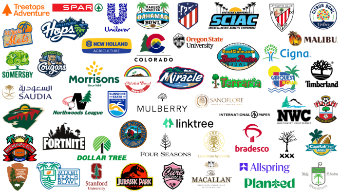
The tree represents stability, growth, development, and unity. That is why its image is often found in the logos of companies in various industries. Branches coming off the common trunk symbolize integrity and unity, and roots going deep into the ground symbolize continuity and strength. Thus, the metaphor of a tree speaks of the stability, strength, and reliability of an organization.
However, the modern field of visual identity is incredibly diverse. Therefore, the tree is now not only a meaningful symbol but also a spectacular decoration. It adds beauty to inscriptions and colorfulness to the palette. As a result, heavy inscriptions and dark colors are perceived more easily. However, sometimes trees are difficult to recognize because designers depict them abstractly.
We offer a list of companies that have chosen a tree for their identity. Some use it as the main element, while others use it as an additional one. Let’s consider this issue in more detail because each detail has a certain meaning. We have ranked the brands by logo popularity.
Dollar Tree
The Dollar Tree logo is the best example of the combination of abstract and real. Taking the name of a famous American chain of stores as a basis, it chose a money tree. However, it is not an ordinary one but a code tree. The trunk is a black unit; the crown is green dollar bills. The dark and light stripes are on a diagonal and interspersed with thin white lines as if it were a side piece of money piled up. The number “1” is located exactly in the middle. It is bold, with small sharp serifs. At the same time, the improvised branches and leaves form an even circle, the fourth part of which is cut out. Beneath the tree is the brand name.
Jurassic Park
In the Jurassic Park logo, trees do not play the main role. The central place is occupied by the silhouette of the Tyrannosaurus rex. The row of vegetation, located under the sign with the name of the cult franchise, only balances the image of the animal. Thus, the designers showed the gigantic growth of the prehistoric creature and balanced the distribution of black color in the emblem. To make the contours more visible in a small circle, the authors of the logo made the background blood red. This technique also adds mysticism and suggests that this is a horror movie. The tops of the trees are well below the skeleton of a dinosaur with an open mouth. Here, they carry no metaphor – just a direct reference.
St Lucie Mets
The St Lucie Mets baseball team chose a non-themed logo, as there is no indication of a sports focus. The main emphasis is on the geographical location of the club. The emblem shows a lone palm tree leaning against a yellow and red sun. The lower part of the disk is covered with a shortboard, which is nailed at the corners with four nails. Above it is an inscription consisting of the title. The letters are cursive, orange in color, handwritten, and outlined with two thin lines – blue and white. The two lines are additionally joined by a bold band. The tree, in this case, is one of the central elements.
Unilever
Another palm tree is encrypted in the famous Unilever logo – in the block “U,” which contains many small details. However, the tree stands out clearly among the fish, shells, flowers, leaves, drops, birds, hearts, sun, and other elements. It is located on the left side, next to the bee and the wave. Compared to the other images, the palm tree is quite large and is drawn slightly curved. These small icons symbolize the wide range of products and brands that make up the international corporation. All the pieces are united not only by the shape of the letter but also by the color: they are blue.
Minnesota Wild
The Minnesota Wild logo is a complete image that integrates the main components of the landscape surrounding the city. One of the central places is occupied by coniferous forests. These are spruce trees, presented in the classic form: they look like sharp triangles superimposed on each other. Although there are five green trees in the emblem, there is also their mirror image: in the negative space are seen five red trees, upside down. In their background, they harmoniously look at the yellow sun, white star, and beige river. The same beige stripe runs along the contour of the head of a wild cat – the mascot of hockey players and the symbol of the state of Minnesota.
Fortnite
The trees in the Fortnite logo are black, silhouetted, and lined up with the rest of the famous game’s entourage. What’s more, there are several of them, and they stand on either side of a house as black as themselves. To the right is one deciduous tree with a tire from a swing tied to it, and to the left are two coniferous trees that resemble classic Christmas trees. In addition, there are three houses in a row: with a satellite dish, a tower, and a flag. There is also a high platform with a chair and a sun umbrella. The name is typed in white letters of varying heights, making them appear to be jumping.
Atlético Madrid
The tree in the Atlético Madrid logo is located at the top of the shield, the same place as the bear. These elements are symbols of the city to which the soccer club belongs. They are taken from the coat of arms and are harmoniously woven into the canvas of the sporting style. Judging by the oval outlines, the tree is deciduous, as conifers are depicted in the form of sharp triangles. The trunk is straight and level. Under the crown is depicted a bear. This side of the emblem is decorated with seven five-pointed stars. They are clearly distinguished on a blue background. Below are vertical red and white stripes.
Malibu
The alcoholic brand Malibu has a very recognizable emblem, so it is included in the rating of popular emblems with trees. In this case, the designers depicted two palm trees extending beyond the gradient background circle. The trees are key components of the visual image and form an elegant composition. They are painted in brown and beige colors, which look great against the yellow and red background. The trunks are slightly curved, as is the lettering at the top in a serif font at the ends.
Sanoflore
The French organic cosmetics company has an elegant visual style: The luxurious Sanoflore logo is gold and shiny. The central part is occupied by a deciduous tree with three branches and a short trunk. It is enclosed in a ring resembling a capital letter “O” and surrounded by the year of the founding of the laboratory and the confirmation of organic certification. To the right is the name, divided into two lines.
Macallan
The Macallan logo is a confirmation of the originality of Scotch whisky. It also depicts a tree. And not just one, but five. Judging by the trunks, four of them grow on the right and one on the left. These are the sprawling plantations that adorn the area around the Gothic castle. Some of the trees are so tall that they almost reach the level of a three-story house. They are painted beige – this is the year the distillery was founded. Its name is below, and it has a dash of the same golden-beige hue.
Caboo Logo
The Caboo emblem is known to a special group of consumers, as it stands for children’s products made of natural fabrics and organic materials. The design of the emblem accurately reflects the concept of the brand: it is green in color and decorated with two miniature bamboo leaves. It is the main component of the fiber blends used by the company. The letter “b” is stylized below it, depicted as a bamboo tree trunk. The central place is occupied by the headline. It consists of even lowercase letters. The font is bold, barrel-shaped, with small extensions at the ends.
Stanford University
The logo of one of the most famous universities in the world consists of a single tree – a tall sequoia. It symbolizes constancy and longevity. The coniferous plant is colored green and is located on the background of the printed letter “S.” It is burgundy in color, with right angles and smooth cuts. Smooth curves, like serifs, are absent in it. The edge is double-edged with thin stripes. The contour of the sequoia is taken from the original tree and artistically processed. The designers circled it with a white line to make it stand out better. The name of the university is located at the bottom.
Timberland
The tree in the Timberland logo is incredibly powerful because it represents a single image. Its trunk is straight, diverging into many large branches. They densely fill the upper half of the emblem, leaving a minimum of space for gaps in the crown. Moreover, it is cut along the edge and forms part of a circle. Below is an improvised ground with a slight slope, emphasized by two sinuous stripes. The logo itself is monochromatic.
Kane County Cougars
The logo of the Kane County Cougars baseball club consists of trees on a dark background. Judging from the silhouettes, they are spruce, larch, or other conifers. The sharp tops point upward. Thus, they emphasize the team’s formidable determination to win and support the theme of dangerous fangs protruding from the toothy mouth of a jaguar with a bat. Two trees can be seen to his right and two to his left. Opposite the wild animal is the handwritten name of the sports project.
Forest Essentials
The tree in the Forest Essentials logo is a sign of Ayurveda. It emphasizes the brand’s connection to the earth. The trunk of the tree is flat, with an extension at the beginning. There are no leaves on the branches, as the crown, in this case, demonstrates the intertwining of ornaments that have unique properties to “nourish” the face and body, as the company produces natural cosmetics. A thin ring surrounds the tree. It is followed by the name of the company. Another circular band runs along the outer edge. The emblem is made of golden mother-of-pearl with a slight glow.
Morrisons
To demonstrate the extensive network of stores, the company Morrisons developed a logo that resembles a tree. For this purpose, the designers used the lowercase letter “i.” From it, they made a stem, which was decorated with yellow leaves in the upper part. The dot, like the name, remained green, but everything else was colored in warm yellow. In this case, the plant conveys the structure of a trading company.
National Park Service
The National Park Service logo features a sequoia, the largest and longest-lived plant in North America and Canada. It stands proudly above the conifers under its pyramidal crown. A ridge of forest can be seen in the distance. The tree’s height is emphasized by the snow-covered top, which can be seen below it in the photo. This was possible due to the correct distribution of spatial angles. Another important symbol, the bison, is depicted on the green background. It is highlighted in white color.
Northwoods League
In the Northwoods League logo, a spruce tree replaces half of the right side of the letter “N.” The green spruce is formed from five levels of triangles and trapezoids. It proudly towers above the rest of the glyph, extending beyond its borders. The letter is large, massive, and bold. To the left of it is a baseball. It is depicted in the process of flight, as evidenced by the curvilinear trace along the entire trajectory of its movement. Below is the name of the sports league in italics. Each sign is colored green and surrounded by a very thin red stripe.
Mulberry
The tree in the Mulberry logo is minimalistic and small, but despite this, it is a key element of the identity. Its trunk has the shape of a sharp triangle. The leaves look like diamond-shaped figures, chaotically arranged on a white background. They are not connected with each other and are at some distance from each other. The name of the fashion brand is much larger than the graphic image. It is typed in thin black letters, and the wood is colored in brown. The font of the inscription is chopped.
XXXTentacion
The XXXTentacion logo is a customized symbol of a rap musician. The key element in it is a lone tree. It is devoid of leaves, colored black, and slightly curved to the right. Due to the naturalness of the crown and trunk, it gives the impression that this image is copied from a real plant. Below are three X’s. They are made with broad strokes – like a brush. The tree, in this case, reflects the rapper’s worldview and signifies his growth and creative development.
Sunshine State Conference
The Sunshine State Conference logo resembles a band-aid with a lone palm tree painted on it. It is placed obliquely and divides the space into three parts of different colors: dark blue (sky), yellow (sand), and blue (ocean). True, the bottom dividing line is the horizon with the sun. But it also starts from a tree. At the top is the name of a sports organization grouped in three lines. The second word is highlighted by two lines on the sides. Judging by the shape of the emblem, its basis is a coat of arms.
Sproutl Logo
The Sproutl logo shows a sprout, symbolizing growth. After all, this is the meaning behind the name of the online store that sells seeds, plants, and everything related to them. The miniature icon combines two large leaves on a short stem. On the right is the name of the online marketplace, typed in shaped symbols with flowing lines. Almost all of them have sharp ends. The exception is the letters “o” and “l”: one of them is rounded, and the other has the shape of a vertical rectangle. The font is lowercase and solid, with elegant extensions but no classic serifs.
Somersby
The cider producer chose the right tree – the apple tree – because it produces its products from its fruit. Thus, the Somersby logo represents a deciduous tree. It has a very spreading crown consisting of several branches. There are no single leaves – only large green elements, “twisted” in confident strokes. The trunk of the apple tree emerges from an arc-shaped line that covers the brand name from “O” to “B.” The first and the last letters are located outside its frame. Several shades of green are used in the emblem, giving the image a dynamic feel.
Northwest Conference
The tree in the Northwest Conference emblem has a pyramidal shape. It is located on top of a snow-covered mountain next to a small pond. It is impossible to determine what time of year is depicted in the picture because it is a mountain landscape. But the tree can be identified by the shape of the crown: it is a spruce. Conifers are evergreen plants – they have needles instead of leaves, which do not fall every season, so the emblem can be depicted at any time of the year. The name of the sports organization is abbreviated – as “NWC.” The inscription is in square letters with serifs. The graphite-colored glyphs contrast well with the green and white landscape.
Placerville
Placerville’s logo is highly artistic and looks like a miniature story painting. It depicts a prospector washing gold grains of sand in a river. Behind him is a tall pine tree. It is so huge that it does not fit completely into the emblem: only a fragment of the trunk and the lower branch growing on the left are visible. A man dressed in a red shirt and blue pants squats by the water and holds a bowl in his hands. The white cloud behind his back slightly resembles the outline of his silhouette. The colors are bright and eye-catching. The central part is taken in a thin yellow ring, followed by the name of the city. Along the edge is a frame in the form of a twisted rope. The inscription is in the letters of the Old English alphabet.
Allspring
The Allspring logo consists of two parts: the name and the personalized badge. It depicts a stylized fir tree. It is formed of two triangular white segments without frames, so they protrude outside the square and merge with the surrounding space. This structure corresponds perfectly to the concept of the financial investment company: expansion of the client base and comprehensive support of consumers. In the right part, there is the name. It is in bold sans-serif letters.
Boca Raton Bowl
The sports organization Boca Raton Bowl has a logo in the shape of a rugby ball. It is horizontal and contains all the elements: the name, the Internet domain name, and two palm trees on the sides. The trees are black, with wide leaves at the top. The trunk is only partially visible. In the center are inscriptions in three lines. A smiling smiley face is used at the top instead of a dot above the letter “i.” The logo is outlined along the edge with a thin black line. Colors are added to it in yellow, blue, and red.
MicronPC.com Bowl
The emblem of this soccer team is very peculiar and in no way resembles a sports theme. A closer look, you can see that the emblem of MicronPCcomBowl contains an oval ball. It is camouflaged right in the center against a background of emerald and black stripes, which are covered by a wide red ribbon with twisted ends. On it is written the name of the club. Above it are two large palm trees with spreading leaves. The trunks of the trees are cone-shaped and brown, with black strokes imitating rough bark. Here, the plants show the administrative and geographical belonging of the team. This is confirmed by the sun peeking through between them – big and warm yellow.
International Paper
The international paper company International Paper has been using this emblem since its foundation. It has a practical, austere, and businesslike character that reflects its line of business. The hardwood tree is encoded in a ring between the first and second parts of the name. It depicts a triangular figure, which is missing half of the lower segment. Instead, a straight strip stretches downward, denoting the trunk. Spruce or larch are drawn in bold black lines. The emblem directly indicates that the brand is associated with wood.
Athletic Bilbao
The emblem of Athletic Bilbao (a soccer club) is in the form of a three-pointed shield. The center is framed by a frame and divided by a diagonal stripe into two parts. In the upper part, there is a tree. It has a high trunk and black branches. The crown is green and round, with two sand-colored elements protruding on the sides. Under the tree are two dogs walking to the left – towards the bridge and the castle. Below is a fragment of a flag with red and white stripes. In the white frame is the name of the sports team, made in a grotesque style.
Terraria
The tree shown in the Terraria logo is pixelated, as is the green lawn next to it, which features the company name. It looks like the passages made by underground animals. The tree echoes the lawn perfectly, as it is colored brown (trunk) and green (crown with foliage). Below are two processes: they visually balance the composition.
Miami Beach Bowl
The original Miami Beach Bowl logo looks very progressive. Trees play an important role in it: they form the gate for playing American soccer. The ball is located between the green palm trees. Below it are wavy lines tapering to the bottom. All these elements are surrounded by a thin blue band, considering the outline of each object. On the right side is the name of the sports club. It occupies three lines and is typed in simple sans-serif font – capital letters, large, strictly vertical. The background is light beige.
Treetops Adventure
The tree in the Treetops Adventure logo has a spear-shaped form because it belongs to conifers that have such a shape of the crown. It can be either spruce or larch, which is widely spread on the territory of the North American continent. Because of its unusualness, the icon resembles a cursor on a computer display. Such an association arises not only because of the external similarity but also because of the unusual orange color. The trunk of the tree is massive, although not high. Immediately below it begins the crown, slightly curved on both sides. To the right of the corporate symbol is the name of the company. It is written in a thin lowercase font (except for the first letters).
Oregon State University
The logo of Oregon State University is based on urban heraldry and historical and geographical symbols. There is no central element in it – this role is given to all details. Among them are a tall tree, a beaver, and three mountain peaks. They are harmoniously combined with an open book, stars, sun, and waves. A shield resembling a heart serves as a background. Its inner surface is painted in black, where all the above components are located. They are white in color, which provides an excellent contrast. The name of the university is located on the right. The inscription “Oregon State” is red in color, and “University” – is black.
American Forest Logo
The American Forests logo is predictably shaped like a woody plant. Judging by the height of the trunk, the shape of the crown, and the length of the branches, it is a spruce tree. It is four-level, consisting of lines of equal thickness. The bottom of the tree is absent. The top is also absent: in its place is an even horizontal cut. The left side of the spruce legs is short; the right side is long. The spaces between the dark green stripes are painted in bright colors: emerald, yellow, and light green. They give the emblem uniqueness and attractiveness. Then comes the inscription, divided into two lines. This is the name of the organization associated with forestry in the United States. It uses a classic font in upper case. The letters are grotesque, rounded, and bold.
Bahamas Bowl
The Bahamas Bowl sports logo also features a tree, even two. They are large palm trees leaning toward the center. They have a light brown trunk and broad green leaves. They stand on a blue and yellow banner that reads “Bahamas.” The other half of the club’s name is below and partially covered by an oval ball. The emblem itself is also oval but with cut-off dots on the sides.
Southern California Intercollegiate Athletic Conference
The Southern California Intercollegiate Athletic Conference has an emblem in the form of eight trees. They are straight-growing palm trees that seem to stand along the freeway. Between them, a half-disk of the sun is visible on the horizon. On its background is a part of the name of the sports organization, made in black letters. In the center is the abbreviation “SCIAC.” It is colored in blue. The rest of the name is visible under it. The trees are of different sizes: the palm trees in the foreground are tall, and the palm trees in the background are low.
Four Seasons
The tree on the Four Seasons logo essentially conveys the concept of the international hotel chain. Visually, it is divided into four segments representing the seasons. Many leafy branches are in summer, with a medium number of leaves in fall and spring and leafless branches in winter. They demonstrate the busyness of the hotels. The tree is unicolored, drawn with even solid lines. The name of the company is located underneath it.
Carquest Bowl
The logo of the Carquest Bowl demonstrates the attractiveness of the Florida coast. First of all, it is a green palm tree. It indicates a tropical climate. Second, the blue waves. They speak of the appeal of vacationing by the water. Third, the yellow sun. It shows how warm and bright it is around. The central place is given to the heraldic sign with the name of the intercollegiate soccer game. This element consists of simple geometric figures of red and blue colors.
Southampton
The Southampton logo is based on a classic coat of arms. The bright heraldry is combined with sports elements that are elevated to the highest degree of reverence. This is noticeable by the soccer ball against the background of the fans’ striped scarf: a yellow ring resembling a halo is drawn above it. The shield is divided by wavy stripes into two parts. In the upper part, on a white background, is a low tree with a wide crown and a massive trunk, and in the lower part – a flower with five petals. Between them, there are thin segments of sepal. The middle is colored yellow; the background is red. At the very bottom is a wide arc with the name of the club.
Linktree
Of course, the social network could not do without a tree, so the Linktree logo consists of not one but three schematic trees. Two of them are located next to each other and are colored mint and emerald, and the third is located between them and can be seen in negative space. It is located at the point of intersection of the first two plants. Its color is white. The shape of the trees is pyramidal, with a short, thick trunk, which makes all three elements look like computer mouse cursors. The name of the online platform is typed in black lowercase letters to their right.
Cure Bowl
The square shield in the Cure Bowl logo is colored pink. All other elements in it, including the tree, are in black. Despite the unusual main shade, this combination creates an optimal contrast, as pink heraldry is rare. The palm tree, on the other hand, is not. It is traditional in the visual identification of sports themes. There are two trees. They are painted in black and are located at the lowest point of the composition. These elements not only indicate the geographical belonging of the organization but also balance the colors in the emblem so that they are harmoniously distributed on the pink background.
Westvleteren
The Belgian brewing company Westvleteren chose a heraldic emblem because it has been around since the 1830s. The tree takes up 2/3 of the classic shield. It is completely green – even the trunk. The remaining part, 1/3, is reserved for two crossed keys. In the first case, the background is white; in the second, it is green. The coat of arms is surrounded by a dark gray band along the contour. The same color at the top is drawn a curl with three spikes, and the name of the company is written. It has the shape of an inverted arc and is located under the shield. To the right and left of it, there are inscriptions in Gothic style.
Aloha Bowl
The emblem of the Aloha Bowl consists of two parts. The first is an image of an island with two palm trees surrounded by a 4-color rainbow. The second is the name of the sporting event written in calligraphic handwriting. Both the upper and lower sides are semicircles. The green foliage of trees is harmoniously combined with bright colors, among which there is green. At the bottom is an inverted arch, on which the word “Hawaii” is written in white. That is, this is the designation of the island drawn above. In this case, the palm trees show a traditional tropical landscape.
Bradesco
The tree in the Bradesco logo is abstract in nature. It consists of two crescent-shaped lines that intersect at different heights. This forms a lush crown. Two thick and short strips form a trunk with a diagonal cut, which gives the logo dynamics – as if the tree is mobile and moves its branches. The letters “b” and “d” have the same oblique cuts. All the letters in the inscription are lowercase. The logo is made in one shade of red color.
Capital One Bowl
The palm tree on the Capital One Bowl logo conveys an atmosphere of lightness and fun because what better place to see it than the Florida coastline where a soccer tournament is being held? The tree is large, dark green, with shade at the base. Next to it is drawn an oval ball with a string. On their background is a flat ribbon with twisted ends. On it is written the name of the sports competition. All elements are placed in a yellow circle with a blue border. The letters are white and decorated in different styles.
Hillsboro Hops
Based on the name, the Hillsboro Hops team uses, of course, an emblem in the form of a hop cone. The fact is that it chose its name in honor of the brewery in Oregon. In addition, the term is incorporated into the baseball theme. There are six trees in the emblem. They signify the area to which the club belongs, as spruce trees grow extensively around Mount Hood, which is also featured in the emblem. They have a pico-shaped structure and are green-blue in color.
SPAR
The logo of a food chain from Germany is simple: it contains only the name and the brand name. It is very interesting in that it is a white circle with a green border that transitions into a tree at the bottom. It is a single spruce tree, depicted as a triangle on a short stem. Next to it is the name of the stores, which contrasts sharply with the drawing on the left as the lettering is placed within a red rectangle.
Fort Myers Miracle
The Fort Myers Miracle baseball team has a palm tree logo. It reminds of the roots of the club – the place where it originated. The tree is sustained in green and beige colors. The leaves are painted; first, and the trunk is the second. By the way, it is wide and powerful, which allowed it to fit perfectly into the contour of the curved “M.” The leaves are above the letter. Next comes the ball, which replaces the dot at “i.” Below the title are a picture of the coast and the ocean with a white yacht in the distance. The emblem has an oval shape and is located horizontally. She also has a red border.
Saudi Arabian Airlines
The logo of Saudi Arabian Airlines is designed in an oriental style. Sabers, palm trees, gold – everything speaks of the prestige of the air carrier and the fact that it is associated with a historically important and warm region. The name is typed in Arabic script and a font resembling it. All glyphs are colored ultramarine. The English letters are capitalized, chopped, and bold. The tree is large, so its crown forms the upper part of the symbolic circle. The trunk is flat and straight, which speaks of the stability of the company.
Citrus Bowl
The Citrus Bowl logo carries information about its name. Despite the fact that the event is held in Florida, there is no palm tree on the emblem – instead, it shows a deciduous tree with a short trunk. The crown is colored in mint and dark green, with a perfect display of citrus – yellow and orange. Above the tree in a semicircle is the name, and below on a blue background is the contest sponsor. Symbolically, the background smoothly passes into the trunk: through it, the tree absorbs juices from which useful fruits grow.
Colorado
The tree in the Colorado logo demonstrates the state’s potential as one of the most scenic in the US. The company chose a tall spruce tree for this purpose. It is dark green, pyramidal, and consists of three sections. The vegetative power of the region is so great that the designers depicted a tree as tall as the capital letter “C.” This is an abbreviated version of the state’s name. The icon is half blue and half red, and where the two colors intersect, it is purple. In addition, the color of the glyph smoothly transitions into a diagonal line of mountains visible against the yellow sun. A thin black stripe separates the graphic and text parts.
Planted
Naturally, the Planted logo features a tree. It replaced the letter “T” in the company name, which is the emblem. Other elements are absent. The green word is written in lowercase. The only exception is the first character – it is capitalized. Glyphs are vertical and streamlined, with smooth transitions. The spruce also contains a rounding: its branches are not traditionally sharp but drop-shaped. The emblem is fully colored in green, evoking a sense of unity with nature.
Cigna
Cigna has a conceptual emblem. It conveys confidence, joy, and well-being. With its help, medical and insurance companies promote the idea of a happy life. In addition, the tree is abstract: its trunk is formed by two curved lines resembling a man with his arms raised. And the head is a flesh-yellow circle between them. At the top, there is a spreading crown. It consists of green leaves located at some distance from each other. Thus, there is a fan in which large leaves alternate with small ones. Behind the tree is a crescent-shaped horizon, with the name of the organization on the right.
New Holland
The world’s most popular manufacturer of agricultural machinery, New Holland, also has a tree in its logo. But it is schematic: it has yellow branches and blue leaves pointing upward. This structure makes it universal to all kinds of plants, from fruit trees to grain crops. The icon occupies the top line along with the name. At the bottom is the word “Agriculture.” Unlike the first part, it is typed in a thin font.
