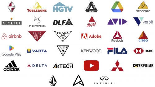
Triangles in logos are pretty neat because they can mean many different things. They can show that a company is strong, always moving forward, or cares about balance and being steady. This is why you’ll see triangles in logos from various companies, whether they make your computer, your car, or even your clothes.
Why Triangles Are Cool in Logos:
- Strong and Steady: The bottom of the triangle is like a solid base that can hold up anything. It makes companies look reliable.
- Pointing Up: When a triangle points up, it says, “Let’s go!” or “We’re growing!” This is great for companies that are all about new ideas and improvement.
- Balanced: A triangle has three sides that fit together just right, making everything look in harmony.
- Full of Energy: Triangles can make things look exciting and full of life, perfect for companies that want to show they’re all about fun and new stuff.
Types of Companies That Love Triangles:
- Tech Savvy: Tech companies use triangles to show they always think about what’s next.
- Fast Cars: Car companies use them to say, “We’re fast and precise.”
- Fashion Forward: In fashion, triangles can show elegance and a special touch.
- Nature Lovers: Companies about the outdoors might use triangles to remind you of mountains and adventures.
What Triangles Do for a Logo: Using triangles can make a logo pop. It makes people see the company as strong and innovative. Plus, it can make customers feel certain, like getting excited or trusting the company more.
Designing with Triangles: When making a logo with a triangle, they think about which way it should point, how big it should be, and what color it looks best. Triangles are simple but can be used creatively to tell a story or share what a company is about.
Triangle logos are a big deal because they can share so much about a company without using words. They can show that a company is strong, ready to grow, balanced, and full of energy.
Google Play
In 2008, Google started Android Market, a place where people could get apps for their Android phones. Over time, they added more stuff like books, music, movies, and TV shows, making it a big shop for digital things. In 2012, it changed its name to Google Play to show it was more than just an app. It also works with other devices, like Chrome OS and Wear OS gadgets.
Google Play grew a lot, and by 2022, it had over 3 million apps and tons of songs, books, and movies. They made some big updates, like changing Google Play Movies to Google TV in 2020, so you could buy or rent shows and movies. In 2019, they started Google Play Pass, a service where you pay monthly to use many apps and games without ads. They also stopped using Google Play Music in 2020 and switched to YouTube Music, making getting app subscriptions easier.
The Google Play logo is easy to spot. It has a play button in a triangle, showing the idea of moving forward and trying new things. The logo uses bright colors to show all the different things you can find on Google Play, like a promise from Google that you’ll always find something new and fun to do.
YouTube
In 2005, three guys who used to work at PayPal started YouTube. It was a new way for people to put videos online for others to see. The YouTube logo has the company’s name and a red play button. This button looks like the play button we see on video players, showing that YouTube is all about watching videos.
YouTube began on Valentine’s Day in 2005. The first video was about one of the creators at the zoo. It was easy for anyone to post videos on YouTube, and soon, people could comment on videos and share them on other websites.
By 2006, many people were watching videos on YouTube every day. Nike’s famous video was a hit, and many people started sharing their videos. Even though YouTube wasn’t making money yet, Google bought it for $1.65 billion because they believed it would be important.
Now, YouTube is the biggest place to watch videos online. Over 2 billion people use it monthly, watching more than a billion hours of videos daily. YouTube is available in 100 countries and is more popular than TV. It’s a big deal because it changed how we watch and share videos with people worldwide.
Adobe
In 1982, John Warnock and Charles Geschke started Adobe Inc. They named it after Adobe Creek, which was near Warnock’s house. They wanted to change how we use digital media. First, they worked on PostScript, a new way to talk to printers. This became significant when they worked with Apple in 1984 to put PostScript in Apple’s printers. By 1986, Adobe was big enough to sell shares to the public and moved to San Jose, California. This was the start of growing and making new things.
In the 1990s, Adobe made big changes with Photoshop for editing pictures in 1990 and creating PDFs in 1993, making it easier to share and look at documents. They bought a company called Aldus and got a program called PageMaker, which helped them make more things on computers. In the 2000s, Adobe started asking people to pay regularly to use its programs, like a subscription. They also bought some other companies, making Adobe even bigger. Now, Shantanu Narayen leads Adobe, known for making tools like Photoshop, Acrobat, Illustrator, and Premiere Pro that many people use for creative projects.
Adobe’s logo is a simple but bold “A” in red. It looks like an arrow pointing up, showing Adobe’s goal of always being creative and innovative. The red color in the logo shows how passionate Adobe is about helping people be creative. With more than 22,000 workers and making over $12 billion in 2020, Adobe has grown from a small idea to a big company that changes how we use digital stuff.
Airbnb
In 2008, Brian Chesky, Joe Gebbia, and Nathan Blecharczyk started Airbnb. They had an idea to let people stay in their apartments on air mattresses to help pay their rent in San Francisco. This idea turned into Airbnb, a way for travelers to find cool places to stay and for hosts to earn money by sharing their homes. They charged their first guests $80 each night, and this helped kickstart their big idea.
Airbnb has a logo called the “Bélo,” which resembles a mix of a heart, a person’s head, and a map pin. This logo represents Airbnb’s goal to help people feel like they belong anywhere they go.
The company grew quickly after getting $600,000 from investors in 2009. They created an app and improved how photos were shown, and soon, millions of people were staying in Airbnb places worldwide. Even though they lost some money at first, they started making a profit in 2016. The COVID-19 pandemic in 2020 made things hard, but Airbnb bounced back and went public in December 2020, which was a big deal because it showed the company was worth $47 billion.
Now, Airbnb has over 6 million listings and offers “Experiences” to make travel even better by letting guests enjoy local activities. It has changed how people travel, making finding unique places to stay and things to do easier.
Adidas
In 1924, in a small town in Germany, two brothers, Adolf “Adi” Dassler, and Rudolf “Rudi” Dassler, started making sports shoes in their Dassler Brothers Shoe Factory. Their big break came in 1936 when Jesse Owens won four gold medals at the Olympics wearing their shoes. This made their brand famous for making great sports shoes.
But in 1947, the brothers had a big argument and decided to split up. Adi started Adidas, named after his nickname and first name, and Rudi started Puma. Adidas got popular when the German soccer team won the 1954 World Cup wearing their shoes.
Adidas didn’t just stop at shoes; they started making sports clothes in 1959 and developing new shoe designs for different sports. By 1967, they were the biggest sports shoe brand in Europe. In 1971, they introduced a new logo, the Clover Leaf, showing they were a global brand connecting with athletes everywhere.
Another big moment came in 1978 with the Copa Mundial soccer shoe, which became super popular. In the 1990s, Adidas expanded big time into America, even buying another sports brand, Reebok. They kept focusing on making new and better sports gear through the 2000s.
The Adidas logos, like the three stripes and the clover leaf, show the brand’s commitment to providing top-quality gear for athletes worldwide, adhering to Adi Dassler’s original goal.
Reebok
Joe and Jeff Foster started a company called J.W. Foster and Sons in Bolton, England, in 1958, later known as Reebok. It started by making running shoes and grew into a big brand for fitness and lifestyle clothes and shoes. Reebok’s logo looks like a triangle made of three parts. It shows how fitness changes people’s bodies and minds and their interactions with others.
Reebok became famous in the 1980s when aerobics got popular. They made a special shoe for aerobics called the Reebok Freestyle, which helped them become well-known worldwide. In 1979, Paul Fireman brought Reebok shoes to the United States; by 1981, he owned the company. Under his lead, Reebok did well, especially because many people were getting into fitness.
In 1985, Reebok went public, meaning people could buy shares in the company. For a while, it even sold more than Nike. They made cool products like the Reebok Pump shoe and worked with famous athletes like Shaquille O’Neal.
Even though there were some tough times after Adidas bought Reebok in 2005, the brand started a new chapter in 2021 when Authentic Brands Group bought it for up to $2.5 billion. Reebok is still doing great, focusing on fitness and training products and encouraging people to be their best through fitness.
Prada
Prada was founded in 1913 in Milan, Italy, by Mario and Martino Prada. They first sold high-quality leather goods and accessories to rich people. The Prada logo is known for its simple triangle shape, which shows the brand’s long history and focus on making things well.
In the late 1970s, Miuccia Prada, Mario’s granddaughter, took over the company. She had studied political science and was also a mime artist, quite different from fashion. Miuccia brought new ideas to Prada, such as using black nylon fabric for backpacks and tote bags, making the brand known for cutting-edge fashion.
With Miuccia leading, Prada began selling worldwide in the 1980s, including in New York, and started making women’s clothes and leather goods. The company grew quickly and became very successful, especially after going public in 1993, which helped it expand even more.
Over the years, Prada opened many stores worldwide and bought other luxury brands. Today, thanks to Miuccia’s innovative designs, Prada is a top name in luxury fashion, famous for its creativity and high-quality products.
Mitsubishi
In 1870, Yataro Iwasaki started a shipping company called Tsukumo Shokai, which quickly changed its name to Mitsubishi in 1873. Mitsubishi combines two Japanese words that mean “three diamonds,” which you can see in their logo. With three red diamonds making a triangle, this logo stands for being strong, honest, and wanting to do well. It shows what Mitsubishi is about doing great work, sticking together, and always getting better.
Mitsubishi first focused on ships but didn’t stop there. They entered many different businesses, such as building ships, banking, insurance, and making machinery, paper, and steel. By 1920, they had over 100 companies, including making cars like the Mitsubishi Lancer and Outlander, and they even made fighter planes during World War II.
After the war, Mitsubishi split up but came back together as the Mitsubishi Group by 1954. They started doing even more, like electronics and banking. Mitsubishi is a huge group with about 40 companies, including Mitsubishi Motors and Mitsubishi Heavy Industries. They work on cars, energy, and big industrial projects. These companies make over $321 billion, showing how big Mitsubishi is.
With its three connected diamonds, the Mitsubishi logo is more than just a cool design. It shows what Mitsubishi stands for: trust, honesty, and growing together. This symbol is a big part of Mitsubishi’s history and its promise to bring new ideas to many industries.
Delta Air Lines, Inc.
Delta Air Lines started as a small crop dusting business called Huff Daland Dusters in 1925 in Macon, Georgia. C.E. Woolman founded it to help with farming, but soon, they began flying people around, growing bigger by joining other companies. Delta became known for being good at what they do, ensuring passengers are happy and flights are on time.
The name “Delta” comes from the Mississippi Delta area. Delta began flying internationally to Caracas, Venezuela, in 1945. It got bigger in the 1970s and 1980s, especially after buying parts of Pan Am and setting up a big hub in Atlanta. Even though it had some tough times, like filing for bankruptcy in 2005, joining Northwest Airlines helped Delta become one of the top airlines in the world.
Based in Atlanta, Delta has over 80,000 workers and flies almost 200 million people yearly. It keeps updating its planes with new models like the Airbus A220 and A330neo to stay modern.
Delta’s logo, known as the “widget,” is a triangle pointing up. It’s simple but shows that Delta always aims to progress. This logo tells everyone that Delta is about bringing people together, doing it well, and leading the way in flying across the globe.
HSBC
HSBC started in 1865 when Thomas Sutherland created it to help trade between China and Europe. It quickly became important for international money matters. A year after starting, it got special recognition that helped it grow in Asia and make its own money.
HSBC’s logo has six sides and mixes red and white triangles. The red shows its energy and global reach, and the white shows it’s trustworthy. This logo fits HSBC well because it shows the bank is strong, stable, and always thinking ahead. It wants to reach far but also make sure customers come first.
Some big moments for HSBC include buying The Mercantile Bank in 1959, which helped it start working in Europe. In 1991, it changed a bit to reach even more places worldwide. It also bought banks in the USA, France, and Bermuda to grow its business.
HSBC is a big name in banking, working in 64 countries with over 40 million customers. Its logo stands for its promise, to be honest, to be there for its customers, and to help them find new opportunities worldwide.
Caterpillar Inc.
In 1925, Holt Manufacturing Company and C.L. Best Tractor Company joined to create Caterpillar Inc., a big name in building and mining machines. It started in California but moved to Peoria, Illinois, because it was a good place with skilled workers. The company made a big splash with its powerful machines, like the crawler tractor invented by Benjamin Holt in 1904. Led by Daniel Best, Caterpillar became known for making tough machines that helped build many things in the 1920s and 1930s. They also made important equipment for World War II.
After the war, there was a big need for building machines, so Caterpillar grew worldwide in the 1950s and 1960s. The 1980s were tough, but with the help of CEO George Schaefer, Caterpillar got better by making its production smarter and its products even better. This helped the company grow and become a leader worldwide. Today, Caterpillar is the top maker of construction and mining machines, engines for ships and power plants, and big trains, with more than $54 billion in assets. It sells lots of its stuff outside the United States.
Caterpillar’s logo, with big letters and the word “CAT,” is known all over. It has a yellow triangle under the ‘A’ to show the company’s focus on being strong, stable, and excellent. Like their machines, this triangle is also yellow, showing that Caterpillar cares a lot about ensuring its machines are safe and easy to see when they’re working.
Avid Technology, Inc.
In 1987, a guy named Bill Warner started a company called Avid Technology because he thought the way people were editing movies and videos was too old-fashioned. He had a big idea to change editing using computers instead of cutting film by hand. This idea led to the creation of Avid/1 in 1989, a new way for editors to work with videos on computers, making their jobs easier and faster.
Avid became popular as a cool tool for making movies, TV shows, and music. By the 1990s, many famous movies and shows were made using Avid’s stuff. Thanks to buying some other companies, the company kept growing by adding more products like 3D graphics and sound software.
Even when new, simpler editing tools came out in the 2010s, Avid didn’t give up. They made their products better and cheaper to stay important for people who make content. In 2018, Avid got new owners but kept its goal: to help people who create videos and music do their work better with cool tools.
The Avid logo resembles a bunch of triangles, making up the company name. It shows that Avid is all about new ideas, being exact, and always changing to improve content creation. More than 30 years later, Avid is still leading the way in helping people tell their stories with videos and music.
Guess
In 1981, the Marciano brothers from France moved to Los Angeles and started Guess, a fashion brand that quickly became known for its stylish denim jeans. They brought a new European touch to American fashion, which was very different then. Guess jeans were more than just pants; they were a fashion statement made with a special light wash and soft feel. The simple and elegant Guess logo shows the brand’s focus on being fashionable yet timeless.
Guess was about more than just clothes; it was about showing a young, adventurous spirit. This was highlighted in their bold advertising, which featured new models like Anna Nicole Smith, making the brand seem cool and sexy.
Guess grew to sell various clothes and accessories in the United States and worldwide. By the 1990s, it had become a big name in fashion, seen as a symbol of American youth. Even after the Marciano brothers stopped managing the day-to-day operations in 1993, Guess kept up with trends, mixing old styles with new ones to stay popular.
Today, Guess is still a big deal in fashion. It sells clothes, shoes, bags, watches, and perfumes worldwide and makes a lot of money annually. It remains a key player in the fashion world.
Infiniti
In 1989, Nissan started Infiniti to sell fancy cars, just like Toyota did with Lexus and Honda with Acura. Nissan wanted to make nice cars for people in North America. They made their first cars, the Q45 and M30, to show everyone how good they were at combining fast cars, good looks, and new technology.
Infiniti’s logo looks like a road that goes on forever. It’s a way of showing they always want to be better and make fancier cars.
Since the beginning, Infiniti has mixed new tech with Zen ideas, which means they have made cars that are not just fancy but also feel peaceful and simple. They added more cars over time, such as the G20 and J30, and the Q45 kept getting better. People liked these cars because they were new, fancy, and drove well.
In the 2000s and 2010s, more people worldwide started buying Infiniti cars. They even made some cars in Tennessee to sell everywhere. This was a big deal because it showed Infiniti was a popular brand in many countries.
Now, more than 30 years later, Infiniti is known for making luxury cars that are nice to drive and look at. They sell different kinds of cars like sedans, coupes, and SUVs in many places, from Mexico to China. Infiniti shows Nissan’s dream of making nice cars that people from all over the world enjoy.
HGTV
HGTV started on December 30, 1994, and quickly became a favorite channel for people who like home improvement, design, and improving their living spaces. It was created by the E.W. Scripps Company, led by Kenneth Lowe, because people wanted more shows about homes and gardens, which weren’t on TV much before.
The HGTV logo has a triangle that looks like the roof of a house over the “H,” showing that HGTV is all about helping people make their dream homes come true. This symbol shows HGTV’s goal to inspire people to be creative and put their personal touch on their homes.
In the beginning, HGTV had shows like “Room by Room,” “Homes Across America,” and “Gardening by the Yard.” Over time, they added more shows by joining with other media companies. In 2009, HGTV became its own company under Scripps Networks Interactive, which was then bought by Discovery Communications in 2018 for $14.6 billion. This made HGTV part of a big group of channels that show all kinds of real-life entertainment.
Now, HGTV is with Warner Bros. Discovery and continues to be a place where people who love home design, fixing up houses, and real estate can find shows that inspire them. Shows like “Property Brothers,” “Flip or Flop,” and “Fixer Upper” keep viewers coming back for more. HGTV is a channel where people can get ideas and feel inspired to improve their homes.
Toblerone
Like Switzerland’s mountains, Toblerone is a famous Swiss chocolate known for its triangle shape. Theodor Tobler and Emil Baumann created it in 1908 in Bern, the “City of Bears.” They chose a design with a bear and a mountain for the logo to show where it comes from. Toblerone became very popular in Europe in the 1920s and then all over the world.
After Theodor Tobler died, his sons kept the business growing. In the 1930s, they made the packaging look like mountains. Over the years, different companies owned Toblerone, and in 1990, Kraft Foods (now Mondelēz International) bought it, helping it become even more popular in the United States.
Toblerone kept creating new flavors and sizes. Even when people didn’t like the change in shape in 2016, the company listened and returned to the original design. This shows that they care about keeping the quality and tradition alive.
Toblerone is sold in 120 countries, and over 3 billion bars are sold yearly, which shows how much people love it. The logo, with the bear and the mountains, reminds us of the chocolate’s Swiss roots and the creativity of its founder.
Asus
Asus is a big company that makes a lot of tech stuff, like computers, screens, parts for computers, and things to help computers talk to each other. Their symbol looks like an arrow going up, made of triangles. It shows that they always want to do better and make cooler stuff. Asus was started in 1989 in Taipei, Taiwan, by four people who used to work at another tech company. They named it after a flying horse from stories to reach high goals.
At first, Asus made parts for other brands’ computers, but they soon became the best because they added new features like sound and video to the parts. Then, they started making their computers and other gadgets. In 2007, they made a small laptop that was easy to carry around, which was a big deal.
Now, Asus is worth over $6 billion and employs 30,000 people. It’s the fourth-biggest company in the world for selling computers. Asus keeps making new stuff, not just computers but also phones and gaming gear, and it is always trying to combine good prices with great quality.
Citgo
In 1910, the Cities Service Company started in Bartlesville, Oklahoma. It’s now known as Citgo Petroleum Corporation, a big name in the American energy field. Citgo works with oil refining, moving oil and gas around, and selling fuel and other oil-related products. It grew from a small oil finder to a key energy provider in North America.
Citgo’s logo has three triangles interning in red, white, and blue, just like the American flag. This logo represents the company’s promise to do great work with honesty and respect in the U.S. It also shows Citgo’s journey of growth and helping communities.
Citgo first looked for oil in Oklahoma, then refined and sold it in the 1920s and 1930s. It opened many service stations in the Midwest. In 1959, when the owner of 7-Eleven stores bought Citgo, the brand grew a lot because Citgo stations were put near 7-Eleven stores. By the 1980s and 90s, Citgo was a big gasoline brand in the U.S., with 14,000 stations.
In the 1990s, the government of Venezuela bought a large part of Citgo and then owned all of it by 1997. Even though there have been tough times, like economic sanctions, Citgo has kept going strong. It runs many refineries, pipelines, and terminals in the U.S. and supports over 5,000 stores in 30 states. Citgo’s story shows its commitment to excellence, no matter what challenges come.
Volcom
Volcom started in 1991, thanks to Richard Woolcott and Tucker Hall in Orange County, California. It became popular among young people who liked skateboarding, surfing, and snowboarding. The company always wanted to be different and stood for “Youth Against Establishment.” Its “Stone” logo looks like a diamond but is two triangles together, showing Volcom’s love for action sports and being bold and creative.
Volcom was made because Woolcott saw that clothes for board sports were all the same and not very exciting. The name “Volcom” comes from mixing “volume” and “commerce.” They wanted to be new and different, which is what “The Stone” logo stands for. In the 1990s, the logo and their clothes became very popular in the skate, surf, and snow world.
The 2000s were a big time for Volcom, as it grew significantly by making more kinds of products and became a big name in action sports. In 2005, it reached a big goal by going public. In 2011, Kering bought Volcom for $607 million, helping it grow worldwide and make new products like outerwear. In 2019, Authentic Brands Group bought it for $70 million, adding it to their collection of youth brands.
Today, Volcom is known for making clothes for young people, like t-shirts, shorts, swimsuits, and jackets for snowboarding. It has stores worldwide and supports athletes and events in board sports. Volcom is still about being young, rebellious, and creative in action sports.
Fila
Fila was started by two brothers, Ettore and Giansevero Fila, in 1911 in a beautiful place in Italy called Biella. They first made high-quality clothes and underwear because Biella had good wool. This was just the beginning. Later, Fila became famous for making sports clothes and shoes, mixing good looks with being useful for sports.
In the 1970s, Fila began making tennis clothes and worked with famous tennis players like Björn Borg. This move made Fila popular in sports like soccer, basketball, golf, and cycling during the 1980s and 1990s. Famous athletes wearing Fila clothes helped make the brand well-known for being both stylish and good for sports.
The 2000s were a bit tough for Fila, which was eventually bought by Cerberus Capital Management in 2003. Then, in 2007, Fila Korea bought the global Fila brand, which helped it become popular in Asia. Despite all these changes, Fila kept its reputation as a top Italian sports fashion brand.
Fila’s logo, especially the triangle shape in the letter “A,” focuses on speed, movement, and new ideas. This special “A” isn’t just for looks; it represents Fila’s goal to support athletes and people who love fashion, showing off performance and style. The logo helps tell Fila’s story of being great at mixing sports and fashion.
Kenwood
Kenwood was founded in 1946 in Komagane City, Japan, as Kasuga Radio Company. At first, it made AM radios and devices for wireless communication, all based on family values and smart ideas. In 1960, it changed its name to Trio Corporation, beginning its path to becoming well-known in electronics. In the early 1960s, it chose Kenwood to appeal to the American market, a smart move that made it famous worldwide.
In the late 1960s, Kenwood became famous for creating high-quality audio equipment like amplifiers and FM stereo receivers, meeting the need for better home sound systems. They kept inventing new stuff, like CD players, speakers, and more, becoming a favorite brand for music lovers everywhere. They expanded into Malaysia, China, and Thailand in the 1980s, making more audio gear for homes and cars.
In 1986, after a big company buyout, they simply became Kenwood. After merging with JVC in October 2011, Kenwood, now part of JVCKenwood and based in Yokohama, Japan, still stands for top-notch audio equipment. Kenwood is all about making great sound products that people love.
The Kenwood logo has a red triangle in the letter “W,” showing its careful eye for detail and aim for perfection. This little design touch shows Kenwood’s exciting approach to making new things and its promise to keep improving its customers’ lives with awesome products. The red triangle is a bold symbol of Kenwood’s long history of leading the way in electronics.
Alcatel
Alcatel started in 1898 in France as part of a big company called CGE, which was good at making telephones. In 1988, Alcatel became its own thing, focusing on making and improving telecommunication tools. They decided to call themselves Alcatel in 1998 to show they were all about telecommunication.
In the 1990s and 2000s, Alcatel became important worldwide for helping people talk to each other, whether by phone or the internet, and it even started making mobile phones. They joined up with another company called Lucent in 2006 in the USA to get even better at this. After facing some tough times, Alcatel started making mobile phones in 2007 and worked with a company called TCL Corporation in 2010 to make Alcatel One Touch phones. Now, they’re known as Alcatel Mobile and make affordable Android phones, mainly for people in places where fancy phones are too expensive, under the big Nokia company.
Alcatel’s logo has a special white triangle instead of the letter ‘A,’ which shows they love new ideas, want to make things clear for everyone, and are always thinking about the future. This logo isn’t just nice to look at; it means Alcatel wants to make sure everyone can talk to each other easily with their technology, aiming to make things simple and focused on what’s coming next in tech.
Verbit
Verbit was started in March 2017 by Tom Livna, Eric Shelf, and Kobi Ben Zvi. A company uses artificial intelligence to turn spoken words from videos and audio into written text. This is helpful for schools, lawyers, and TV shows to ensure everyone can understand what’s being said. Verbit is good at doing this quickly and without making mistakes because of its smart technology.
The company’s main office is in Israel, and it started with the idea of mixing human smarts with computer speed. This idea helped it grow quickly. In 2018, it got $11 million to improve its service. By 2019, it could write down what was being said right as it was happening and understand more languages. The next year, it raised $31 million and was used more, reaching 100 million minutes of writing each month. Buying another company in 2021 made it even bigger in TV captioning, and in 2022, it got a huge $250 million, making the company worth $2 billion. This showed how serious it was about making speech recognition better.
Verbit employs more than 200 people worldwide, and many important groups trust its technology. The logo looks modern and sharp, using shapes like triangles to show that it’s all about technology, accuracy, and staying ahead of the game. This shows Verbit’s goal of bringing together the best of humans and machines.
Varta AG
Varta AG started in 1887 in Berlin, Germany, thanks to Adolf Müller. It was all about batteries, focusing first on lead-acid batteries. The company was into improving batteries and introduced the VARTA brand in 1924. This was a big deal because it showed they were serious about making top-notch energy solutions. They even made a big leap in 1954 by creating a battery without mercury, leading the way in the industry.
After World War II, Varta became one of the top battery makers in Europe, making all sorts of batteries for cars, factories, and everyday gadgets. Around 2000, they started focusing on batteries for healthcare, gadgets, and energy storage, even looking into lithium-ion technology. After a few changes in ownership, Varta returned to being traded on the Frankfurt Stock Exchange in 2017, concentrating on small batteries and energy storage.
The Varta logo, a blue square with a yellow triangle pointing up, shows what the brand is all about cutting-edge energy tech. The triangle stands for their commitment to keep improving and moving forward, and the square shows they’re solid and dependable. Now, Varta is at the forefront of making lithium-ion cells, battery packs, and energy storage systems. They’re all about meeting the needs of today’s tech, like portable gadgets, electric cars, 5G, and IoT devices, making over $630 million in sales.
DS Automobiles
DS Automobiles is a car brand from France known for its fancy cars that mix good looks with new tech. It started as part of Citroën in 2009 with a car called the Citroën DS3. DS wanted to make luxury cars in a new way, with cool designs and the latest technology. DS stands for “Different Spirit” and “Distinctive Series,” showing it’s not like other car brands. In 2014, DS became its brand, moving away from Citroën to focus on luxury cars and take on big German car brands.
DS has made several high-end cars, like the DS4, DS5, and DS6, and started making electric cars with the DS 3 Crossback E-Tense in 2020. In 2021, DS joined Stellantis, a big company made by joining Groupe PSA and Fiat Chrysler Automobiles. This helped DS grow, with over 260 showrooms worldwide.
The DS logo uses triangles to spell out “DS,” showing the brand’s focus on sharp design and new ideas. This unique logo shows DS’s goal of making fancy cars with the latest in car making. The triangles in the logo stand for DS’s ongoing effort to lead the way in making luxury cars that are both beautiful and advanced.
Behringer
Uli Behringer founded Behringer in 1989 in Willich, Germany. He aimed to make music production affordable for hobbyists and professionals without sacrificing sound quality. The company’s logo, with its orange triangle and ear, shows its focus on good sound and making customers happy. The triangle also represents the company’s stable and innovative approach to making audio equipment.
When Uli Behringer finished college, he saw that people needed affordable audio gear for home and small studios. He started making mixers, speakers, and audio interfaces that were less expensive by figuring out how high-end equipment was made. By the 1990s, Behringer made a wide range of audio products that didn’t cost much, from cables and headphones to synthesizers and amplifiers.
Even though Behringer faced criticism and legal issues, its focus on making affordable products helped it grow quickly. In 1997, Uli Behringer became the sole owner and expanded production to China, making Behringer a well-known brand worldwide.
Lately, Behringer has started making more advanced gear like analog synthesizers, digital mixing consoles, loudspeakers, and digital audio workstations. This shows the company’s commitment to making high-quality products at all price levels. Now, Behringer is part of Music Tribe, led by Uli Behringer. Music Tribe makes over $1 billion a year. It is one of the biggest companies in the music equipment industry, continuing to meet the audio needs of its customers around the globe.
Palace
Palace Skateboards started when Levent Tanju, an English skater, decided to create his brand in 2009 in London. He wanted Palace to mix the cool parts of American skateboarding with a British sense of humor and a willingness to stand out. The brand didn’t just stick to skateboards; it also made clothes that caught the eye of young people with its bold styles and special collections.
Palace’s logo looks like an “impossible triangle,” showing that the brand loves to think outside the box and challenge what’s normal in fashion and design. In 2010, Palace opened its first shop in London, selling skateboards, T-shirts, and hoodies that quickly became popular, especially with the city’s young crowd. The brand’s unique ‘P’ logo and creative designs became a big deal in youth culture.
As more people liked what Palace was doing, it worked with big names like Umbro, Reebok, and Adidas, making it known worldwide. With stores in New York and Tokyo, Palace has grown significantly since it started. By 2016, it wasn’t just for skateboarders anymore; it became a big name in fashion, music, and art, always sticking to its roots of being different and creative. Today, Palace is a major player in streetwear, mixing high-end fashion with the genuine feel of skate culture.
Bass
In 1777, William Bass started Bass Brewery in Burton-upon-Trent, England, with £100 he got from his family. He began by making mild and bitter ales to sell nearby. Then, in the 1800s, Michael Thomas Bass, a family member, helped the company grow by using the new railways to send their beer all over England. By 1874, Bass was the biggest brewery in the world, famous for its pale ales.
The brewery created a red triangle logo, the first registered trademark in the UK. This logo showed that Bass was serious about making high-quality beer and proud of its history. Even as the company changed hands and grew over the years, it focused on making good beer.
In the 1900s, the company underwent many changes, including being sold and merging with other companies. However, the Bass beer people loved was still made, keeping its place in beer history. In 2000, another company bought Bass’s beer-making part, but Bass beer is still around, proving its lasting popularity and importance in the beer world.
Google Drive
Google Drive started as Google Docs in 2006, a simple place to edit and store documents online. In 2012, it turned into Google Drive, offering a place to keep all files in one spot. At first, Google gave everyone 5GB of free space, but now everyone gets 15GB across Gmail and Drive, where people store over 2.4 billion files.
The Google Drive logo, a triangle with rounded corners, clarifies that Drive is all about storing and accessing files easily. The design shows movement and connection, blending colors, and how it works well with other Google services.
Over the years, Google Drive has added lots of new features. In 2010, it made it easy to keep Microsoft Office files updated with Google Cloud Connect. In 2013, people could start using Drive on their phones. It kept improving, with new ways to collaborate on documents added in 2014 and something called Team Drives in 2016 for even better teamwork. Google has always added new things to help businesses, such as better controls and keeping files safe.
In 2018, they simply called it Drive, showing it’s more than just a place to store files—it’s a key tool for working together online. Today, Google Drive is essential for keeping, sharing, and working on files using Google’s cloud technology.
Alvis
Alvis is known for its big steps in car and airplane engineering in the UK, and its logo shows what it stands for. The logo is a triangle with the name “Alvis” inside, using letters of different sizes to make the triangle shape clear. This design tells us about Alvis’s focus on being precise, energetic, and excellent. The triangle isn’t just nice to look at; it shows Alvis’s goal to improve with technology and design.
Alvis was started in 1919 in Coventry, England, by T.G. John. By 1921, they had assembled engines and then made whole cars. They were immediately known for their smart engineering, making cars with advanced braking systems by 1923. Their work showed that they were always trying to lead the way.
In 1936, they made the 4.3 Litre model, a fancy sports car that could go 100 mph, showing off how fast and luxurious their cars were. After World War II, Alvis cars were popular in races and with famous people like Sir Alec Issigonis and Ian Fleming because they were fast and fun to drive.
When Rover Group bought Alvis in 1965, the focus shifted to making armored military vehicles, and they stopped making regular cars in 1967. However, the love for Alvis cars didn’t end. In 1981, the Alvis Owner Club started to keep the company’s story alive. Today, old Alvis cars are still wanted by collectors, showing the lasting impact Alvis had on the car world. With its creative designs, Alvis left a mark with its cars and a logo that looks ahead.
A4Tech
A4Tech is a company that was founded in 1987 in Taipei by a smart engineer named Robert Cheng. He used to work at another company before deciding to make his own, focusing on making good computer mice. The first mouse they made in 1990 was a big deal because it worked better and felt nicer than others in Taiwan. After that, A4Tech started making more things like keyboards, computer cameras, headphones, and stuff for gaming, not just for people at home but also for offices.
They grew a lot when they started making things in China in 1994, so they could make more stuff and send it to people worldwide. Now, they send their products to more than 40 countries and are known as one of the big companies that make mice.
Over the years, they kept making more types of gadgets to use with computers, ensuring they had many choices for everyone. They even opened offices in the US, Europe, and Asia to reach people everywhere. The man who started it all, Robert Cheng, still leads the company, and they’re known for being very creative, holding more than 200 patents for their technology.
The logo of A4Tech, with the letter “A” and an orange triangle, shows they care a lot about making new and precise technology. It’s their way of saying they’re all about creating things that improve people’s use of computers.
Borgward
Carl F. W. Borgward started Borgward in 1929, in Bremen, Germany. This company made high-tech, affordable cars perfect for regular people. From the 1930s to the 1950s, they made cool cars like the small Blitz three-wheeler, fancy Hansa sedans, and Isabella coupes with a special design. By 1937, Borgward was popular in Germany; by 1950, it had more than 10,000 workers.
However, Borgward went bankrupt in 1960 because its new P100 car wasn’t selling fast; they made bad money choices, faced tough competition, and had tax problems. At that time, it was the second-biggest car maker in Germany after Volkswagen.
But in 2008, Christian Borgward, a relative of the founder, brought the company back to life in Stuttgart as Borgward Group AG. They’re making electric and hybrid cars, combining old charm with new tech. At the 2019 car show, they showed off their latest cars, which looked great and were packed with the latest tech.
The Borgward logo has a unique diamond shape with four triangles, showing the company’s goal to blend old traditions with new ideas. The red and white logo reflects Borgward’s commitment to making cars that honor their history and look forward to the future.
DLF Building
DLF Limited is a big company in India that has made fancy homes, office spaces, and big building projects for over 70 years. Its symbol is a big black triangle with nine smaller triangles inside. It shows they’re all about working together, planning well, and making smart buildings connecting people.
The company was started in 1946 in New Delhi by Chaudhary Raghvendra Singh. At first, they built things for the government, but then they started making houses and office spaces. They made important places like big townships and a tech park named after Rajiv Gandhi. DLF got big in the 1980s and made one of the biggest places for offices in Asia at Bhikaji Cama Place. They also helped turn Gurugram into a top spot for IT and businesses.
In 2007, DLF started selling parts of the company to the public, which helped them grow into new areas like shopping, hotels, and making things better for the environment. DLF has been around for over 70 years and has built over 250 million square feet of space in big cities. They make much money, over $1.5 billion annually, and are one of India’s top real estate companies. They care about building things that are good for the planet and improving cities.
FAQ
Which brand has a triangle logo?
Brands like Toblerone, Guess, Google Drive, Chevron, and Delta Air Lines have all incorporated triangle shapes into their logos, showcasing innovation, stability, and direction. These companies have skillfully used the triangle’s unique attributes to reflect their brand’s core values and identity.
- Guess, a renowned fashion brand, utilizes a triangle in its logo to signify elegance, strength, and the cutting-edge nature of its fashion line. The triangle’s simplicity adds a sophisticated touch that aligns with the brand’s appeal to modern and stylish consumers.
- Google Drive cleverly incorporates a triangle resembling a play button to symbolize movement, progression, and the dynamic nature of its cloud storage service. This represents advancing technology, easy access to information, and collaboration that Google Drive facilitates.
- Chevron, an energy corporation, uses a pair of red and blue chevrons (inverted V shapes) to form a stylized triangle. This logo reflects precision, energy, and the company’s forward-moving ethos. The triangular motif conveys stability and reliability, which is crucial for a company in the energy sector.
- Delta Air Lines features a triangle, often interpreted as the Greek letter Delta, which points upwards in its logo. This symbolizes ascent and progress, reflecting the airline’s commitment to excellence, safety, and innovation in aviation. The triangle also hints at a jet flying upwards, reinforcing Delta’s identity in the air travel industry.
The flexibility in design offered by triangles is unmatched by other shapes, allowing for a broad range of interpretations and applications in branding. Whether it’s about pointing towards the future, laying a strong foundation, or representing balance and harmony, the triangle shape can encapsulate these concepts simply yet profoundly. These brands have created memorable logos that effectively communicate their core values and ambitions by leveraging triangles’ geometric strength and dynamic potential.
What do triangles symbolize in logos?
Triangles in logos are a powerful choice because they can symbolize a variety of concepts and values, making them versatile and meaningful in visual branding. Here’s what they often represent:
- Stability and Strength: When positioned with a flat base, triangles convey stability and strength, akin to pyramids, which have stood the test of time due to their triangular structure.
- Growth and Aspiration: An upward-pointing triangle suggests growth, progress, and the aspiration to achieve higher goals. It’s about moving up and reaching for success.
- Balance and Harmony: The three sides and corners of a triangle can represent a state of balance and harmony, embodying the idea that every aspect of the business or product is in equilibrium.
- Direction and Movement: Triangles can point directions, guide the eye, and suggest motion. This can be seen as a metaphor for moving forward, indicating a company’s dynamism and innovation.
- Conflict or Tension: Sometimes, triangles can symbolize conflict or tension, reflecting challenges and obstacles that are overcome through strength and resilience.
- Innovation and Energy: The sharp angles of a triangle convey a sense of innovation and energy, making it a popular choice for technology companies or businesses that wish to emphasize their cutting-edge nature.
- Hierarchy or Progression: Triangles can also represent hierarchy or progression, with different triangle levels indicating stages of growth or development within a company or process.
In logos, how a triangle is used—its orientation, color, and interaction with other elements—can significantly influence what it symbolizes. Designers carefully choose how to incorporate triangles into logos to ensure they align with the brand’s identity and the message it wants to convey.
What sports brand has a triangle logo?
One well-known sports brand with a triangle in its logo is Reebok. The Reebok logo, which features a stylized delta symbol (a triangle), represents change and transformation. This logo symbolizes the positive changes that fitness can bring to an individual’s life, touching on physical, mental, and social aspects. The Reebok Delta logo is designed to inspire people to push themselves to become their best selves through the power of fitness.
What is the name of the red and white triangle logo?
The red and white triangle logo you’re referring to is likely the Delta Air Lines logo. Delta’s logo features a red triangle, known as the “widget,” pointing against a white background. This design symbolizes the Greek letter Delta and represents ascent, precision, and the airline’s commitment to excellence and innovation in aviation.
